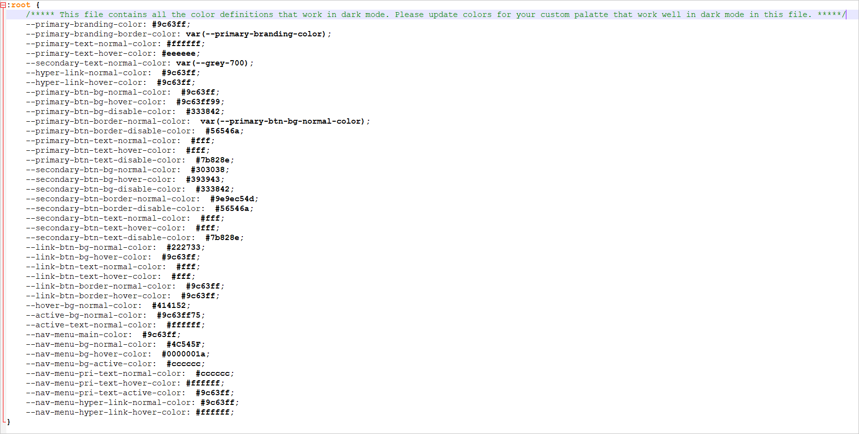
How to create custom application theme
Once you have extracted the template file downloaded from the link in the Manage Application Theme dialog, you can manually edit the CSS variables and assign color codes in the template file to customize the theme.
Let’s learn some basics on CSS3 variable and color code assignments.
CSS3 variable syntax: name:value;
Here name represents the variable name, and it should starts with two dashes (--). For example, --primary-branding-color.
The value represents the hexadecimal representation of the color code that you want to assign to this variable. For example, #ffffff. You can either assign a hex color code or use the already defined CSS3 variable name like the one below.

Points to be noted while editing and uploading custom theme file.
-
To avoid errors in the color assignment, please check this online color picker tool to get the hex value for the color you wish to use in the template file.
-
Make sure that you use appropriate color codes that will be suitable for the mode you prefer to customize. For example, use light based colors in dark mode and dark based colors in light mode so that the visibility will be clear.
-
A custom theme can only be created for either the dark or light mode. A single custom theme will not work for both. Please choose a custom theme based on your current application mode. To reset the custom theme, please select the default value.
-
Once a theme is uploaded, you can’t change the color codes in the already uploaded theme file with the same name or by deleting the theme file. You need to re-upload a new file with changes for further customization.
-
Before uploading the custom theme file, please ensure your custom theme file is valid by uploading it into this online validation helper.
Assign color code to variables in template file
Simple Customization
You can customize the branding color, primary text, secondary text, active text, and hyper link colors by changing color codes for the below-mentioned variables. These minimal changes will be enough to customize all components and elements.
Branding Color
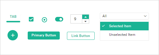
You can customize the branding color by changing the --primary-branding-color variable.
This will reflect in the areas and components shown in the below image.
Branding color
--primary-branding-color |
|
Typography
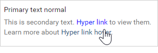
You can customize primary text, secondary text, hover text, active text, and hyperlink color over the entire application by changing the color codes of the below variables.
Primary text
--primary-text-normal-color --primary-text-hover-color Secondary text --secondary-text-normal-color Hyper link --hyper-link-normal-color --hyper-link-hover-color |
|
Advanced Customization
You can customize the active and hover state colors, as well as the primary button, secondary button, and link button by assigning color codes to their respective variables.
State background
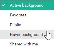
You can customize the hover background and active background color across the entire application by changing the color codes in the variables below.
Active background
--active-bg-normal-color Active state text --active-text-normal-color Hover background --hover-bg-normal-color |
|
Buttons Customization
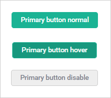
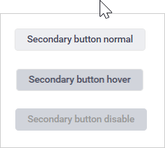
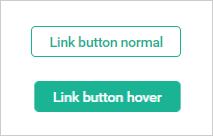
You can customize the primary button, secondary button, and link button colors by changing the color codes of the variables below for the normal, hover, and disabled states.
Primary button normal
--primary-btn-bg-normal-color --primary-btn-text-normal-color --primary-btn-border-normal-color Primary button hover --primary-btn-bg-hover-color --primary-btn-text-hover-color Primary button disable --primary-btn-bg-disable-color --primary-btn-text-disable-color --primary-btn-border-disable-color |
|
Secondary button normal
--secondary-btn-bg-normal-color --secondary-btn-text-normal-color --secondary-btn-border-normal-color Secondary button hover --secondary-btn-bg-hover-color --secondary-btn-text-hover-color Secondary button disable --secondary-btn-bg-disable-color --secondary-btn-text-disable-color --secondary-btn-border-disable-color |
|
Link button normal
--link-btn-bg-normal-color --link-btn-text-normal-color --link-btn-border-normal-color Link button hover --link-btn-bg-hover-color --link-btn-text-hover-color --link-btn-border-hover-color |
|
Once you customize the template file with advanced customization, it will resemble the image shown below.
