Responsive Design in Bold BI Server
We can view the Bold BI Server on desktop, mobile, and tablet devices. The server page can be recalculated and adapt its view for various screen sizes and orientations.
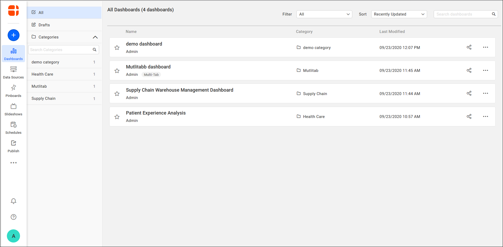
Desktop Layout in Bold BI Server
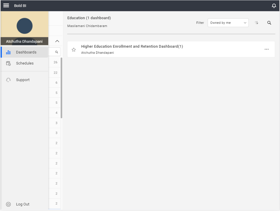
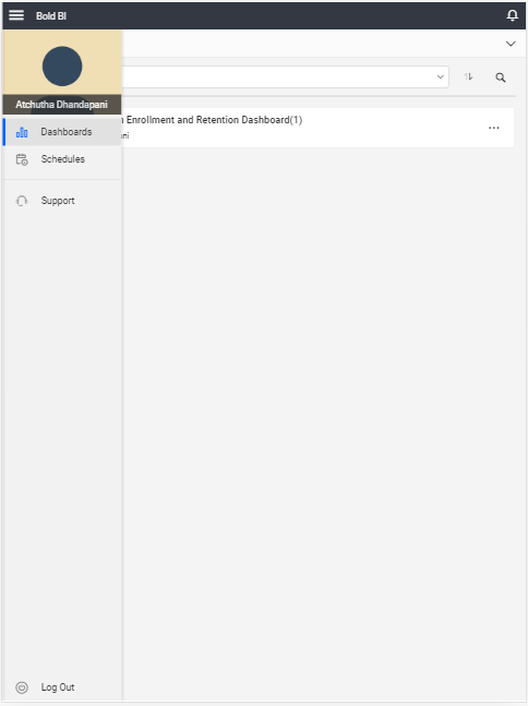
In Desktop layout, you can view the Bold BI user and settings pages on your PC and laptops, and can manage the dashboards and resources.
All the supported features in Bold BI are available on desktop devices.
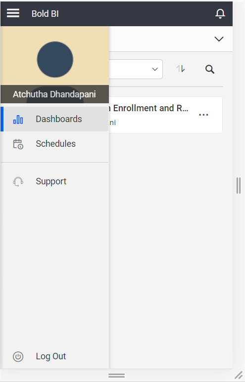
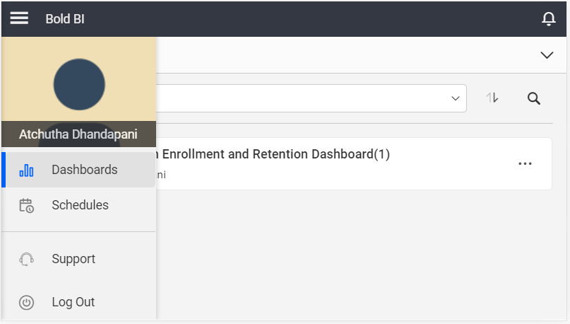
Mobile Layout in Bold BI Server
In the Mobile layout, you can view the Bold BI Server page according to different screen sizes for various mobile devices.
In mobile view, operations such as Data sources, Pinboard, Slideshows, Publish, Settings, and User management will be disabled.
The default screen size for the mobile layout is 360 * 640 pixels.
Any overflowed content on mobile devices will be hidden and displayed with an ellipsis (…).
The Bold BI Server page is displayed in Portrait orientation for mobile layout as shown below.
The Bold BI Server page is displayed in Landscape orientation for mobile layout as shown below.
Tablet Layout in Bold BI Server
In the Tablet layout, you can view the Bold BI Server page with respect to different screen sizes and orientations.
In tablet view, various operations such as Data sources, Pinboard, Slideshows, Publish, Settings, and Users menu will be disabled.
The default screen size for the tablet layout is 768 * 1024 pixels.
The Bold BI Server page is displayed in Portrait orientation for tablet layout as shown below.
The Bold BI Server page is displayed in Landscape orientation for tablet layout as shown below.