How to create a custom theme using variables for dashboards
You can customize your dashboard in BoldBI using the provided variables to create a custom theme. Follow these steps:
-
Download the default
lightanddarkfiles from the Github repository and extract them. -
Copy all
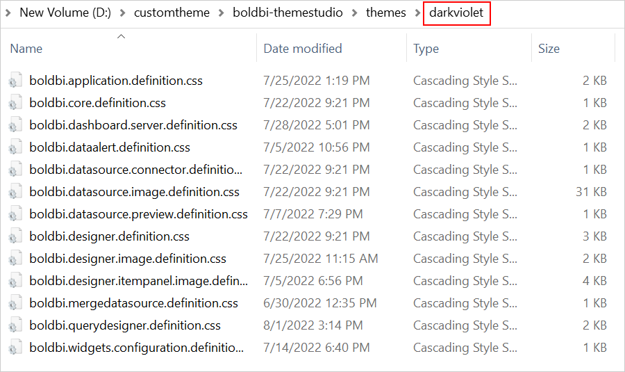
CSSfiles from thelightfolder inside thethemesfolder and paste them into a newly created folder. For example, create a new folder calleddarkviolet.
- Open the
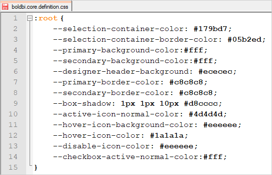
boldbi.application.definition.cssandboldbi.core.definition.cssfiles in aneditorand customize the color code in the provided variables.
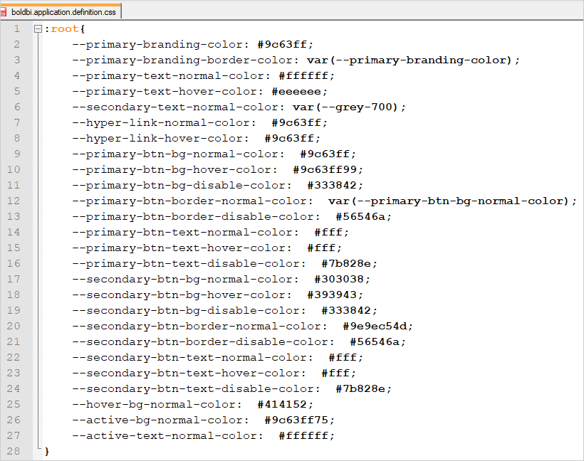
boldbi.application.definition.css
:root {
  --primary-branding-color: #9c63ff;
  --primary-branding-border-color: var(--primary-branding-color);
  --primary-text-normal-color: #ffffff;
  --primary-text-hover-color: #eeeeee;
  --secondary-text-normal-color: var(--grey-700);
  --hyper-link-normal-color: #9c63ff;
  --hyper-link-hover-color: #9c63ff;
  --primary-btn-bg-normal-color: #9c63ff;
  --primary-btn-bg-hover-color: #9c63ff99;
  --primary-btn-bg-disable-color: #333842;
  --primary-btn-border-normal-color: var(--primary-btn-bg-normal-color);
  --primary-btn-border-disable-color: #56546a;
  --primary-btn-text-normal-color: #fff;
  --primary-btn-text-hover-color: #fff;
  --primary-btn-text-disable-color: #7b828e;
  --secondary-btn-bg-normal-color: #303038;
  --secondary-btn-bg-hover-color: #393943;
  --secondary-btn-bg-disable-color: #333842;
  --secondary-btn-border-normal-color: #9e9ec54d;
  --secondary-btn-border-disable-color: #56546a;
  --secondary-btn-text-normal-color: #fff;
  --secondary-btn-text-hover-color: #fff;
  --secondary-btn-text-disable-color: #7b828e;
  --hover-bg-normal-color: #414152;
  --active-bg-normal-color: #9c63ff75;
  --active-text-normal-color: #ffffff;
}
boldbi.core.definition.css
:root {
  --selection-container-color: #179bd7;
  --selection-container-border-color: #05b2ed;
  --primary-background-color: #fff;
  --secondary-background-color: #fff;
  --designer-header-background: #ececec;
  --primary-border-color: #c8c8c8;
  --secondary-border-color: #c8c8c8;
  --box-shadow: 1px 1px 10px #d8cccc;
  --active-icon-normal-color: #4d4d4d;
  --hover-icon-background-color: #eeeeee;
  --hover-icon-color: #1a1a1a;
  --disable-icon-color: #eeeeee;
  --checkbox-active-normal-color: #fff;
}
- Follow the steps outlined in the
README.mdon the Github repository to generateboldbi.theme.definition.min.css.
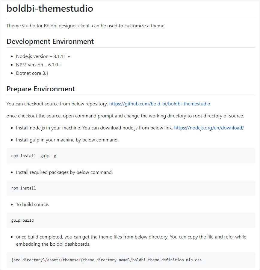
- After running the command from the
README.mdfile, you can find the theme files in the directory{src directory}/assets/theme/{theme directory name}/boldbi.theme.definition.min.css.