Button Widget
The Button widget allows users to trigger actions and events within their dashboards. It enhances interactivity by enabling users to seamlessly navigate between different dashboards. Additionally, the purpose of the Button widget and the actions performed when clicking on it can be described in the tooltip.
How to configure the button widget
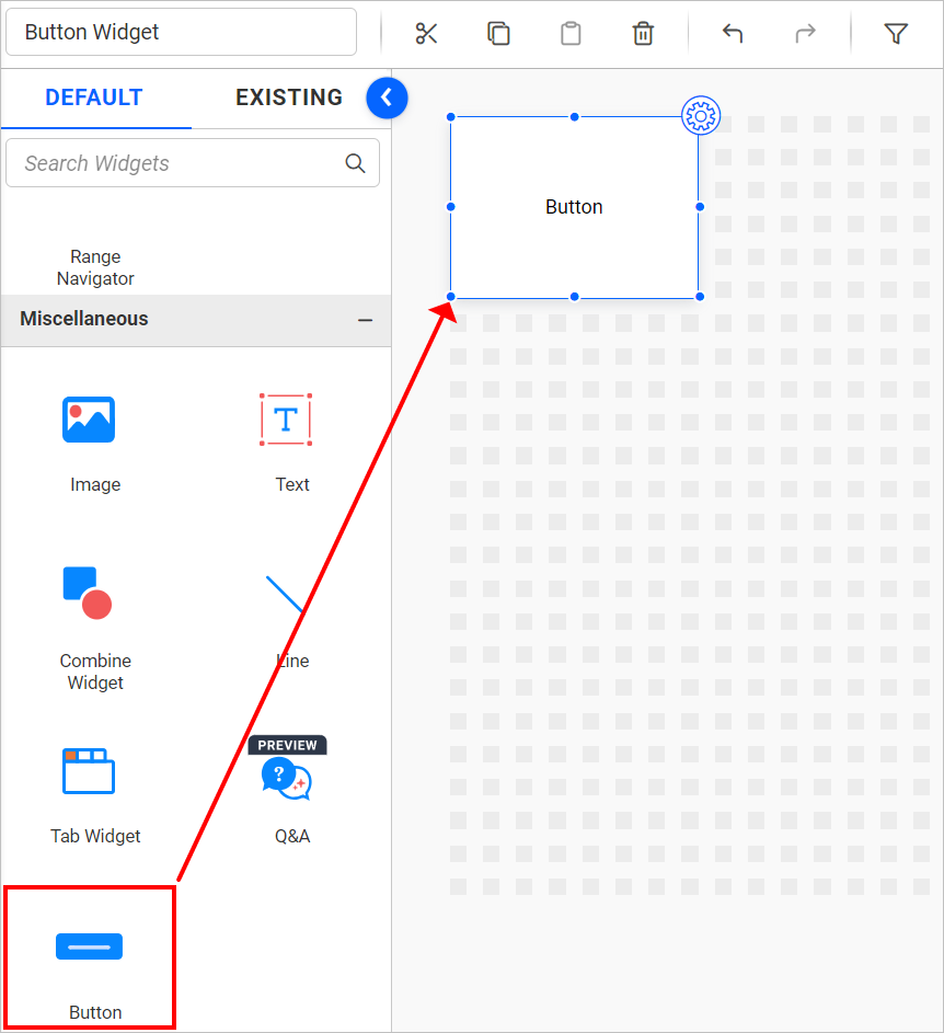
Drag and drop the Button Widget control icon from the toolbox onto the design panel. You can locate the control by searching for it in the toolbox. The widget can be resized as required.
Click the Properties button in the configuration panel’s property pane to visualize the button widget more effectively.
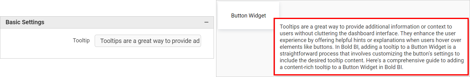
Basic Settings
The tooltip option in the Basic settings of the properties panel for the Button widget allows the user to add content that will be displayed while hovering over the widget, without any limits on the amount of text that can be added.
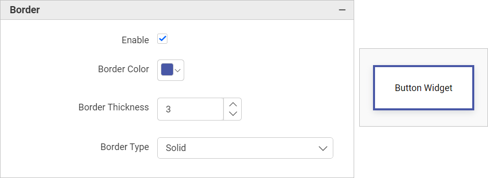
Border
Enabling the Border option in the Properties panel allows the user to add a border to the Button widget. We can customize the Border color, Border Thickness, and Border Type of the widget. By default, the Border Type is set to Solid, but it can be changed to Dotted or Dashed.
Text
The Text option in the properties panel allows user to change text styles using the following options.
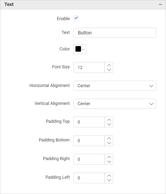
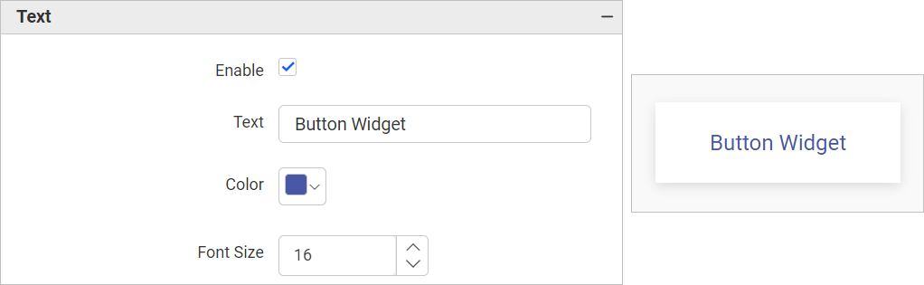
The default text of the Button can be changed to any desired text according to your preferences. The color and font size of the text can be adjusted using the Color and Font Size options in the Text section of the Properties panel.
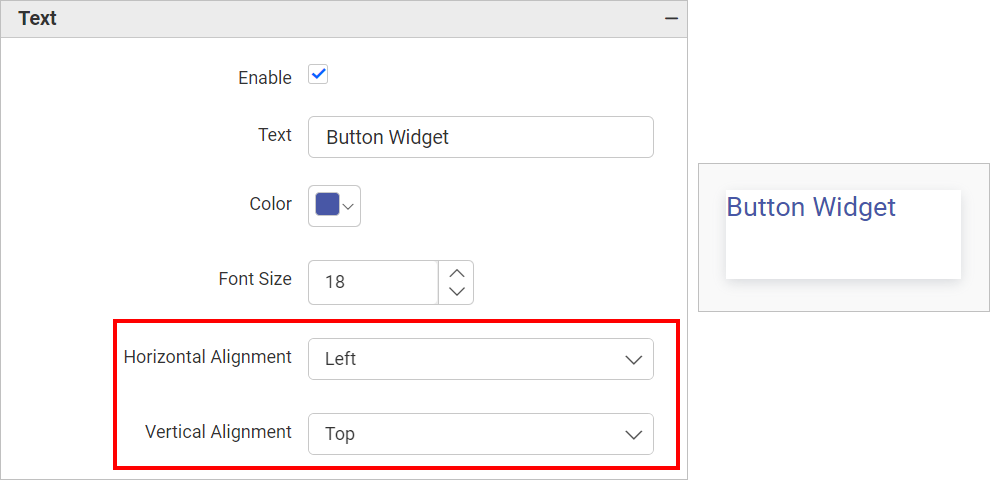
The Horizontal Alignment and Vertical Alignment options allow to align the text displayed in the Button widget. By default, both options are set to center, but they can also be changed to Left or Right.
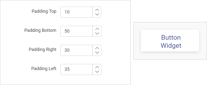
The padding of the text displayed in the button widget can be customized using the options Padding Top, Padding Bottom, Padding Right, and Padding Left. By default, all of these options are set to 0.
Icon
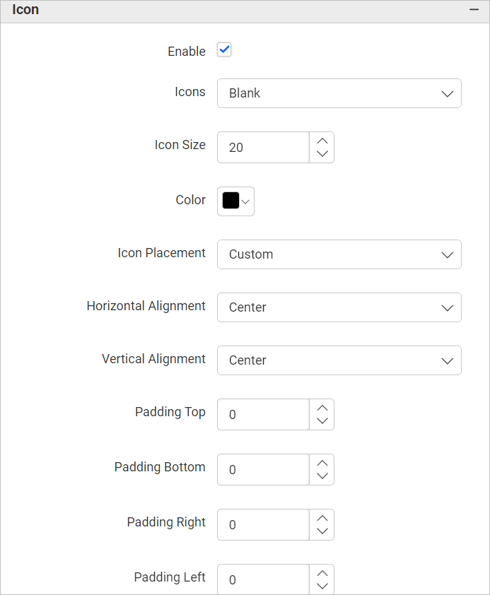
Enabling the Icon option in the properties panel allows to include an icon in the button widget. By default, this option is disabled, and the Icons setting will be set to Blanks. So, no icons will be displayed in the button widget.
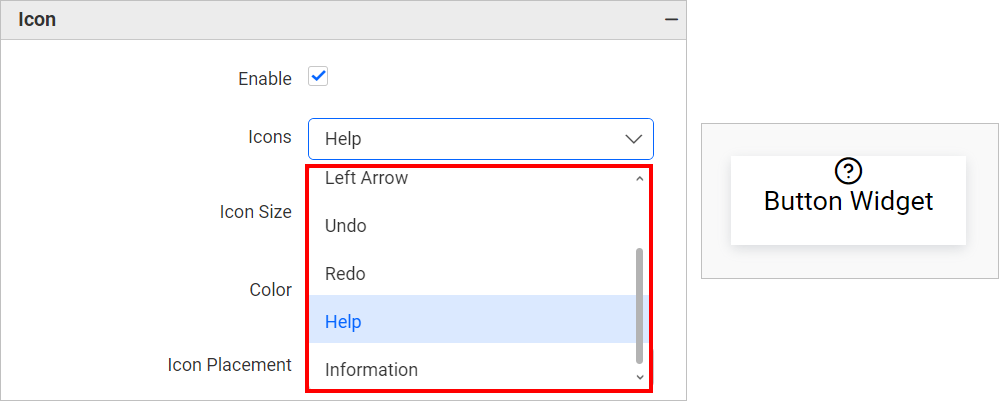
By clicking on the Icons dropdown, the following icon options will be listed: Right Arrow, Left Arrow, Undo, Redo, Help and Information.
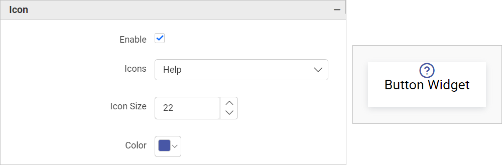
The color and size of the applied icon can be customized using the Color and Icon Size options in the Icon section of the Properties Panel.
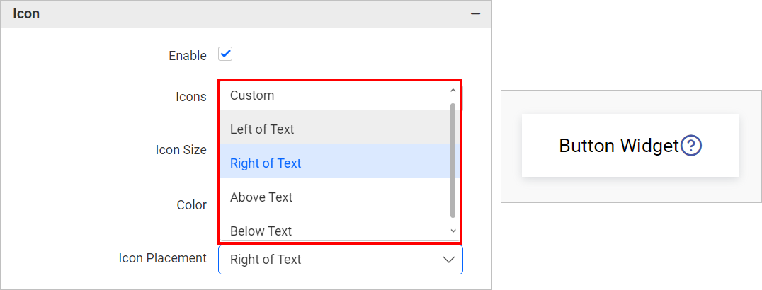
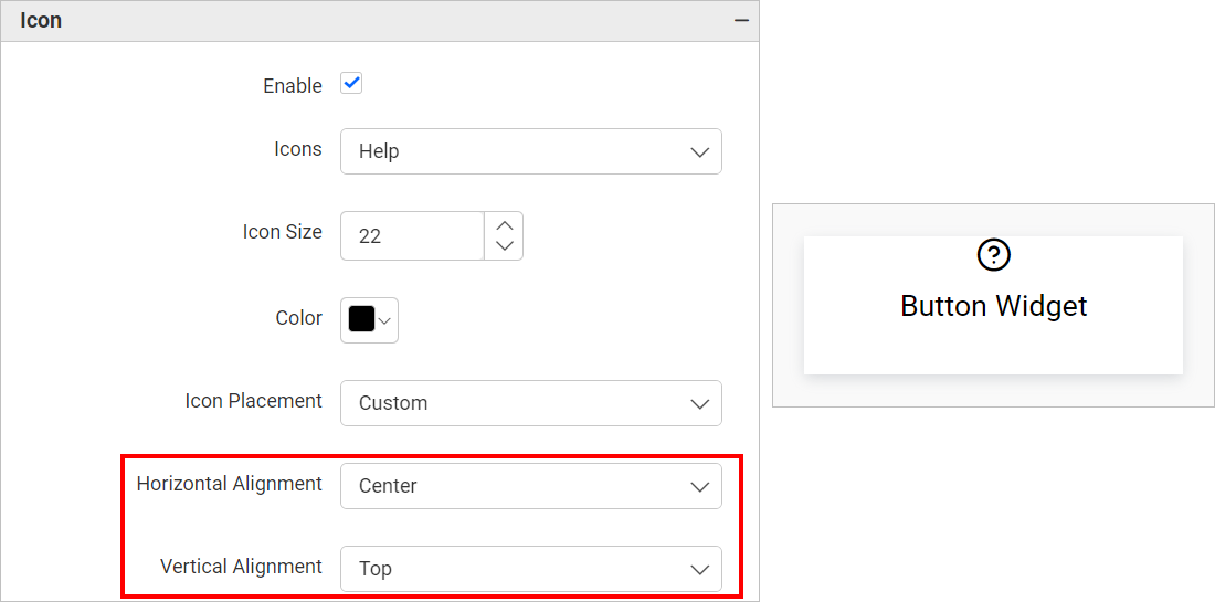
The Icon Placement will be set to Custom by default, so the icon will appear at the top of the Button widget. However, we can customize the Icon Placement to options such as Left of Text, Right of Text, Above Text, and Below Text.
The Horizontal Alignment and Vertical Alignment options allows to align the icon added to the Button widget. By default, both options are set to center, but they can also be changed to Left or Right. Both Alignment option will be shown only for the Icon Placement as Custom.
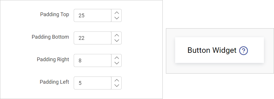
The padding of the text displayed in the button widget can be customized using the options Padding Top, Padding Bottom, Padding Right, and Padding Left. By default, all of the mentioned options will be set to 0.
Fill
Enabling the Fill option allows the user to add a background color or background image to the button widget.
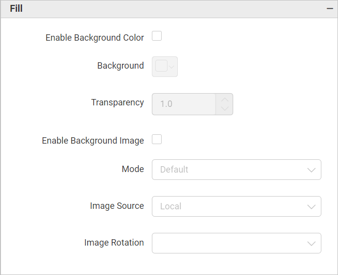
Enable Background Color
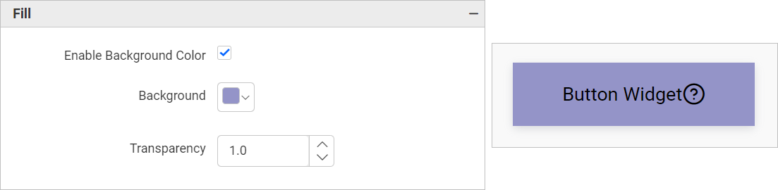
Enabling the Enable Background Color option in the Fill section of the properties panel and applying a background color using the Background Color option allows users to change the background color of the button widget. The transparency of the background color can be adjusted using the Transparency option in the Fill section of the properties panel.
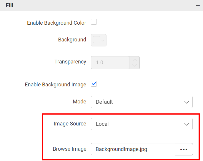
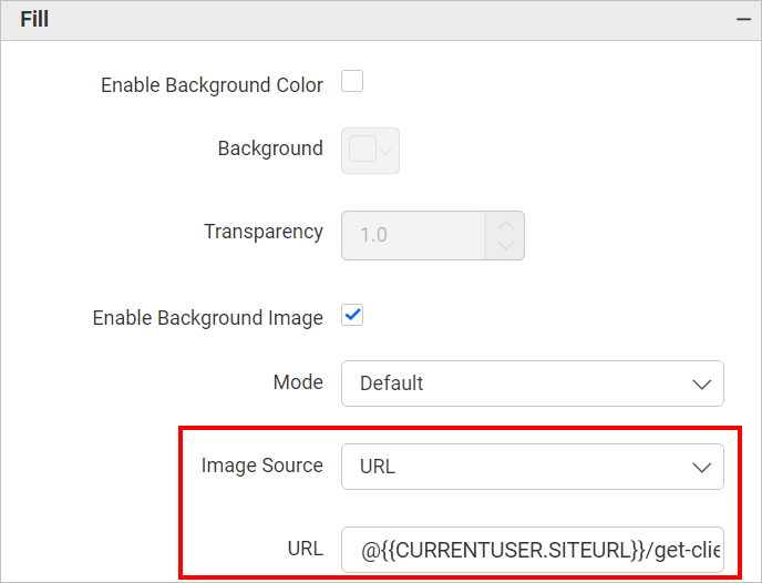
Enable Background Image
Enabling the Enable Background Image option in the Fill section of the properties panel and applying the background image using the Local or URL options allows users to change the background image of the button widget.
- By selecting the
Image TypeasLocal, the user can choose an image from their local device by browsing for it. This image can then be applied as the background image of the button widget.
- By selecting the
Image TypeasURLand entering the image URL in theBackground Image URLtext box, the user can set the background image for the button widget.
Based on the aforementioned Image Type option, the background image will be applied to the button widget, as illustrated below.
Using the Mode option in the Fill section. The mode can be customized as listed below.
- Default
The image will be displayed in its original size.
- Fill
The image will be filled in the available space.
- Uniform to Fill
The image will uniformly occupy the space but may get clipped if it is larger than the control.
- Uniform
The image sizes proportionally (without clipping) to best fit the widget area.
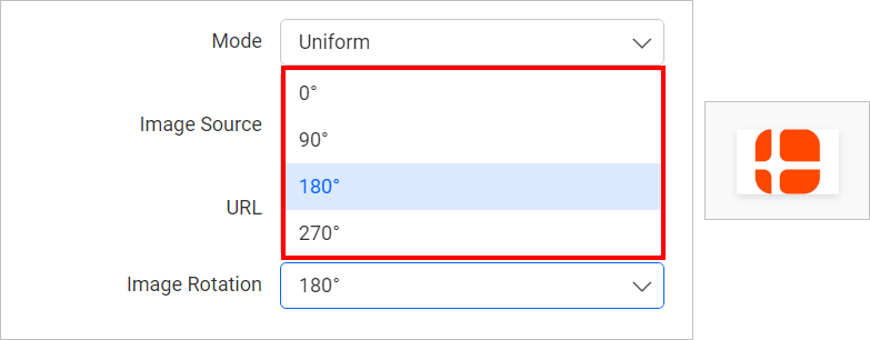
There is an option to rotate the background image in the Button widget according to your preference to 0, 90, 180, or 270 degrees.
Link
The Link option in the button widget allows users to navigate to a specified link or dashboard when the widget is clicked.
There are two options available:
- Dashboard
- URL
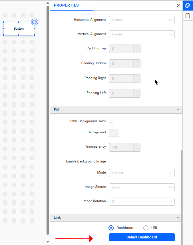
Dashboard
In the dashboard section, users can select the dashboard they wish to navigate to using the button widget. The selected dashboard will be rendered using the same instance as the parent dashboard. Users can also pass filter details from the parent dashboard to the target dashboard.
How to configure
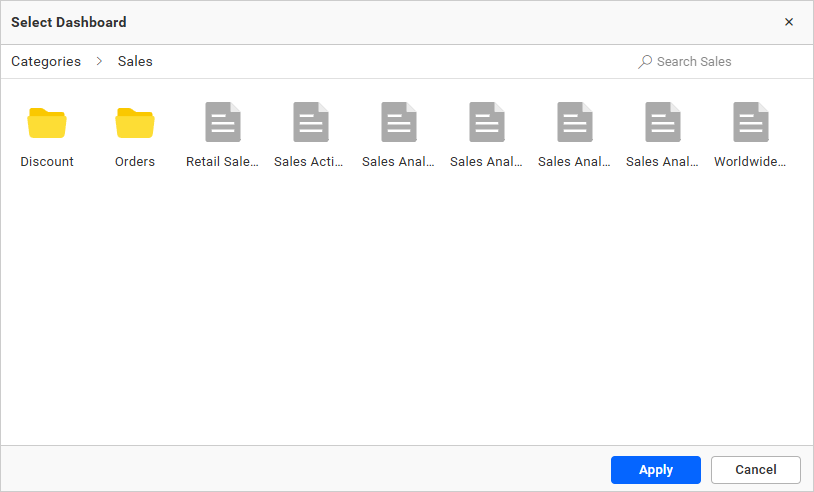
In the properties of the button widget, where you will find the “Select Dashboard” option under the “Link” category. Clicking on “Select Dashboard” will open a dialog box displaying relevant categories and dashboards based on user permissions. Users can either double-click a dashboard file to select it or choose the dashboard and click the “Apply” button at the bottom of the dialog.
Pass Filter Details
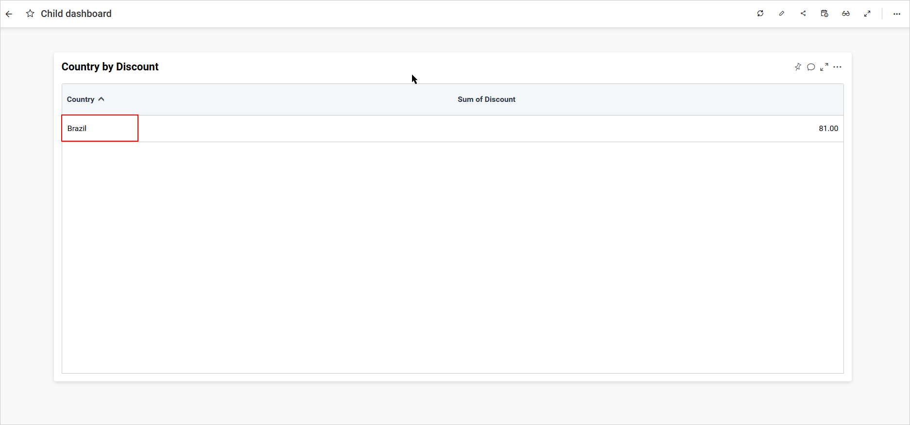
While navigating between dashboards, you can pass filter information from one dashboard to the target dashboard. For example, consider a combo box filter widget filtering the country values to Brazil. After navigation, the same filter will be applied to the child dashboard.
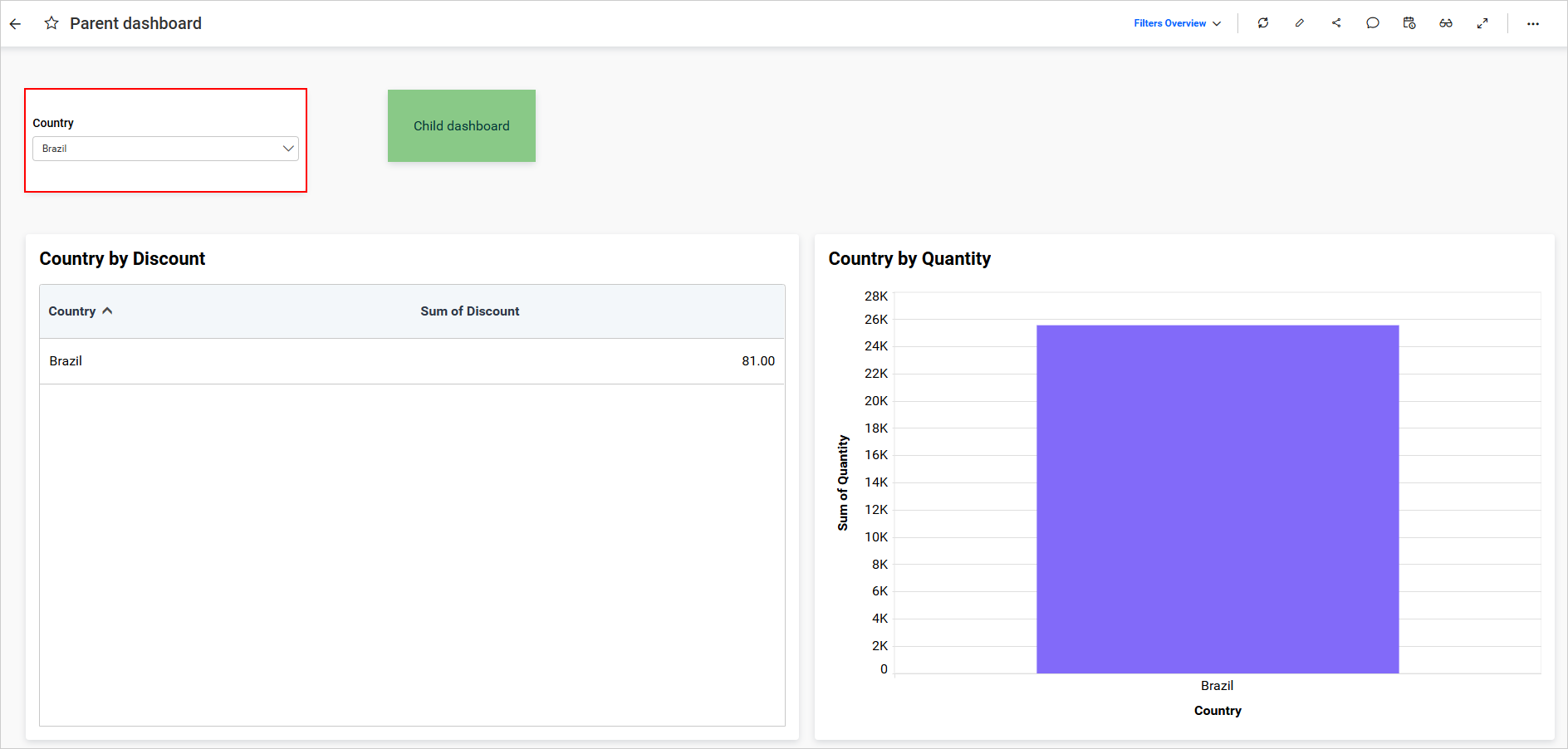
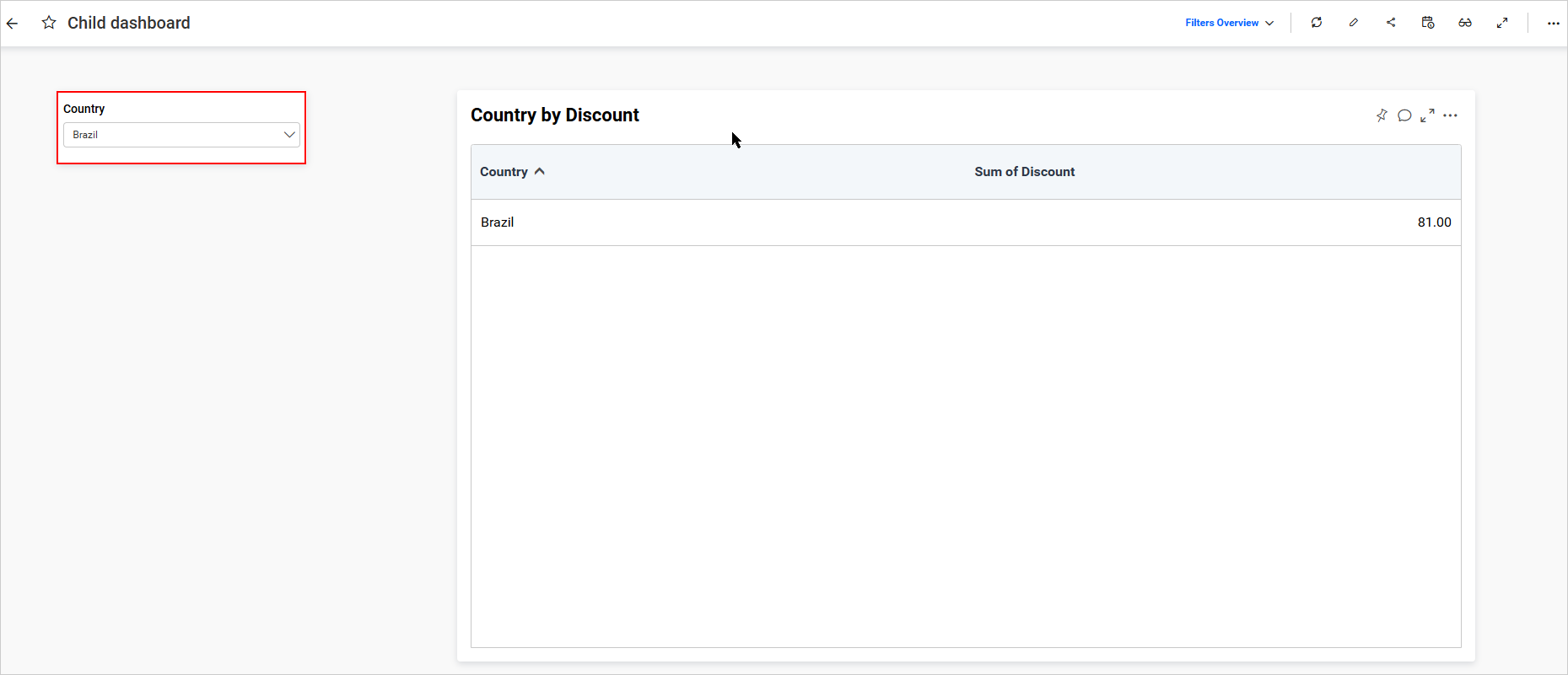
If no filter widgets are present in the child dashboard to receive filters from the parent dashboard, the passed filter will act as a URL filter to filter the child dashboard.
NOTE:
- To pass filters between dashboards, users must configure the same data source for all dashboards.
- If a URL filter is applied to the navigating dashboard, only the filter is applied; the URL will not change.
URL
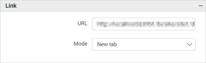
The URL to be navigated should be entered in the URL text box, after which the Mode can be selected. This selection determines how the added URL will be displayed: in a New Tab, Same Page, Current Frame, Parent Frame, Pop Up, or New Window. Based on the selected mode, the URL entered in the text box will be rendered when the button widget is clicked.
Include Master Widget Filters
This option allows the selected filter values from the chosen master widget to be automatically passed to the navigated dashboard via the URL parameters, without the need to manually append parameters. It applies to both Dashboard and URL navigation types.
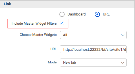
You can select the master widgets from the Choose Master Widgets dropdown. It will display the configured master widgets in the current dashboard. By default, all widgets are selected.
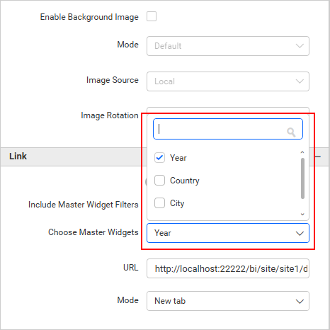
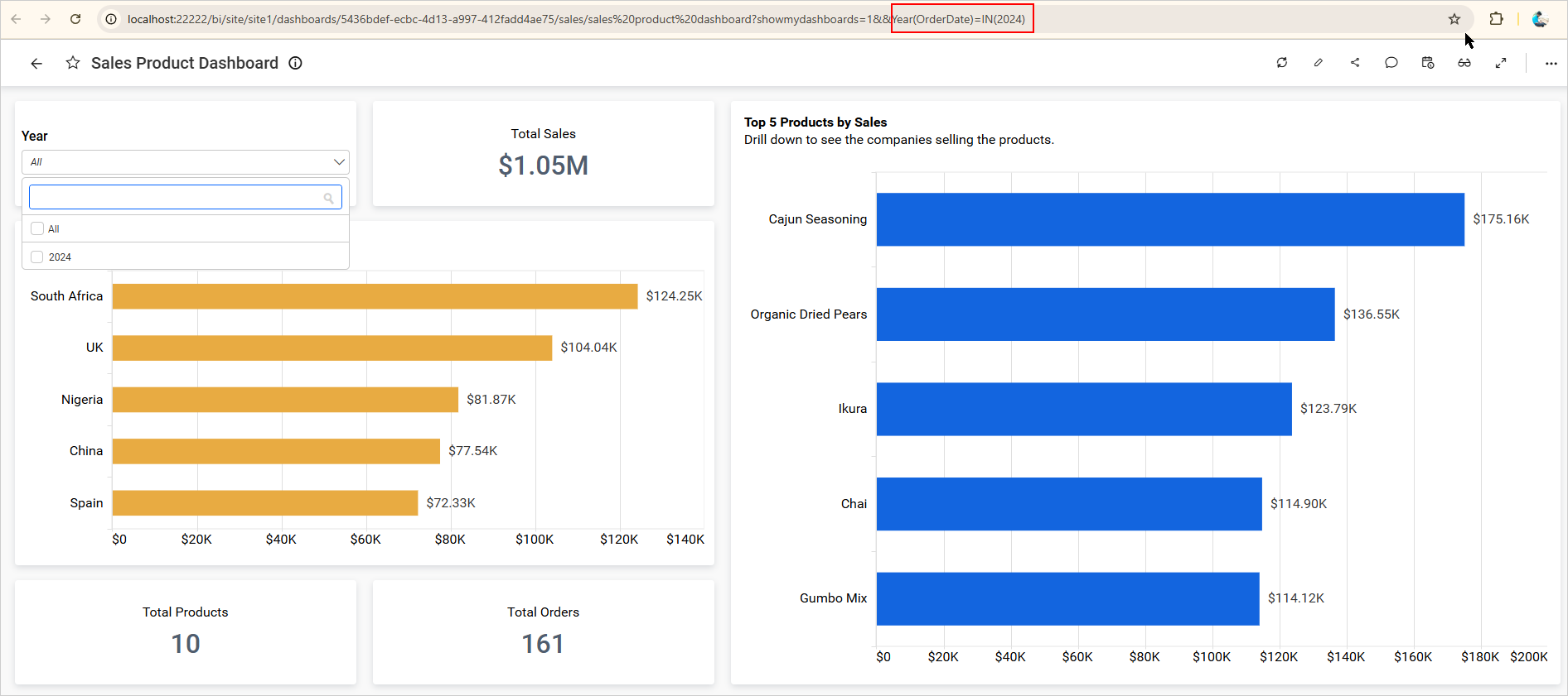
For example, in the dashboard shown below, the Year-configured filter widget is used as the chosen master widget for the slave widget, with 2024 selected as the value. Upon navigation, the selected value is automatically passed to the destination dashboard via a URL parameter.
NOTE: If the selected master widgets are not filtered, then no values should be passed to the
DashboardorURL.
Container Appearance
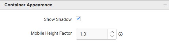
Show Shadow
This allows you to toggle the visibility of the shadow surrounding the widget.
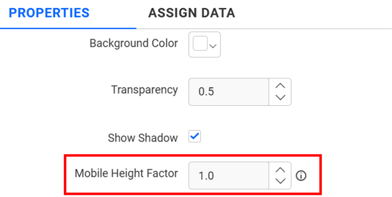
Mobile Height Factor
This option allows you to resize widgets specifically for mobile view.