Image
Image allows you to display both static and dynamic images within defined modes (default, fill, uniform, and uniform to fill).
You can add images of supported formats including BMP, JPG, JPEG, GIF, EMF, JFIF, JPE, PNG, RLE, TIF, TIFF, WMF, DIB, and ICO from your local machine or by column binding to the image widget.
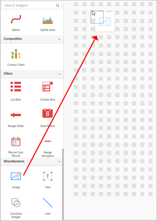
The following steps represent how to add an Image to the dashboard:
- Drag and drop the image widget into the Canvas.
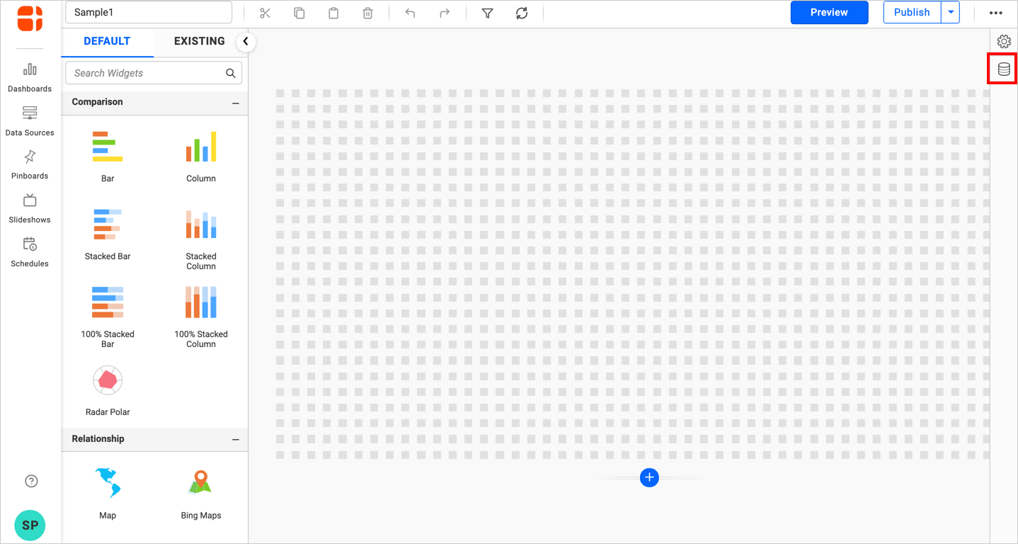
- Click the
Data Sourcebutton in the configuration panel.
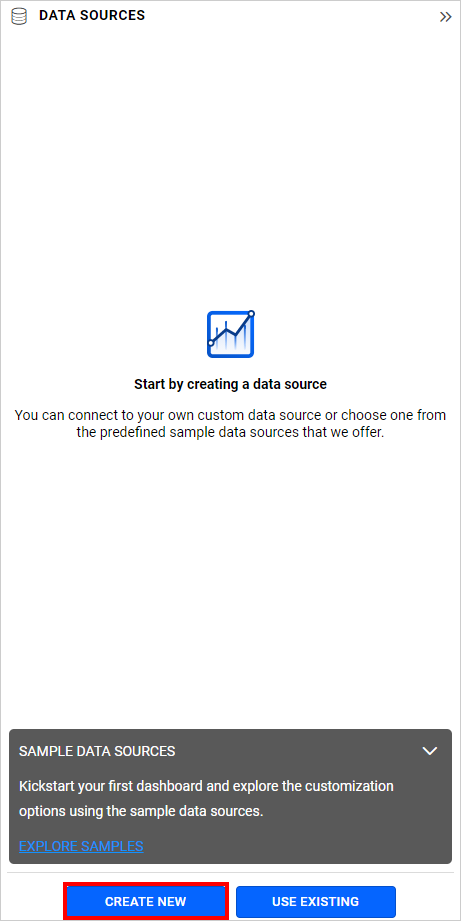
- Click the
CREATE NEWbutton to launch a new connection from the connection type panel.
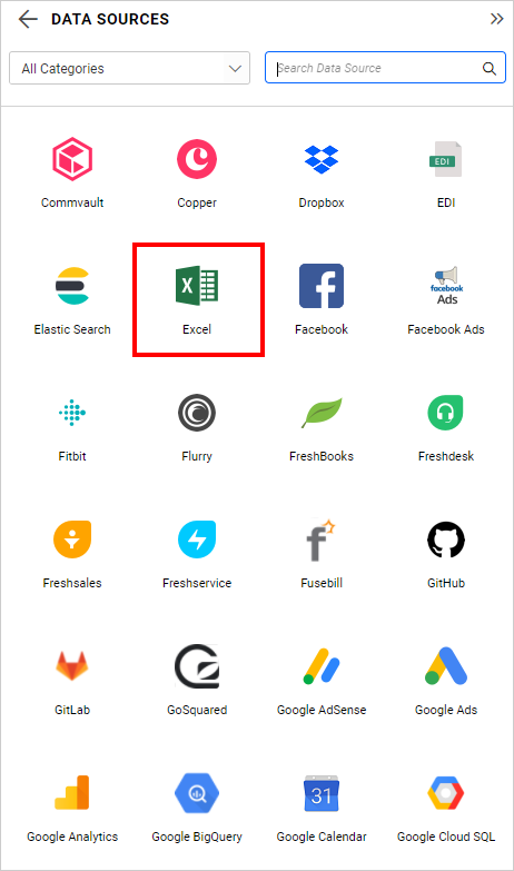
- In the connection type panel, click on any one of the listed connection type buttons (Here, the
Microsoft ExcelConnection type is selected for demonstration).
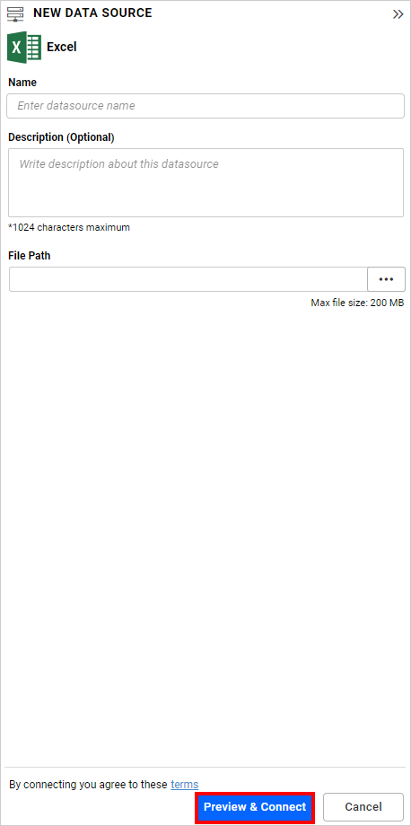
- In the
NEW DATA SOURCEconfiguration panel, fill in the connection type and related details. Click thePreview & Connectbutton.
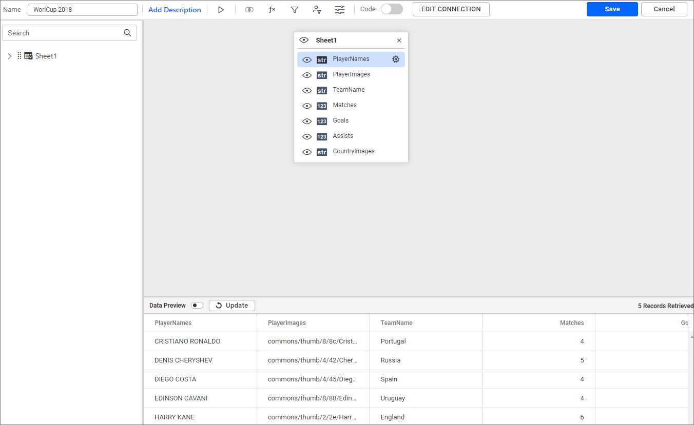
- Drag your preferred table or view from the left pane in the data design view, then click the
Savebutton.
- Click the
Propertiesbutton in the configuration panel.
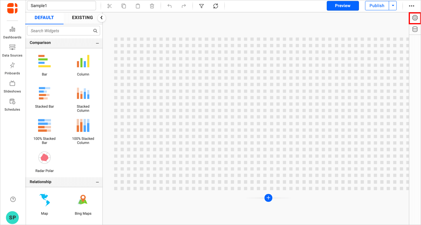
- The property pane will open.
Configuring Data Input for the Image Widget
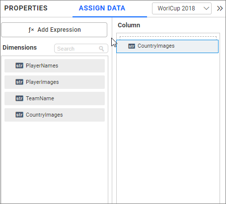
You can browse the image or bind a data source column containing the image URL.
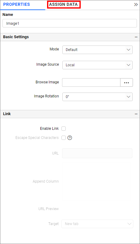
Assign data by clicking the Assign Data button.
Drag and drop the image column from the dimension section to the Column section.
You can format the image for better illustration of the required view through the settings available in the Properties pane.
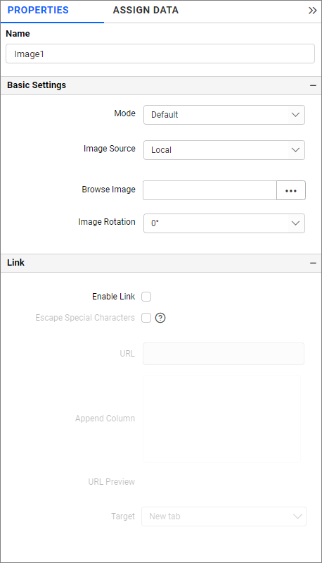
Name
This allows you to set the title for the Image widget.
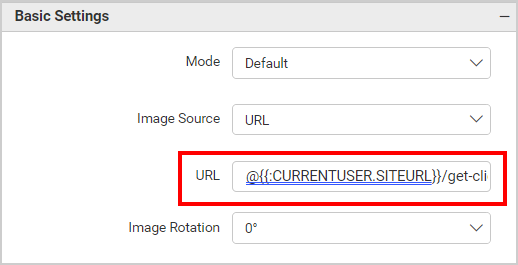
Basic Settings
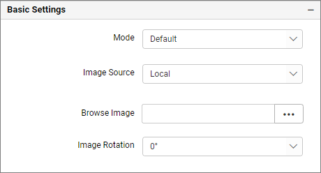
Mode
You can customize the image showcase style through the Mode setting in the Design Tools pane or properties pane.
Default
The image will be displayed in its original size.
Fill
The image will be filled in the available space.
Uniform to Fill
The image will uniformly occupy the space but may get clipped if it is larger than the control.
Uniform
The image sizes proportionally (without clipping) to best fit the widget area.
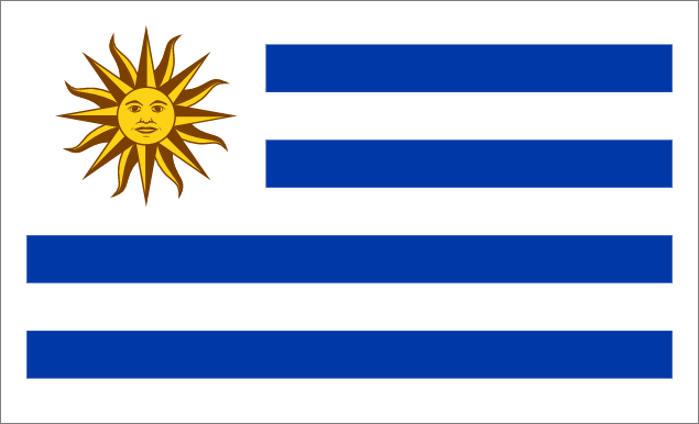
Image Source
Local
You can browse the image from your local system.
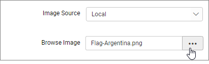
NOTE: Images with special characters in the file name are not supported in the Dashboard Application.
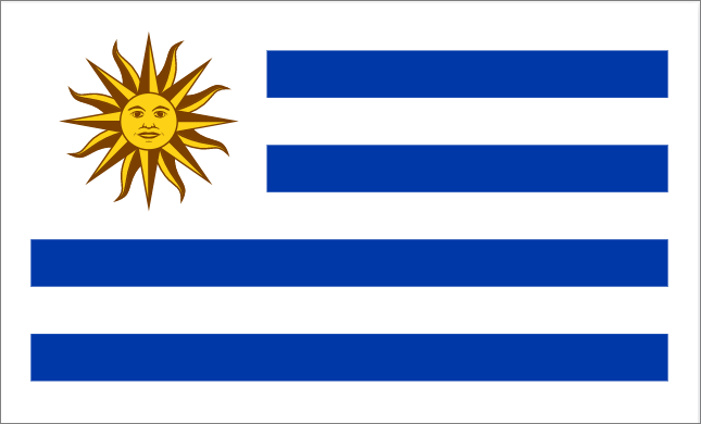
URL
You can provide a valid URL for the image.
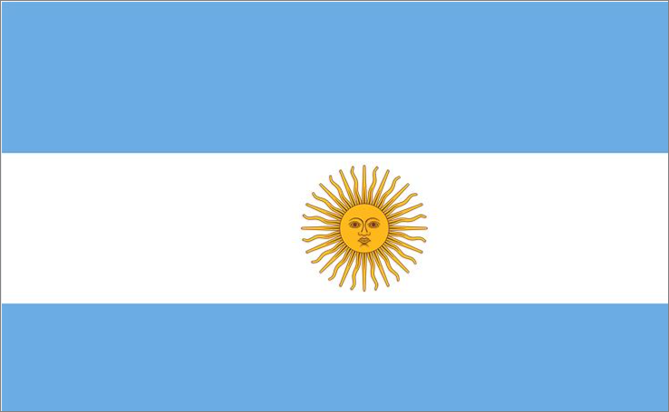
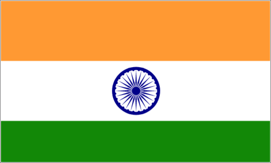
Ex: http://flagpedia.net/data/flags/normal/in.png
If you wish to provide tenant-specific images, you can utilize the dashboard parameter. We have added support for using the dashboard parameter in the URL field.
For Example: you want to render the image located at http://localhost:56372/bi/site/site1/get-client-logo. The default dashboard parameter is @{{:CURRENTUSER.SITEURL}}.
When adding the URL in the image widget, the image will be displayed dynamically based on the tenant. The URL should be structured as follows: @{{:CURRENTUSER.SITEURL}}/get-client-logo.
The image widget is rendered as shown below.
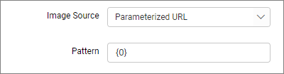
Parameterized URL
This option allows the user to select an image from the data source field for the image widget.
You can add multiple fields through the column section in the assigned data. The fields can be represented using the {N-1} parameter, starting from {0}.
In this example, there are two fields in a column section shown in the illustration.
You can refer to the Teams image field filled with {0} parameter and the Players Image field filled with {1} parameter.
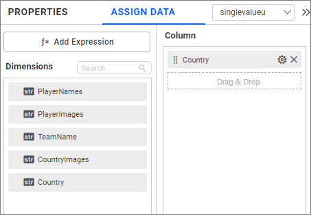
By using the parameter {1} in the Parameterized URL pattern, you get the 1st value of the Players Image field data as the source for the image widget.
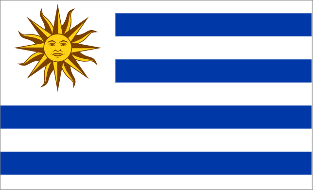
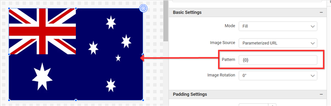
Forming URI through placeholder
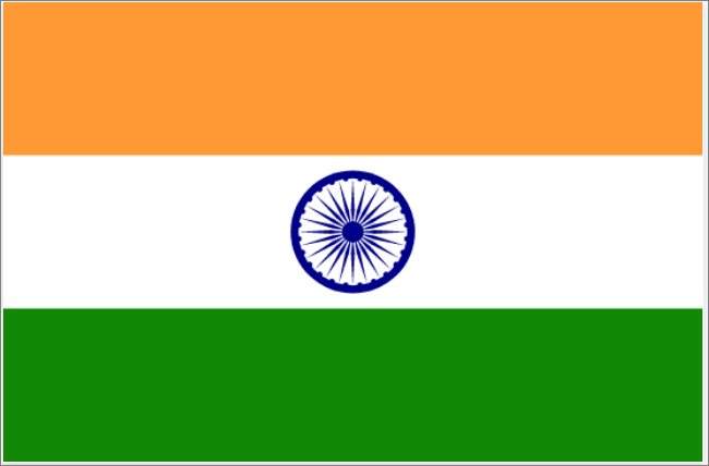
EX: http://flagpedia.net/data/flags/normal/{0}.png
{0}- Represents the 1st field of the column section and gets the 1st value of that field for the image widget.- If the 1st value of the
{0}parameter isau, the URL will be framed ashttp://flagpedia.net/data/flags/normal/au.png. This will be used as the image source. - Remaining texts are constant values.
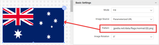
Note: The parameter used will get the 1st value of the field after considering all the dashboard filters.
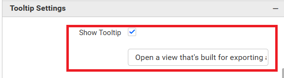
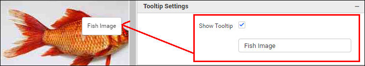
Tooltip Settings
Show Tooltip allows you to toggle the visibility of a tooltip on an image. The text box below the Show Tooltip option allows you to set the text that appears in the tooltip.
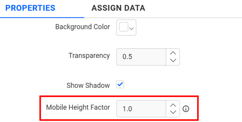
Container Appearance
Mobile Height Factor
This option allows you to resize widgets specifically for mobile view.
Filter Settings
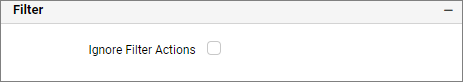
Ignore Filter Actions
You can ignore the filter actions by enabling the IgnoreFilterActions property. Browse Image will not act as a slave widget.
Show Filter
This feature allows you to toggle the visibility of the Filter icon for the image widget when the Act as Master Widget option is enabled.
Link
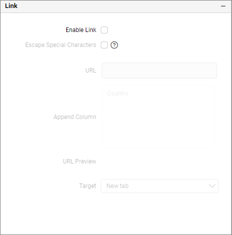
Configure the linking to URL or dashboard with the widget using its settings. For more details, refer to the Linking.
Container Actions
Pin Widget
This allows you to pin the widget.