Configuring and formatting Number card with Bold BI
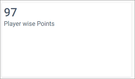
The Number Card widget is a very useful tool that allows users to showcase a single value or a series of measure values in a dashboard. Key metrics such as total sales amount, number of page visits, and current month goal are typically displayed in these card widgets.
The visualization of the Number Card widget is customizable, allowing users to format the values displayed using the provided options.
a) Single Number Card widget.

b) Series of Number Card widget.
How to configure data into the Number Card widget
To display a Number Card, at least one measure value is required.
Follow these steps to configure data for the card:
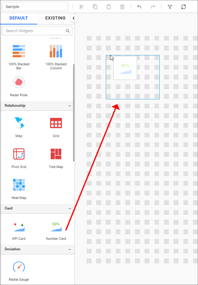
- Drag the
Number Cardcontrol icon from the toolbox into the design panel. The control can be found by searching in the toolbox.
- Click on the
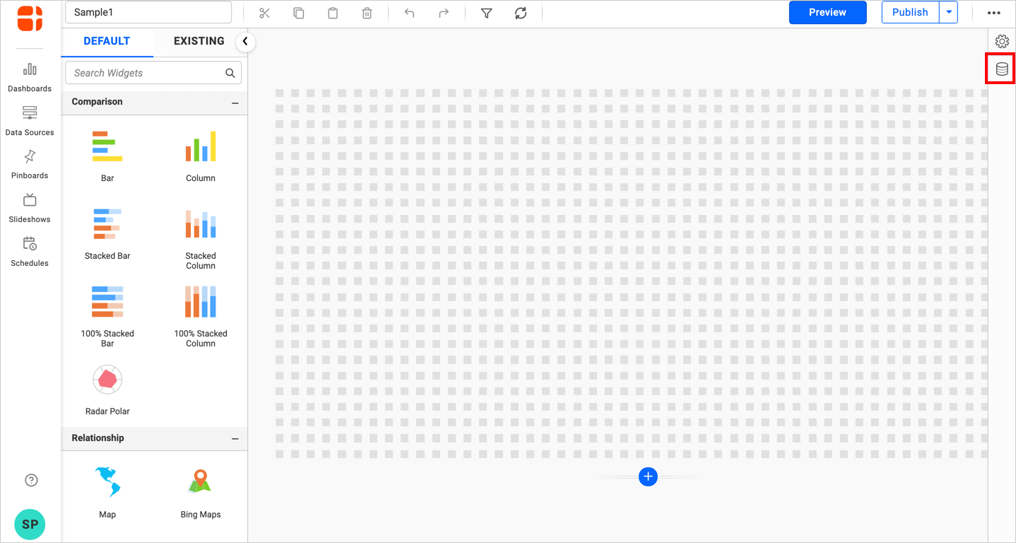
Data Sourcesicon in the configuration panel.
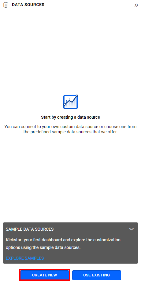
- Click on
CREATE NEWto create a new connection from the connection-type panel.
- Choose a connection type from the options listed in the connection-type panel. For this example, the
Microsoft Excelconnection type is selected.
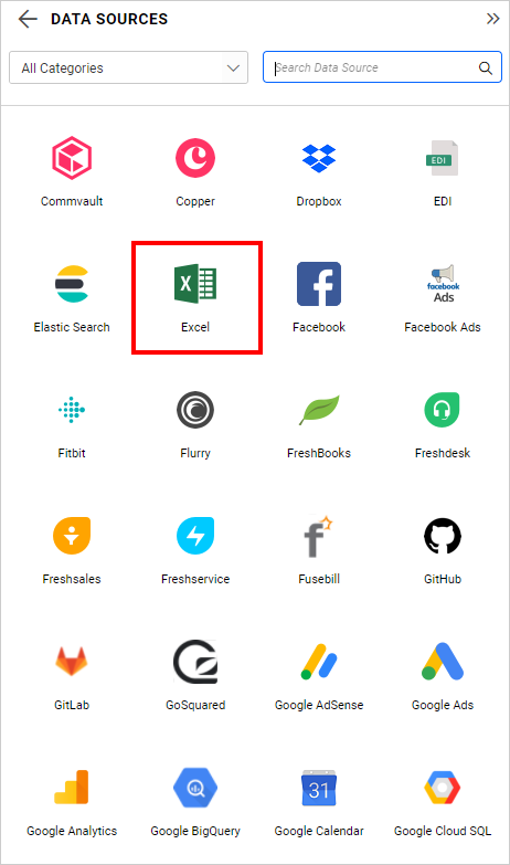
- Enter the required details in the
NEW DATA SOURCEconfiguration panel.
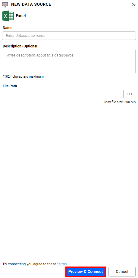
- Click
Preview & Connect. TheChoose Table(s)dialog will appear.
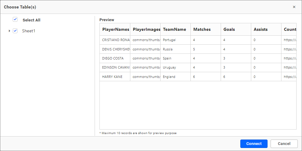
- Select the desired tables and click
Connect.
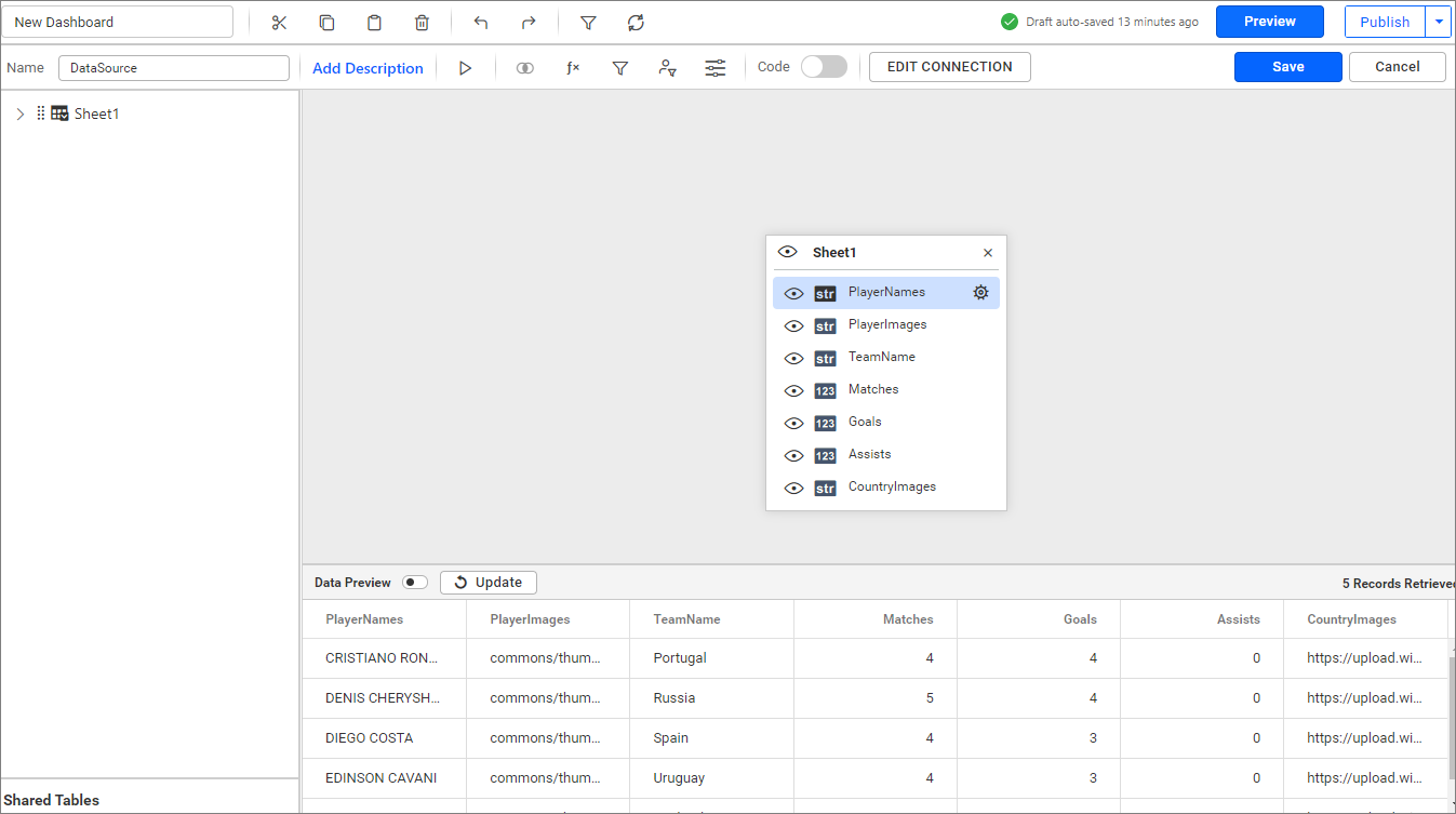
- Drag the preferred table from the left pane to the data design view and click
Save.
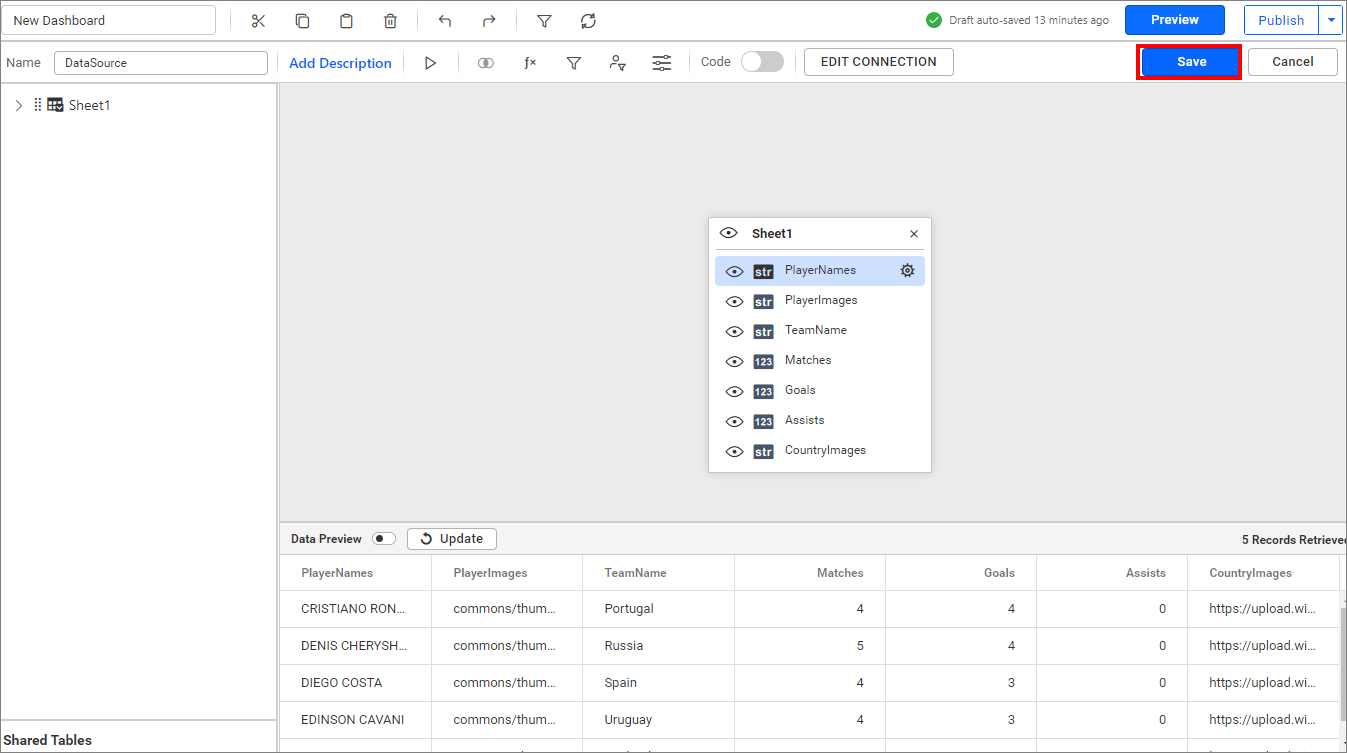
Your data source has now been successfully created.
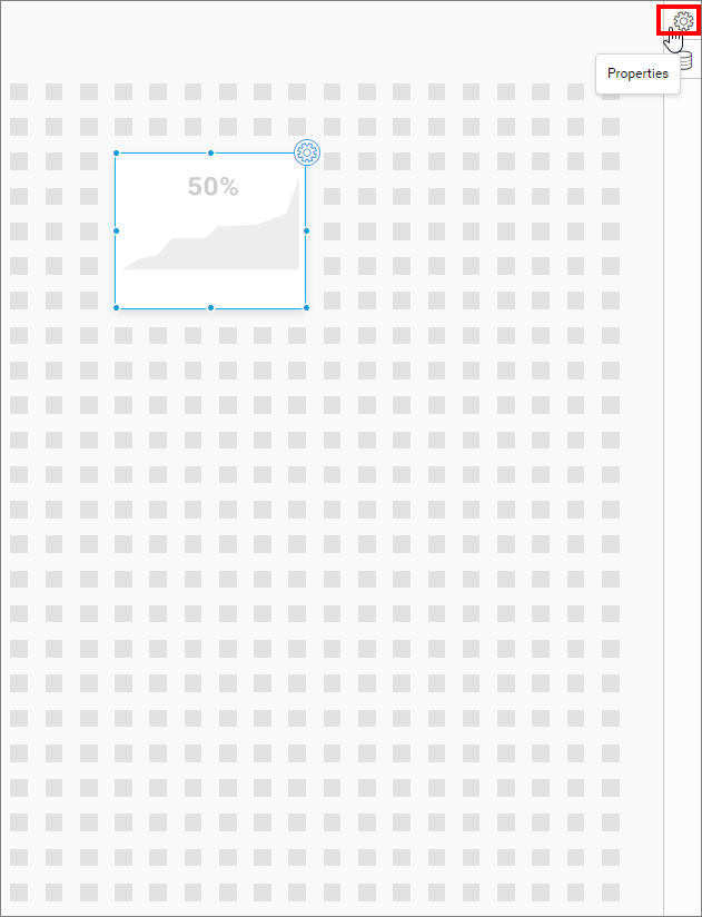
- Click on the
Propertiesicon in the configuration panel.
The properties panel of the widget will appear as shown in the following screenshot.
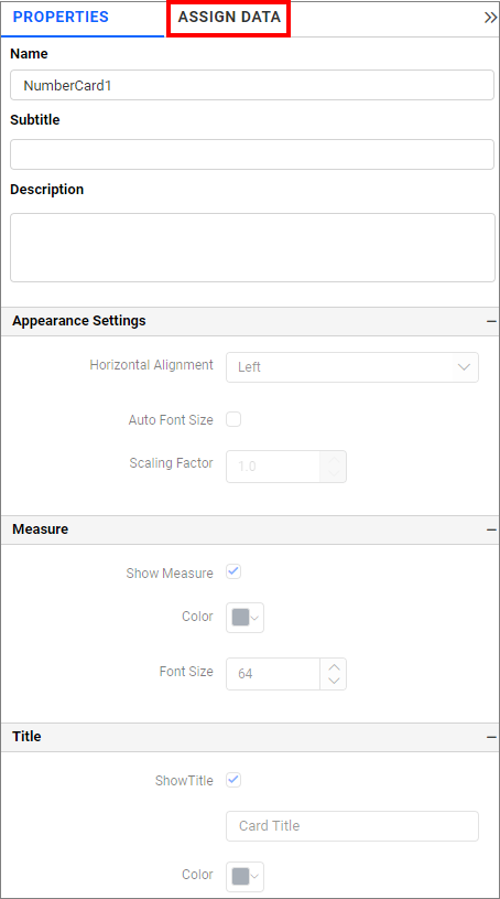
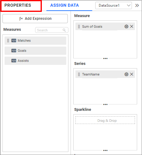
- Now, switch to the
ASSIGN DATAtab.
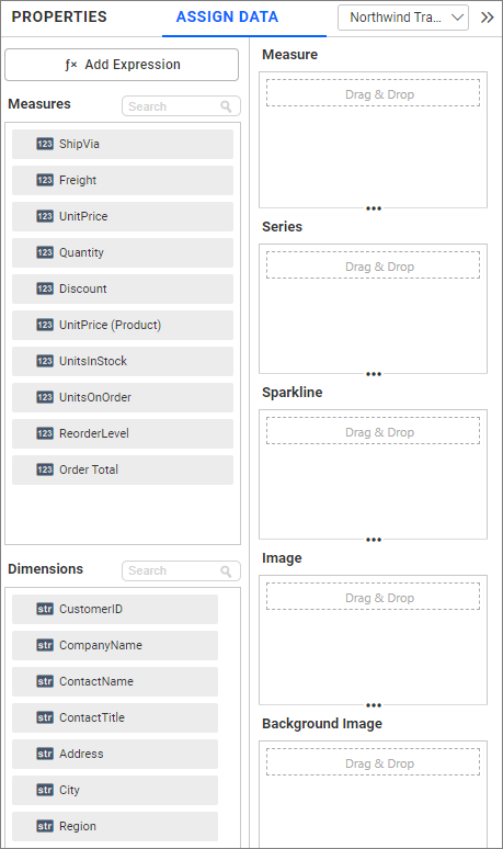
The data pane lists the available measures and dimensions from the data source.
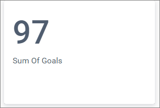
Single number card
Drop the measure field data into the Measure section.
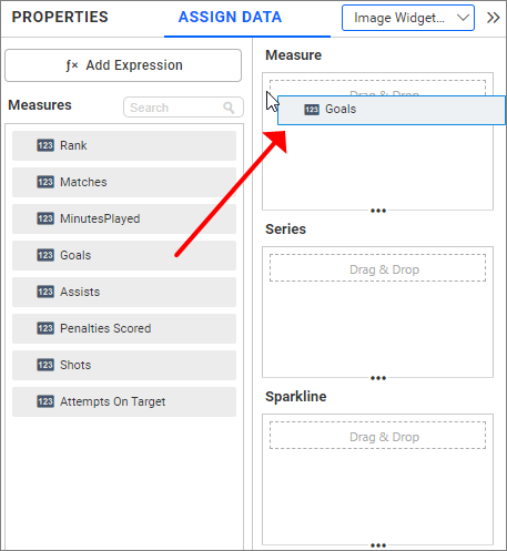
Now, the widget is rendered successfully with the default properties and formatting.
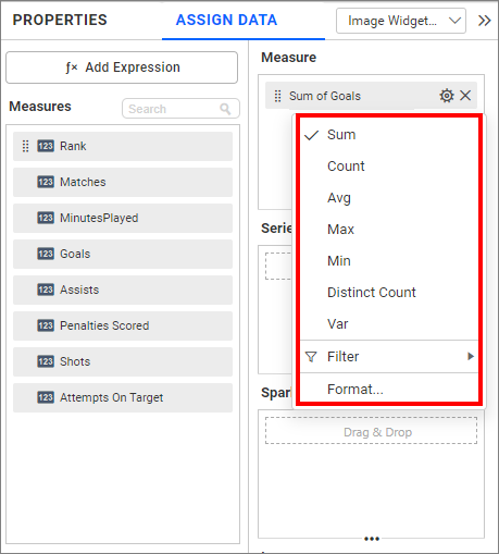
You can change the aggregation type of the measure section from the settings menu as shown in the following screenshot. Refer to this section for more details.
NOTE: Refer to the following sections to learn more about how to filter and format data. NOTE: Measure filter NOTE: Measure Formatting
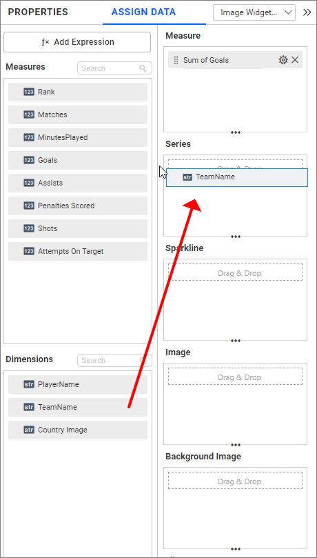
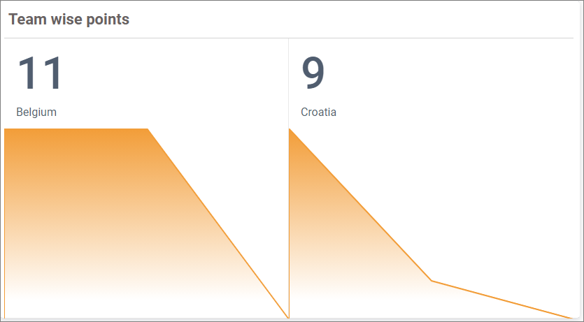
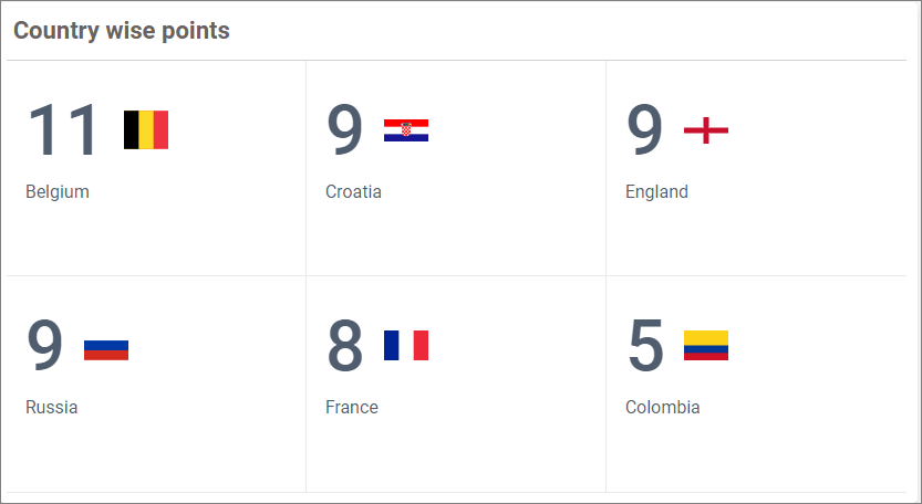
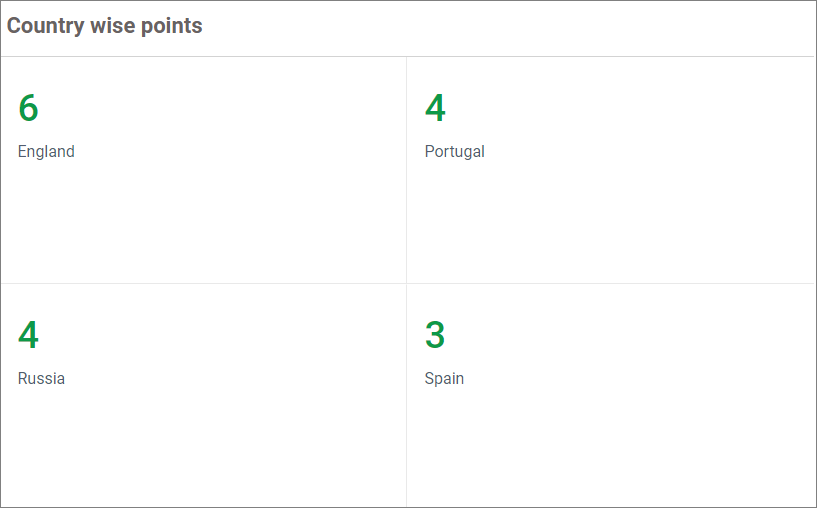
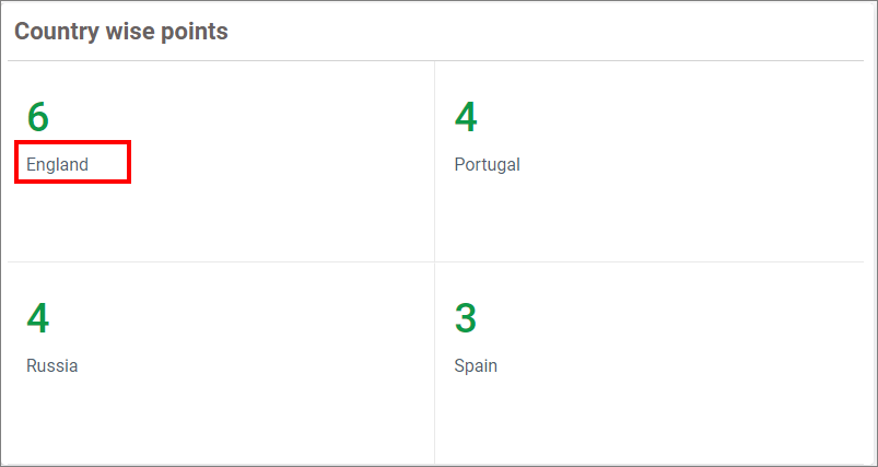
Series number cards
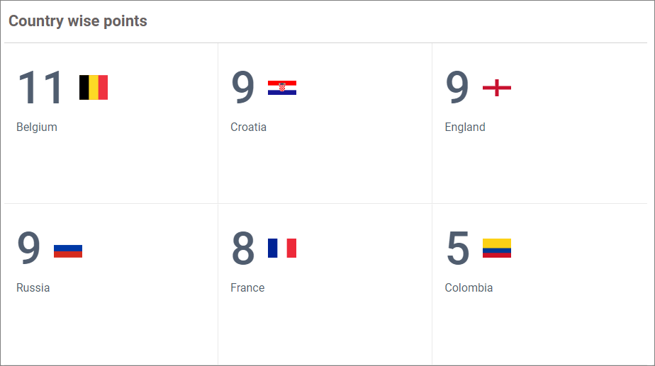
The Series section allows you to plot a series of cards over the dropped field. In this following example, the team-wise goals are displayed in the card.
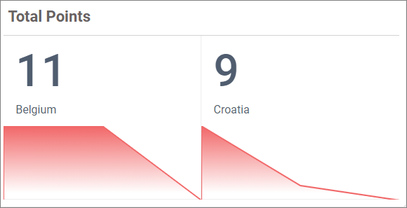
Sparkline
You can use the Sparkline section to showcase the variation of measurement in the Number Card widget.
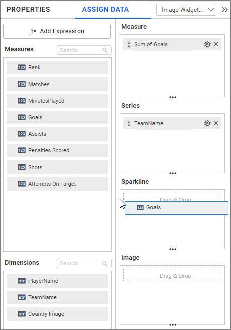
Now, the card will be rendered with the sparkline.
Image
The Image section allows you to configure the image data for each number card/records. The image data may be the direct URL for the records or contain part of the URL.
Direct URL
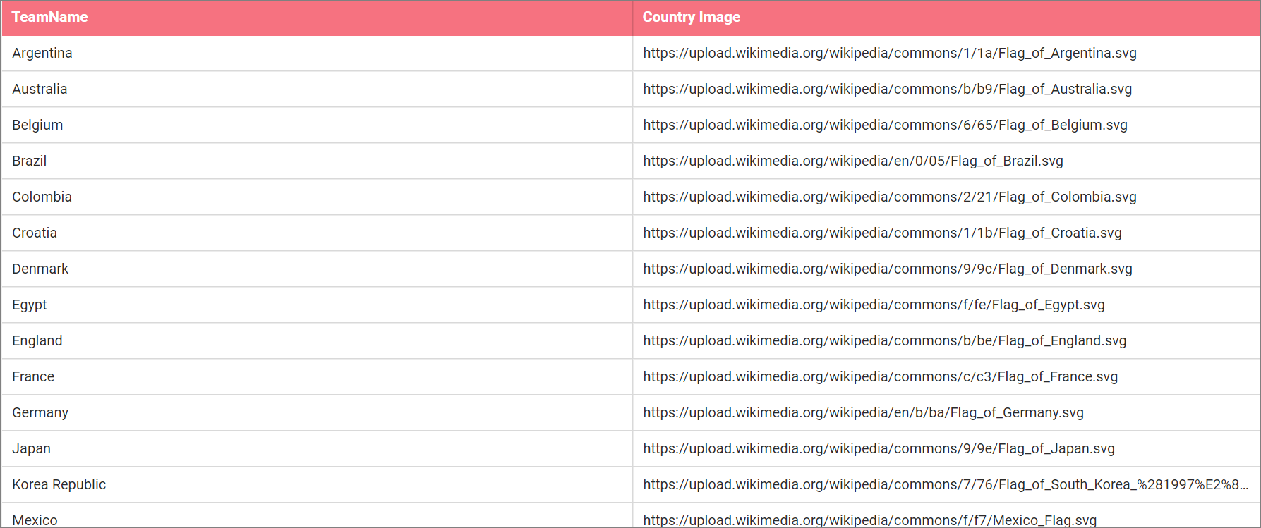
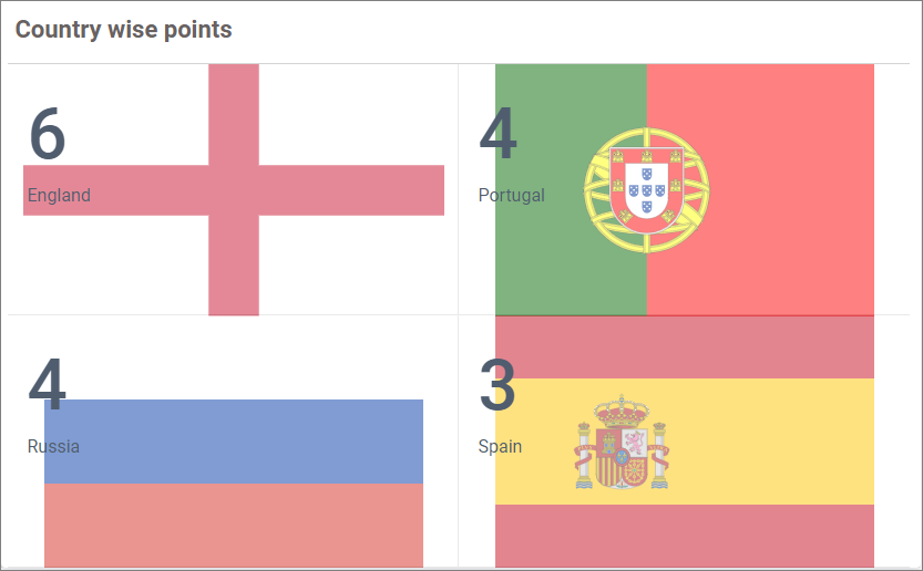
In the following example, each country flag is displayed in the number card by configuring the Country Image field. The Country Image column from the data source contains the full URL of the country flag.
Data screenshot
Follow the given steps to show the country image in the Number card series:
- Configure the Country Image field into the Image section.
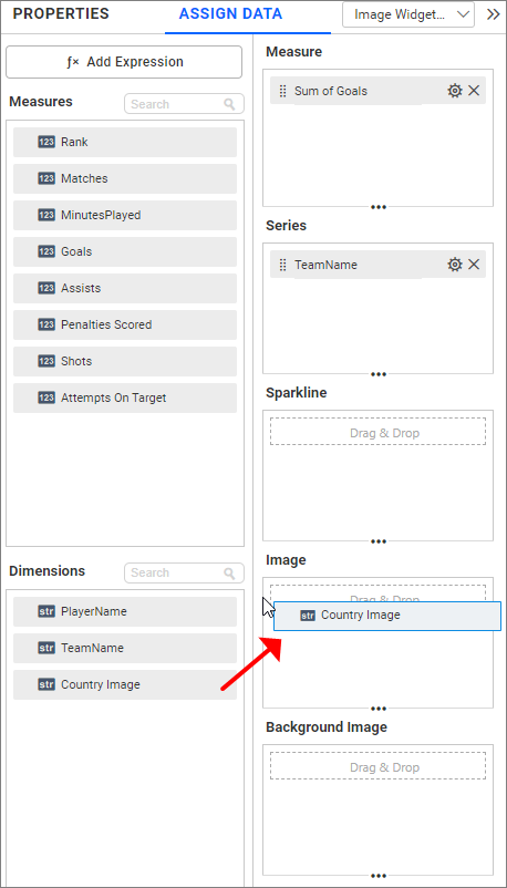
- Make sure whether the pattern text is properly updated.
Now, the widget will be rendered with image data.
Partial Image data
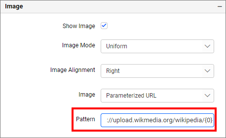
If your data source contains partial data of the URL, enter the URL text with the proper patterns.
For example, consider the following data source.
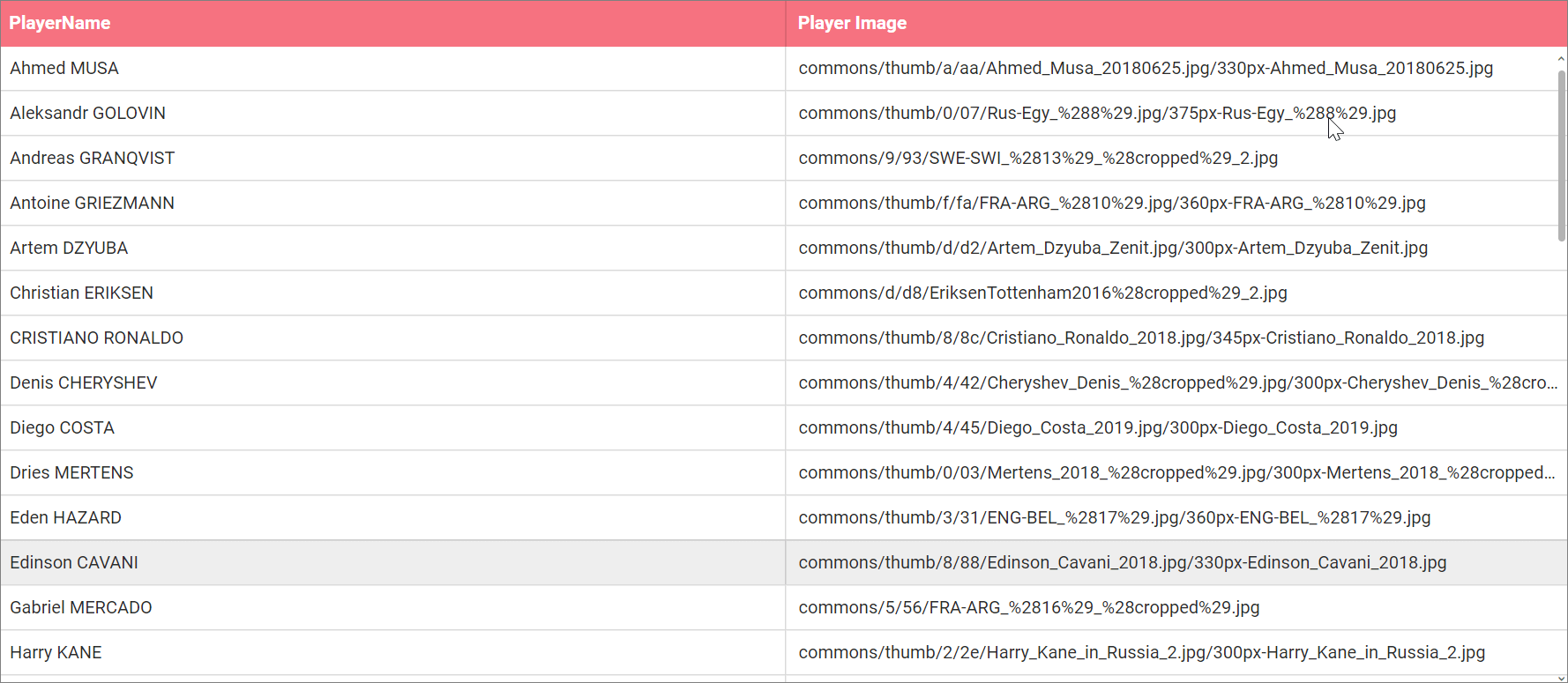
It contains the Players name and part of their image URL in the above columns.
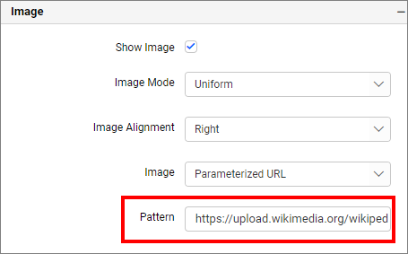
The full Image URL for Cristiano Ronaldo is https://upload.wikimedia.org/wikipedia/commons/thumb/8/8c/Cristiano_Ronaldo_2018.jpg/345px-Cristiano_Ronaldo_2018.jpg and the Player Image Column contains the information commons/thumb/8/8c/Cristiano_Ronaldo_2018.jpg/345px-Cristiano_Ronaldo_2018.jpg. So, you should enter the URL as https://upload.wikimedia.org/wikipedia/{0}, where the {0} indicates the first field in the image section.
NOTE: - You can add any number of fields in the image section and need to append {0}, {1} for the 1st, 2nd fields configured in the image section.
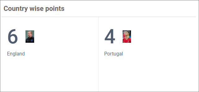
NOTE: - If more than one data is available in the record, the first record with the highest measure will be displayed in the Number Card widget.
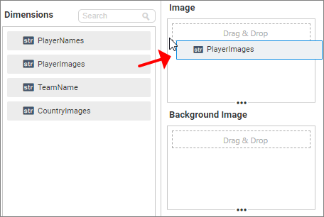
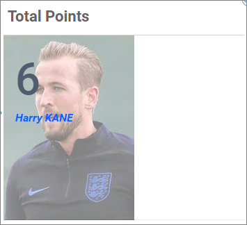
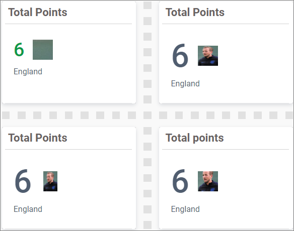
For example, if you try to show the goals of each team and configure the player image in the image section, it will display the top scorer image of each team as shown in the following screenshot.
Configure Image Section
Update Image Pattern
Final view
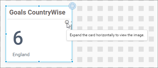
NOTE: The image will be hidden automatically if the width of the number card is low. An information icon will display the message as highlighted in the following image.
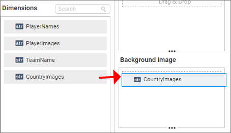
Background image
Similar to the image option, you can also configure the background image of the Number Card.
How to format the Number Card widget
To format the properties of the Number Card widget, switch to the PROPERTIES tab.
General properties
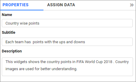
You can modify the widget’s name, subtitle, and add a useful description in the highlighted section of the image.
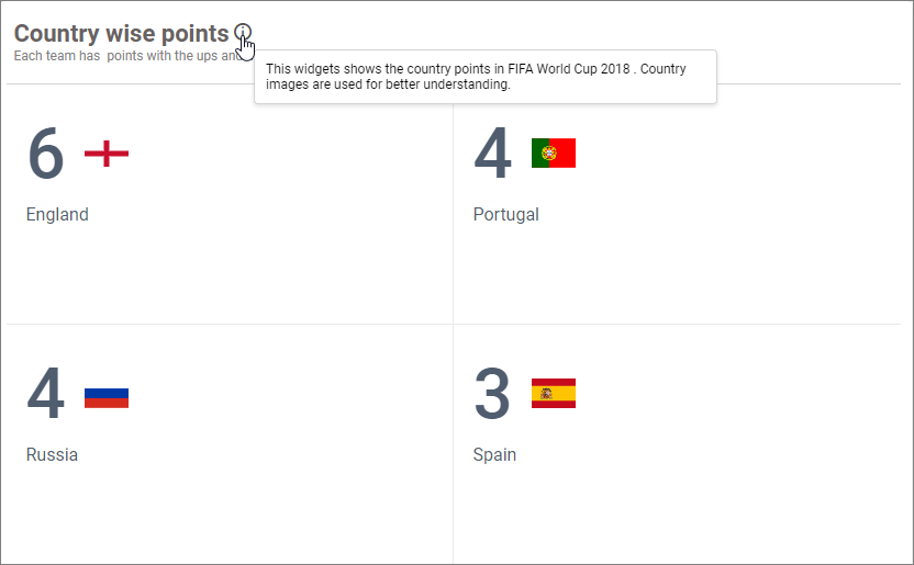
The following screenshot shows the Number Card widget, after modifying the header properties.
Tooltip Settings
The Tooltip Settings section allows you to customize the appearance and behavior of tooltips in widget visualizations.
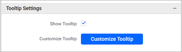
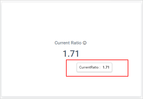
Show Tooltip
This option allows you to toggle the visibility of the tooltip in a card.
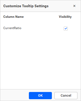
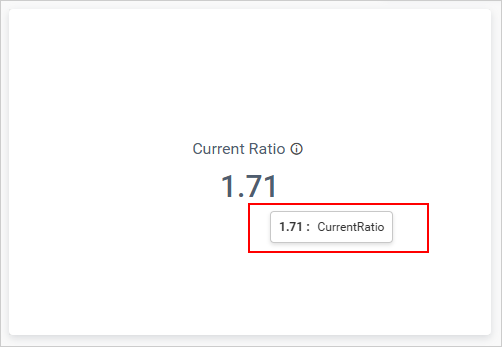
Customize Tooltip
This option allows you to customize the columns that are visible in the card tooltip.
Enable RTL
This option allows you to display fields and their data from right to left.
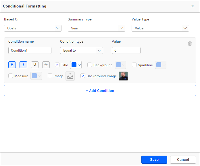
How to apply conditional formatting in Number card
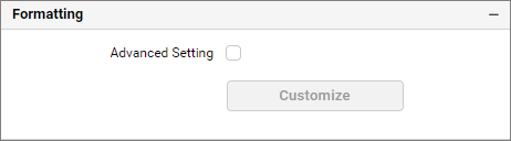
By enabling the advanced settings in formatting, you can customize the color, styles, and highlighting of the data based on the conditional range values.
How to enable advanced formatting
In the properties pane, check the Advanced Setting checkbox provided under the formatting section.
This will open the Conditional Formatting dialog.
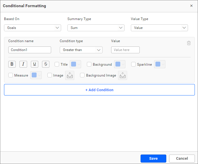
Properties
You can customize more than one property using rule-based conditional formatting:
- Title
- Background
- Sparkline (Applicable only when sparkline is configured)
- Icon
- Icon color
- KPI Value
- Image
- Background image
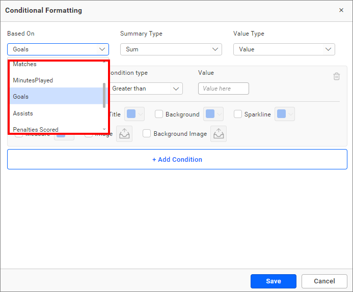
Based on field
To apply the conditions from the highlighted drop-down, choose the field from the Based On section. The drop-down contains the columns present in the data source.
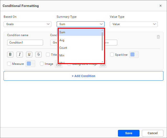
Summary type
You can select the summary type for the selected measure field.
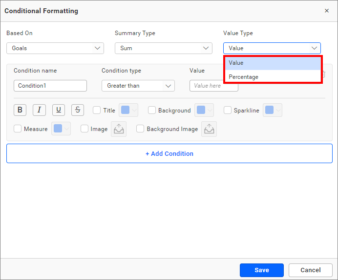
Value type
The value type drop-down allows you to choose whether you are going to apply the direct value (specific number like 3 goals, order ID 10248) or percentage (values above 30% or 50%).
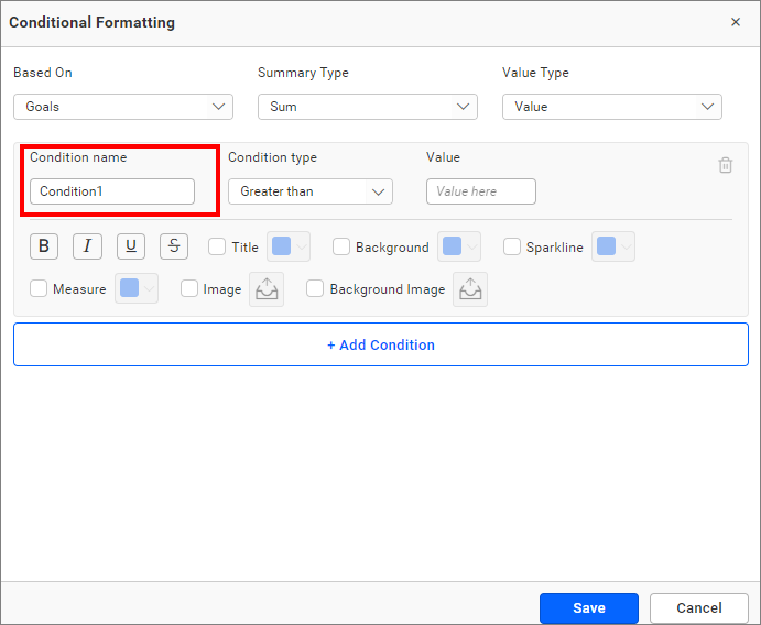
Condition name
You can give a meaningful name to the applied conditions using the highlighted text box.
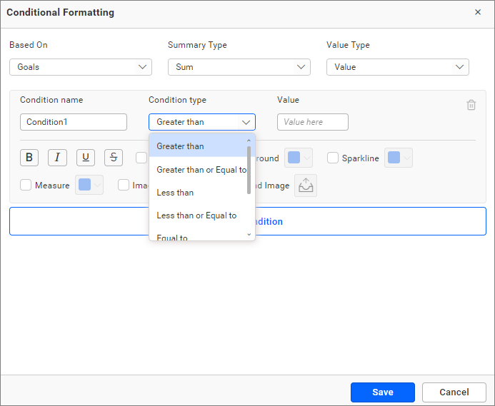
Condition type
Choose the condition for the measure field from the highlighted conditions.
The following text-based conditions are available, if you have selected the dimension as a based on field and want to use text condition.
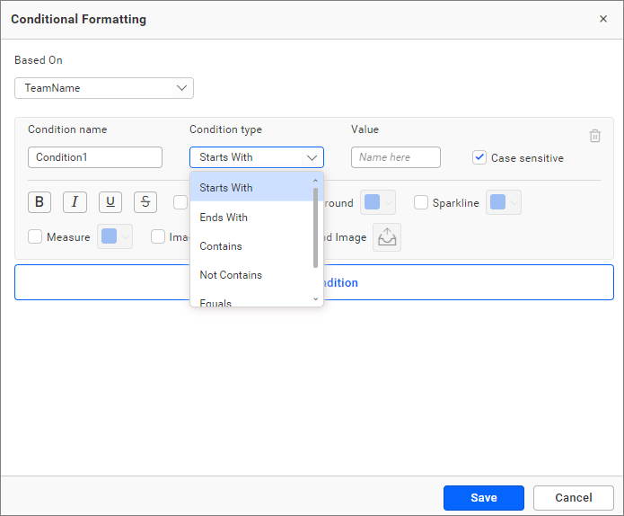
**NOTE:**The text-based condition type will be enabled only when the dimension configured in the series field is used as the based on field.
Value
Enter the condition value.
Font style
Allows you to choose the title font style (bold, italic, underline, and superscript).
Case sensitivity
For dimensions, the case-sensitive option is provided to choose whether the entered value is case-sensitive or not.
Select the checkbox next to the options to customize the properties, and click Font Style icons to apply them.
Appearance settings
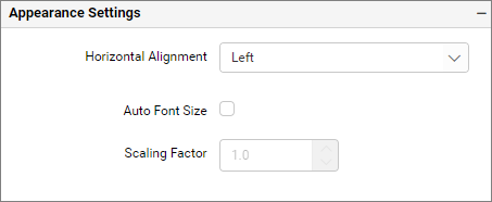
Horizontal alignment
This option allows you to place the content of the widget at the position of Left,Center and Right.
Vertical alignment
This option allows you to customize the alignment of the number card vertically. This dropdown option has Top, Center, and Bottom values. By default, the alignment value is set to ‘Center.’
Auto font size
By enabling the Auto Font Size option, the font size will be adjusted automatically if the resolution of the screen varies.
Auto font size at 3840 x 2160
Auto font size at 1366 x 768
Auto font size at 1920 x 1080
Scaling factor
If the auto font size is enabled, the scaling factor allows you to increase or decrease the font size.
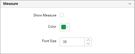
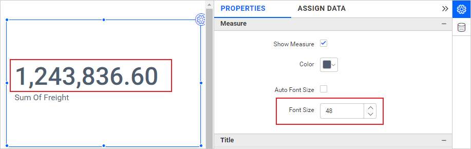
Measure properties
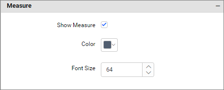
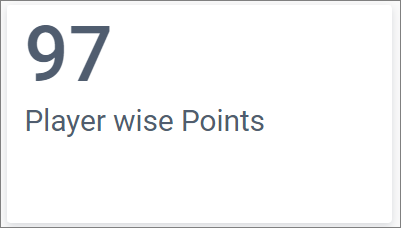
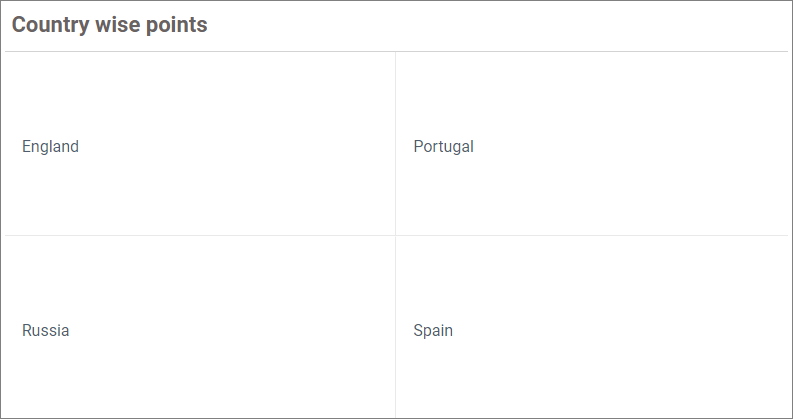
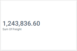
Show Measure
You can toggle the measure card visibility in the Number Card widget by using the Show Measure checkbox.
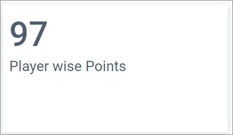
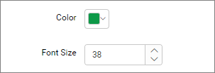
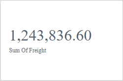
From the measure property section, you can customize the font size and color of the measure values displayed in the Number Card widget.
The following image shows the Number Card widget, after modifying the color and font size of the measure value.
Measure hidden
Auto Font Size
On enabling this property, the font size of the number card measure varies based on the screen resolution.
Use Case:
If we have created a dashboard with number card which can be viewed by different clients of different screen resolution and we wants the measure value to be adjusted with respect to their resolution then we can use this option.
Auto font size at 3840 x 2160
Auto font size at 1366 x 768
Auto font size at 1920 x 1080
Font size
You can customize the font size of the number card title by unchecking Auto Font Size.
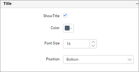
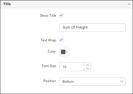
Title properties
You can customize the font color and size of the title. You can also enable or disable the title.
The following image shows the Number Card widget after modifying the color and font size of the title value.
The following image shows the Number Card widget after unchecking the title value.
Title for single card
You can customize the font color and size of the title. You can also enable or disable the title and edit the title.
The following image shows the Number Card widget after modifying the color and font size of the title value.
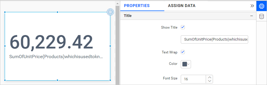
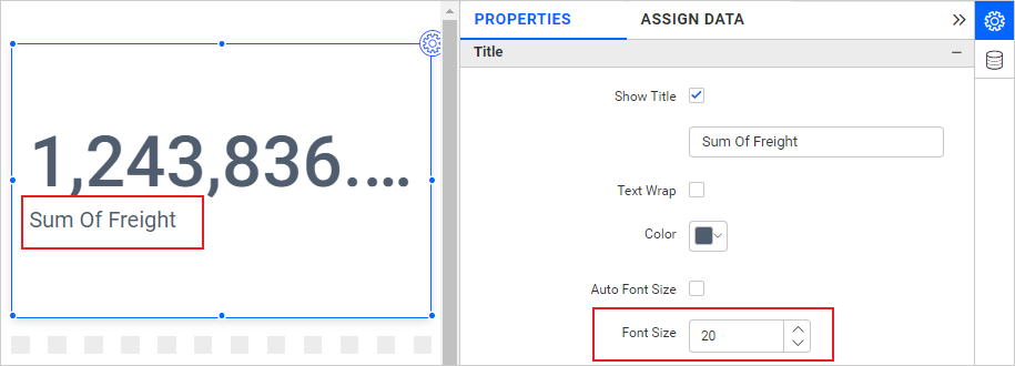
Text Wrap
This option allows you to wrap the Card Title based on Card size. This option will be enabled only for a single card. It wraps the title only if the space is not enough to show the title in a single line.
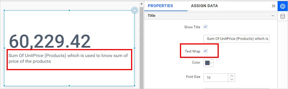
If the card height is not enough to wrap the title further, it will trim the title.
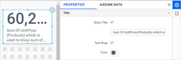
If the title doesn’t contain space between words, it will not wrap.
Auto Font Size
By enabling this property, the font size of the number card title varies based on the screen resolution.
Use Case:
If we have created a dashboard with a number card that can be viewed by different clients of different screen resolutions, and we want the title value to be adjusted with respect to their resolution, then we can use this option.
Auto font size at 3840 x 2160
Auto font size at 1366 x 768
Auto font size at 1920 x 1080
Font size
You can customize the font size of the number card title by unchecking Auto Font Size.
Series settings
Series settings are enabled only when you configure the series in the Assigned Data tab.
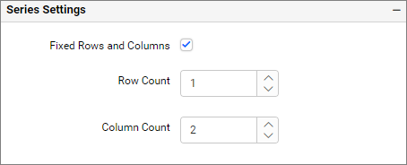
Fixed rows and columns
If you enable Fixed rows and columns, you can customize the rows and columns. The rows and columns are fixed based on the container size and the card size of the number card.
Row count
By enabling row count, you can set the row count.
Column count
By enabling the Column Count, you can set the column count.
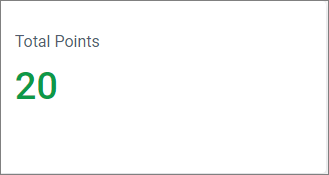
Note: If invalid columns and rows are given, the rows and columns will reset to their default value. For example, if you set the number of rows as 6 and the number of columns as 5 but your data count is only 20, in this case, the rows and columns will reset to their default value.
Animation settings
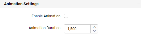
Enable animation
It animates the measure values when you enable the Enable Animation.
Animation duration
This animation-duration property specifies how long the animation cycle should last, and the time is specified in seconds or milliseconds.
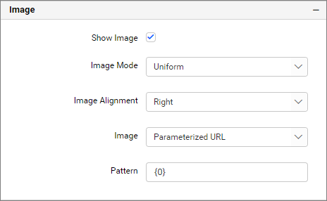
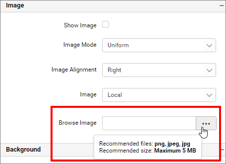
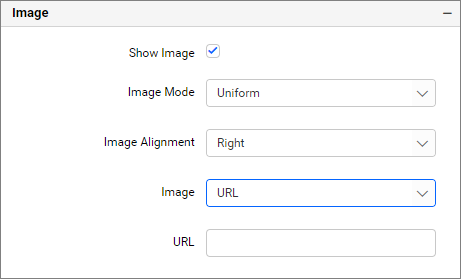
Image properties
Show Image
If the Show Image check box is unchecked, then the image is not displayed in the Number Card.
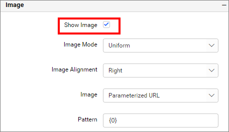
Image Mode
You can customize the image showcase style through the mode setting.
Default: The image will be displayed in its original size.
Fill: The image will be filled in the available space.
Uniform to fill: The image will be uniformly occupying the space but gets clipped, if it is larger than control.
Uniform: The image sizes proportionally (without clipping) to best fit to the widget area.
Different Modes of Image
Image
Browse Image
You can browse the image from the local system.
URL
You can enter the direct URL of the image.
Pattern
You can use the pattern as explained in the Image data section.
Background properties
Background Image
The background image properties are the same as the Number card’s image properties.
Background color
Allows you to set a solid color as the background and to change the transparency of the color.
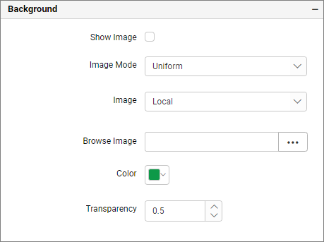

NOTE: If both the background image and background color are enabled in the widget, then based on the transparency of the background image and the selected image mode, either the background image alone will appear in the widget or both the background color and image will appear in the Number Card.
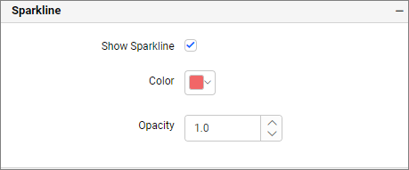
Sparkline properties
The Sparkline in the Number Card widget can be turned off by unchecking the Show Sparkline check box. The color of the sparkline and the transparency can be customized using the provided options.
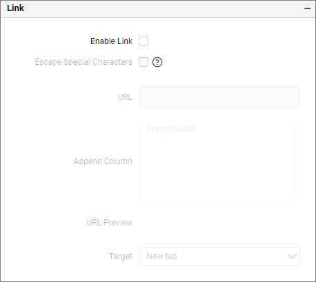
Link
You can enable linking and configure it to navigate to a general URL with or without parameters. For more information, refer to Linking.
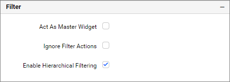
Filter interaction properties
The Number Card widget can be set to act as a master widget by selecting the Act as Master Widget check box. Enabling the Ignore Filter Actions check box allows the Number Card widget not to be filtered by any other master widgets during the interaction time in both preview and published modes.
NOTE: The Act as Master Widget check box will be enabled only when the Series section is configured.
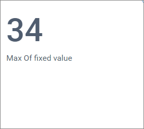
Number card with fixed measure
You can create a fixed measure value in Number Card using expressions.
The following steps illustrate how to add the fixed value:
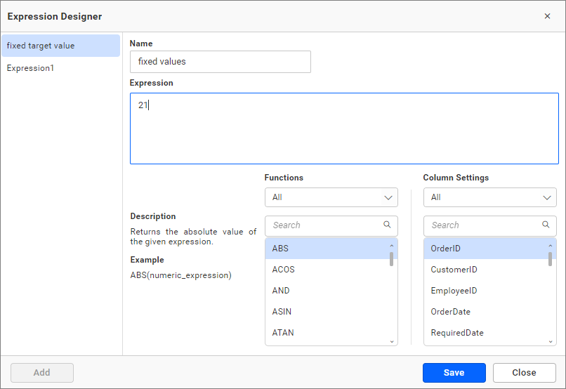
- Click the
fx expressionin the Data Source.
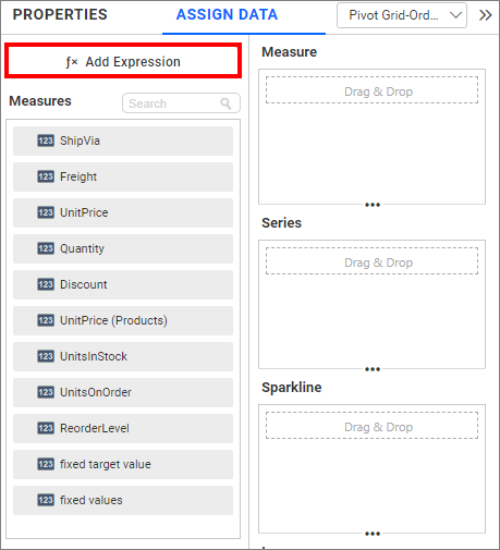
- Add the name and expression, then click
Save.
- You can view the added value in the measure section in the assigned data tab. Drag the added measures into the
Value(s)section.
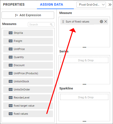
- Change the aggregation type to Min or Max.
Fixed Value for Number card
Container appearance
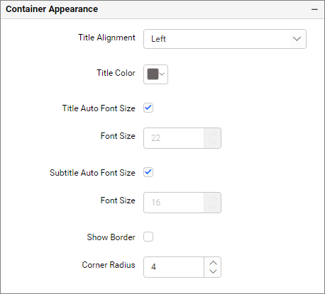
Title alignment
This allows you to handle the alignment of the widget title to either left, center, or right.
Title color
This allows you to apply the text color to the widget title.
Title Auto Font Size
By enabling the Auto Font Size, the font size of the title will be adjusted automatically if the resolution of the screen varies.
Font Size
This allows you to apply the specified font size to the widget title if the Title Auto Font Size is disabled. The value can range between 10 and 44.
Subtitle Auto Font Size
By enabling the Auto Font Size, the font size of the subtitle will be adjusted automatically if the resolution of the screen varies.
Font Size
This allows you to apply the specified size of the font to the widget title if the Subtitle Auto Font Size is disabled. The value can range between 10 and 32.
Show Border
This allows you to toggle the visibility of the border surrounding the widget.
Corner Radius
This allows you to apply the specified radius to the widget corners if the Show Border is enabled. The value can range between 0 and 100.
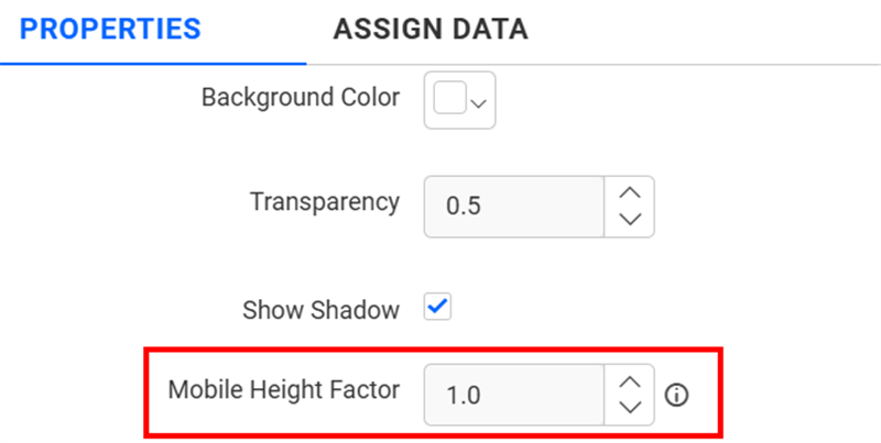
Container Appearance
Mobile Height Factor
This option allows you to resize widgets specifically for mobile view.
Container actions
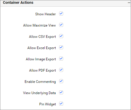
Show header
This allows you to enable or disable the widget title of the number card widget.
Allow maximize view
This allows you to enable or disable the maximized mode of the number card widget. The visibility of the maximize icon in the widget header will be defined based on the setting in the viewer.
Allow CSV export
This allows you to enable or disable the CSV export option for the number card widget. Enabling this allows you to export the summarized data of the widget view to CSV format in the viewer.
Allow Excel export
This allows you to enable or disable the Excel export option for the number card widget. Enabling this allows you to export the summarized data of the widget view to (.xlsx or .xls) format in the viewer.
Allow image export
This allows you to enable or disable the image export option for the number card widget. Enabling this allows you to export the view of the widget to image format (.jpg), (.png), or (.bmp) in the viewer.
Allow PDF export
This allows you to enable or disable the PDF export option for the number card widget. Enabling this allows you to export the view of the widget to pdf format in the viewer.
Enable comments
This allows you to enable or disable comment for the dashboard widget. For more details, refer to the Commenting Widget.
Allow Viewing of underlying data
This allows you to visualize the raw data associated with a widget at runtime.
Pin widget
This allows you to pin the widget.
Related links
Blog post - Turn on Insights Using the Right Card Widget