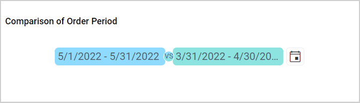
Period Over Period(PoP)
Period over Period support is used to compare measure values for one period of time against the results from a previous or subsequent period of time. The PoP widget is used to choose two different time periods at a time.
How to configure table data to Period over Period?
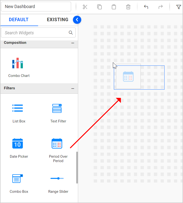
- Drag and drop the
Period Over Periodfrom the toolbox on the left into the design canvas and resize it to your required size.
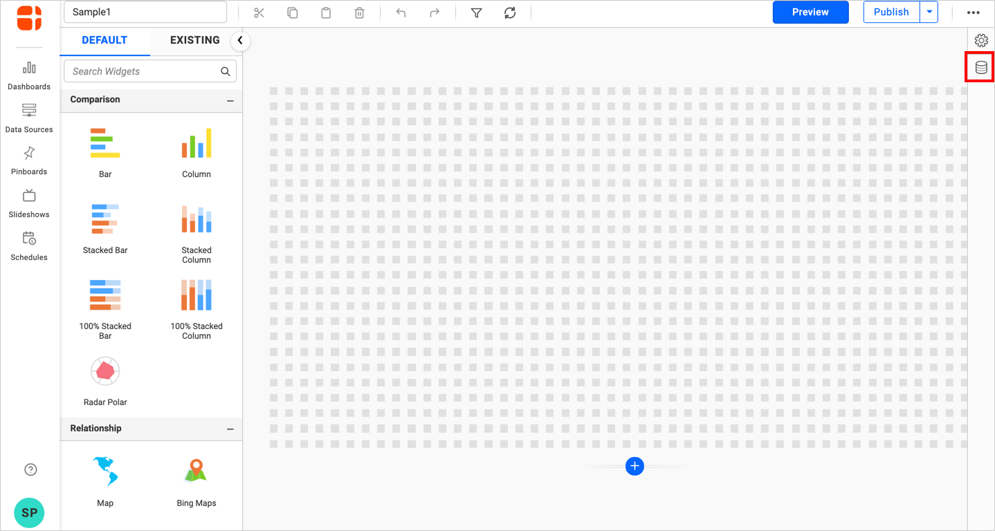
- Click the
Data Sourcebutton in the configuration panel.
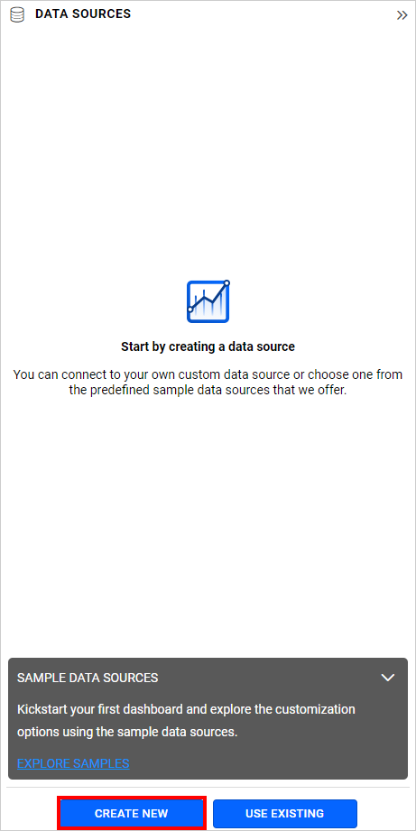
- Click the
CREATE NEWbutton to launch a new connection from the connection type panel.
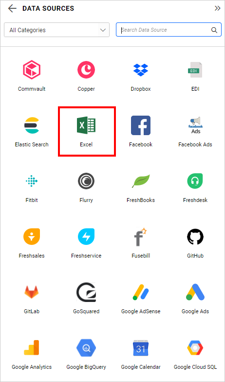
- In the connection type panel, click on any one of the listed connection type buttons (For demonstration purposes, the
Microsoft ExcelConnection type is selected).
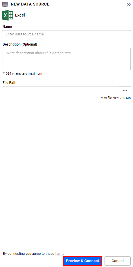
- In the
NEW DATA SOURCEconfiguration panel, fill in the connection type and related details. Click theConnectbutton.
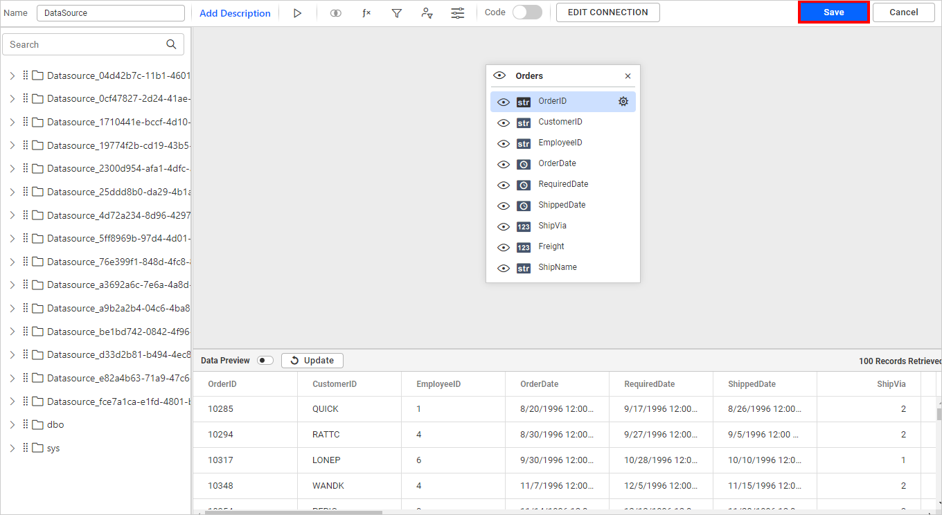
- Drag your preferred table or view from the left pane in the data design view and click the
Savebutton.
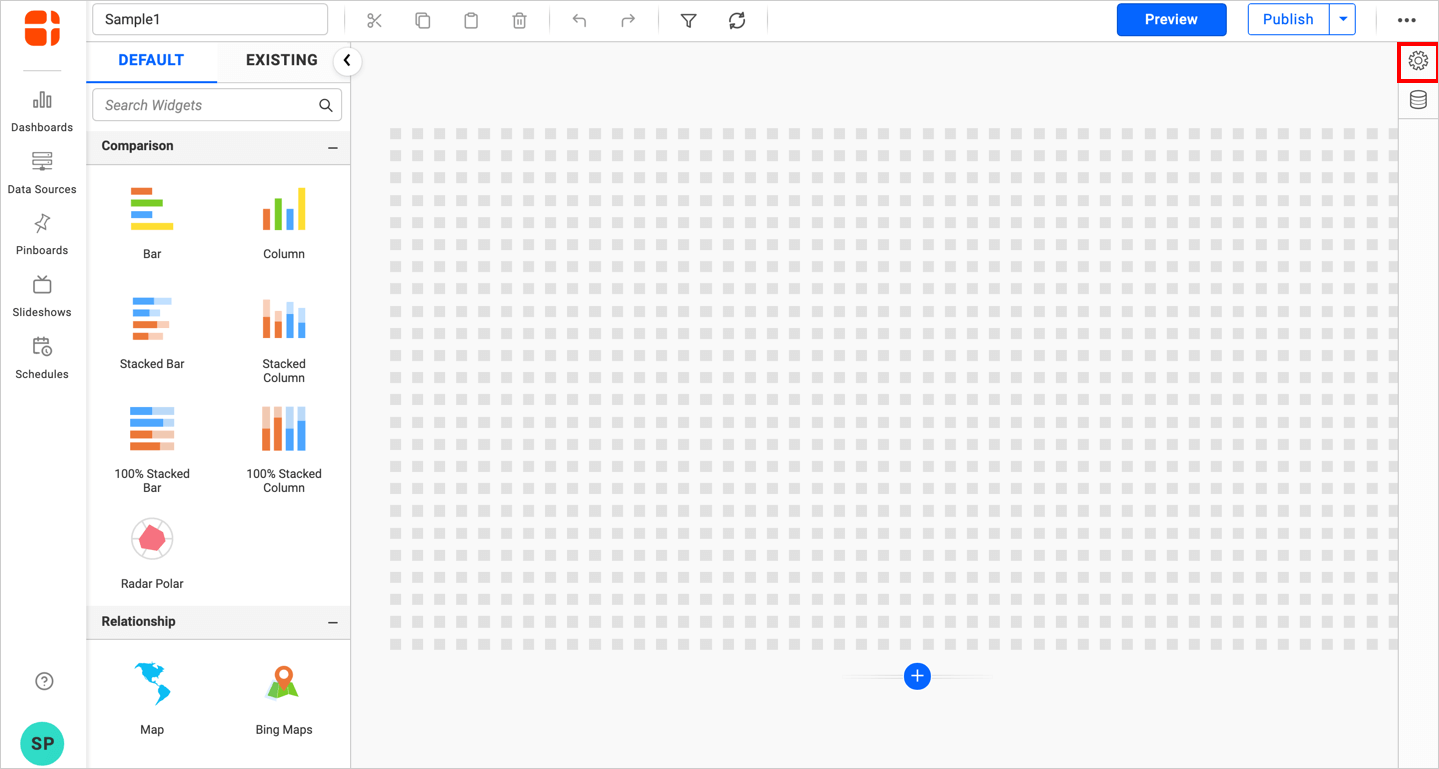
- Click the
Propertiesbutton in the configuration panel to open the property panel. Switch to theASSIGN DATAtab.
- The data tab will open with available measures and dimensions from the connected data source.
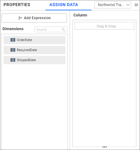
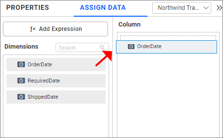
- Drag and drop a date field from
Dimensionsinto theColumnssection.
Binding Fields
When binding a field to the PoP widget, default date ranges are calculated based on the bound field and set as a selected filter.
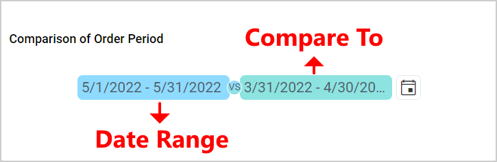
The PoP widget is initially rendered with a default filter value that cannot be removed. Filters can only be reset to default if changes have been made. The default date range is determined by the number of days between the minimum and maximum dates of the bound field.
Users can select Relative/Custom date ranges using the Relative Combobox or Calendars, regardless of the bound field. The bound field is used for calculating default date ranges and for filtering purposes.
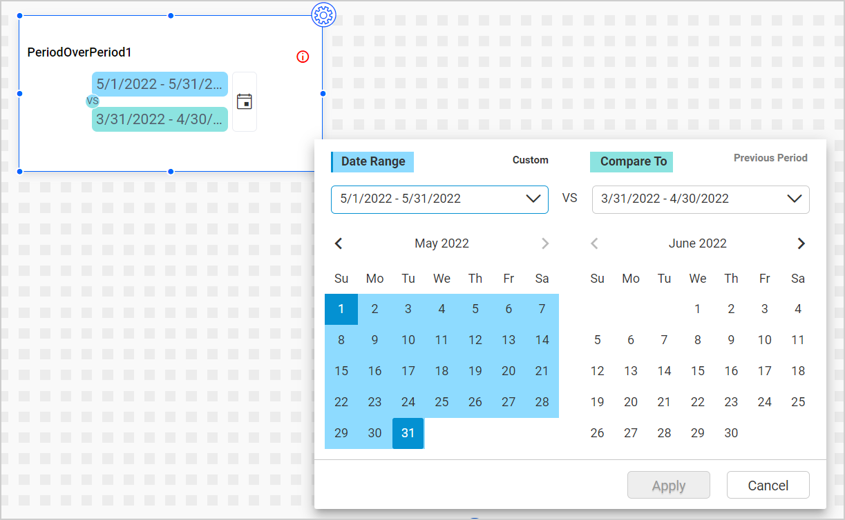
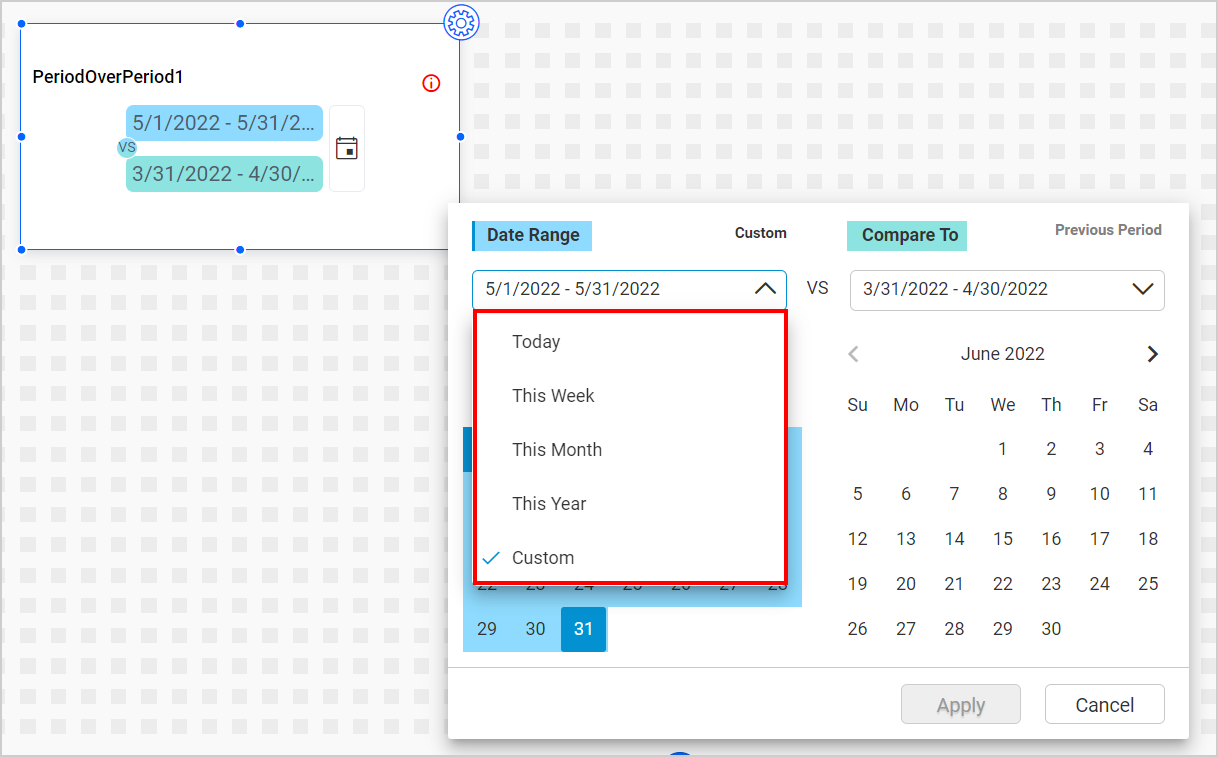
Under the Date Range, the following relative items are displayed:
Under the Compare To, the following relative items are displayed:
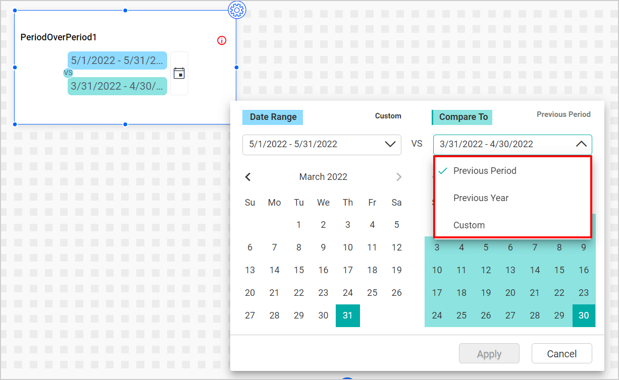
In both relative items Combobox, the Custom option will be automatically selected if a custom range is chosen from the calendar or entered manually in the Combobox input section.
IMPORTANT:
- The PoP widget does not function as a slave for any widget.
- The PoP widget always has a default value selected and filter values cannot be discarded.
- No widget is automatically mapped as a slave to the PoP widget; required widgets must be configured manually.
- Widgets acting as slaves for the PoP widget will only display their virtual measure in view mode.
- Currently, PoP support is available for the Chart widget (excluding Bubble Scatter, Combo, and Radar Polar), Grid, and KPI card.
How ‘Compare To’ relative items range calculated?
Compare To relative items value calculated dynamically based on the date range selection from Date Range. You can see how it calculated for each relative item:
Previous Period:
It is calculated based on the number of days between the selected dates(start and end) of Date Range. For example, consider the Date Range selected value as 1-Jan-2019 to 10-Jan-2019. Here, the number of days between the selected dates is 10. So, the Previous Period value for the selected range is 22-Dec-2018 to 31-Dec-2018.
Previous Year:
It is a previous year date of the selected date values from the Date Range. For example, consider the Date Range selected value as 1-Jan-2019 to 10-Jan-2019. Here, the year of start and end date value is 2019. So, the Previous Year value for the selected range is 1-Jan-2018 to 10-Jan-2018.
How the PoP filtering works in Slave Widget?
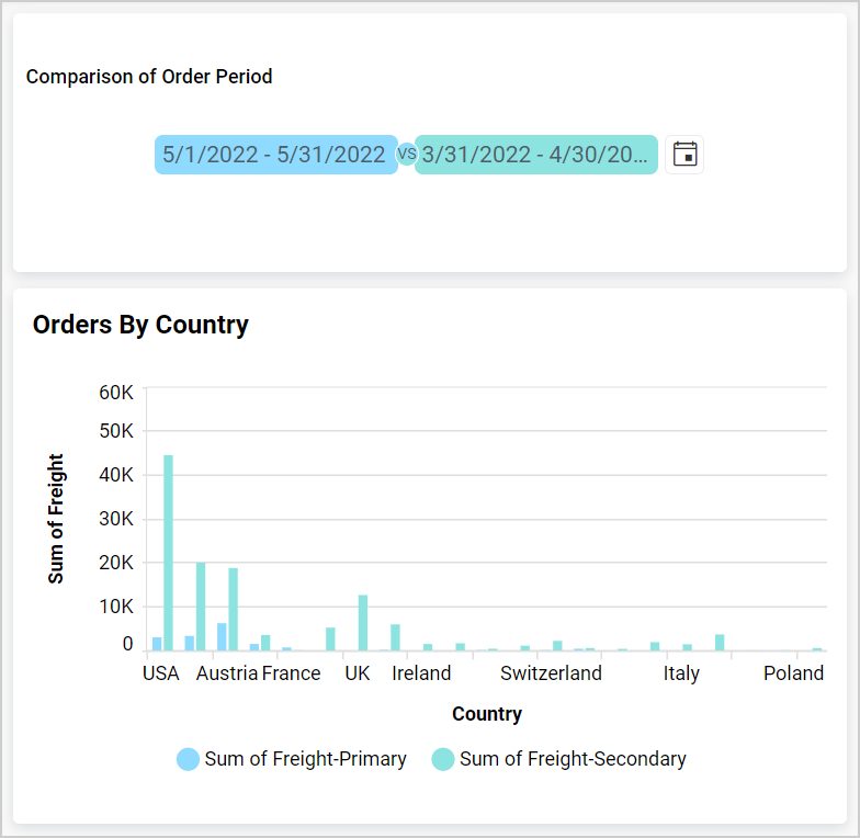
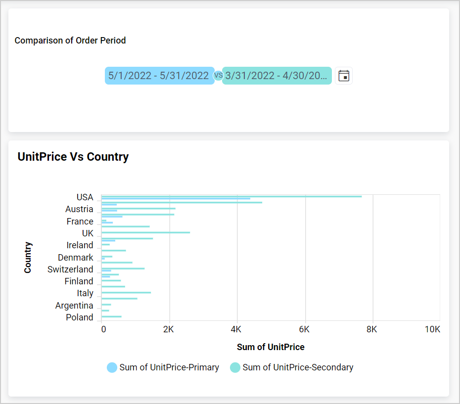
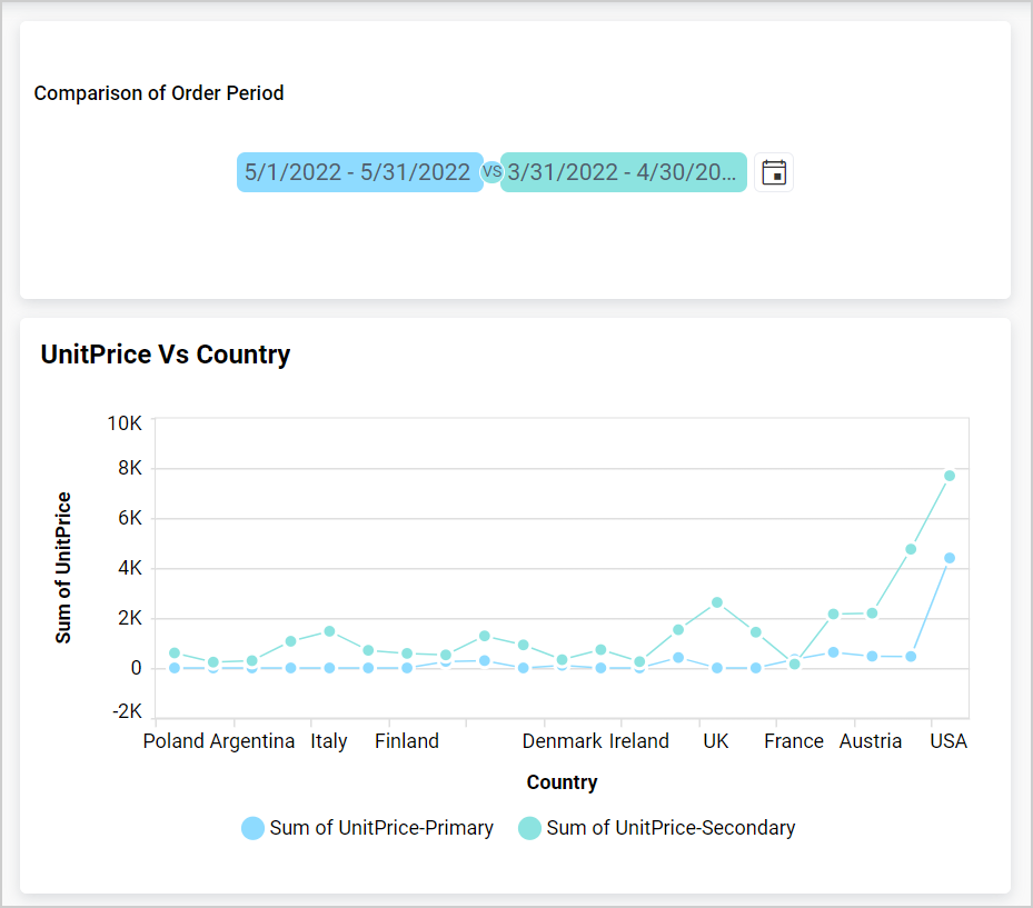
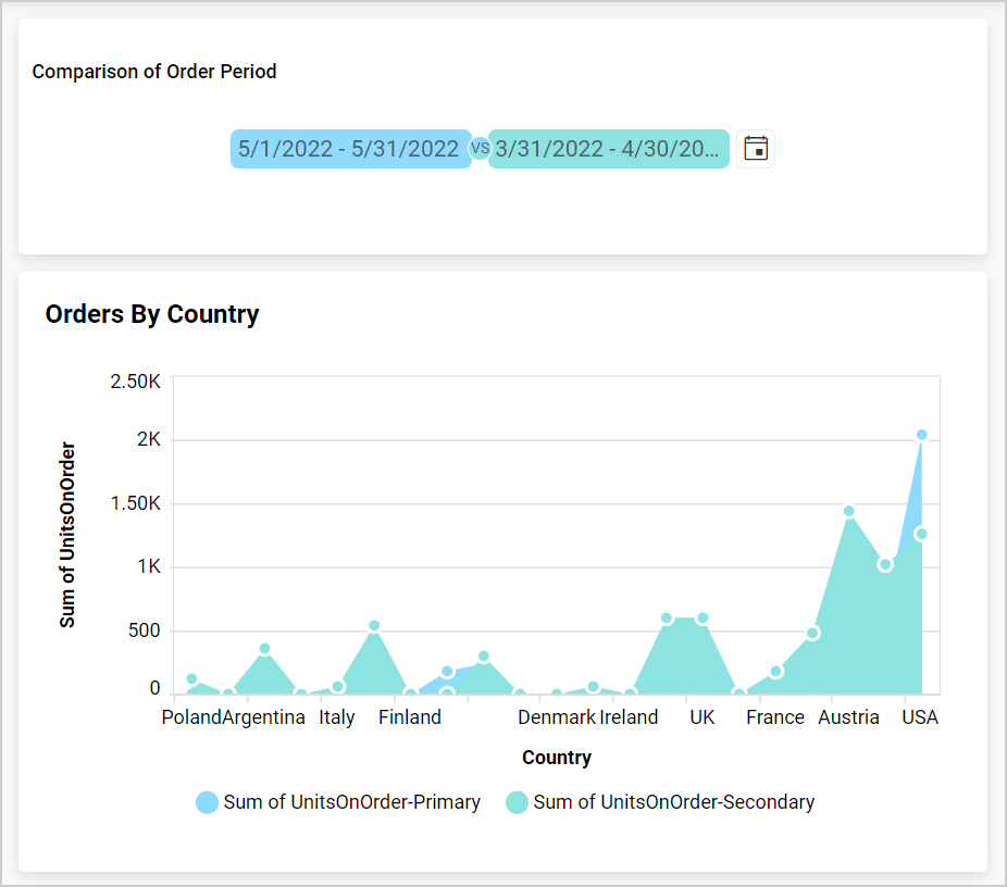
Comparison types of charts like Bar, Column, Stacked Bar, Stacked Column, 100% Stacked Bar, and 100% Stacked Column. Distribution types of charts like Line, Spline, Spline Area, Area, Stacked Area, and 100% Stacked Area. Proportional types of charts like Pie, Doughnut, Pyramid, and Funnel and Grid can be slave widgets for Period Over Period widget. KPI Card can also be a slave widget for Period Over Period widget, when only the Actual Value is configured in the card.
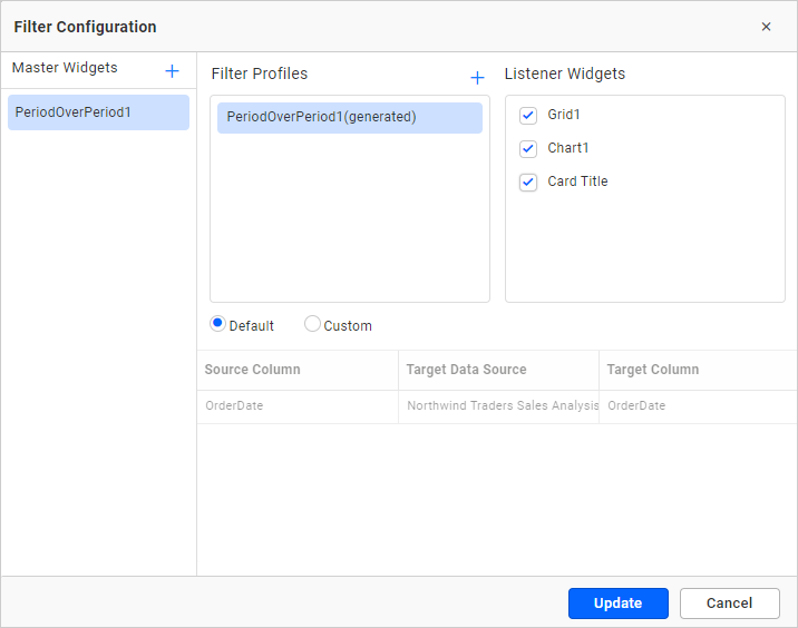
Consider that you have configured the Column Chart, Grid, and KPICard. You can make the Column Chart, Grid, and KPICard act as slaves for the Period Over Period widget by using the filter interaction window, as shown below.
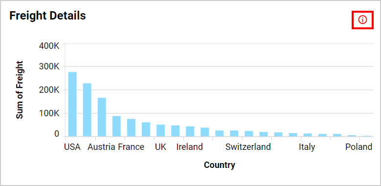
Upon configuration, the Chart color palette will change to the PoP selection colors (blue and green). The red information icon indicates that the chart virtual column value will not be displayed in design mode.
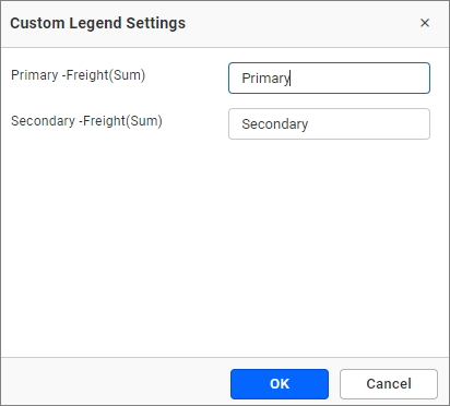
Options to customize legend and palette for the virtual column will be available in Design, Preview, and View modes.
The formatting category in the property panel will be displayed as shown below.
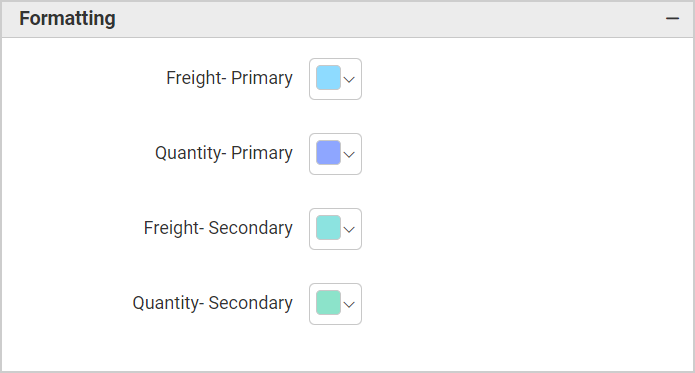
The stacked column chart will display colors under the formatting category.
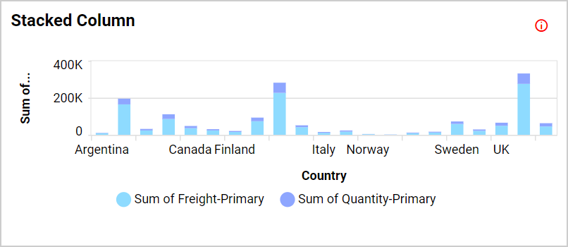
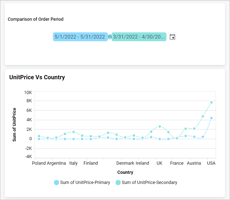
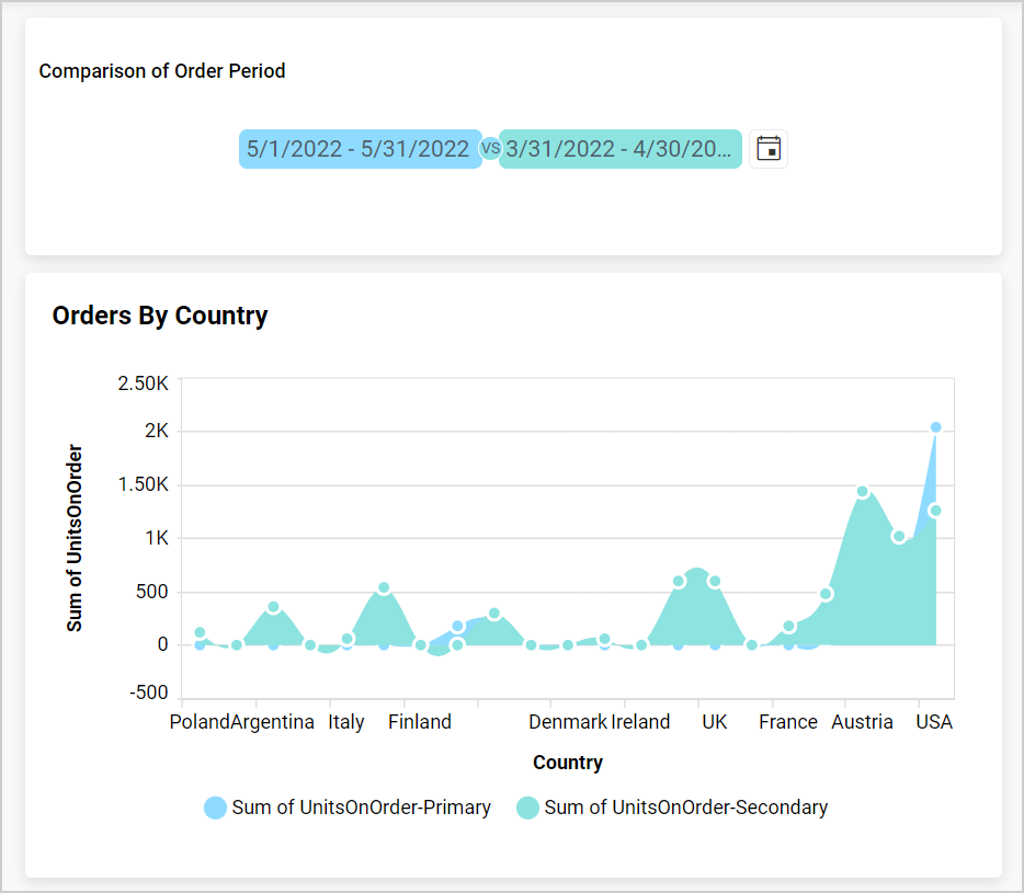
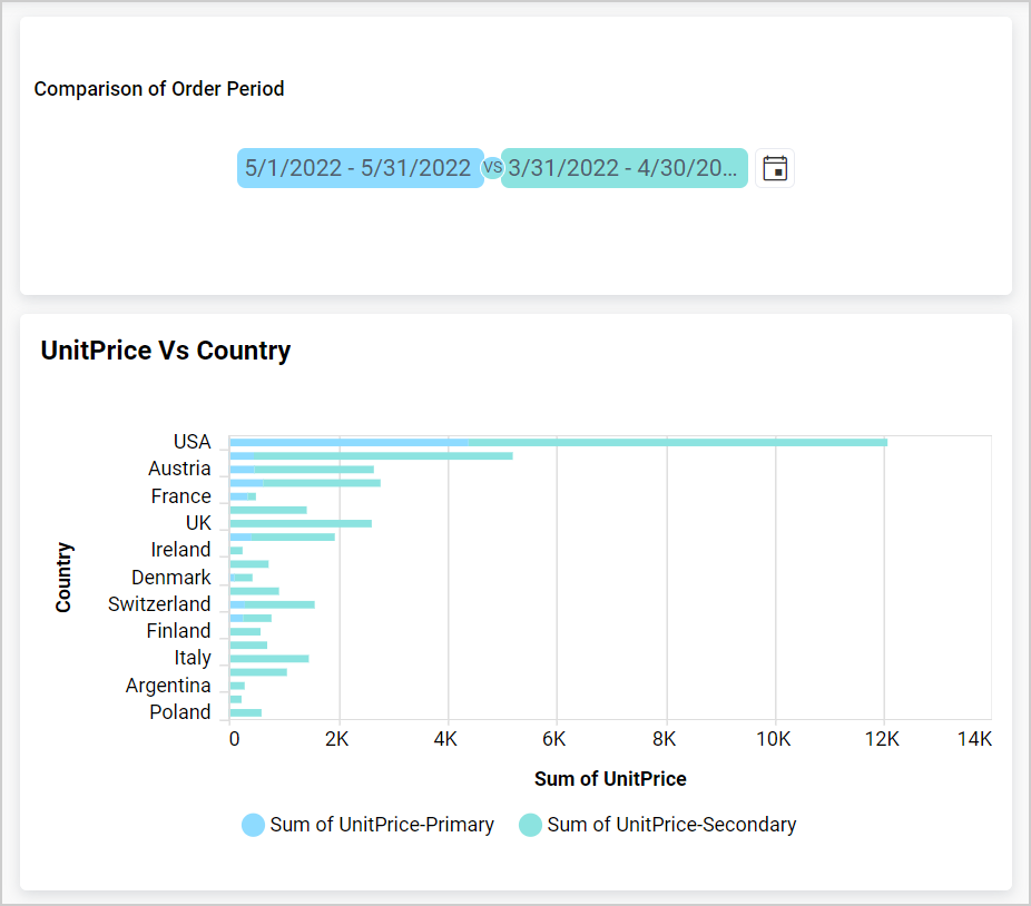
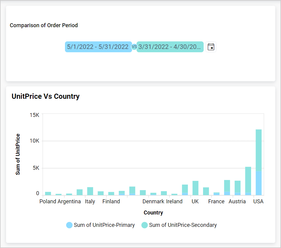
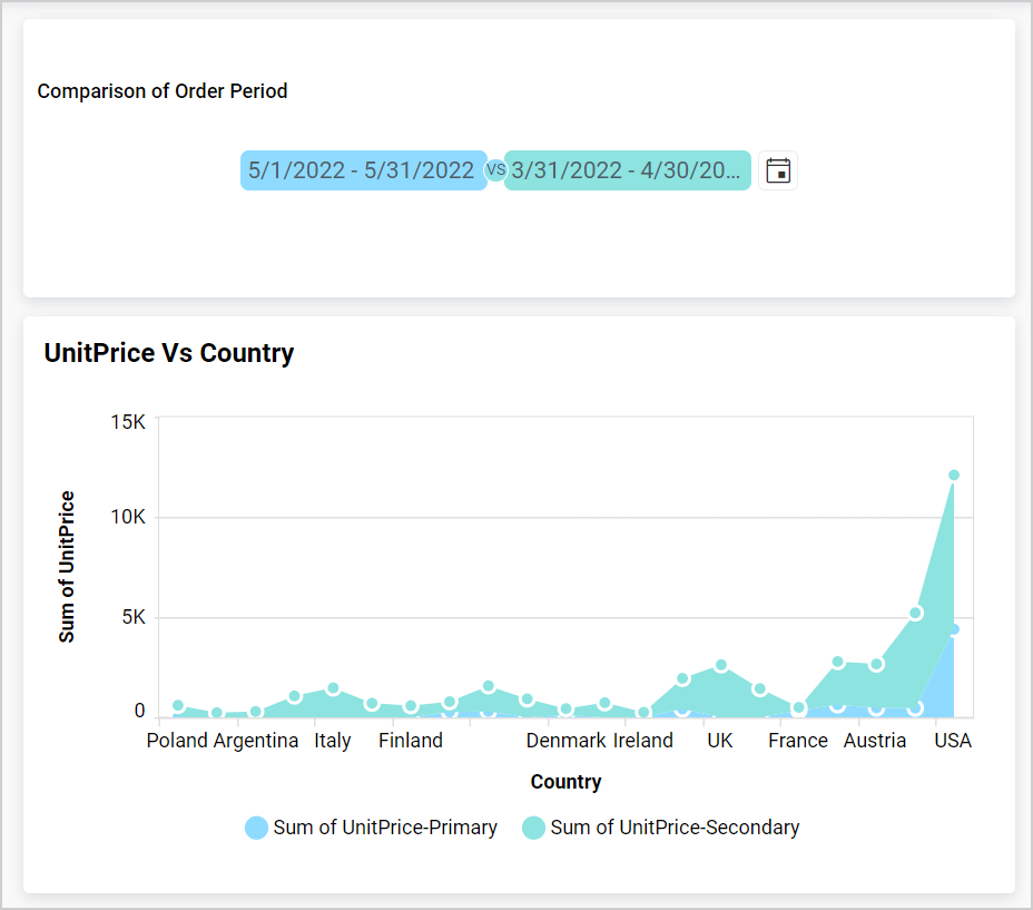
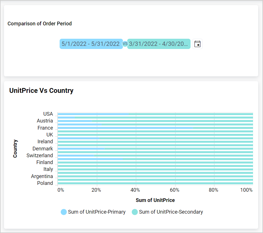
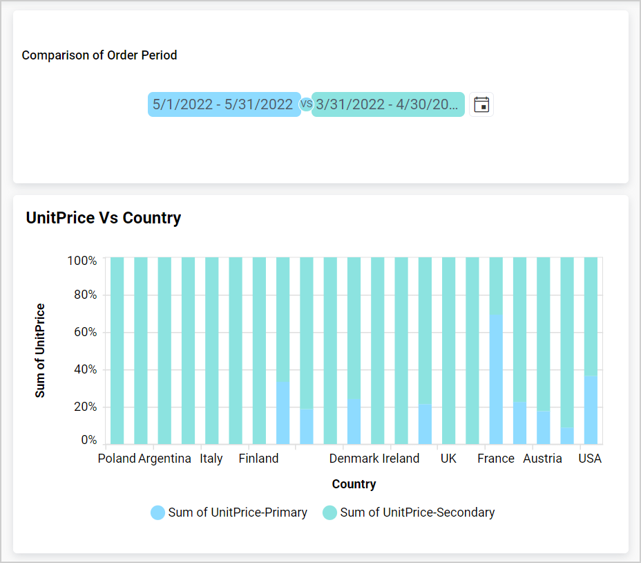
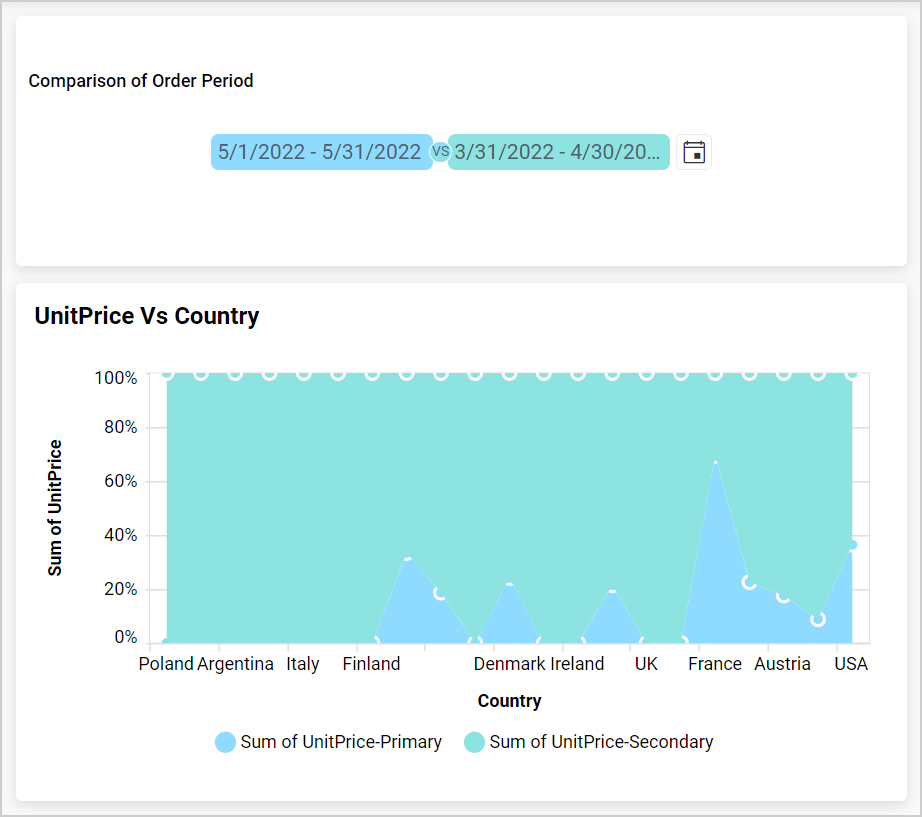
During interaction with the PoP widget, the chart will display two series. One series will have values filtered from the Date Range, and the other will contain filtered values from the Compare To.
Please find the response of different types of charts as slaves of the PoP widget:
Bar Chart
Line Chart
Area Chart
Spline Chart
Spline Area Chart
Stacked Bar Chart
Stacked Column Chart
Stacked Area Chart
100% Stacked Bar chart
100% Stacked Column chart
100% Stacked Area chart
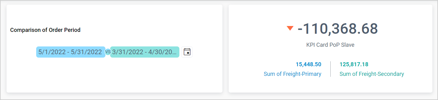
KPI card
The KPI Card will be displayed with the following information. You can visualize its value in Preview or View Mode.
During interaction with the PoP widget, the KPI Card will display two values. One value is filtered from the Date Range and is displayed as the Actual Value, while the other value contains the filtered value from Compare To and is displayed as the Target Value.
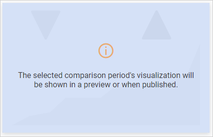
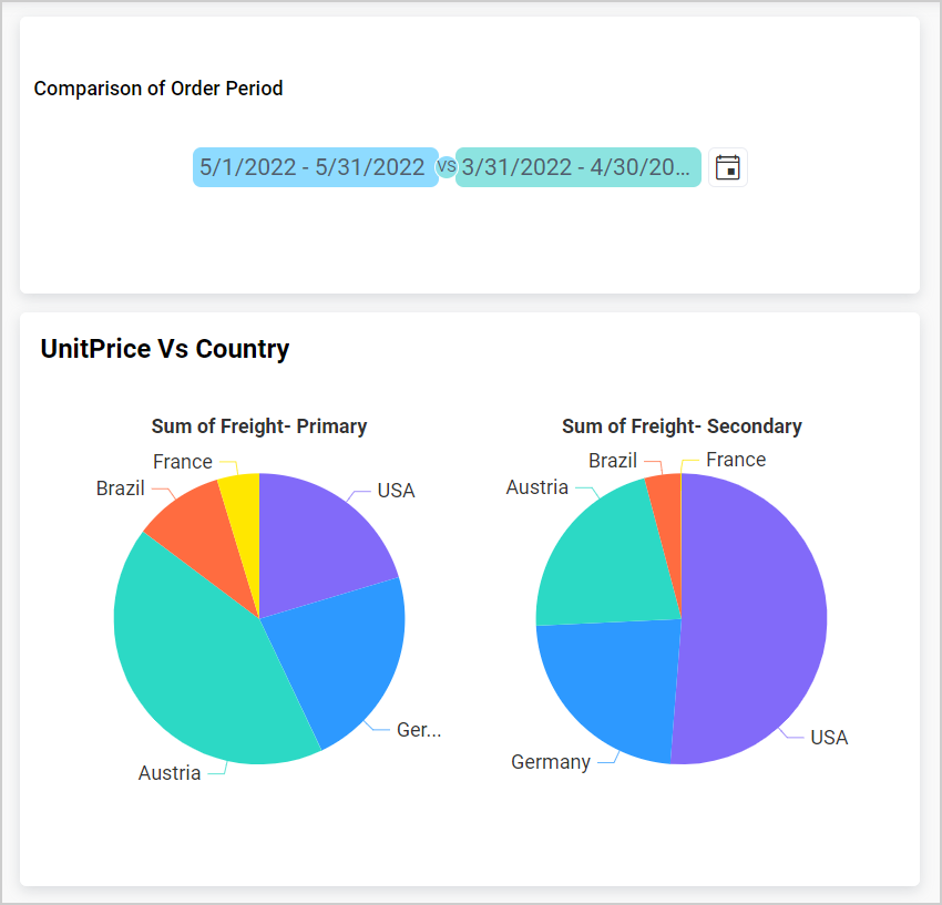
Proportion chart
Consider that you have configured the Proportional Chart as a slave for the Period Over Period widget. Like the column, bar, and line charts, the proportion chart’s color palette will not be changed. The red information icon denotes that the comparison of period visualization will not be shown in the design mode.
During interaction with the PoP widget, the proportional chart will display two series. One series shows values filtered from the Date Range, while the other series contains filtered values from the Compare To.
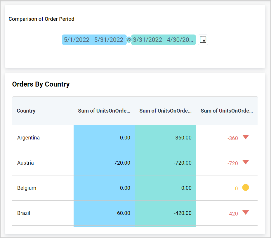
Grid
During interaction with the PoP widget, the grid will display two series for each column which are slaves to the PoP. One will have values filtered from the Date Range, while the other will contain filtered values from Compare To.
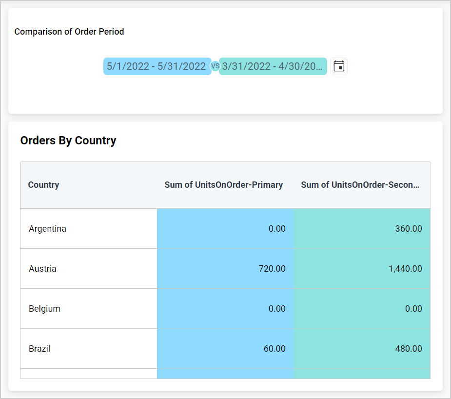
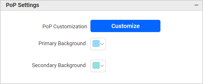
You can see a category to customize the POP settings and color palette for the grid which will be displayed in Design, Preview, or View Mode.
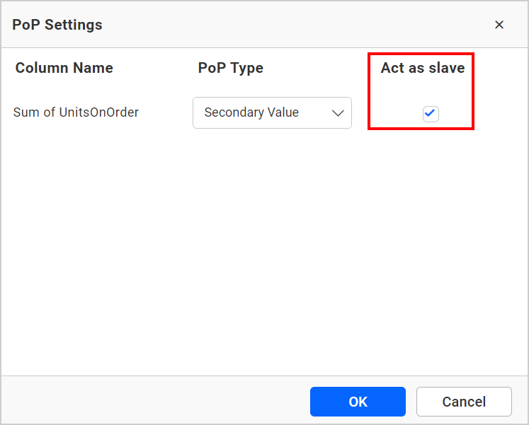
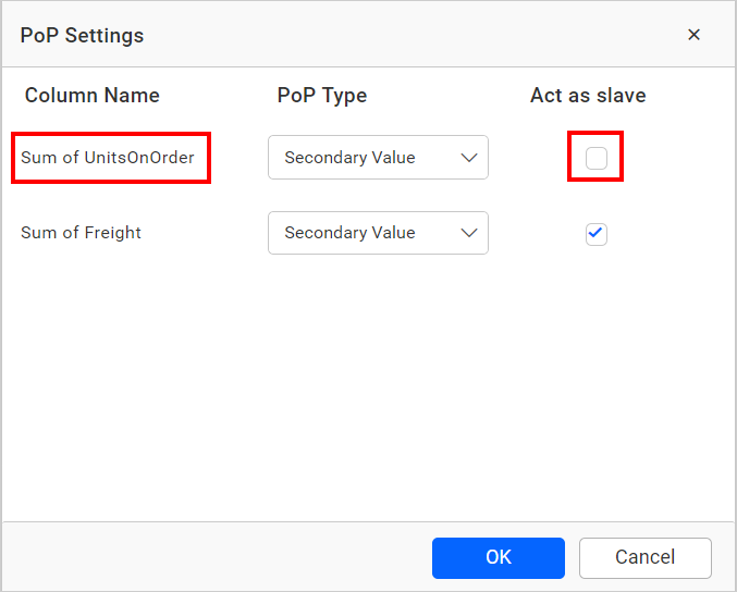
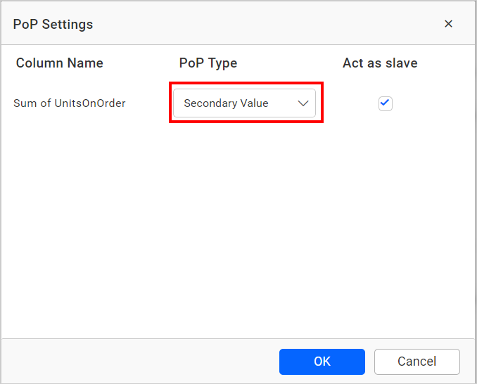
You can customize each column to be displayed in Design, Preview, or View Mode using the Customize option. If you click on the Customize option, a window will appear with a checkbox labeled Act as Slave. This helps us decide whether the column should act as a slave for the PoP or not.
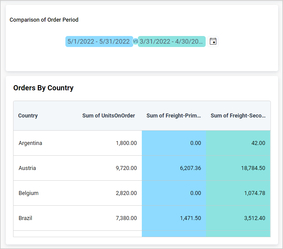
Consider that you have configured two measure columns in the grid. For example, if you only want the Freight column to act as a slave for the PoP, uncheck the Act as slave checkbox for the UnitsOnOrder column and click Ok to update the changes.
Now, the grid will render with the Freight column as a slave for the PoP as shown below.
In this POP settings window, by default, the Secondary Value is selected in the POP type.
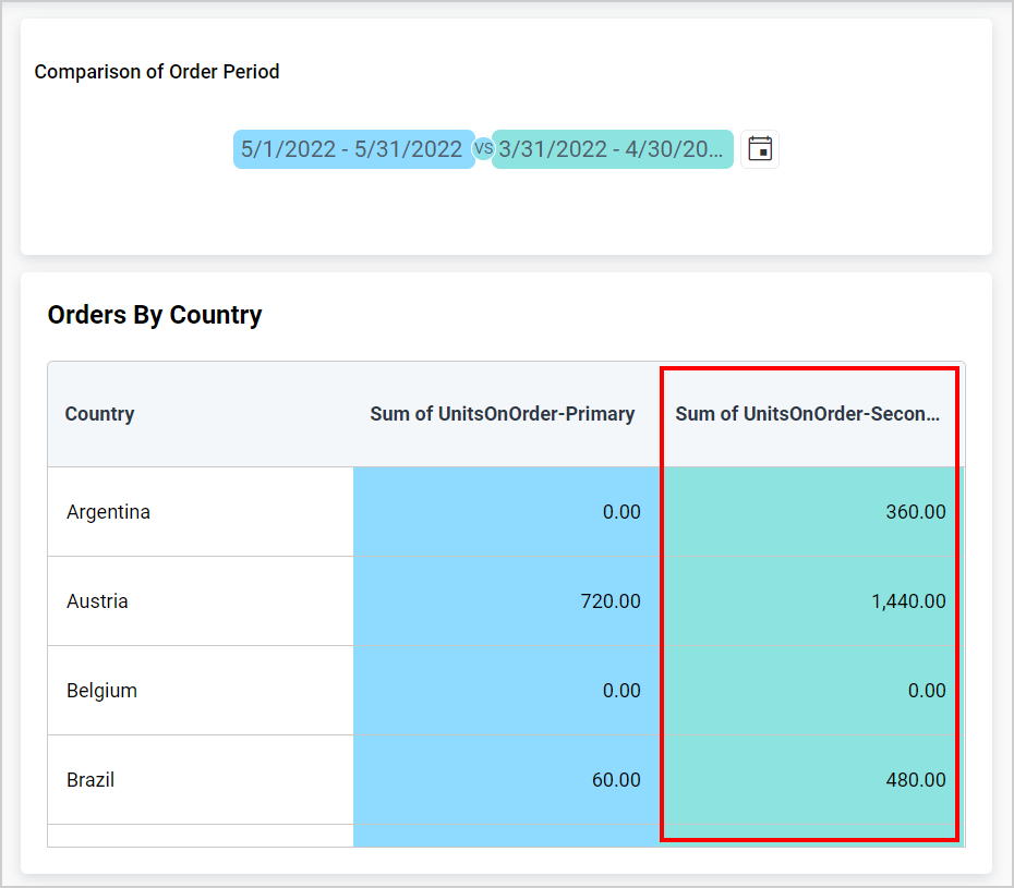
Now, the grid will render as shown below with the secondary value.
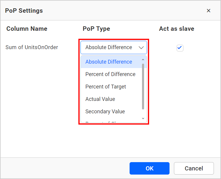
For example, if you wish to display the absolute difference between the Actual and Target value, then click on the POP Type dropdown. You will see the following POP types. From this, you can select the Absolute Difference POP type according to your preference and click Ok to update the changes.
Now, the grid will render as shown below with the absolute difference value.
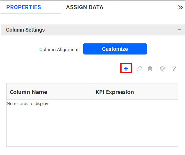
If you require both primary and secondary values and wish to compare them, you can utilize the KPI column option of the grid. To observe the variation between the chosen range in the KPI, then navigate to the Column setting in the property panel and add the KPI Expression by clicking the add icon.
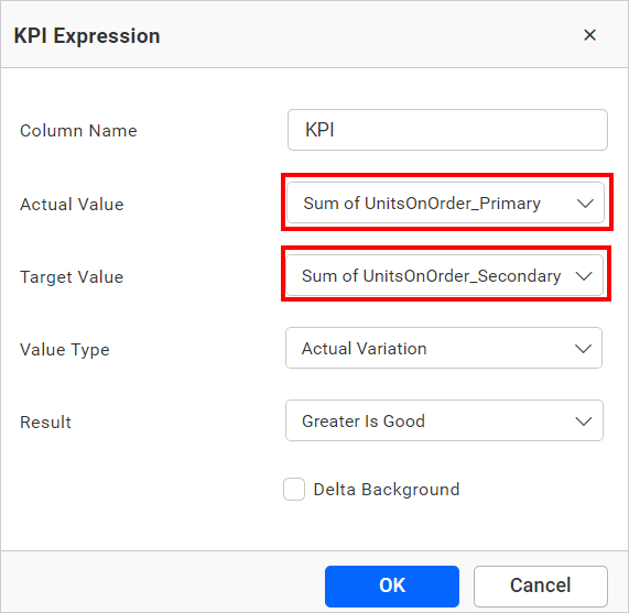
In this KPI Expression window, the following types are available in the Actual and Target Value.
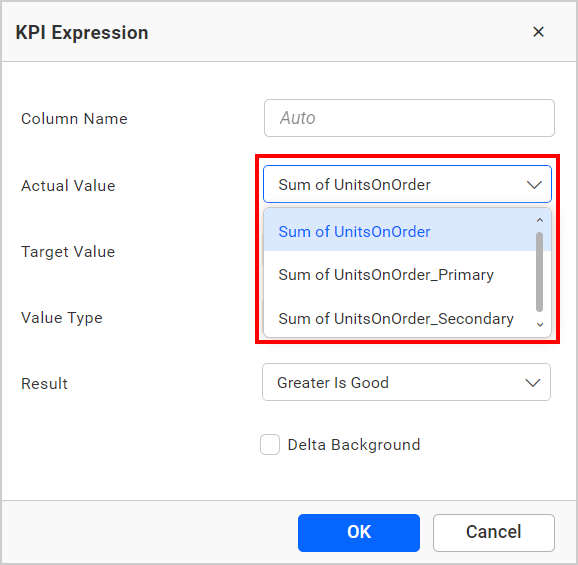
You can change the Actual and Target value type as shown below.
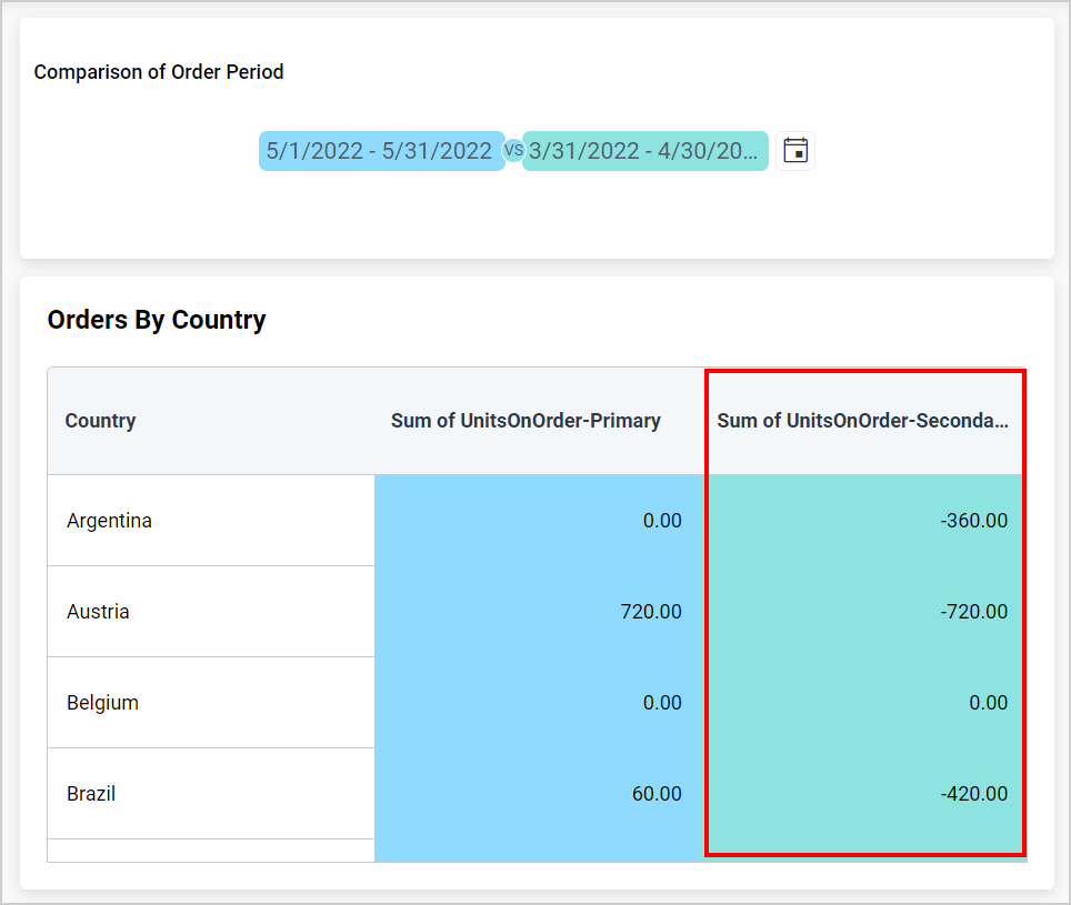
Now, the grid will render as shown below with the KPI value.
How to format Period Over Period?
You can format the Period Over Period for better illustration of the view that you require, through the settings available in the Properties tab.
General Settings
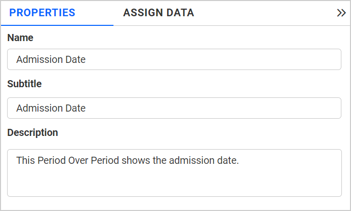
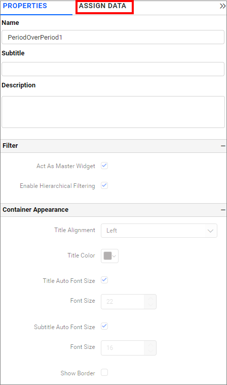
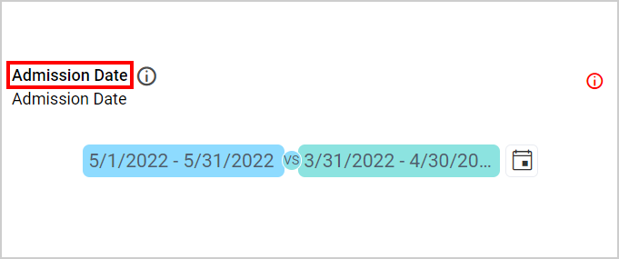
Name
This option allows you to change the title for the Period Over Period widget.
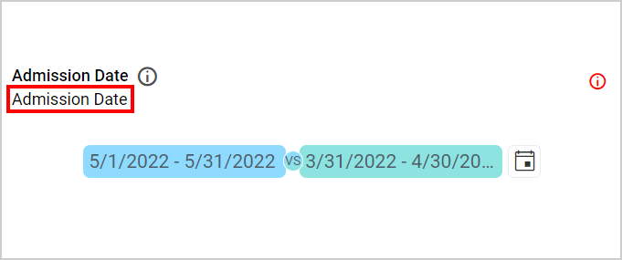
Subtitle
This option allows you to change the subtitle for the Period Over Period widget.
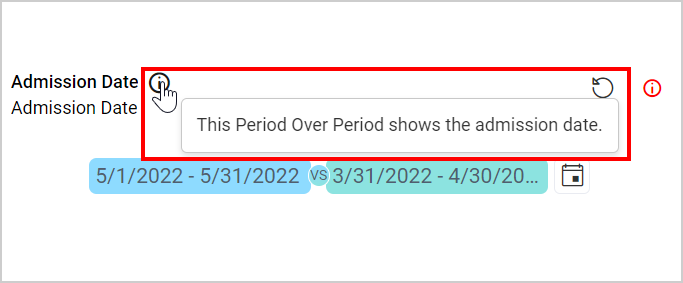
Description
This option allows you to change the description about the Period Over Period widget.
Filter
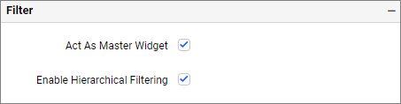
Act as Master Widget
This allows you to define this PoP as a master widget such that its filter action can be made to listen by other widgets in the dashboard.
Container Appearance
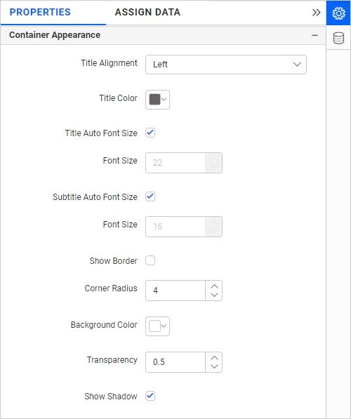
Title Alignment
This option allows you to handle the alignment of widget title to either left, center, or right.
Title Color
This option allows you to apply the text color to the widget title.
Title Auto Font Size
On enabling Auto Font Size, the font size of the title will be adjusted automatically if the resolution of the screen varies.
Font Size
This option allows you to apply the specified size of the font to the widget title if the Title Auto Font Size is disabled. Value can be between 10 and 44.
Subtitle Auto Font Size
On enabling Auto Font Size, the font size of the subtitle will be adjusted automatically if the resolution of the screen varies.
Font Size
This option allows you to apply the specified size of the font to the widget subtitle if the Subtitle Auto Font Size is disabled. Value can be between 10 and 32.
Show Border
This option allows you to toggle the visibility of the border surrounding the widget.
Corner Radius
This option allows you to apply the specified radius to the widget corners if the Show Border is enabled. Value can be between 0 and 100.
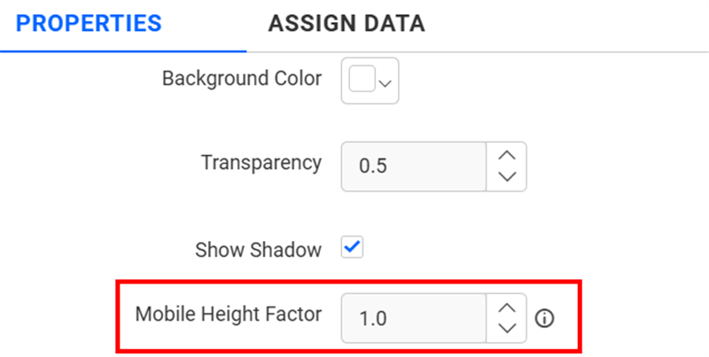
Background Color
This option allows you to set the background color to the Period over Period widget.
Transparency
This option allows you to specify the transparency for the background color.
Show Shadow
This option allows you to toggle the visibility of the shadow surrounding the widget.
Mobile Height Factor
This option allows you to resize widgets specifically for mobile view.
Container actions
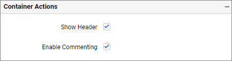
Show Header
This option allows you to enable or disable the widget title of the Period over Period widget.
Enable Comments
This allows you to enable or disable comments for the dashboard widget. For more details, refer to the Commenting Widget.