Text (Rich Text Editor)
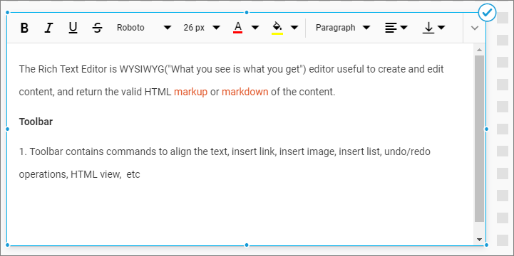
The text editor allows you to edit and visualize the content of formatted texts, tables, hyperlinks, and source code.
How to configure text editor ?
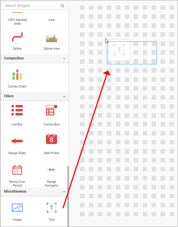
Drag and drop the Text control icon from the toolbox to the design panel. You can find the control by searching in the toolbox.
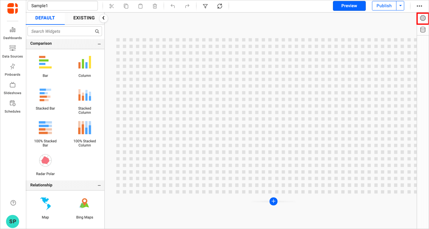
Click the Properties button in the configuration panel property pane to open.
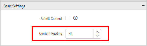
Container Padding
This allows you to customize the padding of the widget container. The default value of the padding is 16.
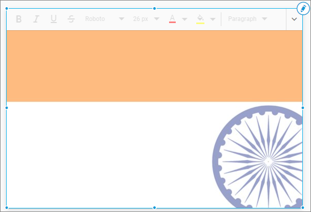
If the padding is set as 0, the RTE widget will render as shown below.
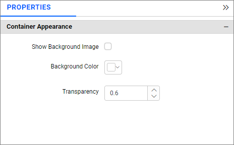
Container Appearance
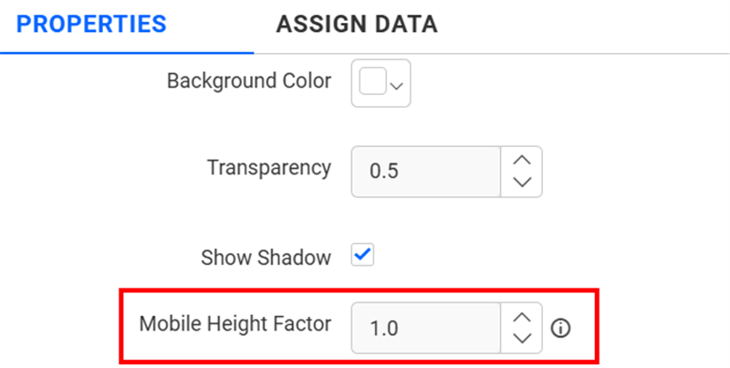
Mobile Height Factor
This option allows you to resize widgets specifically for mobile view.
Show Background Image
This option allows you to enable an image for the background.
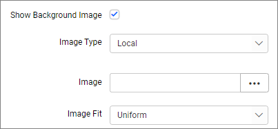
Image Type
This option allows you to select the type of image.
Local
You can browse the image from your local system.
URL
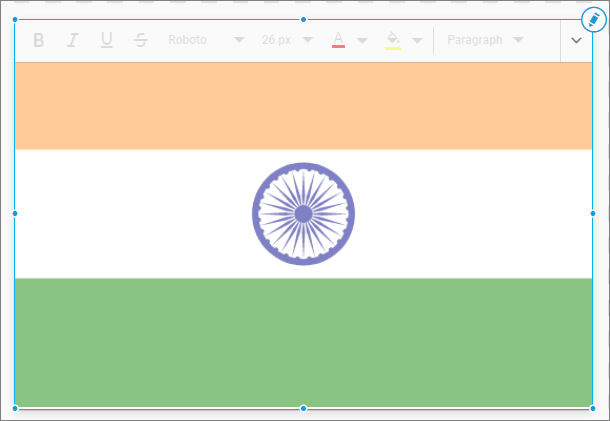
You can provide the URL of the image, which must be a valid URL.
Ex: http://flagpedia.net/data/flags/normal/in.png
Image Fit
You can customize the image showcase style through the Image Fit settings in the Design Tools pane or properties pane.
Default
The image will be displayed in its original size.
Fill
The image will be filled in the available space.
Uniform to Fill
The image will uniformly occupy the space but may get clipped if it is larger than the control.
Uniform
The image sizes proportionally (without clipping) to best fit the widget area.
Background color
You can customize the color of the background by enabling the background color, only when the background image is not enabled.
Transparency
This property allows you to specify the transparency for the background color.
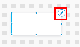
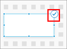
By default, the text editor is in read-only mode. Click the edit icon to interact with the widget.
Click the tick icon to save the Text.
The Text editor property panel is disabled by default because it does not have any items in the property panel. It contains all properties in the toolbar.
Toolbar Classification
The toolbar contains properties used in Text. Based on the size of the text editor, the toolbar mode can be classified as floating and inline toolbar.
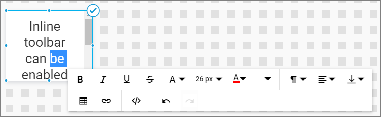
Inline Toolbar
The Text editor contains an inline toolbar by default because of its smaller size. The inline toolbar can be enabled by selecting the text content. This mode is active when the text editor does not have enough space to enable a floating toolbar.
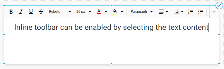
Floating Toolbar
It can be enabled by increasing the widget size to the required size based on the resolution. This mode is active when the text editor has enough space to display a floating toolbar.
Properties
Text editors support formatting the font, paragraph, and other functionalities.
Font Formatting
You can format the text by applying font style, family, and color. The available font formats are bold, italic, underline, strikethrough, font size, font color, highlight color, superscript, and subscript.

Bold - It allows you to Bold the text.
Italic - It allows you to Italicize the text.
Underline - It allows you to underline the text.
Strikethrough - It allows you to strikeout the text.
Font Family - Roboto is the default font family, it allows to change the font family of selected text. Available font families are Roboto, Segoe UI, Arial, Georgia, Impact, Tahoma, Times New Roman, Verdana.
Font Size - Size of the selected text can be modified as pixels(px). Available font size are 8, 9, 10, 11, 12, 14, 16, 18, 20, 22, 24, 26, 28, 36 and 48px.
Font Color - Color of the font can be change using this item.
Highlight Color - It allows you to highlight the selected text.
SuperScript - It allows you to add superscript text.
SubScript - It allows you to add subscript text.
Paragraph Formatting
You can format the paragraph in the text widget. The available paragraph formats are paragraph formats, alignments, numbered and bulleted lists.
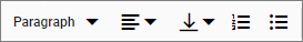
Formats - This allows you to apply the formatting for the paragraph. Available formatting options are paragraph, code, quotation, and headings. By default, the paragraph type is formatted.
Alignments - Used to align the paragraph as left, right, center, and justify.
Numbered and Bulleted List - It allows you to add numbers and bullets before the selected lines of the paragraph.
Vertical Alignments
This allows you to align the paragraph vertically.
There are three options in the menu for vertical-align as follows.
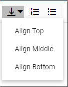
Align Top - Allows you to align the paragraph by vertically top of the container.
Align middle - Allows you to align the paragraph by vertically centered.
Align Bottom - Allows you to align the paragraph by vertically bottom of the container.
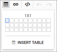
Insert Table
Text editor’s table can be created by clicking the create table icon on the toolbar.
To create table, do one of the following,
-
Choose the number of rows and columns by hovering the pointer over the cell.
-
Open the Insert Table dialog by clicking the
Insert Tablebutton. Enter the number of rows and columns required in the numeric textbox.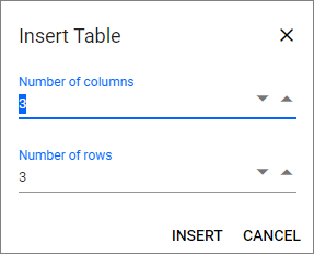
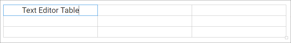
The created table is shown below and can be resized based on row and column.
Quick Toolbar
Quick toolbar is opened by clicking the table. It has different sets of commands to be performed on the table which increases the feasibility to edit the table easily.
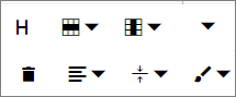
Table Header - This command is available with the quick toolbar option through which the header row can be added or removed from the inserted table.
Table Rows and Columns - Additional row/column in the table can be added before/after selected row/column element or delete unwanted row/column.
Background Color - The background color can be set for each table cell.
Table Remove - Users can delete the entire table using the delete item in the quick toolbar.
Alignments - Alignment options include left, right, center, and justify for cell content.
Table Cell Vertical Align - Cells can be aligned vertically in top, middle, and bottom.
Styles - There are two properties: Dashed Borders for styling table borders as dashed, and Alternate Rows for highlighting a selected row.
Insert Hyperlink
Point the cursor anywhere within the editor where you would like to insert the link. It is also possible to select a text within the editor and can be converted to a hyperlink. Click the Insert HyperLink icon on the toolbar.
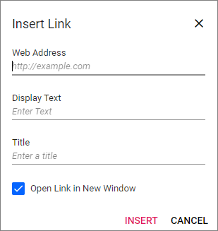
The insert link dialog includes the following options:
Web Address - Type or paste the destination for the link.
Display Text - Type or edit the required text to display for the link.
Tooltip - Enter text in the Tooltip field to display additional information when hovering over the hyperlink.
Open Link in New Window - Specify whether the link should open in a new window.
Quick Toolbar
Enable the quick toolbar for hyperlinks by clicking the link.
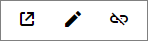
The quick toolbar for the link has the following options:
Open - The given link page will open in a new window.
Edit Link - Used to edit the link in the Rich Text Editor content.
Remove Link - Used to remove the link from the content of the Rich Text Editor.
Code View
The Text Editor includes the ability for users to directly edit HTML code via the Source Code in the text area. If you make any modifications in the Source view directly, the changes will be reflected in the Text Editor’s content.
Click the Source Code  icon on the toolbar to switch to code view.
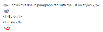
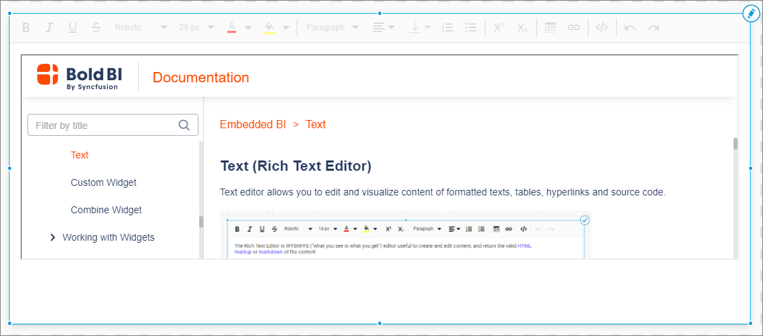
Clicking the preview icon will switch to the editor view.
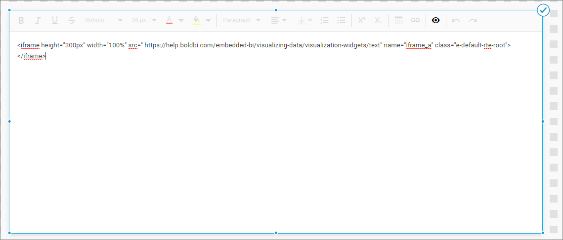
IFrame
The code view allows you to pass <iframe> tag to embed an external web page as shown below.
Undo/Redo Manager
The Undo and Redo tools allow you to edit the text by disregarding/canceling the recently made changes and restoring it to the previous state. It is a useful tool to restore the action performed by mistake. By default, up to 30 actions can be undone/redone in the editor.
To undo and redo operations, do one of the following:
-
Press the
undo/redobutton on the toolbar.
-
Press the
Ctrl + Z/Ctrl + Ycombination on the keyboard.