Forecast in Dashboard
Bold BI allows you to forecast future data when visualizing your data in a chart. Our forecasting includes built-in models that allow prediction based on exponential smoothing techniques. Forecasting in Bold BI can be applied to both seasonal and non-seasonal data points. For seasonal data, seasonality can be automatically detected based on historical data. Our forecasting model also supports bound value prediction using an adjustable confidence interval.
Enabling forecast in charts
This document explains how to enable and configure forecasts in your charts.
-
To enable forecast settings, only one
Columnand oneValuefield need to be included in your chart.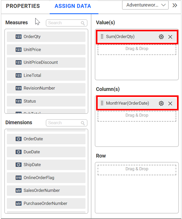
Supported data types in the Column field:
- Numeric
- Numeric
- DateTime
- Date
- Year
- Quarter Year
- Month Year
- Week Year
- Day Month Year
- Month Day Year
The Value field supports only
Numerictype. -
After adding the column and value in the chart, the
Forecast Settingsoption will be displayed in thePropertiespanel.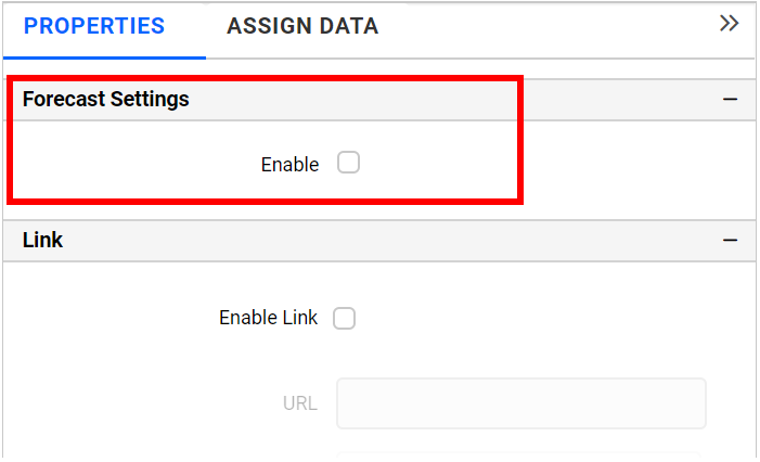
-
Click
Enableto apply the forecast in the chart.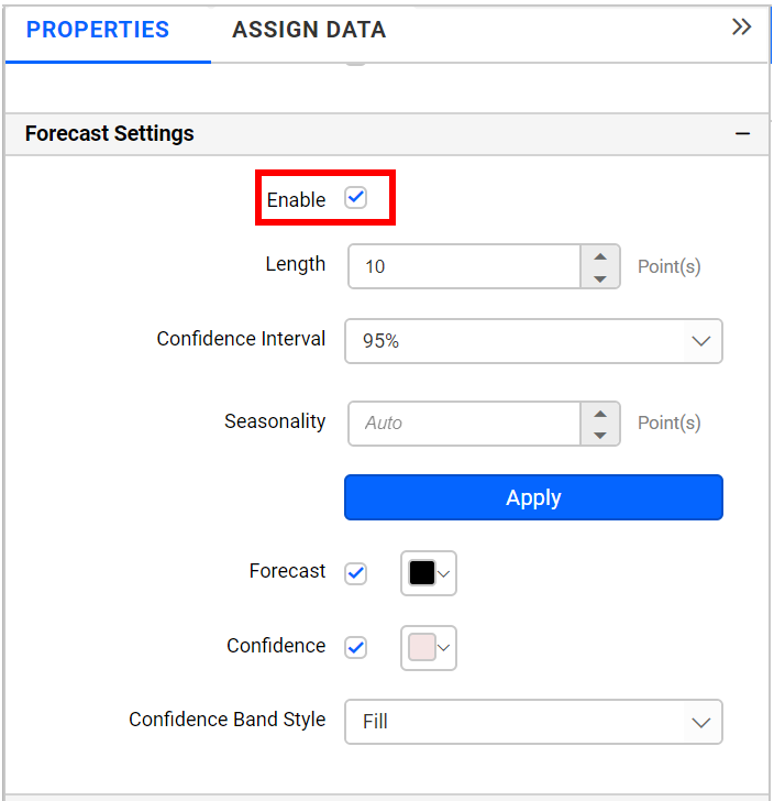
-
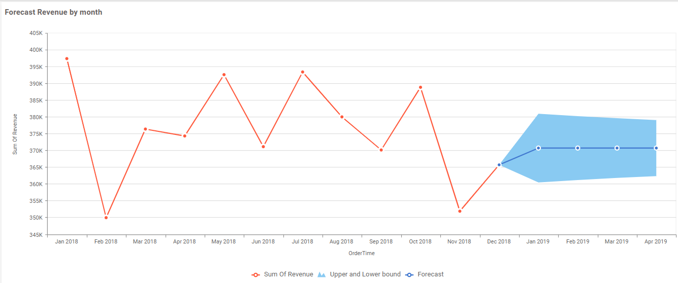
After enabling the forecast, the chart will be updated with forecast, upper, and lower bound data points.
-
The following properties are used to configure forecast data points:
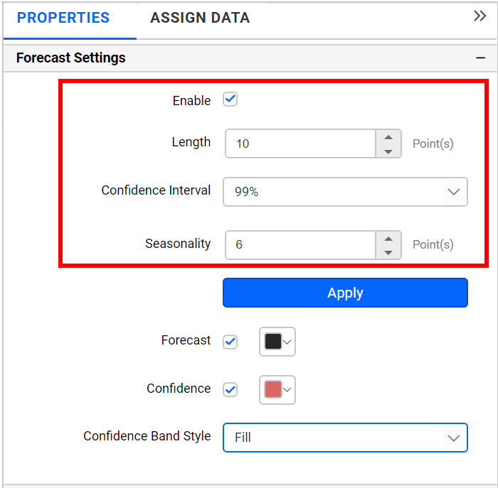
Lengthcan be used to define the number of forecast data points to be included in the chart, with the default length set to 10.Confidence Intervalcan be used to define the range for lower and upper bound values, with the default confidence interval set to 95%.Seasonalityis set to auto by default and will be predicted automatically based on seasonal input data. If you want to set any seasonality period explicitly for your seasonal input data, then this option can be used. -
The following properties are used to customize forecast design:
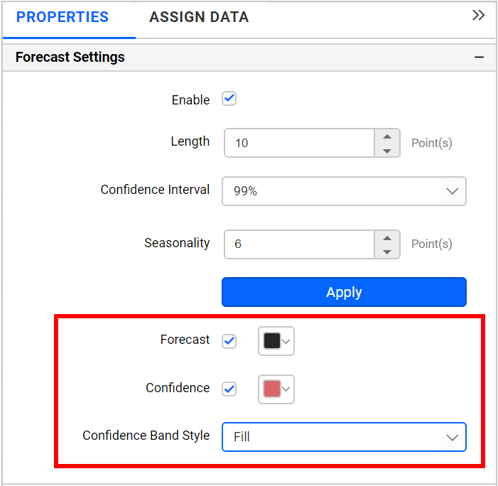
Forecastcan be used to customize the color of the forecast line.Confidencecan be used to customize the color of upper and lower bound data points.Confidence Band Stylecan be used to define the display style of upper and lower bound data points:Fillwill display shaded color between the upper and lower bound range.Linewill display upper and lower bound values with lines.Dotwill display upper and lower bound values with dotted lines.
Limitations on Forecasting
Forecasting is a valuable tool for predicting future data trends, but it comes with specific limitations. These limitations are essential to understand to effectively use the forecasting feature in the Line and Spline chart widgets. Below are the detailed constraints:
General Limitations
- Forecasting is exclusively available for
LineandSplinecharts. Other chart types do not support the forecasting feature. - Forecasting can only be used when the data is configured with a single measure field and a single column field. It does not support the use of multiple measures, multiple columns, or single rows within this context.
- The forecasting feature only supports specific date formats. The following date formats are not compatible with the forecasting functionality:
- Date and time
- Quarter
- Month
- Datehour
- Times (hour, minutes, seconds)
- The Tooltip feature cannot be used for the forecast line. If a column is configured in the
Tooltipcontainer under theAssign Datasection, the data from that column will not appear in the forecasting tooltip. - The
Drilldownfeature is not supported when using forecasting. - In the
Propertysection, specifically within theLegendsettings, it is not possible to customize the Legend text for forecast series. - It is not possible to disable Tooltip visibility for forecast series within the
Tooltipsettings in thePropertysection. - If the
Masterfilter is activated, it will not function with the forecasting feature.