
Button Widget
The Button widget performs an action when a viewer selects it. Use it to open a dashboard or URL and to create clear guided navigation.
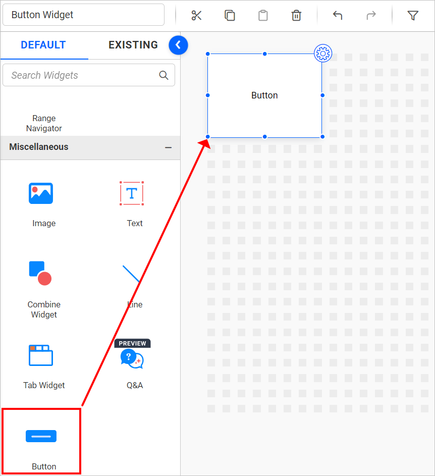
Adding a Button Widget
- Add the Button to the design canvas.
- Resize and position it.
- Open the properties panel to configure its content, appearance, and action.
Formatting the Button Widget
General Settings
Refer to General Settings for information about configuring the widget type, unique name, title, subtitle, and description shown for the widget.
Basic Settings
Tooltip
Sets the text displayed when a viewer points to the button. Leave it empty when additional context is not required.
Border
Enable
Controls border visibility.
Border Color
Sets the border color.
Border Thickness
Sets border width from 1 through 50 pixels.
Border Type
Selects Solid, Dotted, or Dashed.
Text
Enable
Controls label visibility.
Text
Specifies the button label.
Color
Sets the label color.
Font Size
Sets label size from 1 through 72 pixels.
Horizontal Alignment
Places the label at the Left, Center, or Right.
Vertical Alignment
Places the label at the Top, Center, or Bottom.
Top Padding
the top spacing for the label from � through 50 pixels.
Bottom Padding
the bottom spacing for the label from � through 50 pixels.
Right Padding
the right spacing for the label from � through 50 pixels.
Left Padding
the left spacing for the label from � through 50 pixels.
Font Settings
Refer to Font Settings for button text fonts.
Icon
Enable
Controls icon visibility.
Icons
Selects Blank, Right Arrow, Left Arrow, Undo, Redo, Help, or Information.
Icon Size
Sets icon size from 1 through 72 pixels.
Color
Sets the icon color.
Icon Placement
Selects Custom, Left of Text, Right of Text, Above Text, or Below Text.
When placement is Custom, Horizontal Alignment places the icon at the Left, Center, or Right, and Vertical Alignment places it at the Top, Center, or Bottom.
Top Padding
the top spacing for the icon from � through 50 pixels.
Bottom Padding
the bottom spacing for the icon from � through 50 pixels.
Right Padding
the right spacing for the icon from � through 50 pixels.
Left Padding
the left spacing for the icon from � through 50 pixels.
Fill
Enable Background Color
Controls the button background fill.
Background
Sets the fill color, and Transparency controls opacity from 0 through 1.
Enable Background Image
Displays an image behind the button content.
Mode
Selects Default, Fill, Uniform, or Uniform To Fill.
Image Source
Selects Local or URL. Use Browse for a local file or Image URL for a web image.
Image Rotation
Rotates the background image by 0, 90, 180, or 270 degrees.
Actions
Action Type
Selects URL Filtering, Apply All Slicers, or Clear All Slicers.
For URL Filtering, Button Link selects a Dashboard or URL destination. Configure the destination and the supported filter, master-widget, parameter, and URL options displayed for that choice.
Apply All Slicers
Applies the current slicer selections, while Clear All Slicers removes them.
Inter-Widget Linking
Refer to Inter-Widget Linking for information about linking the Button widget to a Tab widget.
Container Appearance
Refer to Container Appearance for widget-container styling.
Container Actions
Refer to Container Actions for supported viewer actions.