
Tab Widget
The Tab widget organizes multiple widgets into switchable views in the same dashboard area, reducing clutter while keeping related analysis together.
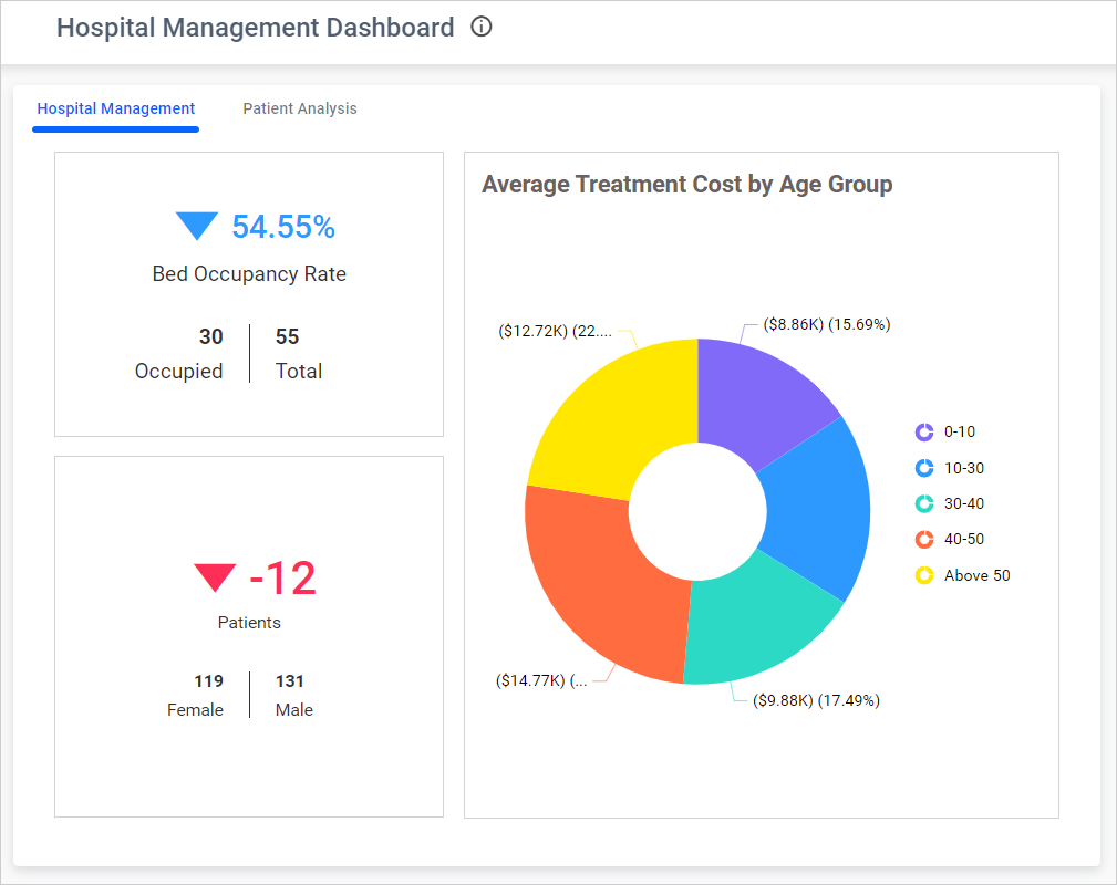
Configuring Tabs
- Add the Tab widget to the design canvas.
- Drag other widgets into the active tab.
- Add, remove, rename, or reorder tabs using the tab controls and properties panel.
- Arrange the widgets within each tab and select the tab shown initially.
Formatting the Tab Widget
General Settings
Refer to General Settings for information about configuring the widget type, unique name, title, subtitle, and description shown for the widget.
Basic Settings
Tab Order
Changes the order in which tabs appear.
Widget Order
Controls the stacking order of widgets within a tab.
Apply Stack Order
Applies the configured order when widgets overlap.
Hide Tab
Hides the tab selector at runtime.
Header Color
Sets the tab-header color.
Header Font Size
Sets header text size from 1 through 50 pixels.
Active Tab
Selects the tab displayed when the dashboard loads.
Tab Loader
Controls the loading indicator shown while tab content is rendered.
Enable RTL
Displays the tab header from right to left.
Enable Lazy Load
Loads a tab’s widgets only when the tab is opened.
Show Child Widget Menu Icons
Displays supported menu icons on widgets placed inside the tab. It is disabled when the parent widget menu is hidden.
Container Appearance
Refer to Container Appearance for padding, background, border, and shadow settings.
Container Actions
Refer to Container Actions for supported viewer actions.