
Axis Settings
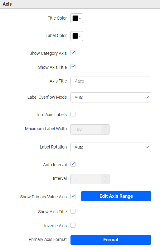
Axis settings control how the category axis (X-axis in column charts, Y-axis in bar charts) and the primary value axis (Y-axis in column charts, X-axis in bar charts) are labeled and styled. Well-configured axes give viewers the context they need to interpret chart values without having to reference a data table.
| Unsupported widgets |
|---|
| Grid, Pivot Grid, Radial Gauge, KPI Card, Number Card, Pie Chart, Doughnut Chart, Pyramid Chart, Funnel Chart, Tree Map, Heat Map, Image, Text, Line Widget, Button, Tab Widget, Q&A Widget, Combo Box, Text Filter, Date Picker, Period Over Period, Range Navigator |
Appearance Properties
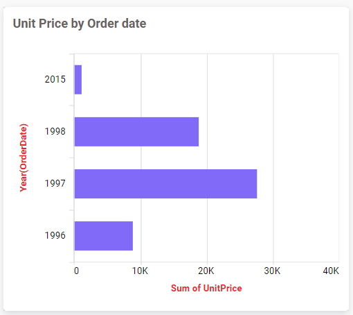
Title Color
Sets the font color of both axis titles.
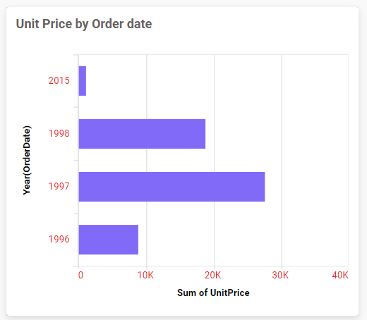
Label Color
Sets the font color of both axis tick labels.
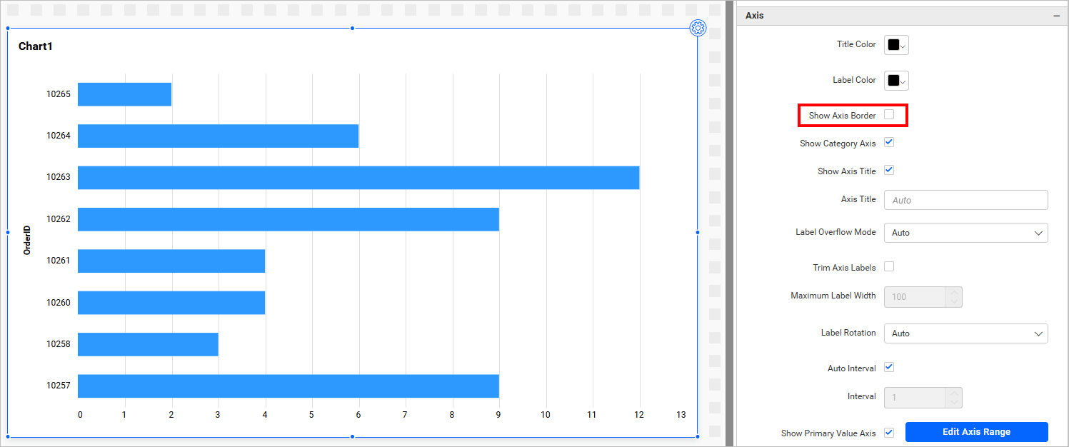
Show Axis Border
Toggles the visibility of the axis border line.
Category Axis
The category axis displays the dimension field used to group data (for example, product names or date values).
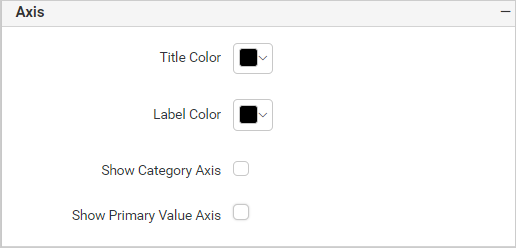
Show Category Axis
Toggles the entire category axis. When disabled, the dependent properties Show Axis Title, Axis Title Text, Trim Overflow Mode, Trim Axis Labels, Label Rotation, and Auto Interval are also hidden.
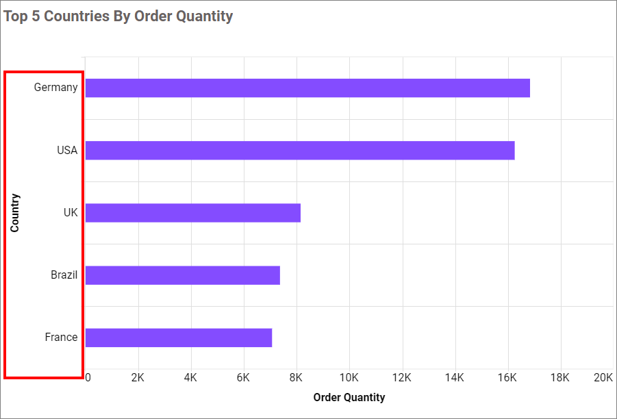
Show Category Axis Title
Toggles the visibility of the category axis title label independently of the axis tick labels.
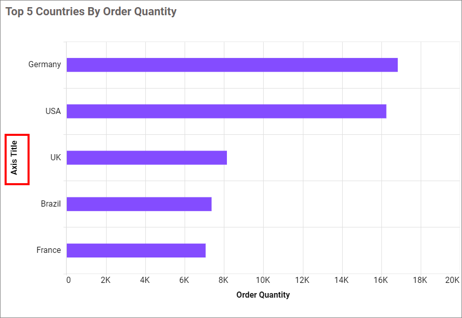
Category Axis Title
Sets the text displayed as the category axis title. Reflected as the X-axis name (or Y-axis for horizontal bar charts) on the rendered chart.
Label Overflow Mode
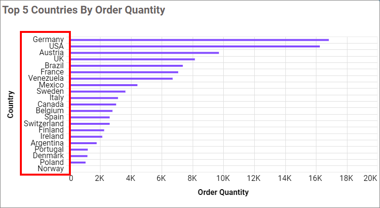
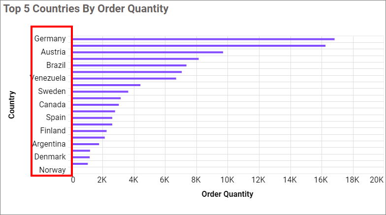
Controls how overlapping category axis labels are handled.
-
Trim - Truncates overlapping labels, displaying only the portion that fits within the available space.
-
Hide - Hides overlapping labels entirely to prevent visual clutter.
Trim Axis Labels
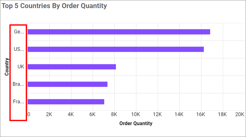
When enabled, trims axis labels that exceed the width defined by Label Maximum Width.
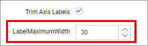
Label Maximum Width
Sets the maximum pixel width for axis labels. Labels wider than this value are trimmed. Only active when Trim Axis Labels is enabled.
Label Rotation
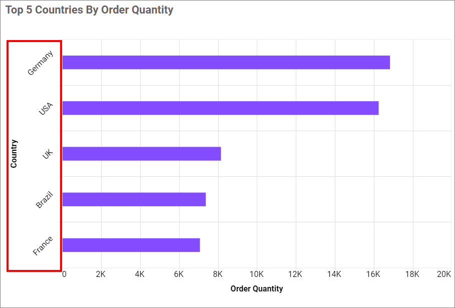
Sets the rotation angle (in degrees) applied to category axis labels. Use this to prevent label overlap on densely populated axes, such as daily date ranges.
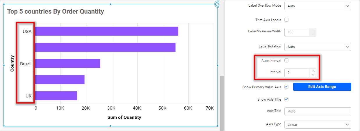
Auto Interval
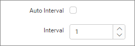
When enabled (the default), Bold BI automatically calculates the label interval based on the number of data points. Disable to set a specific interval manually using the Interval field.
Primary Value Axis
The primary value axis displays the measured values plotted on the chart.
Show Primary Axis
Toggles the visibility of the primary value axis. When disabled, the dependent properties Axis Title, Axis Title Text, Axis Type, and Axis Format are hidden.
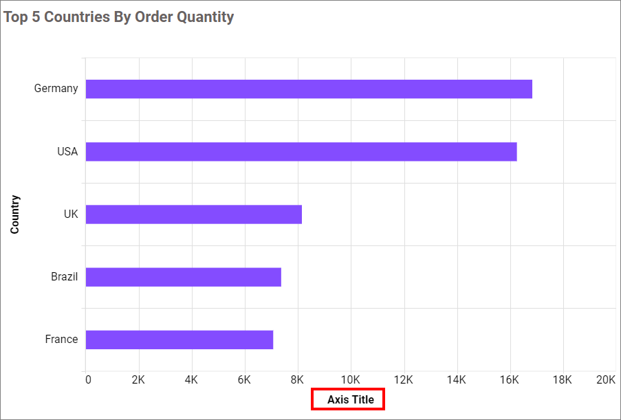
Show Primary Axis Title
Toggles the visibility of the primary value axis title.

Primary Axis Title
Sets the text displayed as the primary value axis label. Reflected as the Y-axis name (or X-axis for horizontal bar charts) on the rendered chart.
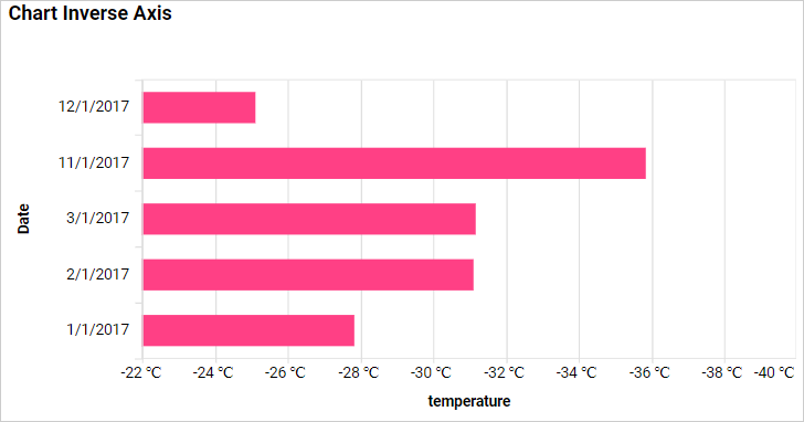
Inverse Axis
Inverts the value axis so that positive values appear at the bottom and negative values appear at the top. Useful for plotting inverted metrics such as temperature, depth, or error rates.
Axis Type
Sets the scale used on the primary value axis.
Linear
Uses a standard linear scale. Suitable for most data with values in a narrow range.
Logarithmic
Uses a logarithmic scale. Recommended when the data spans multiple orders of magnitude (for example, values ranging from 0.000001 to 1,000,000), because it prevents very large values from compressing smaller ones into a flat line at the bottom.
Axis Format
Applies a number format to the primary value axis tick labels using the Bold BI measure format dialog. Use this to display values as currency, percentages, thousands (K), or millions (M).
For detailed formatting options, refer to Measure Format.
