Legend Settings
A legend identifies each data series plotted on a chart by mapping a color or shape to a series name. It helps users interpret multi-series charts without needing to hover over individual data points. Legend settings let you control where the legend appears, how it looks, and how users interact with it.
| Unsupported widgets |
|---|
| Grid, Pivot Grid, Radial Gauge, KPI Card, Number Card, Azure Maps, Image, Text, Line Widget, Button, Tab Widget, Q&A Widget, Combo Box, Text Filter, Date Picker, Period Over Period, Range Navigator |
Properties
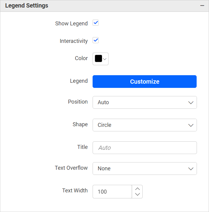
Show Legend
Toggles the visibility of the legend. When enabled, the legend appears adjacent to the chart plot area. When disabled, all dependent legend properties are also hidden.
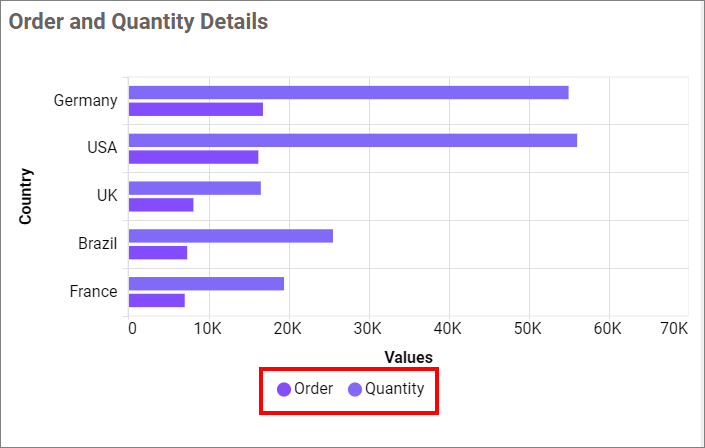
Note: The legend is not visible when only a single data series is configured on the chart.
Custom Legend Text
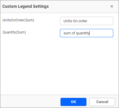
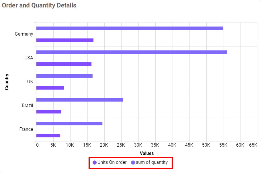
When enabled, a text area appears alongside each series in the combo box, allowing you to replace the default series name with custom display text.
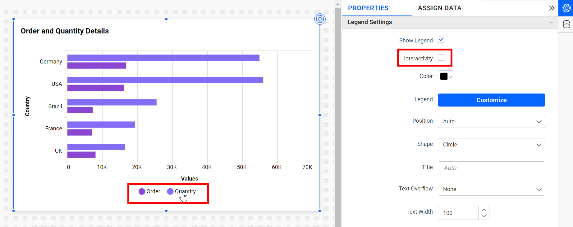
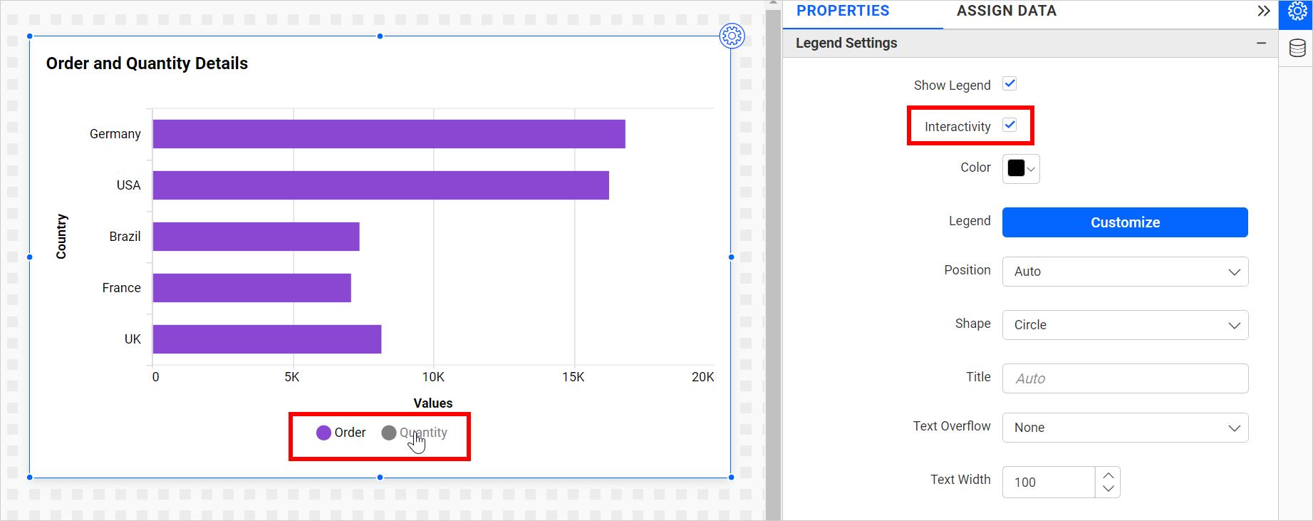
Legend Interactivity
Controls whether users can click a legend item to show or hide the corresponding series on the chart.
- Enabled - Clicking a legend item toggles the visibility of that series. Useful for exploratory dashboards where users compare subsets of data.
- Disabled - Legend items are non-clickable. Use this on dashboards where all series must always remain visible, such as compliance or executive summary reports.
Legend Label Color
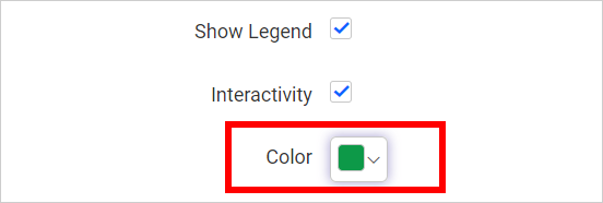
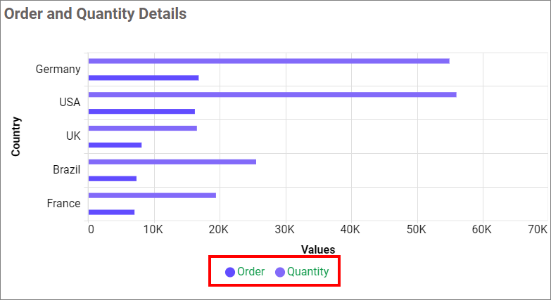
Sets the color of the legend title and legend item labels independently.
Legend Position
Places the legend relative to the chart plot area. Available options: Auto, Left, Right, Top, Bottom.
- Use Top or Bottom for wide, landscape-oriented charts.
- Use Left or Right for tall, portrait-oriented charts.
- Auto lets Bold BI determine the best position based on the available widget space.
Legend as Dropdown
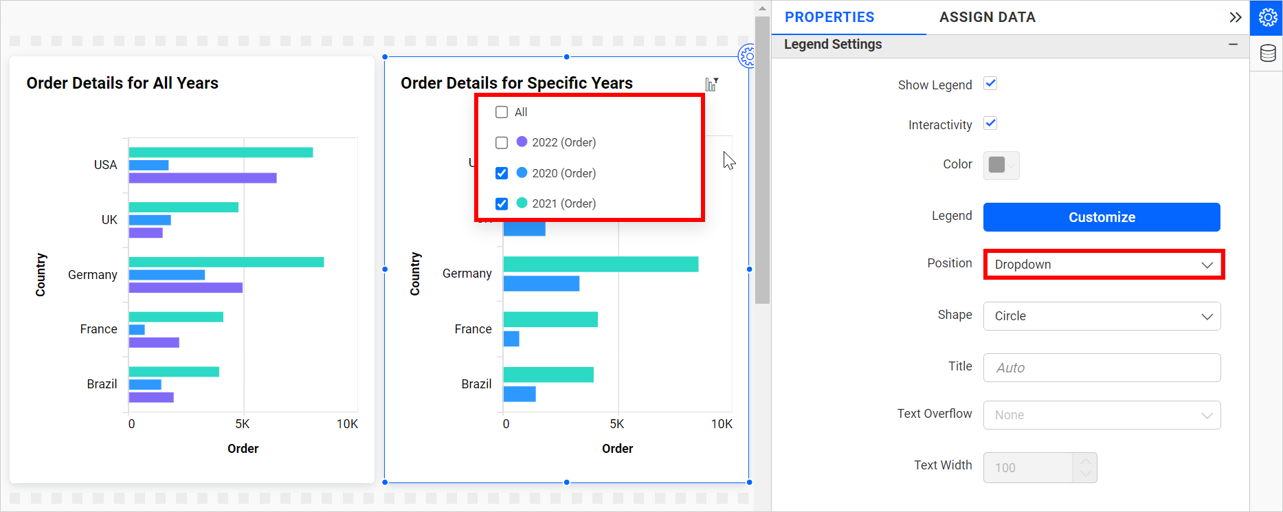
When the legend position is set to Dropdown, the legend is hidden from the chart canvas and replaced by a dropdown icon that appears on hover. Clicking the icon reveals the legend as a floating panel. This recovers chart space on widgets with many series.
Legend Alignment
Fine-tunes the alignment of the legend within its allocated strip (the area next to or above/below the chart). Available options: Near, Center, Far, None.
| Alignment | Description |
|---|---|
| Near | Aligns the legend to the start of the strip (top or left, depending on position). |
| Center | Centers the legend within the strip. |
| Far | Aligns the legend to the end of the strip (bottom or right, depending on position). |
| None | Uses the default rendering position without explicit alignment. |
Legend Shape
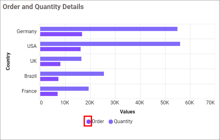
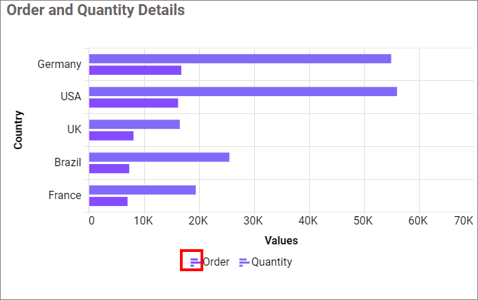
Changes the marker shape used next to each legend label.
-
Circle - Displays a circular marker.
-
Series Type - Displays a marker that matches the shape of the plotted series (for example, a line segment for a line series).
Legend Title
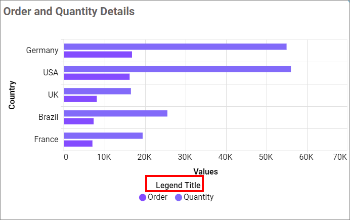
Adds a heading above the legend items. The title is only visible when Show Legend is enabled.
Text Overflow
Controls how legend item text is handled when it exceeds the available width. Works together with Text Width.
-
None - Renders the full text without truncation or wrapping.
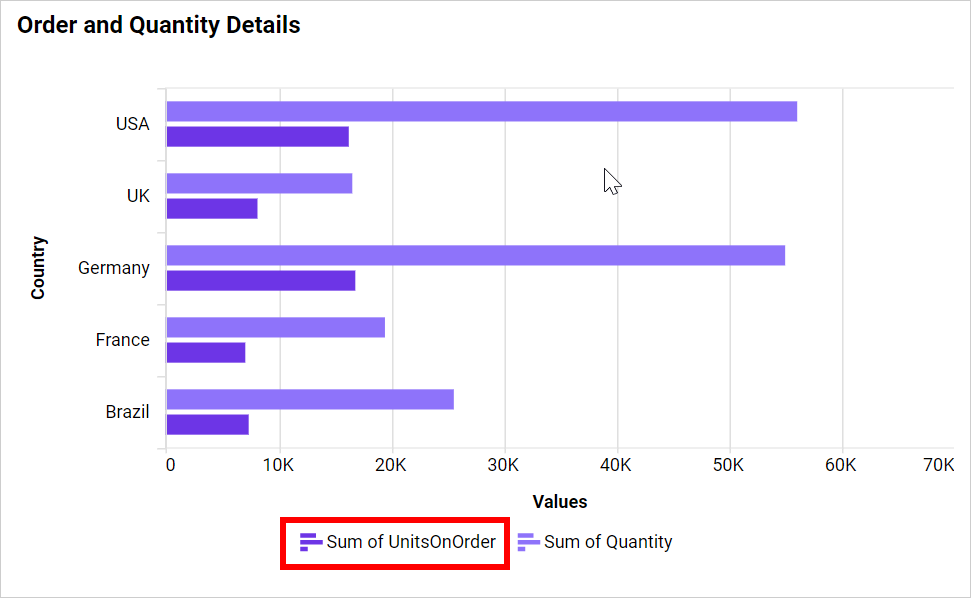
-
Trim - Truncates text that exceeds the Text Width value, adding an ellipsis.
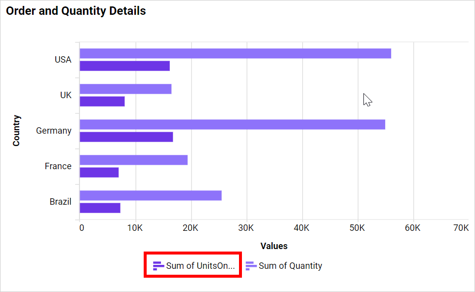
-
Wrap - Wraps text onto multiple lines when it exceeds the Text Width value.
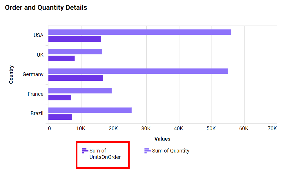
Text Width
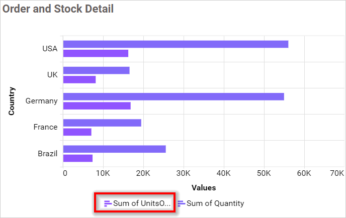
Sets the maximum pixel width for legend item labels. This property is active only when Text Overflow is set to Trim or Wrap.
Customize
Opens the Custom Legend Settings dialog, which lists all series labels on the left and a text area on the right. Enter custom display text for any series to override the default field name in the legend.