Tooltip Settings
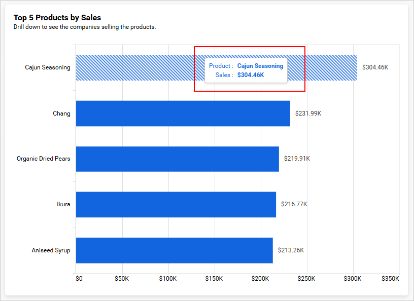
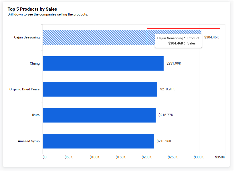
A tooltip appears when a user hovers over a data point on a widget. It provides the exact value, label, or additional context for that point without requiring the user to navigate away from the dashboard. Configuring tooltip settings lets you control what information is shown and how it is presented.
| Unsupported widgets |
|---|
| Radial Gauge, KPI Card, Number Card, Image, Text, Line Widget, Button, Tab Widget, Q&A Widget, Date Picker, Period Over Period, Range Navigator |
Properties
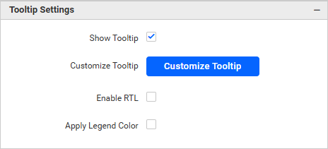
Show Tooltip
Toggles the visibility of the tooltip. When disabled, no tooltip appears when hovering over data points.
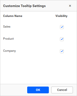
Customize Tooltip
Opens a column selector that lets you choose which data fields appear inside the tooltip. By default, all configured fields are shown. Use this option to include additional context fields, such as a product code or region name, that are not plotted on the chart axes.
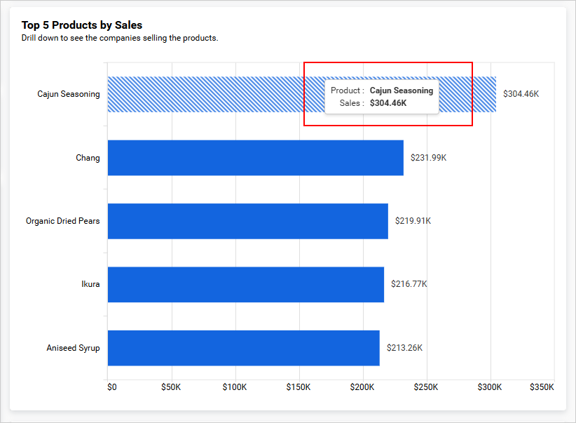
Enable RTL
Renders the tooltip content from right to left. Enable this when the dashboard is displayed in a right-to-left language such as Arabic or Hebrew.
Apply Legend Color
When enabled, the text and value inside the tooltip use the same color as the corresponding legend item. This makes it easier to associate tooltip values with their series when multiple series are plotted.