Configuring and Formatting Bing Maps
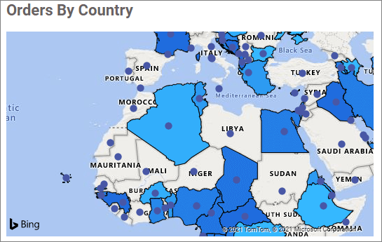
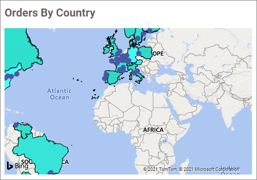
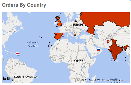
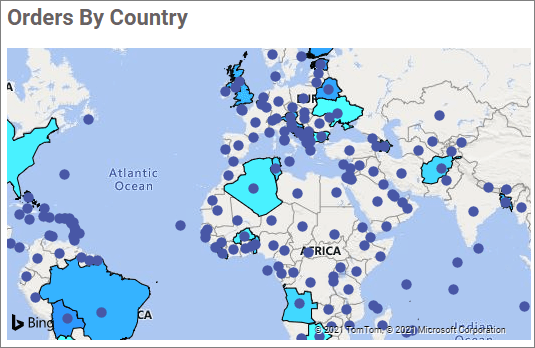
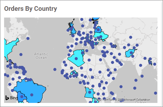
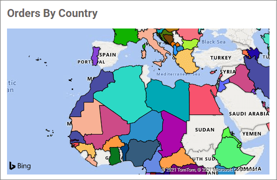
Bing Maps allows you to visualize markers based on latitude and longitude data.
Figure: Default Bing maps visualization showing markers based on the configured latitude and longitude information
How to get Bing Maps keys
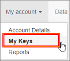
To obtain keys, follow these steps:
-
Go to the Bing Maps
DevCenter at the following link: Bing Maps. -
Register or sign in using your Microsoft account.
-
Select
My keysunderMy Account.
-
Choose the option to
create a new key. -
Provide the required details in the form.
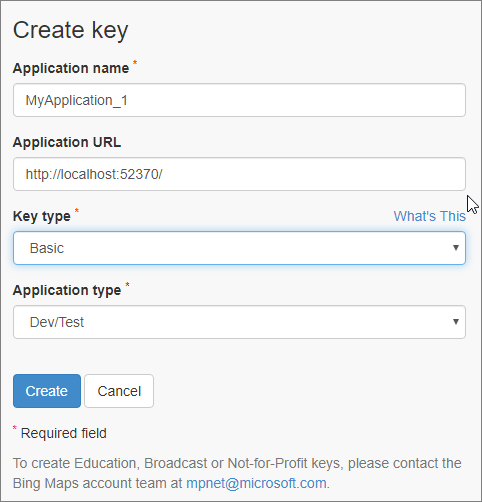
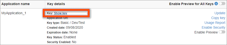
- Click the “Create” button. The newly created key will be displayed in the list. Use this key to authenticate your Bing Maps.
How to enable Bing Maps by configuring the web config file in Server
To enable Bing Maps in your Server build, follow these steps:
Bold BI version 6.19.14 or later
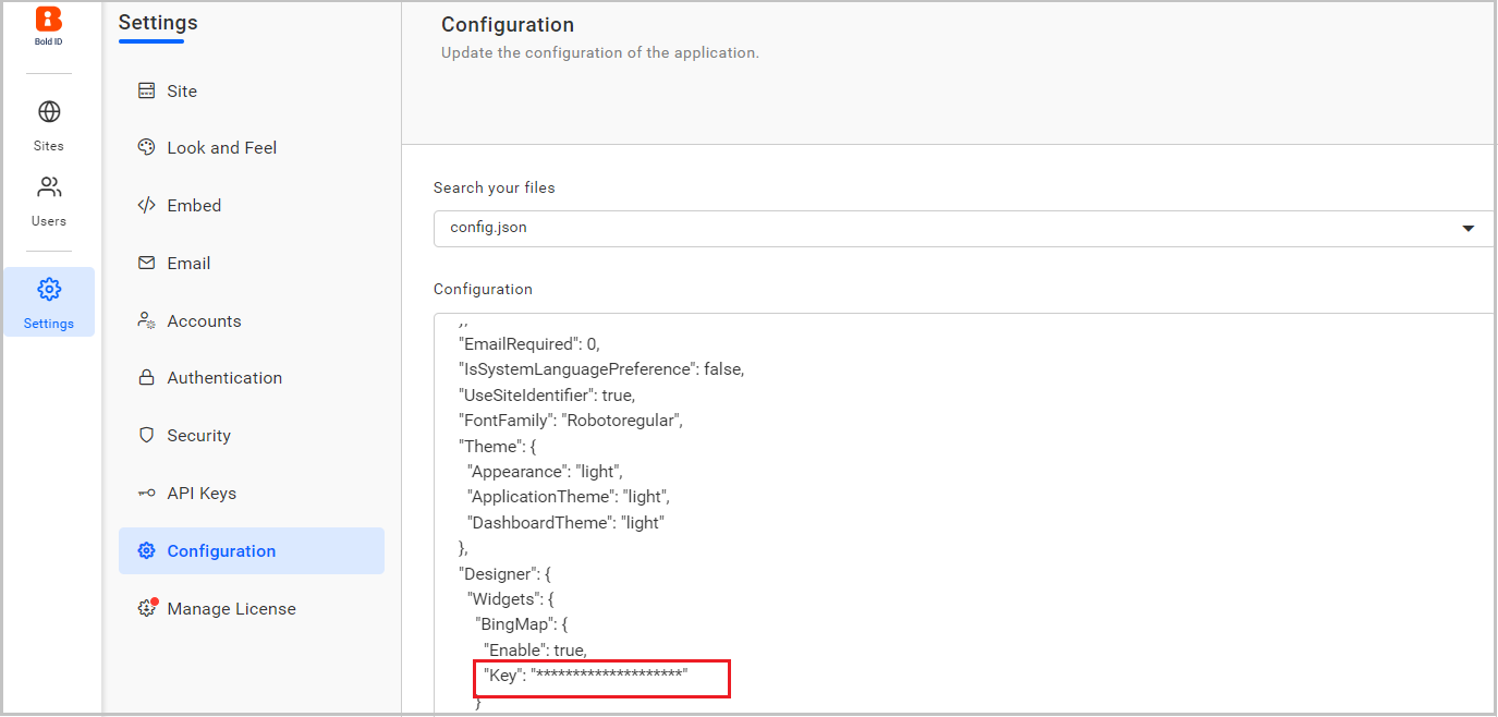
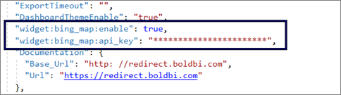
Go to the UMS Configuration Settings page and choose config.json in the Search your files drop-down, using this URL {domain_name}/ums/administration/config-editor.
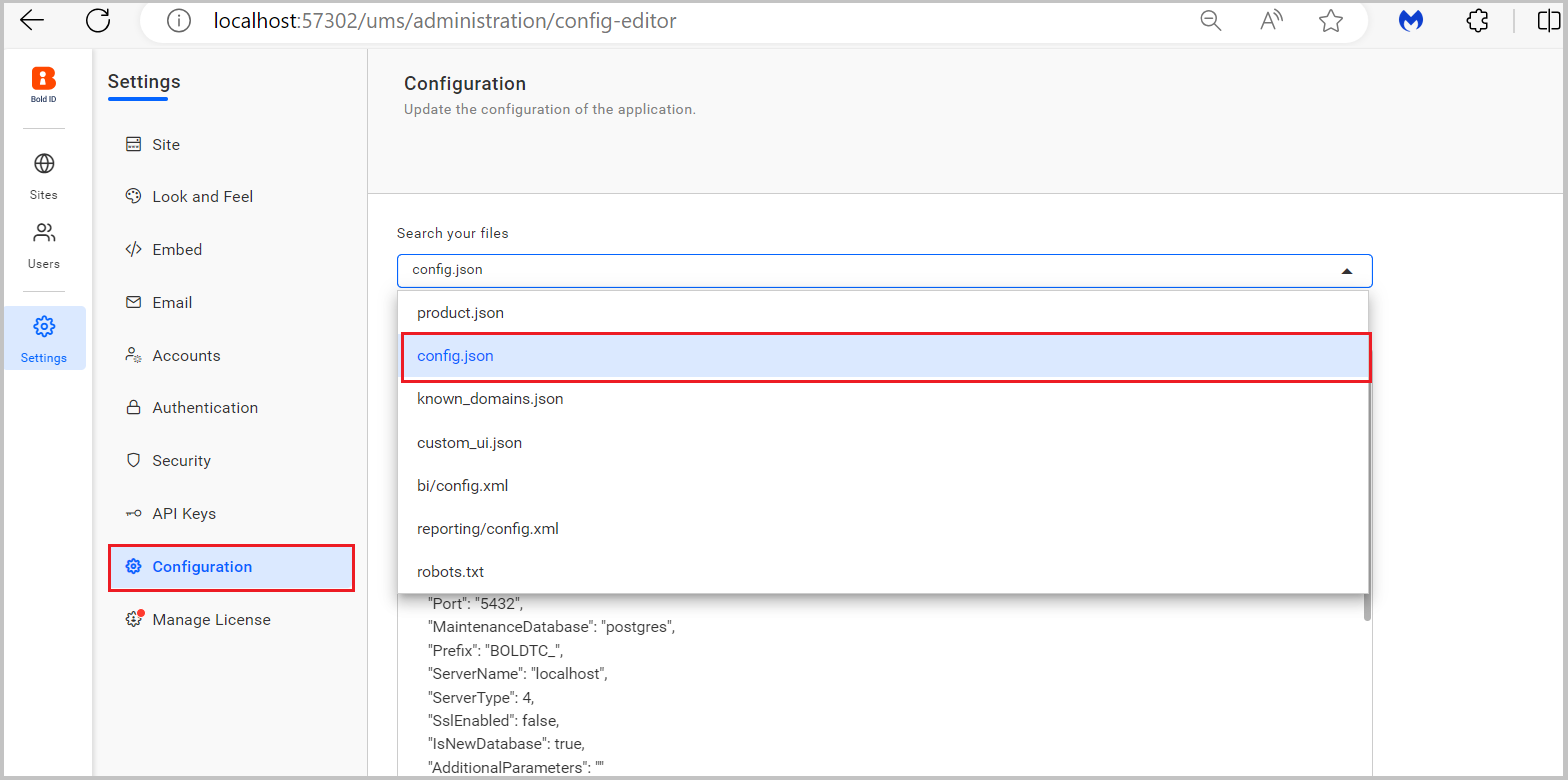
Set the value of the key Widget:BingMap:Enable to true.
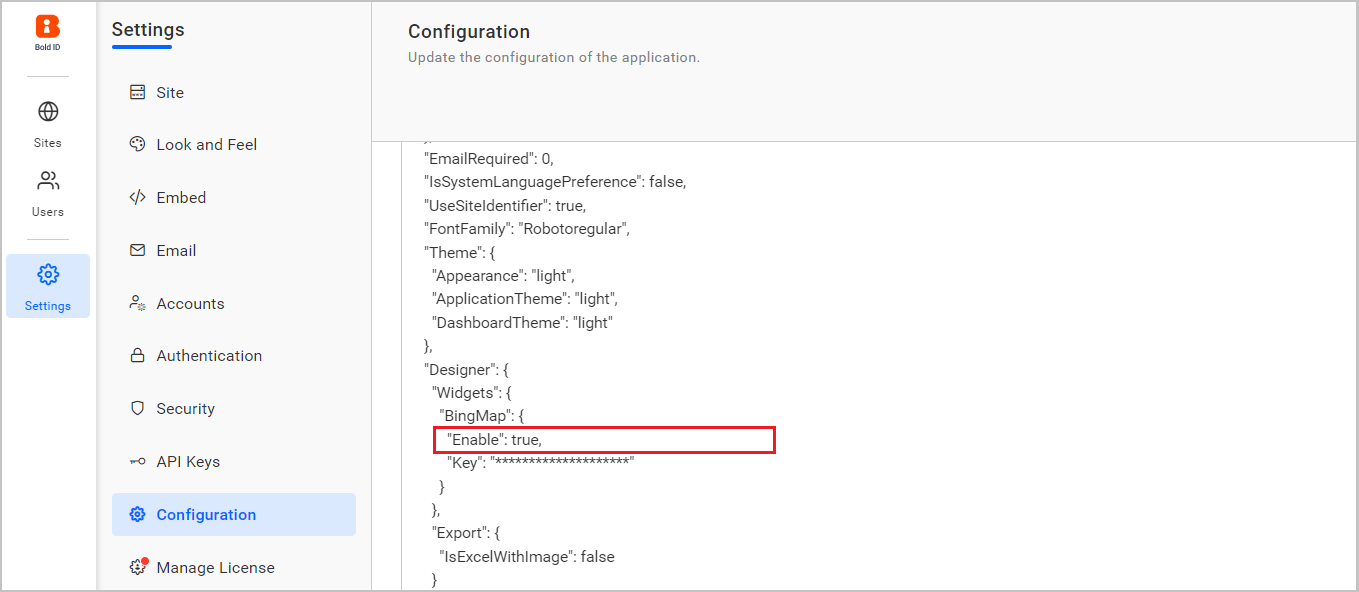
Set your Bing Maps Key in the key field in config.json.
After completing the above changes, To learn how to restart the Bold BI application.
Bold BI version 5.1.55 or later
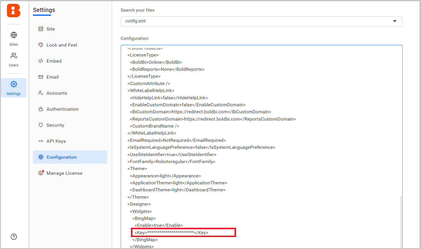
Go to the UMS Configuration Settings page and select config.xml in the “Search your files” drop-down. Use this URL: {domain_name}/ums/administration/config-editor.
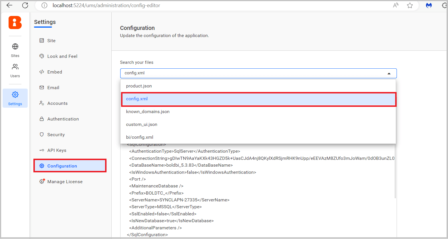
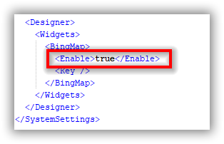
Set the value of the key <widget><BingMap><Enable> to true.
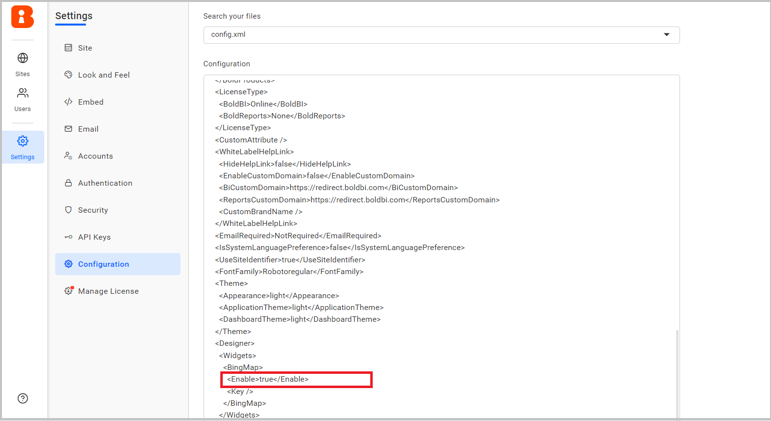
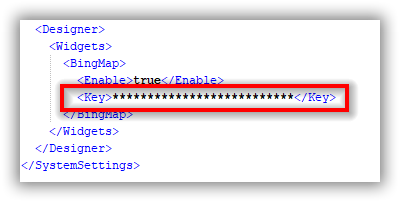
Set your Bing Maps Key in the <key> field in config.xml.
After completing the above changes, To learn how to restart the Bold BI application.
Bold BI version 4.2.68 or later
Open the mentioned file in your Server build location,
[Installed_Directory\ BoldServices\app_data\configuration\config.xml]
Set <widget><BingMap><Enable> key value as true.
Set your Bing Maps Key in the <key> field in config.xml.
Bold BI version 4.1.36 or later
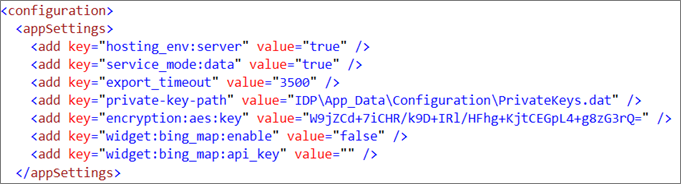
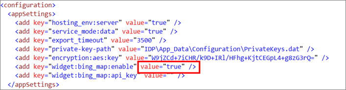
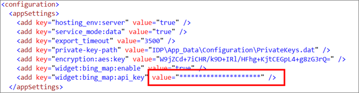
Open the below mentioned file in your Server build location,
[Installed_Directory \BoldServices\bi\dataservice\appsettings.json].
Set widget:bing_map:enable key value as true and set your Bing Maps Key in widget:bing_map:api_key in appsettings.json.
Then, launch your build and you will find Bing Maps in the design panel.
Bold BI version below 4.1.36
- Open the following file in your Server build location,
[Installed_Directory\ Bold BI\Dashboard Designer\Web.config]
- Set the value of the key
widget:bing_map:enableto true.
- Provide your Bing Maps Key.
Then, launch your build and you will find Bing Maps in the design panel.
How to configure the data table to Bing Maps widget
NOTE: Before adding the Bing Maps widget to the design layout, make sure to create the data source. Refer to this section to learn how to create a new data source.
IMPORTANT: To showcase Bing Maps, a minimum requirement of
one latitudeandone longitudefield is needed.
The following steps explain the data configuration for Bing Maps:
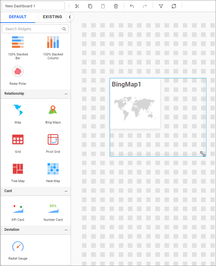
Step 1: Add a bing maps widget to the design canvas
- Drag and drop the
Bing mapscontrol icon from the toolbox into the design panel. You can find control by searching in the toolbox.
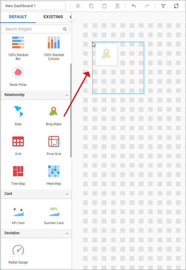
- Resize the widget as needed.
Step 2: Configuring data into the widget
- Click the
Propertiesicon in the configuration panel.
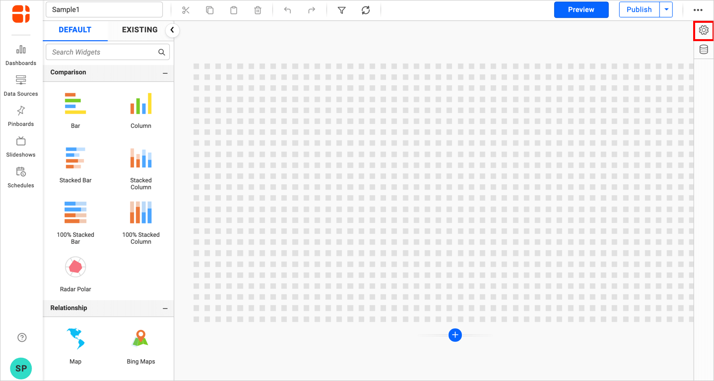
- The properties panel of the widget will be displayed. Switch to the
ASSIGN DATAtab.
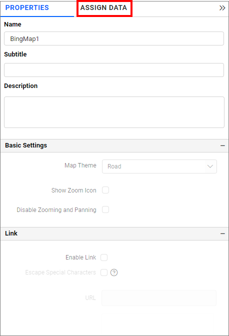
- The data tab will open, displaying available columns from the connected data source.
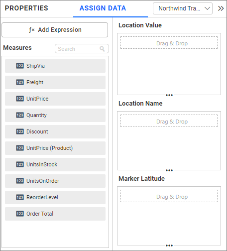
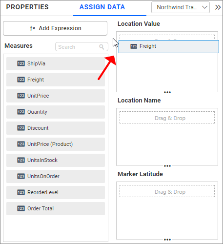
Location Value
Drag an element from the measure or dimension section.
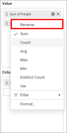
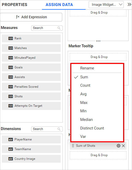
Renaming fields
Edit the configured field names using the Rename option in the settings menu.
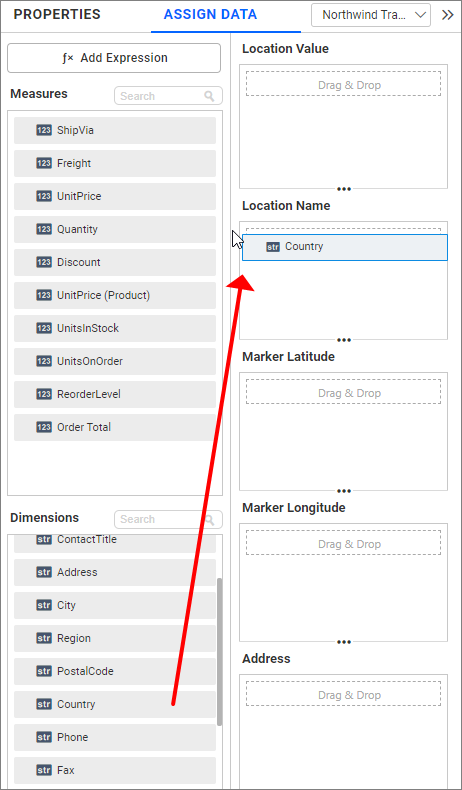
Location Name
Drag elements from the Dimension to the Location Name section.
Bing Maps will render accordingly.
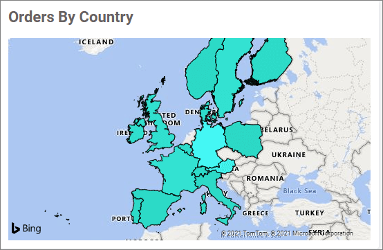
You can add more than one value to the Location Name section. An alert message will appear to enable the drill-down option.
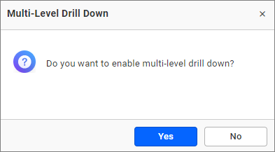
Click Yes to enable the option.
NOTE: If you click No, a single value will be added to the Location Name field(i.e. newly dropped column replace the existing one).
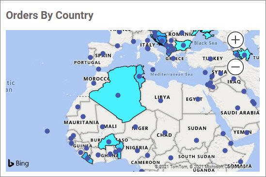
Figure: Bing-map with drilled view of the selected area.
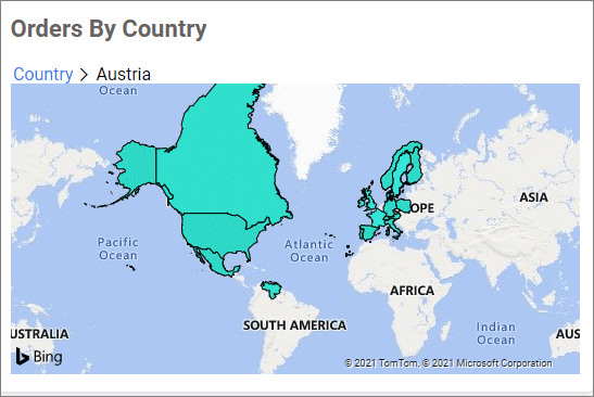
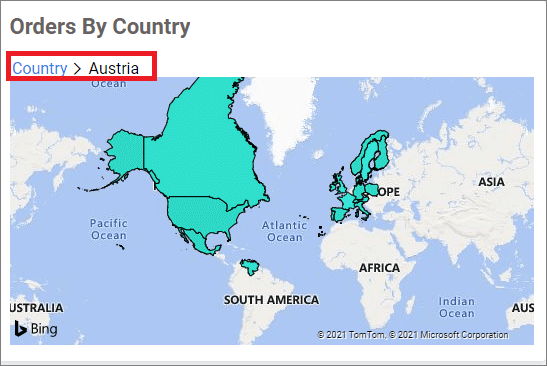
Drill up
Once you’ve drilled down, you can drill up to the previous view using the breadcrumb navigator located at the top of the widget.
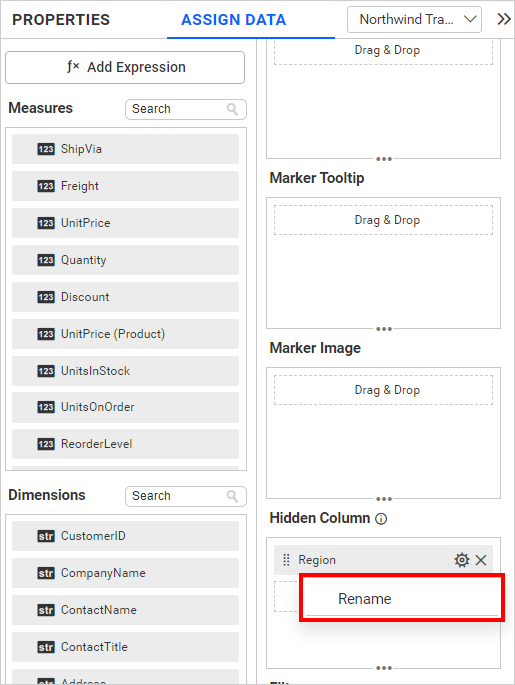
Hidden Column
Hidden columns are useful when we don’t want certain fields to participate in the visualization, but only to be used for linking, filtering and view data.
Both measure and dimension fields can be configured into the hidden column. For measure fields, all settings available for measure fields, except formatting and filtering, can be applied.
For dimension fields, only the following options are available.
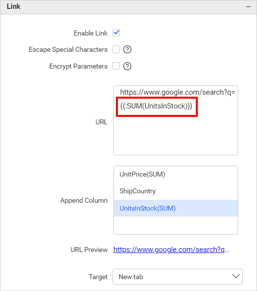
Linking
The primary use case of hidden columns is linking. When hidden columns are configured, the fields listed in the hidden columns are displayed in the linking section. By configuring a column in the linking section, we can pass the corresponding column value as a linking parameter.
Measure Based Example: If we want to pass the number of UnitsInStock as a URL parameter without impacting the visualization, we can configure UnitsInStock in the hidden columns and include it in the link.
Dimension Based Example: If we want to pass the region as a URL parameter without influencing the visualization, we can configure the region in the hidden columns and incorporate it into the link.
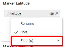
Filtering
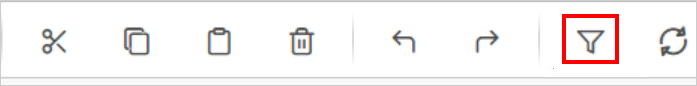
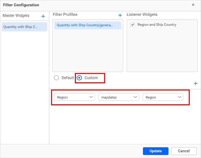
Hidden columns can also be used for filtering data in visualizations. To do this, configure hidden columns and click on the filter icon.
Click the Custom button that is highlighted in the filter configuration dialog image below. It will display a list of all the fields that have been configured in the widget. Retain the field that is configured in the hidden column and remove the other fields. Finally, click the Update button.
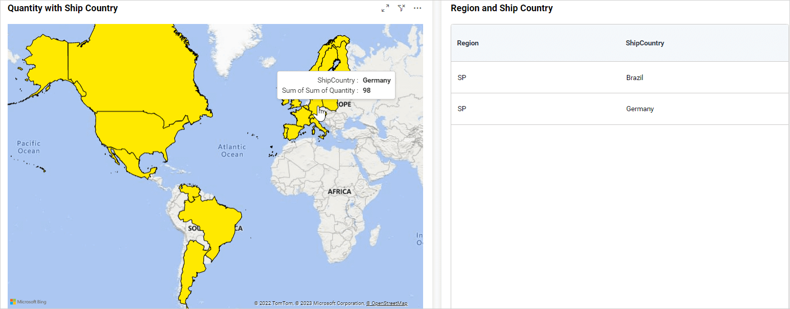
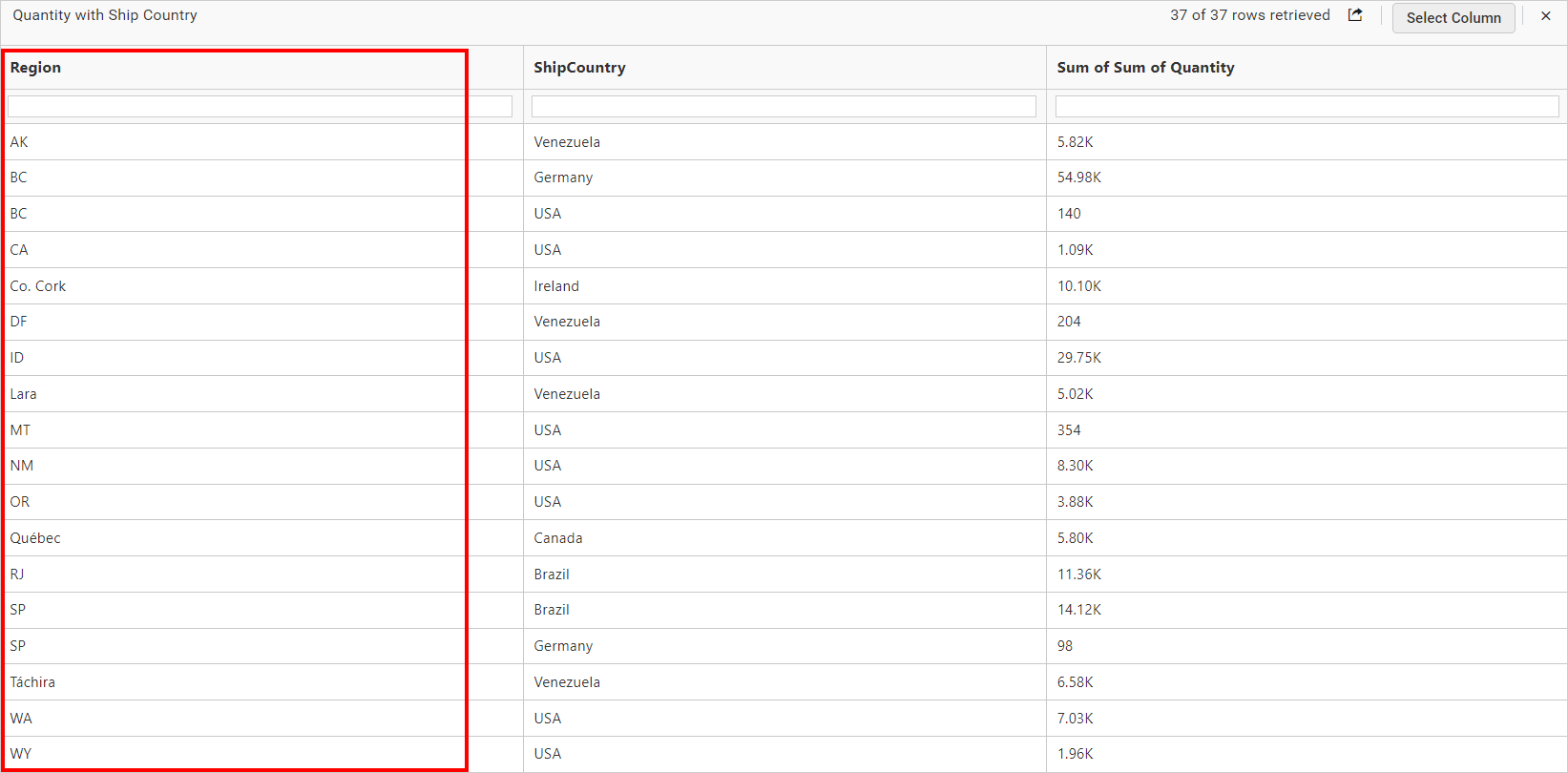
Now, we can see in the image below that the data is filtered based on the hidden column field instead of the actual column that we bound in the widget.
For more details about filtering the widget data, refer to the Cross Filter Configuration documentation.
View Data
You can view the data in the hidden columns in the underlying data view. This is useful for checking the data in more detail and can help you identify any issues with the data.
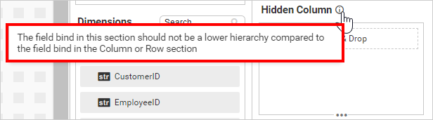
NOTE: We do not recommend configuring lower hierarchy data in hidden columns, as indicated by the info icon in the
Hidden Columnsection.
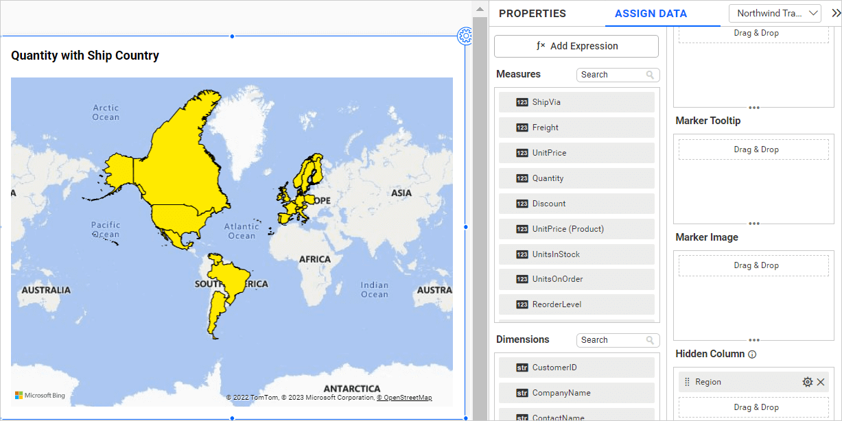
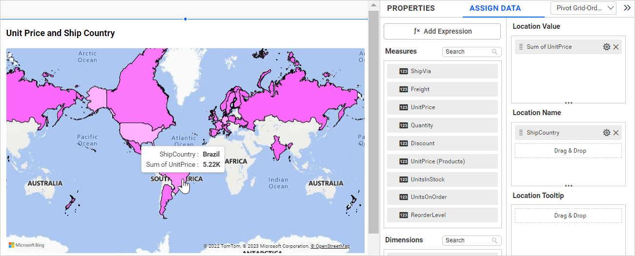
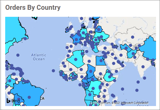
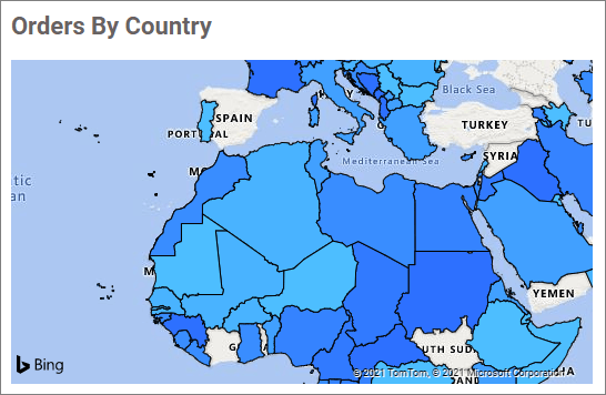
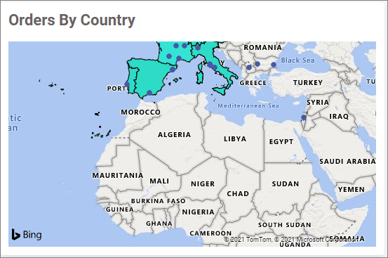
The map below displays the unit price by ship country without any hidden columns.
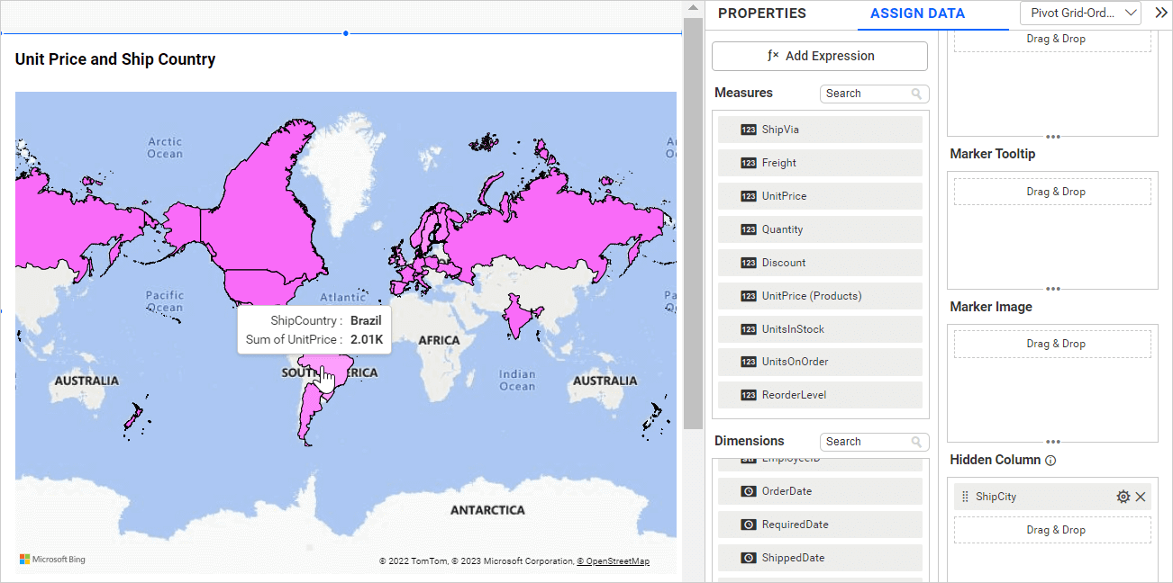
If you configure lower hierarchy data (Ship City) in hidden columns, the data in the widgets will be duplicated and incorrect data will be displayed in the tooltip, as shown in the image below.
Latitude Section
To bind a column, drag and drop the element from the sections to the Latitude section.
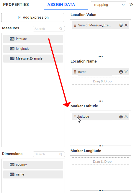
NOTE:
- The field added in this section will act as a latitude value.
Longitude Section
Drag and drop the elements from the sections to the Longitude section.
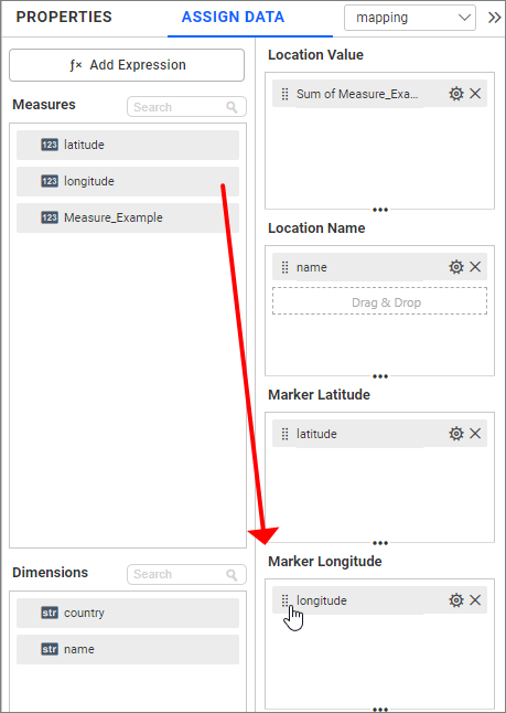
NOTE:
- The field added in this section will act as a longitude value.
Image: Bing maps widget after configuring the mandatory fields.
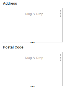
Address
Drag and drop the elements from the sections to the Address section. The field added here will act as an address value.
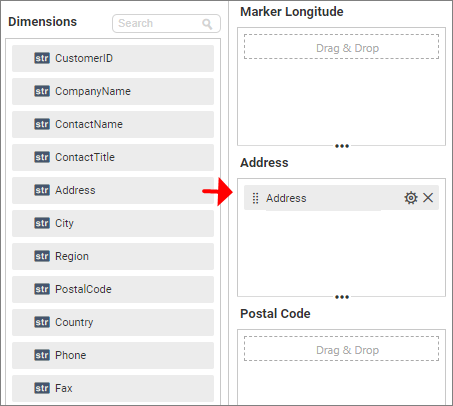
Bing maps widget, after configuring the Address fields.
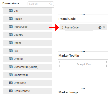
Postal Code
Drag and drop the elements from other sections to the Postal Code section. The field added here will act as a postal code.
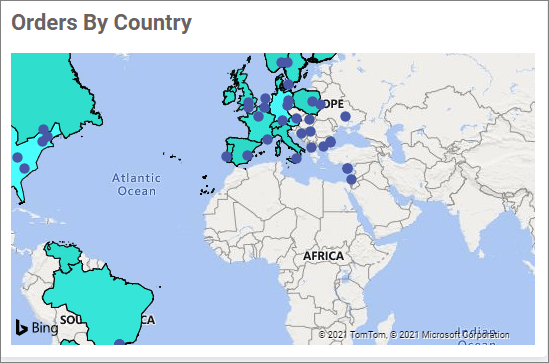
Image: Bing maps widget after configuring the Postal Code fields.
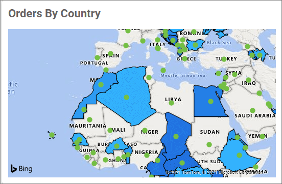
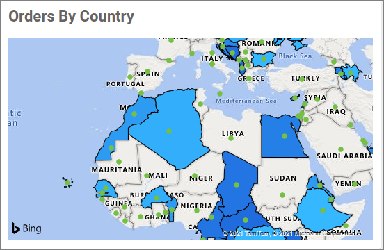
Marker Size
If you want to adjust the size of the marker based on the data, you can configure the data in the Marker Size section. You can only configure the measured field for Marker Size.
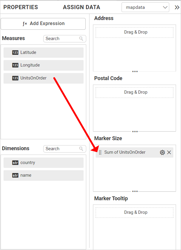
After configuring the marker size field, the Bing map will be rendered as follows.
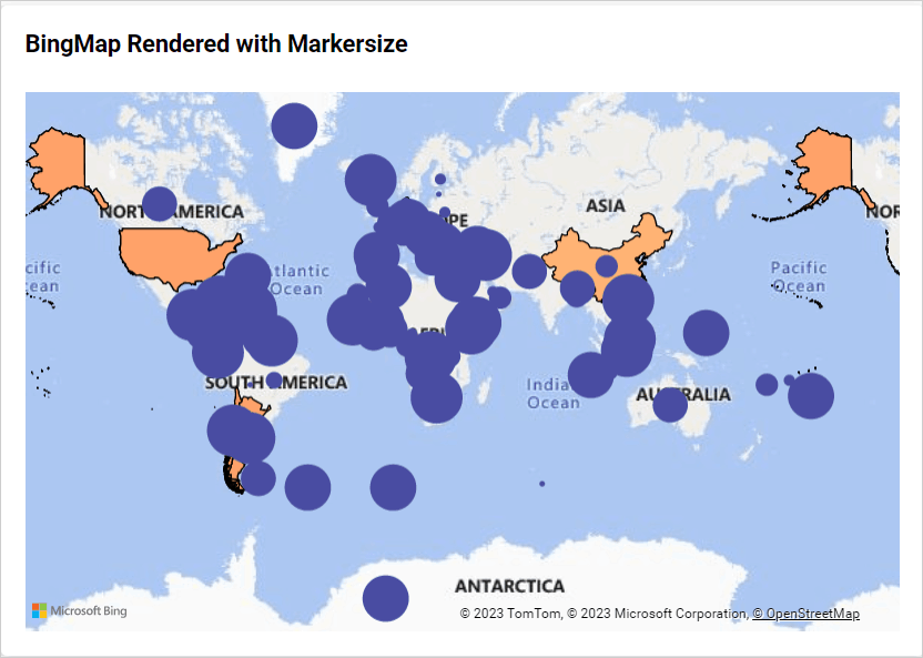
Note: After configuring the marker size, the marker size settings under the property panel will be automatically disabled.
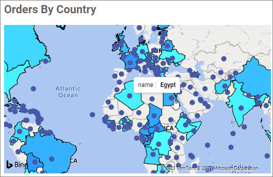
Marker Tooltip section
Drag and drop the elements from the sections to the Marker Tooltip section. This will define the marker tooltip value in the Bing maps. This section is optional.
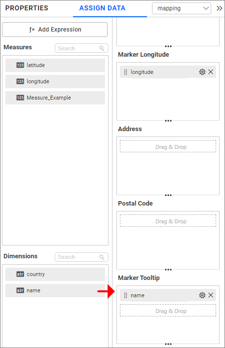
Image: Bing maps widget after configuring the market tooltip field
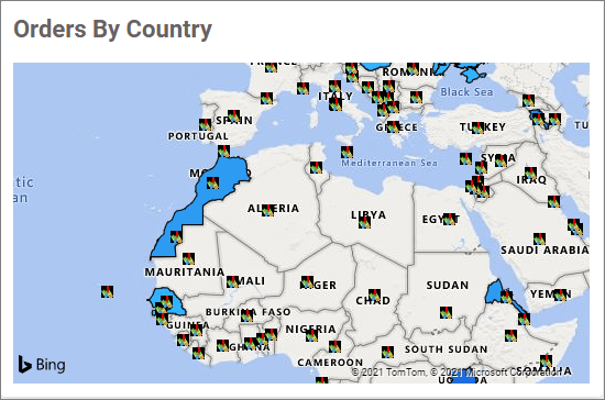
Marker Image section
Drag and drop the elements from the sections to the Marker Image section. This will define the marker in the Bing maps. This section is optional.
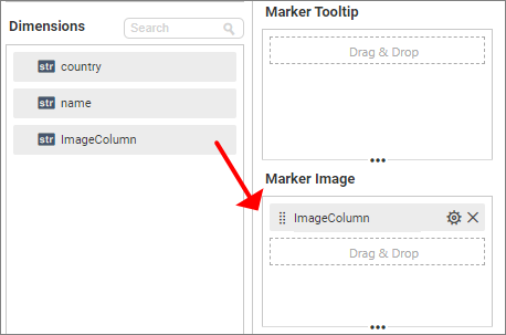
Image: Bing maps widget after configuring the marker Image field
Step 3(Optional): Settings menu options
You can filter and sort the data displayed in the widget from the settings menu options. To open the settings menu, click on the settings icon.
Filtering data
You can use Filters to change the values by selecting the Filter option. For more details, refer to Measure filter and dimension filter.
How to format Bing maps widget
You can format the Bing maps for better illustration of the view that you require using the settings available in the Properties tab.
General settings
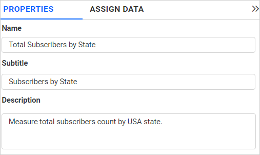
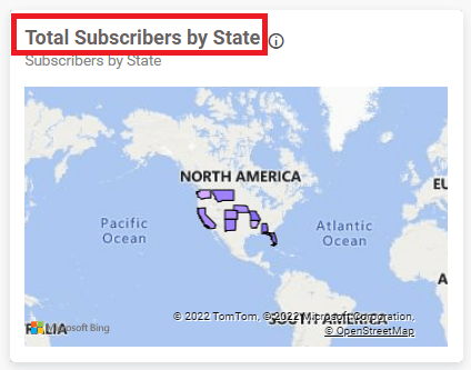
Name
This allows you to set a title for this Bing maps widget.
Subtitle
This allows you to set a subtitle for this Bing maps widget.
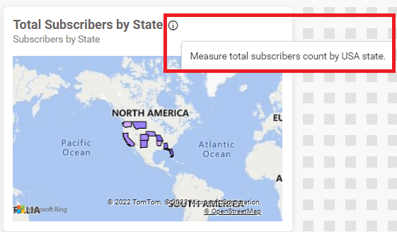
Description
This allows you to set a brief explanation about this Bing maps widget.
Basic Settings
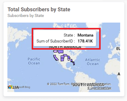
Show Tooltip
This option allows you to toggle the visibility of tooltip in Bing map.
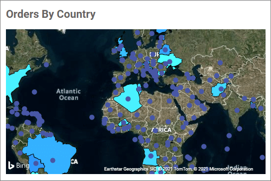
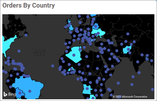
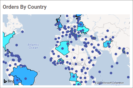
Map theme
This allows you to toggle the theme of the Bing maps.
- Road Type
- Aerial
- Canvas Dark
- Canvas Light
- Gray Scale
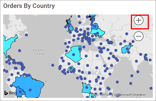
Show Zoom Icon
This option allows you to display the zooming icons in Bing Maps.
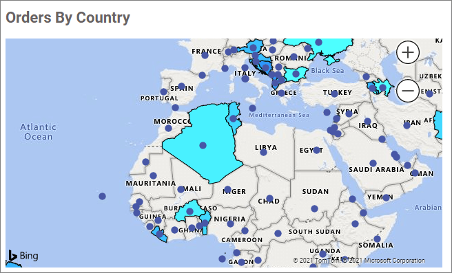
If you zoom in or out using the icons or mouse in design mode, the same zoom level will be maintained in view mode.
Zoom state in design mode.
Zoom state in view mode.
Disable Zooming and Panning
This option disables zooming and panning in maps.
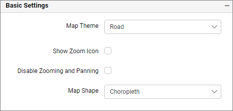
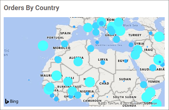
Map shape
This option allows you to toggle the map shapes of Bing Maps.
- Choropleth
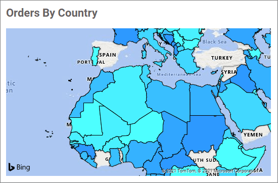
- Bubble
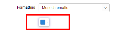
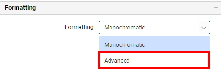
Formatting
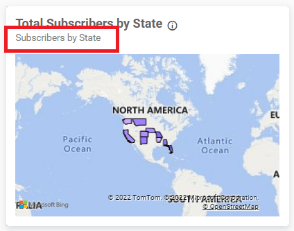
This section appears when the Location Value and Location Name fields have values.
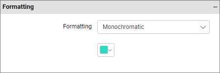
Monochromatic
You can configure a single color palette with varying saturation based on value density.
Advanced Settings
This option allows you to customize the map color using three different types: gradient, rule, or individual. By default, the window renders with the gradient type.
Enabling the Advanced option will cause the color customization window to render as follows:
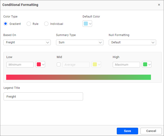
Gradient
You can select the desired measures or dimensions field using the Based On dropdown. You can change the summary type. You can edit the Low and High values and their colors. By default, the low value takes the minimum value of the map and the high value takes the maximum value of the map. The Mid can be enabled and its value and color can be changed. By default, the mid color is disabled.
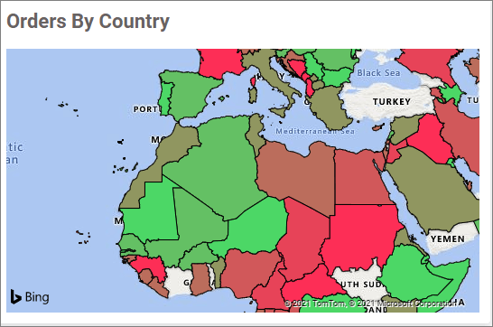
Clicking save will cause the map to render as follows:
Default color
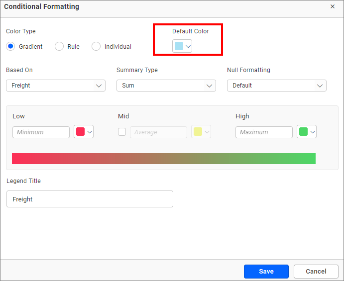
The default color will be applied for conditions not satisfied by the advanced color customization.
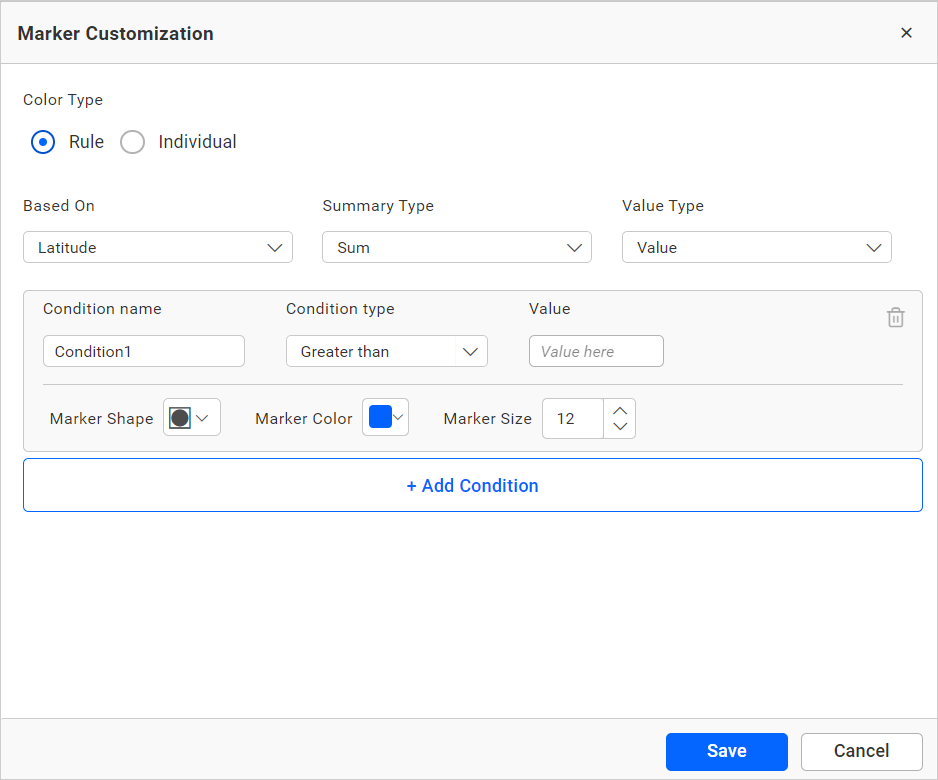
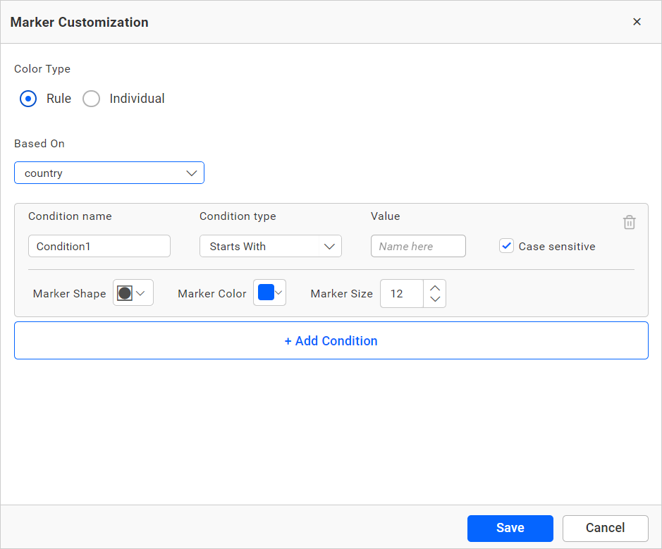
Rule
You can select the rule settings by clicking the Rule radio button. The color customization window will render as follows:
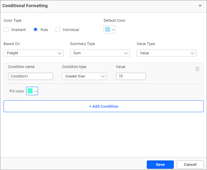
You can change the Based on field and summary type to gradient type. The Value Type can be changed to value or percentage.
You can choose a series of colors using the Fill color picker for multiple condition sets: greater than, less than, equal to, not equal to, between, not between, greater than or equal to, and less than or equal to. You can customize the legend name by providing the necessary values inside the condition name. You can also add multiple conditions.
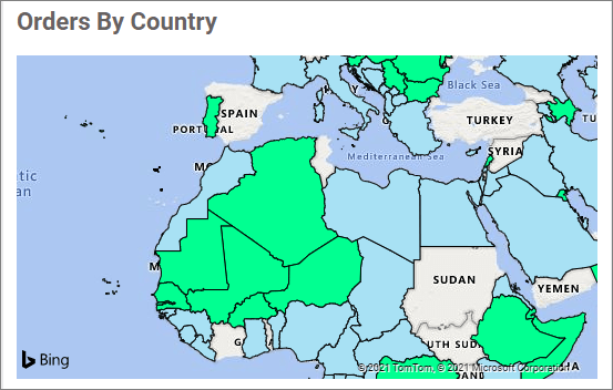
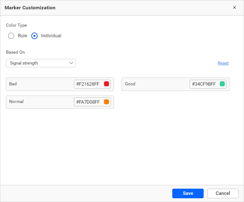
Individual
You can select the rule settings by clicking the Individual radio button. The color customization window will render like this:
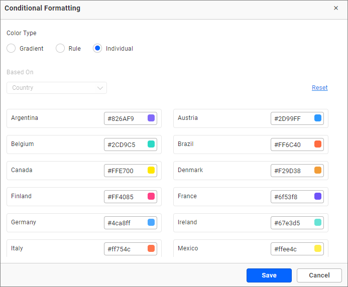
This type renders with the individual default color for each value of the map. You can change the color using the individual color pickers. If you want to reset your changes, return to the default color using the Reset button.
Save your changes by clicking Save. Now, the map will render with the changes.
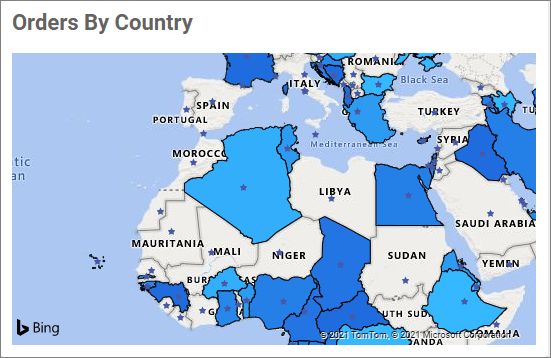
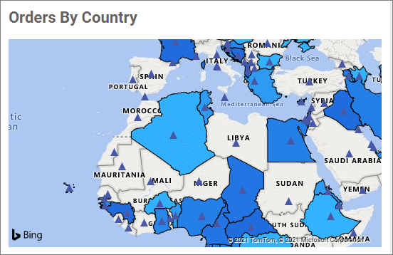
Marker Settings
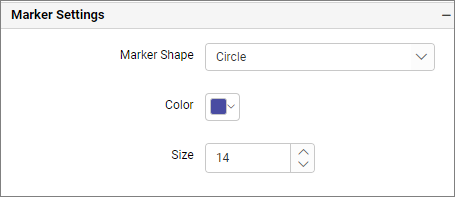
Marker Shape
This option allows you to change the marker shapes of Bing Maps.
- Circle
- Diamond

- Star
- Triangle
- Image
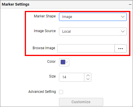
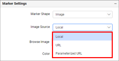
This option allows you to upload various types of images.
Image: Bing maps widget after applying the marker Image settings
Color
This option allows you to change the marker color of Bing Maps.
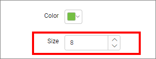
Size
This option allows you to change the marker size of Bing Maps. When configuring data into Marker Size, this property will be disabled.
Note: Marker Settings will only be visible by configuring either latitude and longitude or address and postal code.
Advanced Settings
Rule
Markers can be customized based on conditions and fields by enabling the advanced settings checkbox.
- Based on the measure field.
- Based on the dimension field.
Individual
This option allows you to customize the map marker color individually based on the selected column values.
For example, if you have three types of signal strength options in your data and you want to display marker colors based on the three types, you can select the Signal Strength column in the based selection and assign a color for each type of signal strength option.
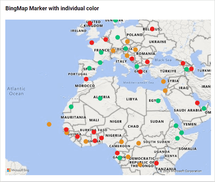
Now, the map marker color is rendered with these changes.
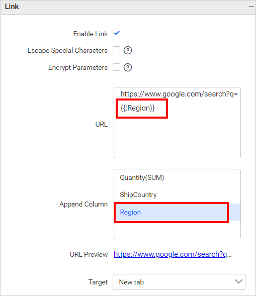
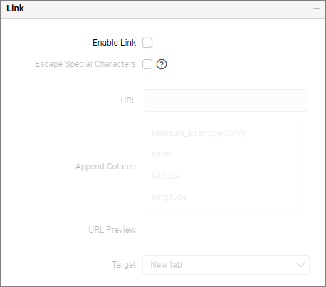
Link
You can enable linking and configure it to navigate to a general URL with or without parameters. For more details, refer to the Linking section.
To Configure Bing maps with address information
You can render the Bing maps markers based only on the address information. For that, two sections, Address and Postal Code, have been added in the field containers section as shown in the following image.
Drag and drop the required fields to the respective field containers to render the Bing maps markers. You can drag and drop either the Address field or the Postal Code field, or both.
After configuring that,
Filter
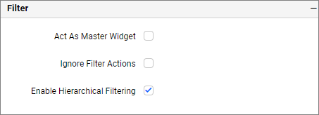
Act as master widget
This allows you to define the Bing Maps widget as a master widget, so that its filter action can be listened to by other widgets in the dashboard.
Ignore filter actions
This allows you to define this Bing Maps widget to ignore responding to the filter actions applied on other widgets in the dashboard.
Enable hierarchical filtering
Using this option, you can enable or disable hierarchical top N filtering. When applying the Top N filter with multiple dimension columns, the returned data can be customized based on whether the filtering needs to be done as flat or based on the hierarchy of dimension columns added.
When the Hierarchical Filter option is enabled, the Top N will be applied for each individual column separately based on the number set for each column.
Show Filter
This feature allows you to toggle the visibility of the Filter icon for the 100% stacked area chart widget when the Act as Master Widget option is enabled.
Container appearance
This section contains the property for bing maps container’s layout.
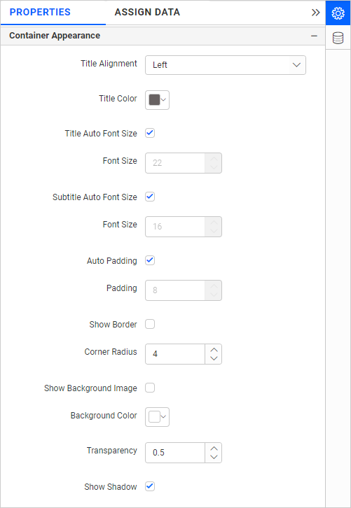
Title Alignment
This allows you to handle the alignment of the widget left, center, or right.
Title Color
This allows you to apply the text color to the widget title.
Title Auto Font Size
When Auto Font Size is enabled, the font size of the title will be adjusted automatically if the screen resolution varies.
Font Size
This allows you to apply the specified size of the font to the widget title if the Title Auto Font Size is disabled. The value can be between 10 and 44.
Subtitle Auto Font Size
When Auto Font Size is enabled, the font size of the subtitle will be adjusted automatically if the screen resolution varies.
Font Size
This allows you to apply the specified size of the font to the widget title if the Subtitle Auto Font Size is disabled. The value can be between 10 and 32.
Auto Padding
When Auto Padding is enabled, the padding of the widget container will be adjusted automatically if the size of the widget varies.
Padding
This allows you to customize the padding of the widget container if the Auto Padding is disabled. The value can be between 0 and 25.
Show Border
This allows you to toggle the visibility of the border surrounding the widget.
Corner Radius
This allows you to apply the specified radius to the widget corners if the Show Border is enabled. The value can be between 0 and 100.
Show Background Image
This allows you to set the background image for the map widget.
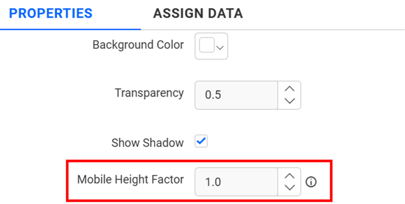
Background Color
This allows you to set the background color for the map widget.
Transparency
This property allows you to change the transparency from 0.0 to 1.0.
Show Shadow
This allows you to toggle the visibility of the shadow surrounding the widget.
Mobile Height Factor
This option allows you to resize widgets specifically for mobile view.
Container actions
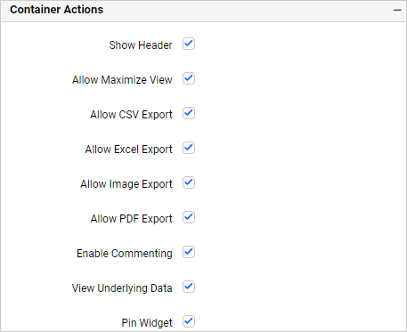
Show Header
This allows you to enable or disable the widget title of the map.
Allow Maximize View
This allows you to enable or disable the maximized mode of the map widget. The visibility of the maximize icon in the widget header will be defined based on the setting in the viewer.
Allow CSV Export
This allows you to enable or disable the CSV export option for the map widget. Enabling this allows you to export the summarized data of the widget view to CSV format in the viewer.
Allow Excel Export
This allows you to enable or disable the Excel export option for the map widget. Enabling this allows you to export the summarized data of the widget view to (.xlsx or .xls) format in the viewer.
Allow Image Export
This allows you to enable or disable the Image export option for the map widget. Enabling this allows you to export the view of the widget to image format (.jpg), (.png), or (.bmp) in the viewer.
Allow PDF Export
This allows you to enable or disable the PDF export option for the map widget. Enabling this allows you to export the view of the widget to pdf format in the viewer.
Enable Comments
This allows you to enable or disable comment for the dashboard widget. For more details, refer to the Commenting Widget.
Allow View Underlying Data
This allows you to visualize the raw data associated with a widget at runtime.
To learn more about viewing the underlying widget data, refer to the view data documentation.
Pin Widget
This allows you to pin the widget.