Configuring and Formatting Custom Widget
The Bold BI Dashboard custom widget allows you to add any user-defined widget, d3 controls, Syncfusion controls, or any JS widgets in a dashboard, and it can perform like a normal widget.
NOTE: This feature is available in On-Premises Deployment but not in Syncfusion Managed Cloud Server.
Prerequisites and knowledge required for handling custom widget authoring:
This section covers the mandatory requirements for developing the custom widget.
| Development Environment | Bold BI Enterprise Edition and any web browser as mentioned in the link |
| Knowledge Required | Basic knowledge about the HTML and JavaScript |
Creating new widget
-
Download the attached custom widget template for development.
Custom Widget Template: Template
-
Modify the settings as per the widget requirements. Refer to the following steps to configure the widget using the configuration file (
widgetconfig.json).
Configuring widget using manifest file
-
You can configure the widget using the manifest file.
-
The manifest file is used to specify the widget’s configuration. This file must be placed in the custom widgets root directory with the name
widgetconfig.json. -
Custom widgets can be configured using the following settings. Refer to the structure of
widgetconfig.json.{ "widgetName" : "Name of the widget.", "displayName" : "Display name of the widget to be displayed in designer toolbox.", "guid": "Unique GUID for the widget.", "category" : "Category in which the widget should be displayed in the designer.", "description" : "Description of the widget.", "srcFile" : "Path of the source file through which widget can be embedded to dashboard", "dependencies" : "Specify the dependency scripts and CSS files to be referred for the widget", "dataFields" : " Specifies the widget fields required for binding data from a datasource. Each field can be bound to single or multiple measure/dimension fields in a data source. When dataFields is not specified, this widget acts as a non-data bound widget. ", "filterSettings": "Filter settings are used to configure whether the widget can take part in filter interactions between the widgets." }NOTE: In the above code, guid must be unique. So, it should be updated whenever a new custom widget template is downloaded. For example guid: “74926583-8493-3333-6382-863428678492”
Setting name for the widget
Name for the widget can be set and specified through the widgetName API.
Format
widgetName: “name of widget”
Example
widgetName: “sunburst”
Rules
- It is a mandatory field for the widget.
- It should not contain any special characters or wide spaces.
Setting display name for the widget
The display name for the widget in the designer toolbar can be set through the displayName API.
Format
displayName: “display name of the widget in designer toolbar”
Example
displayName: “Sunburst Chart”
Rules
- It can contain special characters and wide spaces.
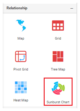
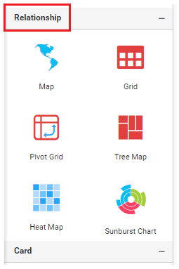
Setting category for the widget
This allows you to specify the category in which the widget should be displayed.
Format
category: “name of the category in which the widget should be displayed”
Example
category: “Relationship”
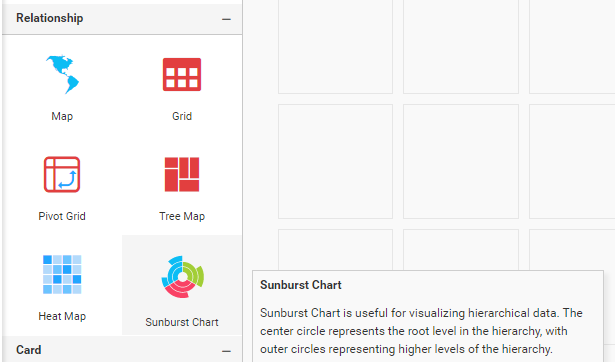
Setting description for the widget
You can describe the widget. The following message will be shown when hovering over the widget icon in the expander toolbox of the designer.
Format
description: “description about the widget”
Example
description: “Sunburst Chart is used to visualize the hierarchical data. The center circle represents the root level of the hierarchy and outer circles represents higher levels of the hierarchy.”
Setting source file location
The source file location should be specified here. Refer to the use of the source file in its module.
Format
srcFile: “location of the source file”
Example
srcFile: src/sunburst.js
Rules
- It is a mandatory field for the widget.
Setting GUID for the widget
The GUID is used to set a unique identification for the custom widget, and it can be set through the guid API.
Format
guid: “used for unique identify the widget”
Example
guid: “74926583-8493-3333-6382-863428678492”
Rules:
- It is a mandatory API for the widget.
- Should satisfy the GUID format.
Setting dependency files for the widget
Dependency script and CSS files that need to be referred for the widget should be specified in the dependencies section.
Format
"dependencies": {
    "scripts": [
      "src/dependency1.js",
      "src/ dependency2.js",
      ….
      ….
    ],
    "styles": [
      "style/ dependency1.css",
      " style / dependency2.css",
      ….
      ….
    ]
  }
Example
"dependencies": {
    "scripts": [
      "src/ej.sunburstchart.js",
      "src/ej.helper.js"
    ],
    "styles": [
      "style/ej.sunburstchart.css"
    ]
  }
Rules
- It is not the mandatory API for the widget.
- Files should be specified in the correct order.
Limitation
The jQuery reference (jquery-1.10.2.min.js) will be added as a built-in reference for the custom widget, so you are not allowed to specify the jQuery files in dependencies.
Specifying data fields
This allows you to specify the data fields with their types for custom widgets. There are three types of data fields available, listed as follows:
Measure data field
In the measure data field, a numeric value column can be configured.
Dimension data field
In the dimension data field, a string, boolean, and date value column can be configured.
Dimensionormeasure data field
In the dimension or measure data field, both the measure and dimension value columns can be configured. In this data field, the default summary type for the measure value column is none.
dataFields:[
{
"displayName" : "display name of the data field1",
"valueType" : "type of the data field1, can be measure, dimension or dimensionormeasure",
"name" :  "name of the data field1",
"min" : "minimum number of block which has to be dropped for the datafield1",
"max" : "maximum number of block can be dropped for the datafield2",
"optional" : "specify whether it is mandatory data field"
},
{
"displayName" : " display name of the data field2",
"valueType" :" type of the data field2, can be measure, dimension or dimensionormeasure" ,
"name" : " name of the data field2",
"min" : "minimum number of block which has to be dropped for the datafield2",
"max": "maximum number of block can be dropped for the datafield2",
"optional" : "specify whether it is mandatory data field"
}
]
Example
dataFields:[
{
"displayName" : "Value",
"valueType" : "measure",
"name" :  "Value",
"min" : 1,
"max" : 1,
"optional" :false
},
{
"displayName" : "Levels",
"valueType" : "dimension",
"name" : "Levels",
"min" : 1,
"max":4,
"optional" : false
}]
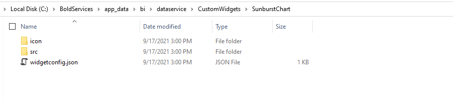
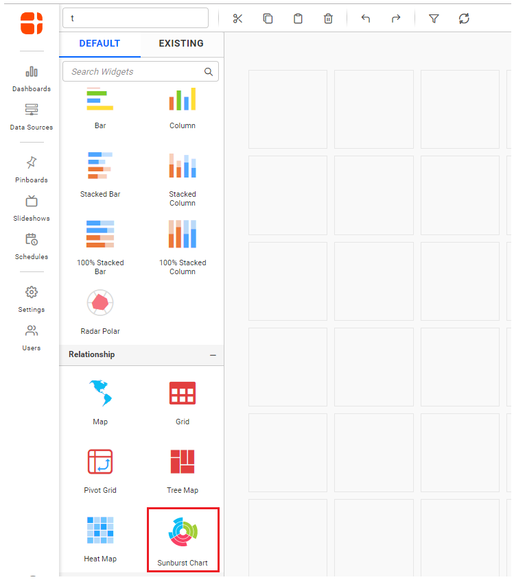
Importing widget in designer
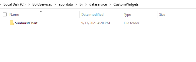
After installing the Bold BI Enterprise build, you need to place the custom widgets as mentioned in the location below. Once the browser is refreshed, the widgets will appear in the Dashboard Designer as shown in the image below.
| Environment | Location |
|---|---|
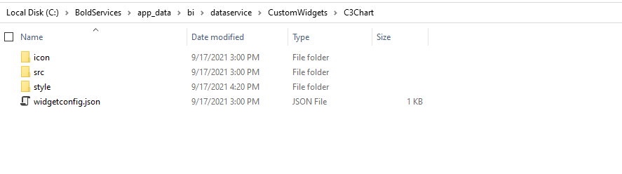
| Windows | Place the Custom widgets in "C:\BoldServices\app_data\bi\dataservice\CustomWidgets" location. |
| Linux | Place the Custom widgets in “var/www/bold-services/application/app_data/bi/dataservice/CustomWidgets” location. |
Debugging the widget through Designer
You can debug the custom widget by dragging and dropping it onto the design canvas after placing debugger in src/sourcefile.js. Now you can debug the widget in the following cases:
Init method
The widget can be initialized through the init method, which will be called initially when the widget is dragged and dropped onto the design canvas with all the widget configuration details but without data.
Update method
Once your widget is initialized through the init method, the update method will be called for widget updates such as data updates, widget resizing, etc.
Rendering widget through the source file
The source file is used to embed the user-defined widget within the dashboard. Refer to the API available in the source file below.
#Format
bbicustom.dashboard.registerWidget(
{

	guid : `Specifies the GUID used in widgetconfig.json`,

	widgetName : `Specifies the name of the widget used in widgetconfig.json`,

	init : function () {
 	/* init method will be called when the widget is initialized. */
	},

	update : function (option) {
		update method will be called when any update needs to be performed in the widget. */
		if (option.type == "resize") {
 		/* update type will be 'resize' if the widget is being resized. */
		}
		else if (option.type == "refresh") {
 		/* update type will be 'refresh' when the data is refreshed. */
		}
	}
});
#Example
bbicustom.dashboard.registerWidget(
         {

guid : "b0d5348d-f625-4b78-8db9-c5ed9d38eb45",

widgetName : "SunburstChart",

init : function () {
var widget =  document.createElement("div").setAttribute("id", this.element.getAttribute("id") + "_widget");
widget.innerHTML = "Widget is created successfully";
this.element.appendChild(widget);
},

update : function (option) {

var widget = document.getElementById(this.element.getAttribute("id") + "_widget");
if(option.type == "resize") {
 widget.innerHtml = "Widget is resized."
}
else if (option.type == "refresh") {
 	widget.innerHtml = "Widget data need to be refreshed."
}
}
   }
);
The following information will be available in this scope.
| Syntax | Uses |
|---|---|
| this.element | this.element Container div element in which the custom widget should be embedded. |
| this.model.dataSource | Holds the datasource for the custom widget in JSON format |
| this.model.boundColumns
|
Holds the information about the bounded column to the control.
|
Samples
Adding Syncfusion ejSunburstChart as custom widget
Follow the steps below to add the Sunburst Chart as a custom widget for the dashboard.
Step 1: Download the below attached custom widget template for developing.
Custom Widget Template : Template
Step 2: Configure the widget through the widgetconfig.json file.
-
description- You can provide a description about the Sunburst chart. -
srcFile- Path of the source file required for the Sunburst Chart. -
dependencies- Specify dependency script and CSS files in the dependencies section. -
ej.sunburstchart.jsdependency file can be downloaded from the Custom Script Generator."description": "Sunburst Chart is useful for visualizing hierarchical data.", "srcFile": "src/sunburst.js", "dependencies": {"scripts": [ "src/ej.sunburstchart.js"] }, -
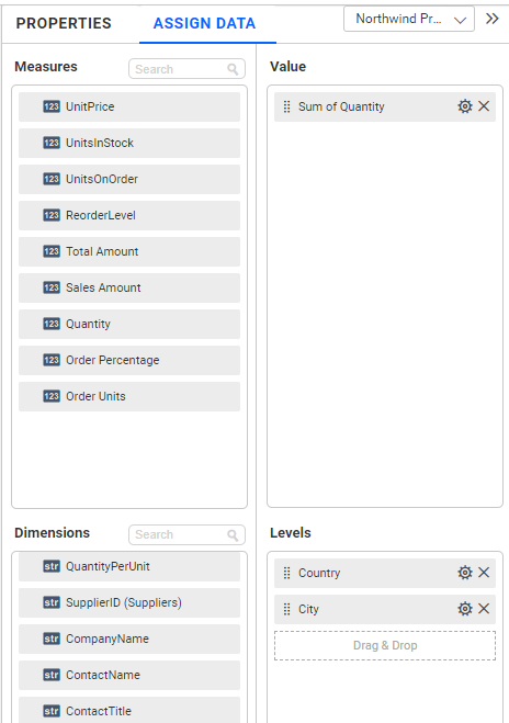
Since the Sunburst Chart requires two data fields, configure Values and Levels as shown below.
"dataFields": [ { "displayName": "Value", "valueType": "measure", "name": "Value", "min": 1, "max": 1, "optional": false }, { "displayName": "Levels", "valueType": "dimension", "name": "Levels", "min": 1, "max": 4, "optional": false } ], -
After configuring the widgets, place the custom widget folder as mentioned in the link.
-
Then, configure the widget with the necessary data.
-
Place the debugger in
SunburstChart/src/sunburst.js, and then you can start rendering the sunburst through the init method in the source file.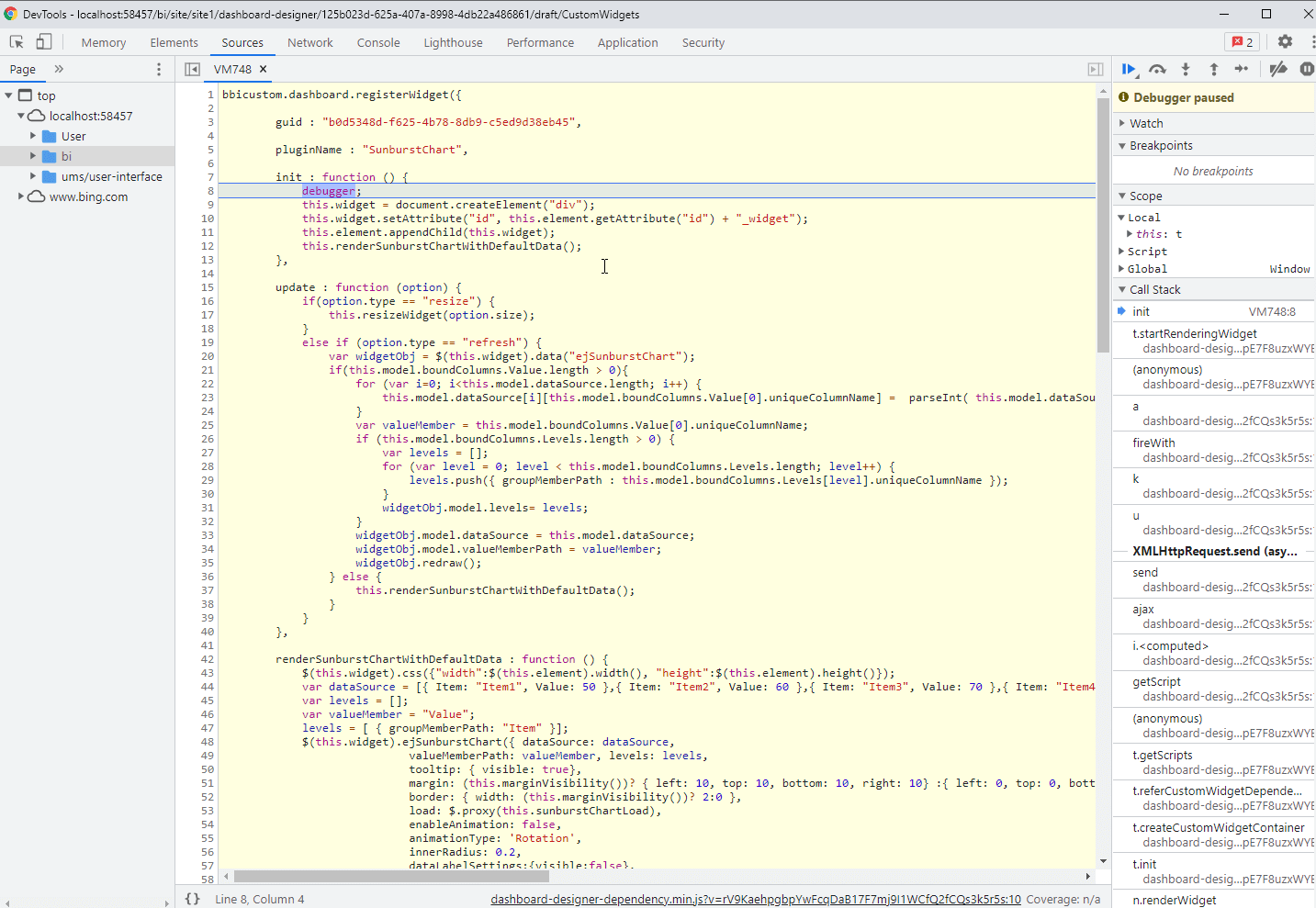
-
this.element is the container (div) provided to render the actual widget.
-
So, we are creating our sunburst chart in this.element by using the data in this.model.datasource .
-
In renderSunburstChartWidthDefaultData(), we are creating a new space (div) to render our sunburst chart custom widget with default data and appending it into the container, as shown in the code.
renderSunburstChartWidthDefaultData : function () { this.widget = document.createElement("div"); this.widget.setAttribute("id", this.element.getAttribute("id") + "_widget"); this.element.appendChild(this.widget); } -
The width and height of the widget are assigned from the container’s width and height, respectively.
$(this.widget).css({"width":$(this.element).width(), "height":$(this.element).height()}); -
Configure the datasource with some default values for the initial rendering of the Sunburst Chart. groupMemberPath and levels are the APIs of ejSunburstChart where we have to configure the uniqueColumnName of the columns that we bind in the levels section.
var dataSource = [{ Item: "Item1", Value: 50 },{ Item: "Item2", Value: 60 },{ Item: "Item3", Value: 70 },{ Item: "Item4", Value: 80 },{ Item: "Item5", Value: 90 },{ Item: "Item6", Value: 90 },{ Item: "Item7", Value: 90 },{ Item: "Item8", Value: 90 },{ Item: "Item9", Value: 90 },{ Item: "Item10", Value: 90 },{ Item: "Item11", Value: 90 }]; var levels = []; var valueMember = "Value"; levels = [ { groupMemberPath: "Item" }]; -
A sunburst chart is created by configuring the necessary APIs and assigning the values.
$(this.widget).ejSunburstChart({ dataSource: dataSource, valueMemberPath: valueMember, levels: levels, tooltip: { visible: true}, margin: (this.marginVisibility())? { left: 10, top: 10, bottom: 10, right: 10} :{ left: 0, top: 0, bottom: 0, right: 0} , border: { width: (this.marginVisibility())? 2:0 }, load: $.proxy(this.sunburstChartLoad), enableAnimation: false, animationType: 'Rotation', innerRadius: 0.2, dataLabelSettings:{visible:false}, size: { height: $(this.element).height(), width: $(this.element).width()}, legend: { visible: (this.legendVisibility()) , position: this.legendPosition() }, highlightSettings: {enable: true}, selectionSettings: {enable: true, mode : "parent"} }); -
The update method will be triggered for the following operations. We are performing the operations based on the update type (resize, refresh) by invoking the respective API of the widget.
-
Resize
-
Refresh
update : function (option) { if(option.type == "resize") { this.resizeWidget(option.size); } else if (option.type == "refresh") { var widgetObj = $(this.widget).data("ejSunburstChart"); if(this.model.boundColumns.Value.length > 0){ for (var i=0; i<this.model.dataSource.length; i++) { this.model.dataSource[i][this.model.boundColumns.Value[0].uniqueColumnName] = parseInt( this.model.dataSource[i][this.model.boundColumns.Value[0].uniqueColumnName]); } var valueMember = this.model.boundColumns.Value[0].uniqueColumnName; if (this.model.boundColumns.Levels.length > 0) { var levels = []; for (var level = 0; level < this.model.boundColumns.Levels.length; level++) { levels.push({ groupMemberPath : this.model.boundColumns.Levels[level].uniqueColumnName }); } widgetObj.model.levels= levels; } widgetObj.model.dataSource = this.model.dataSource; widgetObj.model.valueMemberPath = valueMember; widgetObj.redraw(); } else { this.renderSunburstChartWithDefaultData(); } } } -
-
For ejSunburstChart related API references, please refer to the ejSunburstChart.
-
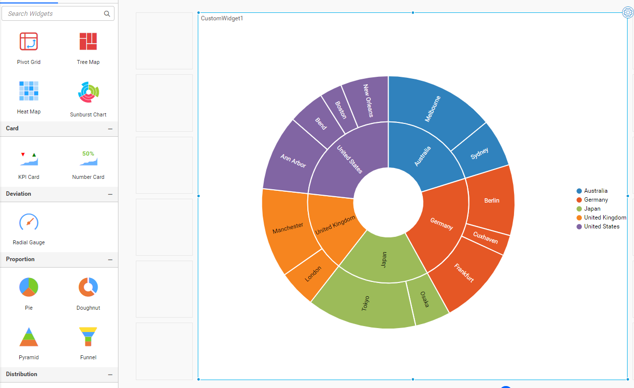
The Sunburst widget will be rendered as follows:
Configuring custom widget for interaction
The custom widget can participate in filter interactions like built-in widgets. Use the following APIs to facilitate communication between the widgets.
Format
var selectedColumnsFilter = [];
var filterColumn = new bbicustom.dashboard.selectedColumnInfo();
filterColumn.condition = "condition";
filterColumn.uniqueColumnName = "unique column name";
filterColumn.values =["value1", "value2", "value3"…] ;
selectedColumnsFilter.push(filterColumn);
bbicustom.dashboard.filterData(this, selectedColumnsFilter); /* selectedColumnsFilter is the list of selected column and its value send from custom widget for interaction. */
Various types of column
-
Dimension type column
Values in the dimension column will be in a string, date format, or boolean format.
-
Measure type column
Values in the measure column will be in number format.
Dimension type column
Various conditions are available for the dimension column other than the DateTime data type:
- include
- exclude
- startswith
- endswith
- contains
- notcontains
Example
The following code will filter the dimension value “India” and “China” in the other widgets
var selectedFilterInfos = [];
var filterinfo = new bbicustom.dashboard.selectedColumnInfo();
filterinfo.condition = "include";
filterinfo.values = ["india","china"];
filterColumn.uniqueColumnName = "unique column name";
selectedFilterInfos.push(filterinfo);
bbicustom.dashboard.filterData(that, selectedFilterInfos);
NOTE: In the code sample above, pass the unique column name of a specific column from the variable
this.model.boundColumnsto filter the data in the other widgets. In this variable, all the bound or configured data fields will be available with their bound value column name and unique column name.
Various conditions are available for the dimension column with the DateTime data type:
- range
- include
- exclude
The following code is an example of filtering the data within a specified date range in the other widgets.
var selectedFilterInfos = [];
var filterinfo = new bbicustom.dashboard.selectedColumnInfo();
filterinfo.condition = "range";
filterinfo.values =["1996", "1998"] ;
filterinfo.uniqueColumnName = "unique column name";
selectedFilterInfos.push(filterinfo);
bbicustom.dashboard.filterData(this, selectedFilterInfos);
Measure type column
To apply the filter based on the measure, the value type should be dimension or measure for the data field, and the summary type of the measure should be set as none. Various condition types are available for the measure type column as follows:
- equals
- notequals
- lessthan
- greaterthan
- lessthanorequals
- greaterthanorequals
- isbetween
- isnotbetween
The following code is an example of filtering other widgets based on the measure value:
var selectedFilterInfos = [];
var filterinfo = new bbicustom.dashboard.selectedColumnInfo();
filterinfo.condition = "greaterthan";
filterinfo.uniqueColumnName = this.model.boundColumns.Value[0].uniqueColumnName;
filterinfo.values =[100] ;
selectedFilterInfos.push(filterinfo);
bbicustom.dashboard.filterData(this, selectedFilterInfos);
The following code is an example of filtering the value between 10248 and 10251 in other widgets:
var selectedFilterInfos = [];
var filterinfo = new bbicustom.dashboard.selectedColumnInfo();
filterinfo.condition = "isbetween";
filterinfo.uniqueColumnName = "unique column name";
filterinfo.values =[10248,10251] ;
selectedFilterInfos.push(filterinfo);
bbicustom.dashboard.filterData(this, selectedFilterInfos);
Adding C3 chart as a custom widget
Here we are creating a C3 Chart using the D3 Library.
Note: The C3 Chart is open-source and is under the MIT license.
Follow these steps to add the third-party widget (C3 Chart) as a custom widget for the dashboard:
-
Refer to this link to create a new custom widget files.
-
Configure the widget using the
widgetconfig.jsonfile. -
As a C3 Chart requires two data fields, we have configured columns and values as shown below, and the properties section contains the properties related to the C3 Chart. Refer to this link for configuring the
widgetconfig.json."widgetName": "C3Chart", "displayName": "C3 Chart", "guid": "b0d5348d-f625-4b78-8db9-c5ed9d38eb45", "category": "Comparison", "description": "Compare values for a set of unordered items across categories", "srcFile": "src/sourcefile.js", "dependencies": { "scripts": [ "src/d3.js", "src/c3.js" ] }, "dataFields": [ { "displayName": "Value", "valueType": "measure", "name": "Value", "min": 1, "max": 1, "optional": false }, { "displayName": "Column", "valueType": "dimension", "name": "Column", "min": 1, "max": 1, "optional": false } ], "functionalities": [ { "header": "Basic Settings", "properties": [ { "displayName": "Show Tooltip", "controlType": "bool", "name": "showTooltip", "defaultValue": "true" }, { "displayName": "Show Label", "controlType": "bool", "name": "showLabel", "defaultValue": "true" }, { "displayName": "Color", "controlType": "color", "name": "barColor", "defaultValue": "#2196F3" } ] }, ], "filterSettings": { "masterFilter": { "visible": true, "defaultValue": true }, "ignoreMasterFilter": { "visible": true, "defaultValue": false } } -
The d3.js dependency file can be downloaded from the D3 website.
-
The c3.js dependency file can be downloaded from the C3 website.
-
import the custom widget into the designer.
-
Then, configure the widget with the necessary data.
-
You can debug the custom widget by dragging and dropping it into the design canvas after placing the ‘debugger’ in
src/sourcefile.js. -
this.element is the container (div) provided to render our actual widget.
-
So, we are creating our C3 Chart in this.element by using the data in this.model.dataSource.
-
In Init(), we are creating a new space (div) for rendering our C3 Chart custom widget and appending it into the container as you can see in the following code.
-
The width and height of the widget are assigned from the container’s width and height, respectively.
init: function () { /* init method will be called when the widget is initialized */ this.widget = document.createElement("div"); this.widget.setAttribute('id', 'chart'); var width = document.getElementById('container').style.width; var height = document.getElementById('container').style.height; this.element.appendChild(this.widget); var that = this; -
Configure the datasource with some default values for initial rendering of C3 Chart.
var columns =[]; columns =[{column:'Item1',values: '50'},{column:'Item2',values: '20'},{column:'Item3',values: '30'}]; -
The
this.model.boundColumns.Valueandthis.model.boundColumns.lengthcontain the columns bound in the columns and values, respectively. By checking the following condition, we can determine whether the widget is configured with columns or not. -
Converting the datasource structure required by C3 Chart.
if (this.model.boundColumns.Value.length > zero) { for (var i = 0; i < this.model.dataSource.length; i++) { columns.push({column: this.model.dataSource[i][this.model.boundColumns.Column[0].uniqueColumnName], values: this.model.dataSource[i][this.model.boundColumns.Value[0].uniqueColumnName]}); } } -
To display the C3 Chart, set up the necessary APIs and assign the data to it.
var chart = c3.generate({ data: { type: 'bar', json: columns, keys: { x: 'column', value: ['values'] }, labels: true, selection: { enabled: true, multiple: false, draggable: true }, onclick: function(d) { that.selectionChange(d) }, }, axis: { x: { type: 'category' } }, grid: { x: {show: false}, y: {show: true} }, bar: { width: { ratio: 0.5 } }, interaction: {enabled: true} }); this.widget = chart; -
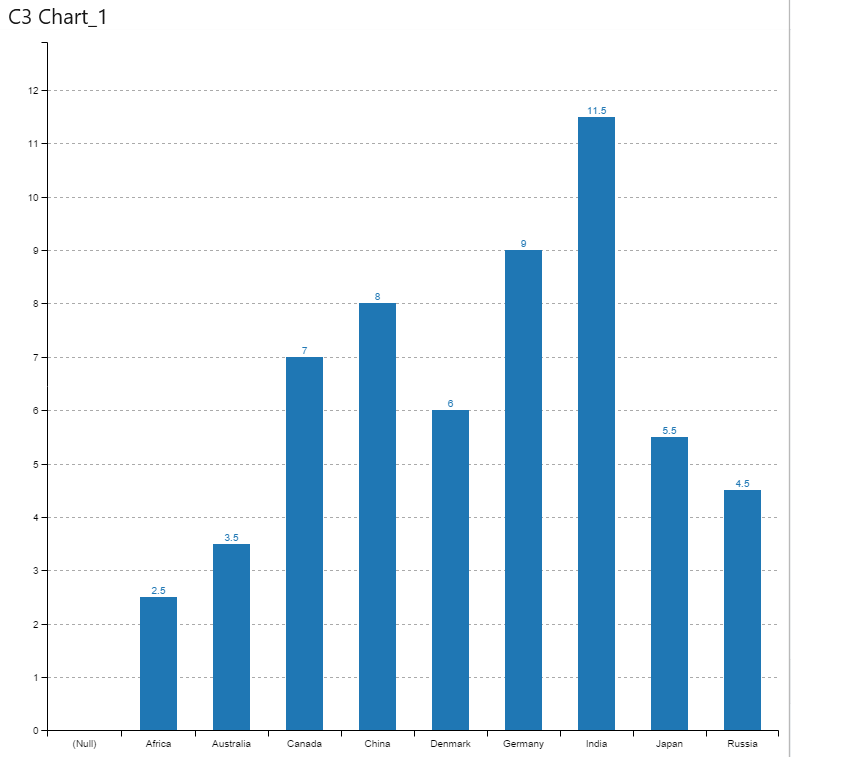
The C3 Chart widget will be rendered as follows:
-
The update method will be triggered for the following operations. We must make the necessary changes by checking the update types (resize, refresh, and propertyChange). The widget will be updated accordingly by invoking the respective API of the widget.
-
Resize
-
Refresh
-
property change
update: function (option) { var widget = this.widget; /* update method will be called when any update needs to be performed in the widget. */ if (option.type == "resize") { /* update type will be 'resize' if the widget is being resized. */ widget.resize(option.size); } else if (option.type == "refresh") { /* update type will be 'refresh' when the data is refreshed. */ this.refreshChart(); } else if (option.type == "propertyChange") { /* update type will be 'propertyChange' when any property value is changed in the designer. */ switch (option.property.name) { case "showTooltip": widget.internal.config.tooltip_show = option.property.value; break; case "showLabel": widget.internal.config.data_labels = option.property.value; widget.flush(); break; case "barColor": widget.internal.config.data_colors.values = option.property.value; widget.flush(); break; } } } -
-
To refresh the C3 Chart, assign the data to the C3 Chart API’s
   refreshChart : function (e) {
  	     var columns =[];
  	    if (this.model.boundColumns.Value.length > 0)
  	   {
  		for( var i=0; i< this.model.dataSource.length; i++)
  		 {
  		  columns.push({column:this.model.dataSource[i][this.model.boundColumns.Column[0].uniqueColumnName],values:this.model.dataSource[i][this.model.boundColumns.Value[0].uniqueColumnName]});
  		 }
          } else {
  			columns =[{column:'A',values: '50'},{column:'B',values: '20'},{column:'C',values: '30'}];
  		   }
          var chart = c3.generate({
                  data: {
                       type : 'bar',
                       json: columns,
                       keys: {
  					      x: 'column',
  					      value: ['values']
  					       },
  					 labels:this.model.properties.show label,
  	                 selection:
  					 {
                       enabled: true,
  					 multiple: false,
  					 draggable:true
  					 },
  					 onclick: function(d) {
  							that.selectionChange(d)
  						},
  					 },
  		        axis:
  					 {
  					    x: {
                          type: 'category'
  					       }
  					 },
  			    grid:
  					 {
  						 x:{ show : true},
  						 y:{show: false}
  					 },
  				bar:
  					 {
  					  width: { ratio: 0.5 }
  					 },
                  interaction: {enabled: true}
  				});
              this.widget = chart;
  	 },
Migration of Custom Widgets from lower versions to v4.2.68 or later
When upgrading Bold BI from a lower version to v4.2.68 or later, custom widgets available in the Bold BI build will be upgraded automatically. To upgrade custom widgets (created in a version lower than 4.2) that have been manually placed in the location specified below after the V4.2.68 migration, run the custom widget upgrader utility mentioned below:
-
Place the Custom Widgets as specified in the link.
-
Now, run the custom widget upgrader utility by following the steps below:
Environment Steps for running Utility Linux Navigate to the custom widget upgrader utility folder cd /var/www/bold-services/application/utilities/customwidgetupgrader/. Run the utility with dotnet command /var/www/bold-services/dotnet/dotnet CustomWidgetUpgrader.dll. Windows Run the CustomWidgetUpgrader.exe which is available in the below location C:\BoldServices\utilities\customwidgetupgrader\.