Configuring and Formatting Grid
The Grid allows you to showcase the ranking relationship through the vertical arrangement of items ordered from top to bottom.
How to configure the table data to Grid
NOTE: Before adding the Grid widget to the design layout, make sure to create the data source. You can refer to this section to learn how to create a new data source.
To construct a grid, a minimum requirement of one column is needed. You can visualize both measure, calculated measure, and dimension column data in the grid control. You can also add a column that is hidden from view by adding the column to the hidden columns section. The data of these columns will be hidden from view but can be used for filtering other widgets in the dashboard.
The following steps explains data configuration of grid:
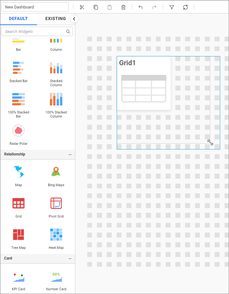
Step 1: Creating a grid widget
- Drag and drop the Grid control icon from the toolbox into the design panel. You can find the control by searching in the toolbox.
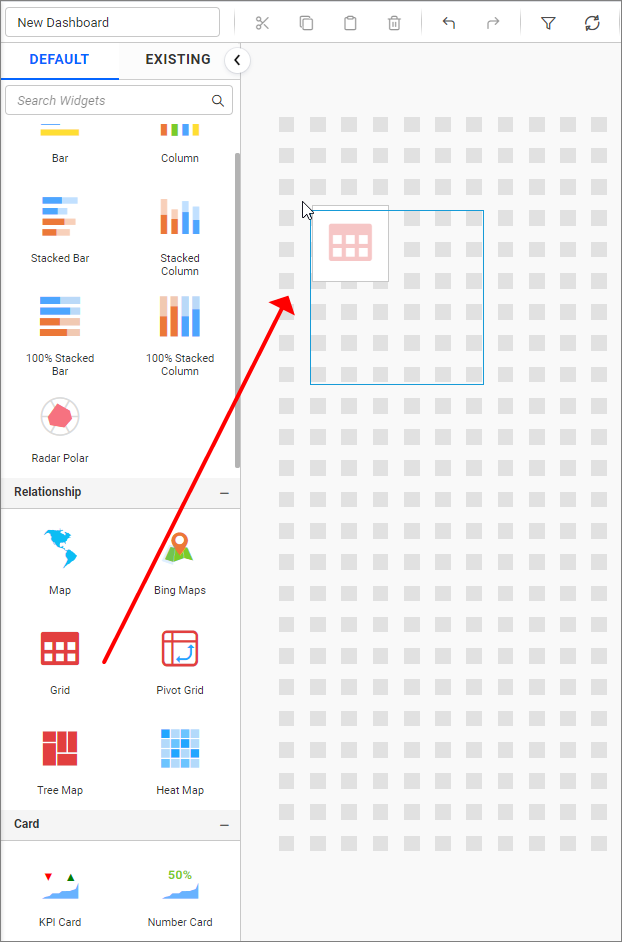
- Resize the widget as required.
Step 2: Configuring data into the widget
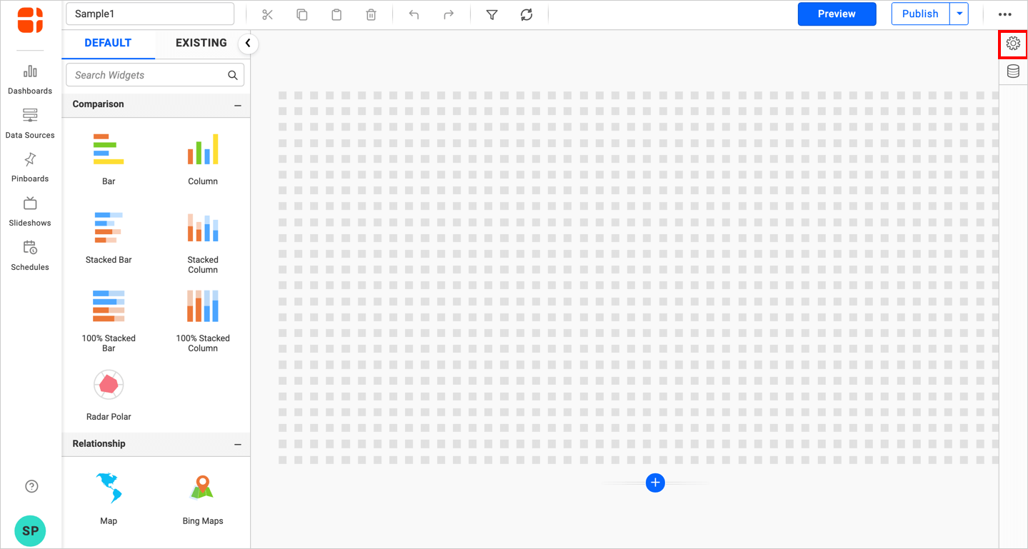
- Click the
Propertiesicon in the configuration panel.
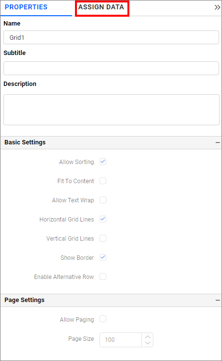
- The
propertiespanel of the widget will be displayed as shown in the following screenshot. Now, switch to theASSIGN DATAtab.
- The
ASSIGN DATAtab will be opened with available columns from the connected data source.
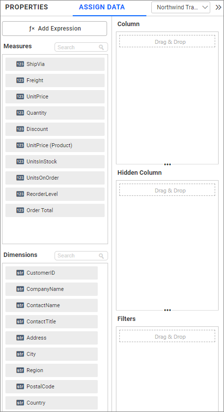
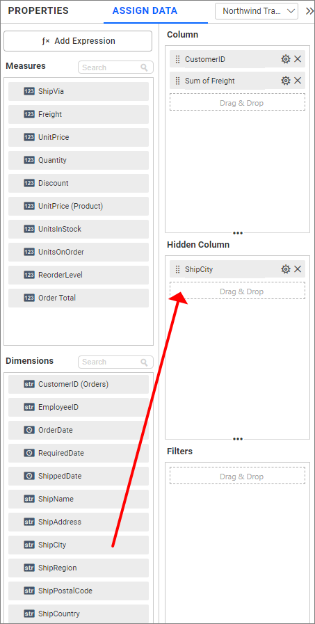
Column section
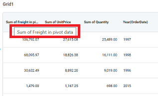
Bind columns by dragging and dropping elements from the Measures or Dimension section to the Columns section.
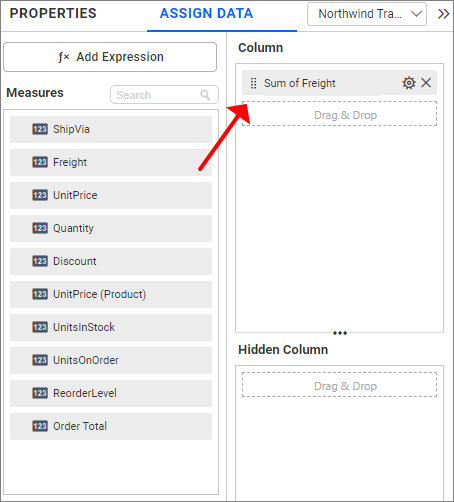
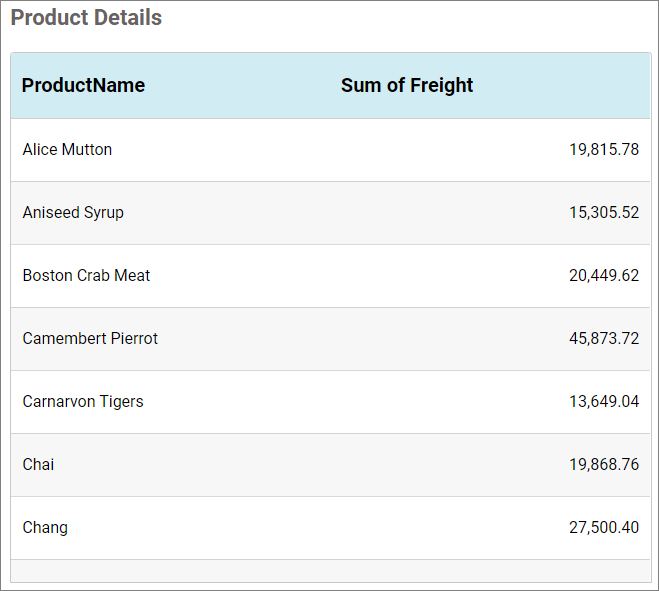
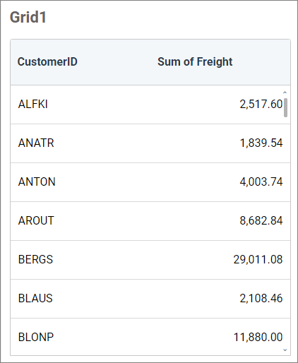
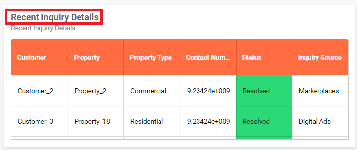
Image: Visualization of grid widget after configuration.
NOTE: By default, 1000 records are displayed for optimized Grid rendering performance (100 records in mobile view), and additional rows will be scrolled virtually on-demand.
NOTE: If any of the Grid columns have advanced settings, bar template, or KPI applied, only 100 records will be fetched by default and then scrolled on-demand.
Hidden column section
If required, you can drag and drop elements to Hidden Columns. Based on the hidden column elements, the values will be shown in the grid widget.
Step 3(Optional): Settings menu options
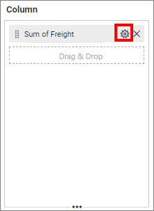
You can Rename, filter, format, and sort the data displayed in the widget from the settings menu options. To open the settings menu, click the settings icon.
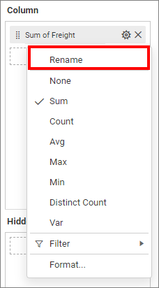
Renaming fields
The configured field names can be edited using the Rename option provided in the settings menu.
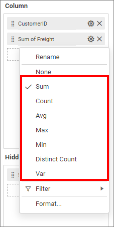
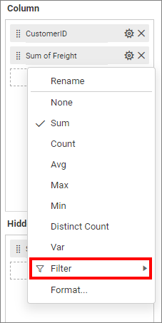
Changing the aggregation type
You can change the aggregation type of the measure section from the settings menu, as shown in the following screenshot. Refer to this section for more details.
Filtering data
You can use filters to change the values by selecting the Filter option. For more details, refer to the Measure filter and dimension filter.
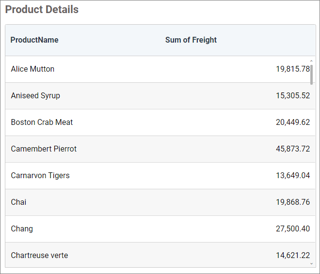
Measure formatting
You can format the elements by selecting the Format option. For more details, refer to the measure format.
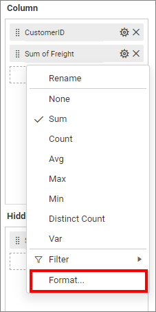
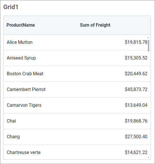
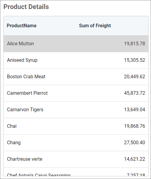
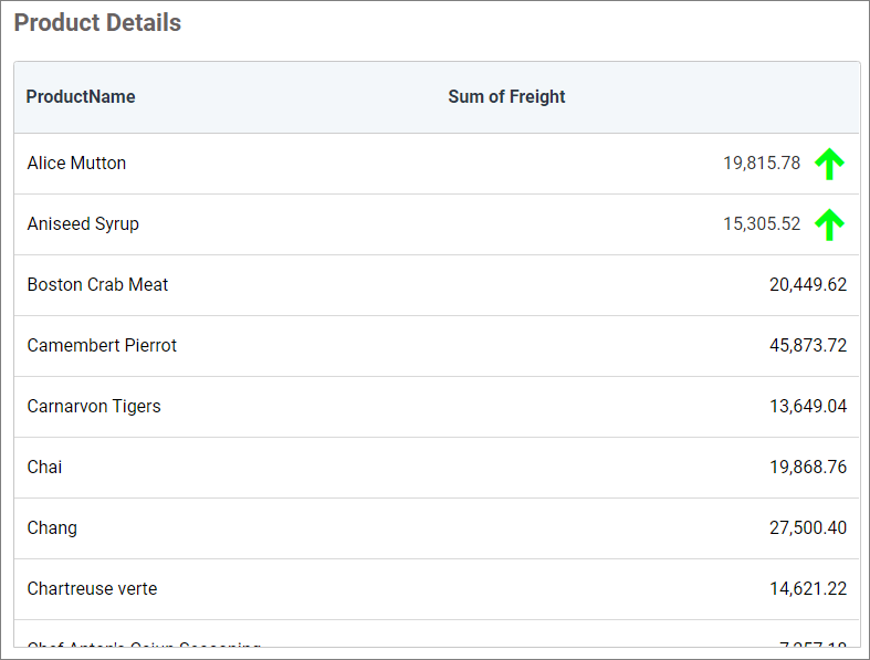
Image: Grid widget after applying the measure formatting
How to format grid widget
You can format the grid for better illustration of the view that you require using the settings available in the Properties tab.
General settings
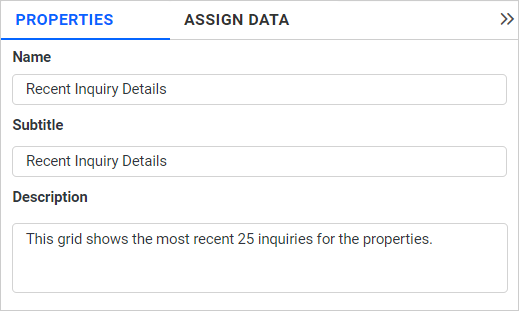
Name
This allows you to set a title for this grid widget.
Subtitle
This allows you to set a subtitle for this grid widget.
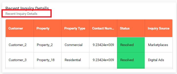
Description
This allows you to set a brief explanation about this grid widget.
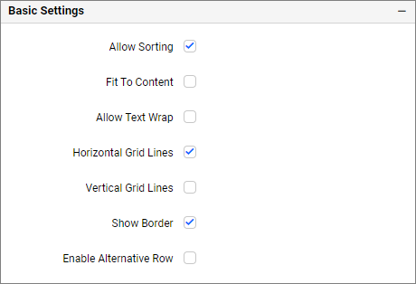
Basic settings
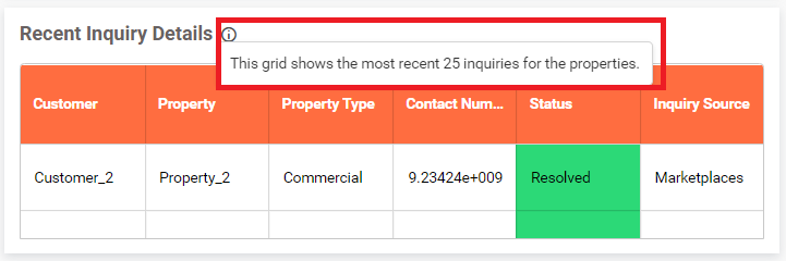
Show Tooltip
This option allows you to toggle the visibility of the tooltip in a grid.
Allow sorting
You can toggle the interactive sorting of columns in the grid control using this option. It is enabled by default.
Fit to content
The columns in the grid can be made to auto-size based on the length of the content of the column. This option is not enabled by default.
Horizontal grid lines
You can enable or disable horizontal grid lines in the grid control. This option is enabled by default.
Vertical grid lines
You can enable or disable vertical lines in the grid control. This option is enabled by default.
Show Border
This allows you to enable or disable the border of the grid control. This option is enabled by default.
Enable Alternative Row
This allows you to differentiate alternative rows of the grid by the background color. If you enable this property, the alternative rows change their background color to #F7F7F7 by default. It can be customized from the Content Settings section.
Allow Cell Selection
You can enable or disable the selection of values in grid cells, allowing you to select the desired cells and use the CTRL + C to copy the data efficiently.
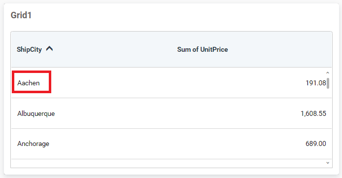
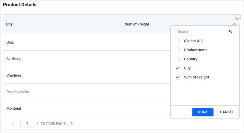
Enable Column Chooser
This option allows you to show or hide columns within the configured fields of the Grid widget.
For example, you can hide specific columns by deselecting the corresponding fields in the Grid widget.
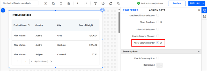
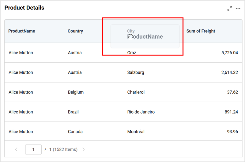
Allow Column Reorder
This option allows you to rearrange the columns within the configured fields of the Grid widget only if the Allow Paging is enabled.
For example, the ProductName column in the grid can be reordered by dragging it to a new position.
Summary Row
This section allows you to add a summary row at the end of the grid container.
If you enable the Enable Summary Row option, the following window will show.

Click on Add Summary to add a summary row.
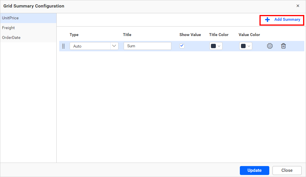
Type
This option allows you to customize the aggregation type of the summary row.
Title
This option allows you to customize the title of the summary row.
Show Value
This option allows you to customize the visibility of the summary value of a column in the summary row.
Title Color
This option allows you to customize the grid summary row title color.
Value Color
This option allows you to customize the grid summary row value color.
Format
This option allows you to measure the format of the summary value. For more details, refer to the measure format.
Delete
This option allows you to delete the summary row.
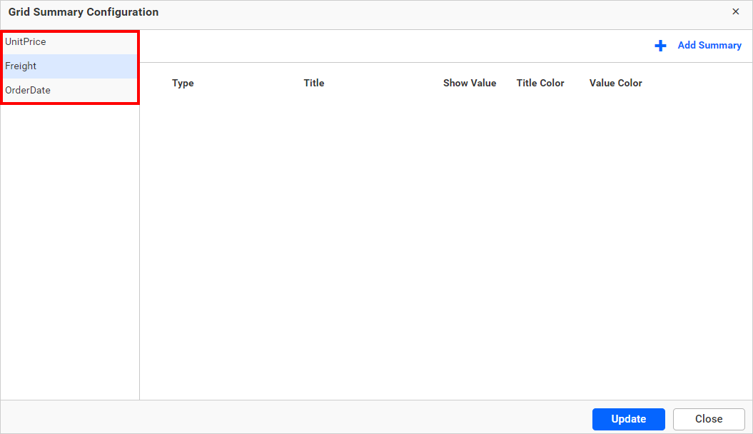
We can configure summary rows for each column by clicking on the respective column.
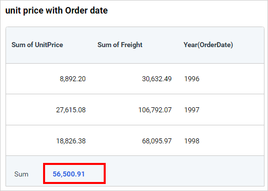
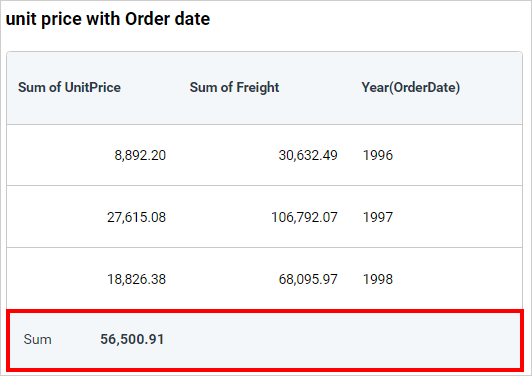
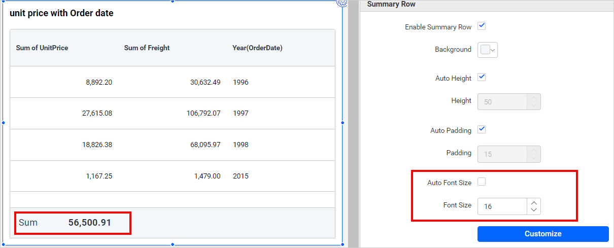
After configuring the summary rows and customizing the properties, click the update button. We can then see the summary rows added at the bottom of the grid, as shown in the image below.
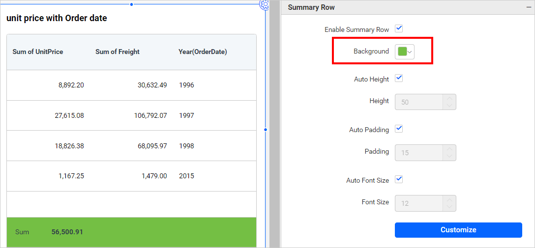
Background
You can customize the summary row background color by using this property. The default color of the summary row background is the same as the grid header color, which is #f3f7fa.
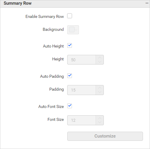
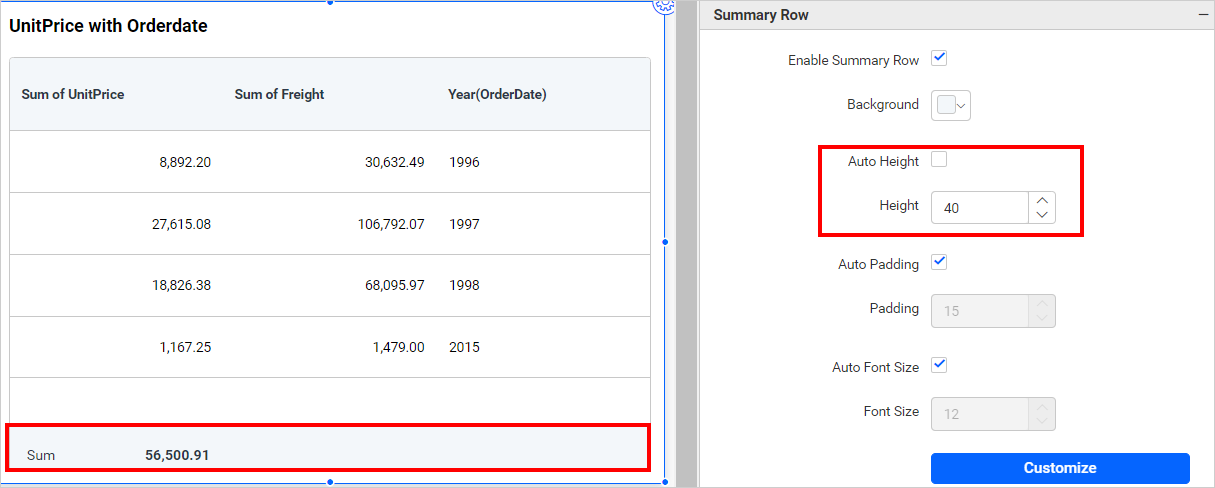
Auto Height
This property picks auto height for the grid summary row when it is enabled, otherwise, it allows you to choose a fixed height from the Height property. This option is enabled by default.
Height
You can enable this property by disabling Auto Height. You can use the Height property to view the entire summary row when creating more than one summary row. You can customize the height of the grid summary row by increasing or decreasing the values. The minimum value of this property is 10.
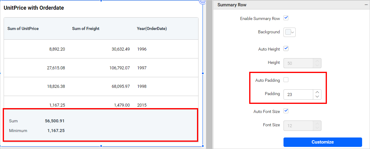
Auto Padding
This property picks auto padding for the grid summary row when it is enabled. The default value of this auto padding is 15. This option is enabled by default.
Padding
You can enable this property by disabling Auto Padding. You can increase or decrease the space between the top and bottom of the border by adjusting the padding option.
Auto Font Size
This property picks auto font-size for the grid summary row title and value when it is enabled. The default value of this auto font-size is 12. This option is enabled by default.
Font Size
You can enable this property by disabling Auto Font Size, Which allows you to adjust the font size of the grid summary row title and value.
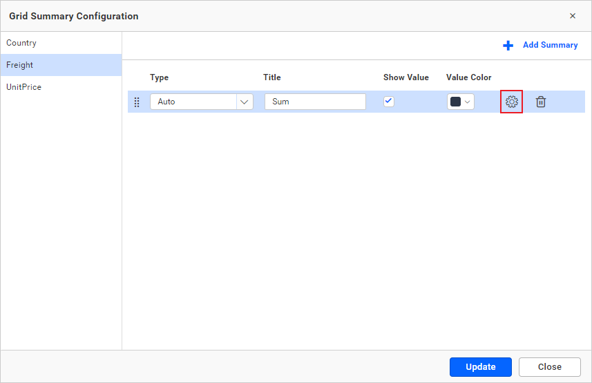
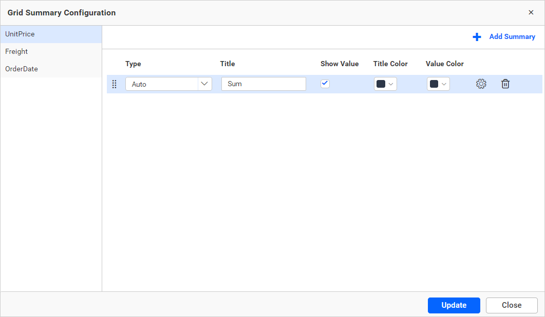
Customize
You can edit the existing summary row configuration by using this Customize button. Upon clicking the Customize button, the summary row dialog will appear displaying the current configuration, as shown in the image below.
Page Settings
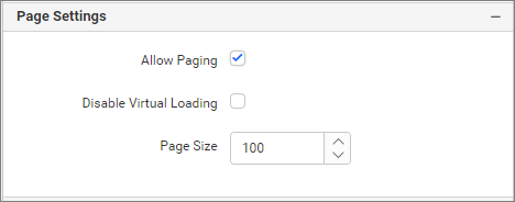
Allow Paging
This option allows you to enable pagination in a Grid. When this option is enabled, the pager is enabled in the footer section. You can see options to navigate pages, such as previous, next, and a text box to choose a specific page. Additionally, you can view the total record count of bounded column results.
Disable Virtual Loading
Enabling this option will fetch the entire record on the initial load, and there will not be any waiting indicator shown when navigating between pages.
Page Size
This option allows you to set the number of records that need to be fetched on the initial load. It also acts as the page size for pagination.
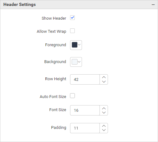
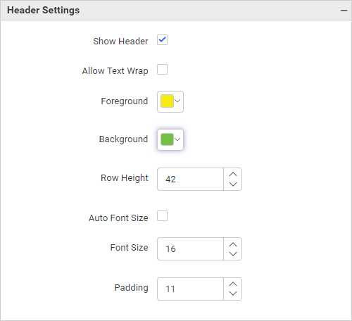
Header Settings
This section allows you to format the grid header visibility, color, and font size.
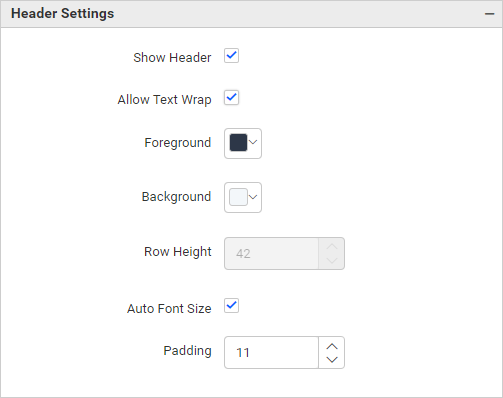
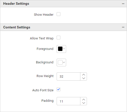
Show Header
This allows you to enable or disable the grid header. This option is enabled by default.
If we uncheck the Show Header, dependent properties will be hidden, such as Allow Text Wrap, Foreground color, Background color, Row height, Auto font size, padding.
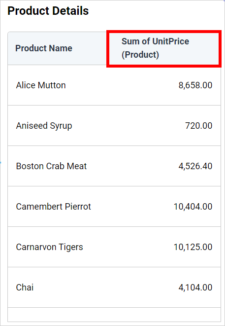
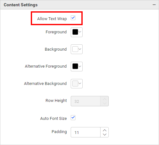
Allow Text Wrap
This allows you to wrap the header text if the text length is high.
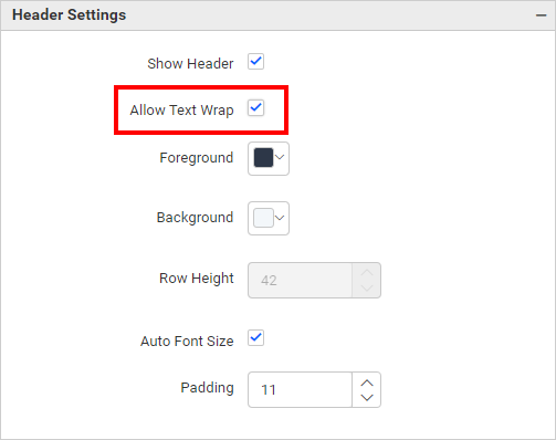
NOTE: If you enable the
Allow Text Wrapproperty, theRow Heightproperty from header settings will be disabled.
Foreground
You can customize the header font color. The default color of the header font is #2d3748.
Background
You can customize the header background color. The default color of the header background is #f3f7fa.
Row Height
You can customize the height of the grid header by increasing or decreasing the values.
Auto Font Size
This property automatically picks the font size for the grid header when enabled. Otherwise, you can choose a fixed font size from the Font Size property. This option is enabled by default.
Font Size
You can enable this property by disabling Auto Font Size, which allows you to change the font size of the grid header.
Padding
You can increase or decrease the space between the border and the header by adjusting the padding option. The value can range between 1 and 20.
Content Settings
This section allows you to format the grid row height, color, and font size.
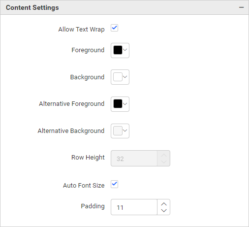
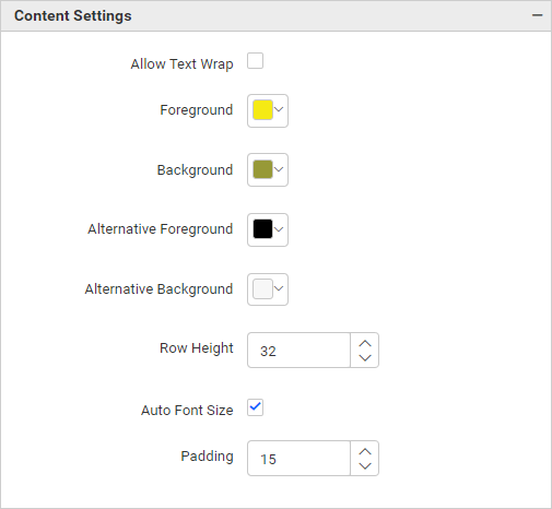
Foreground
You can customize the font color. The default color of the font is #000000.
Allow Text Wrap
This allows you to wrap the content text if the text length is high.
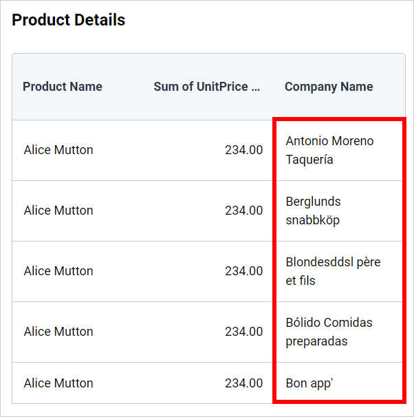
NOTE: If you enable the
Allow Text Wrapproperty, theRow Heightproperty from content settings will be disabled.
Background
You can customize the background color. The default color of the background is #ffffff.
Alternative Foreground
You can customize the font color of alternative rows. The default color of the alternative font is #000000. This property can be displayed by enabling the Enable Alternative Row.
Alternative Background
You can customize the background color of alternative rows. The default color of the alternative background is #f7f7f7. This property can be displayed by enabling the Enable Alternative Row.
Row Height
You can customize the height of the grid rows. The default value is 32, and the maximum value is 120.
Auto Font Size
This property automatically picks the font size for grid rows when enabled. Otherwise, you can choose a fixed font size from the Font Size property. This option is enabled by default.
Font Size
You can enable this property by disabling Auto Font Size, which allows you to change the font size of the grid content.
Padding
You can increase or decrease the space between the border and the header by adjusting the padding option.
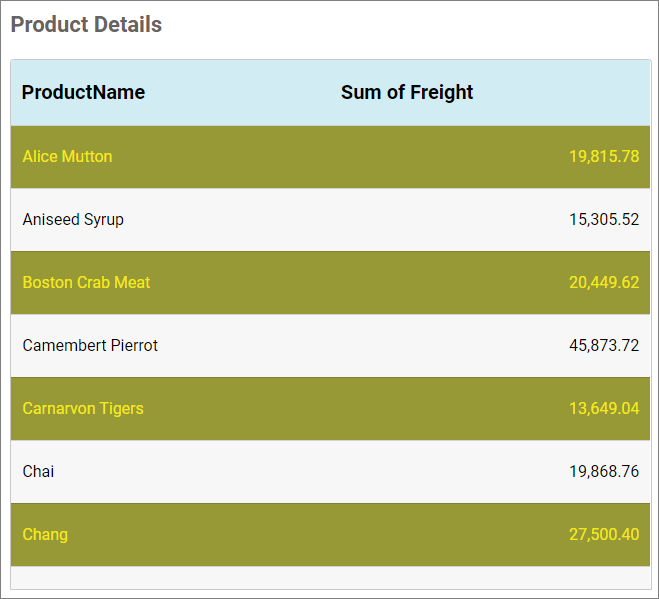
After customizing the content settings
Filter
Allow filter
This allows you to enable a filter type for each column in the grid for easy data filtering.
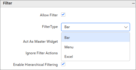
Filter Type
This option allows you to choose how the data can be filtered within the grid. The filter types are Bar, Menu, or Excel.
Bar
The Bar filter type displays a text box under each column header that allows users to filter values.
The following filtering options are supported in Bar:
For Measure Fields
<[numeric value]- Returns the value less than the numeric value<=[numeric value]- Returns the value less than or equal to the numeric value>[numeric value]- Returns the value less than the numeric value>=[numeric value]-Returns the value less than or equal to the numeric value[numeric value]- Return the value equal to the numeric value
For Dimensional Fields
[text]- It perform contains operation[text]*- It performs start with operation*[text]- It performs ends with operation[text1],[text2]- search multiple text by using,
Menu
The Menu filter type displays a filter icon in the column header, allowing you to filter values using available filter conditions based on the field type.
- For Dimension fields, it provides text-based conditions such as StartsWith, EndsWith, Contains, Equal, and NotEqual.
- For Measure fields, it provides numeric conditions such as LessThan, GreaterThan, LessThanOrEqual, GreaterThanOrEqual, Equal, and NotEqual.
This filtering option is supported for Measure and Dimension fields (excluding Date fields).
Excel
The Excel filter type displays a filter icon in the column header. It provides a list of available values, allowing you to select one or more items to filter the data.
This filtering option is only supported for Dimension fields (including Date fields).
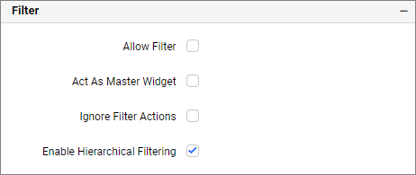
Act as master widget
This allows you to define this grid widget as a master widget so that its filter action can be listened to by other widgets in the dashboard.
Ignore Filter Actions
This allows you to define this grid widget to ignore responding to filter actions applied on other widgets in the dashboard.
Enable hierarchical filtering
Using this option, you can enable or disable hierarchical top N filtering. When applying a Top N filter with multiple dimension columns, the data returned can be customized based on whether the filtering needs to be done flat or based on the hierarchy of the dimension columns added.
When the Hierarchical Filter option is enabled, the Top N will be applied for each individual column separately based on the number set for each column.
Show Filter
This feature allows you to toggle the visibility of the Filter icon for the grid widget when the Act as Master Widget option is enabled.
Column Settings
This section allows you to format the grid columns based on alignment, width, and KPI customization.
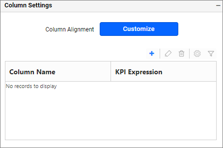
If you click the Customize button, the window will render like this.
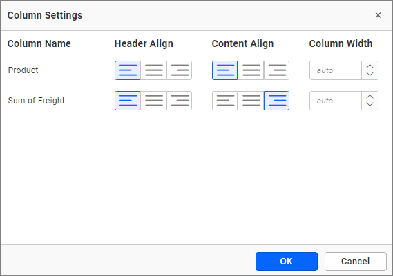
Header Align - You can align the header of each column by left, right, or center alignment.
Content Align - You can align the content of each column by left, right, or center alignment.
Column Width - You can specify the width for a particular column by entering numeric values in the textbox. To set the width to default, clear the entered value from the textbox.
You can add Key Performance Indicator (KPI) columns to the grid control by navigating to the KPI Expression window and clicking the Add KPI button from the property panel at the top.
Key Performance Indicator (KPI)
A Key Performance Indicator changes the color of each column depending on its relation to a target line value.
Creating a KPI Column
- Click the
+button to create a new KPI column.
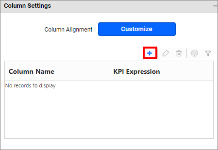
- It will open the
KPI Expressiondialog.
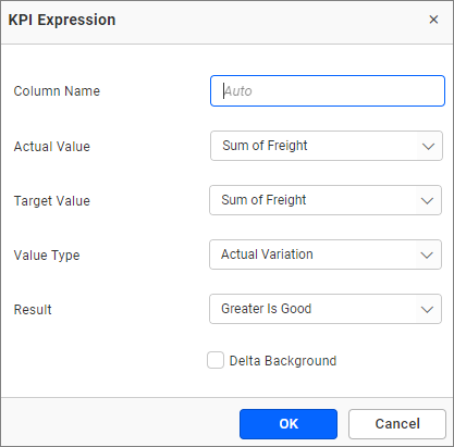
-
From the
KPI Expressiondialog, you can specify the name of the KPI and the column whose values need to be considered as actual values, and the column that needs to be considered as a target. -
The value type can be set based on which the KPI will be calculated. The following value types are available:
- Actual Variation (Default)
- Actual Value
- Percentage of variation
- Percentage of target
- Value and Percentage
-
The result can be set to showcase the result as gain or loss based on which the value will be visualized. You can choose the type as value or graphical bar to showcase the data in the column.
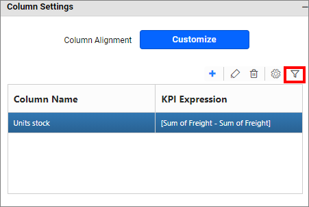
KPI column measure filtering
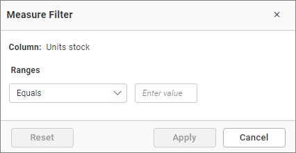
The KPI column can be filtered based on the measure values bound to the KPI. You can set measure filter by clicking the filter icon button, which will open the Measure Filter dialog from where you can specify the column and the condition for filtering the showcased data.
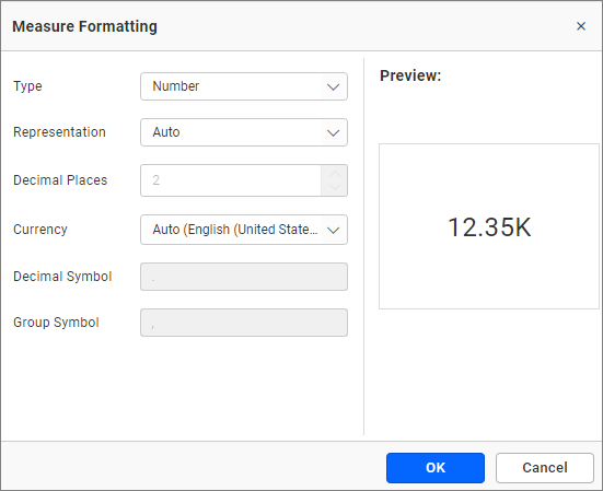
KPI Column measure formatting
The values showcased in the KPI column can be formatted like any other measure column. You can open the Measure Formatting dialog box by clicking the format KPI column button. This allows you to handle different formatting options such as display type, representation, decimal places, and currency culture for the respective KPI column added.
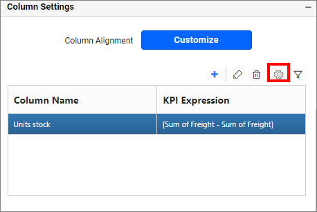
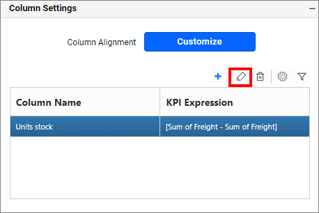
Editing the saved KPI column
You can edit the KPI column by clicking the Edit KPI column icon.
Deleting a KPI column
You can delete the KPI column by clicking the Delete KPI column.
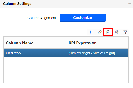
This action cannot be undone.
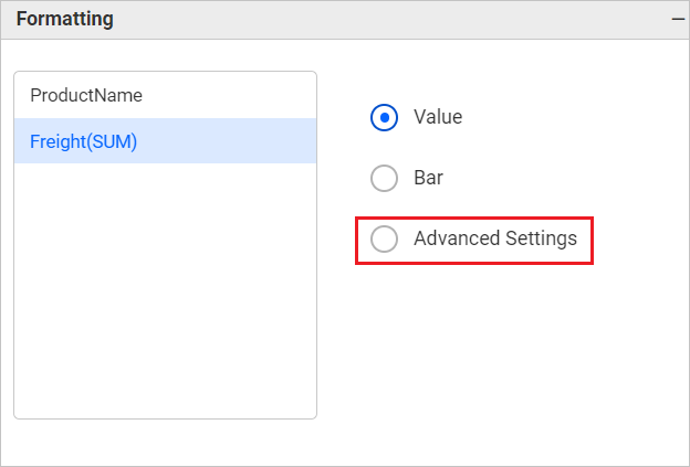
Formatting
You can define the column value represented as text, bar, or condition-based coloring. This lists out the columns, which are added to the grid widget.
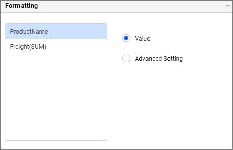
For each of those columns, the value representation can be configured using the options displayed on the right side.
Value
Select value as the display type to get the column values represented as they are.
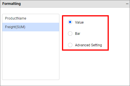
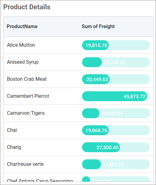
Bar
This property allows you to configure the color, shape, and range of the progress bar from the Bar Settings dialog.
To customize the progress bar, open the Bar Settings dialog by selecting the Bar radio button from the Formatting section.
The dialog can be opened by selecting the Bar radio button for initial configuration, and then clicking the Customize button.
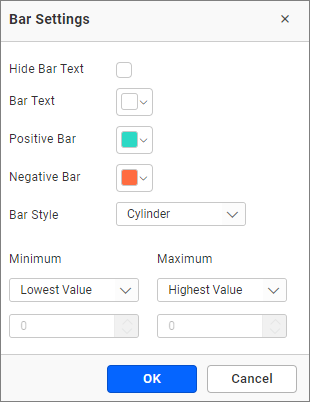
Hide Bar Text The text of the progress bar can be enabled or disabled. By default, the text is enabled for the progress bar.
Bar Text The progress bar text color can be changed using this property.
Positive Bar The progress bar background color for positive values can be changed.
Negative Bar The progress bar background color for negative values can be changed.
Bar Style This property allows you to change the bar shape. The dropdown contains two shapes: Cylinder and Rectangle.
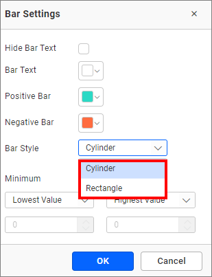
Minimum The minimum property renders the progress bar from the given value. It contains two modes in the dropdown to configure the minimum value:
Lowest Value - It takes the default minimum value to render the progress bar.
Customize - Selecting this property will enable the text box. Users can customize the minimum value by entering a numeric value in the text box.
Maximum The maximum property renders the progress bar up to the given value. It contains two modes in the dropdown to configure the maximum value:
Highest Value - It takes the default maximum value to render the progress bar.
Customize - Selecting this property will enable the text box. Users can customize the maximum value by entering a numeric value in the text box.
Click the OK button to apply the changes to the grid.
Advanced settings
Select Advanced settings to configure conditions and apply color to the cells based on that. Click here for more details.
Link
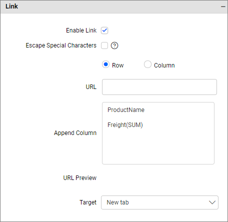
To configure the linking to URL or dashboard with the widget using its settings. For more details, refer to the Linking.
How to apply advanced settings in grid
If you have the requirement to highlight any data based on some conditions, you have to enable the advanced settings option.
How to enable advanced settings
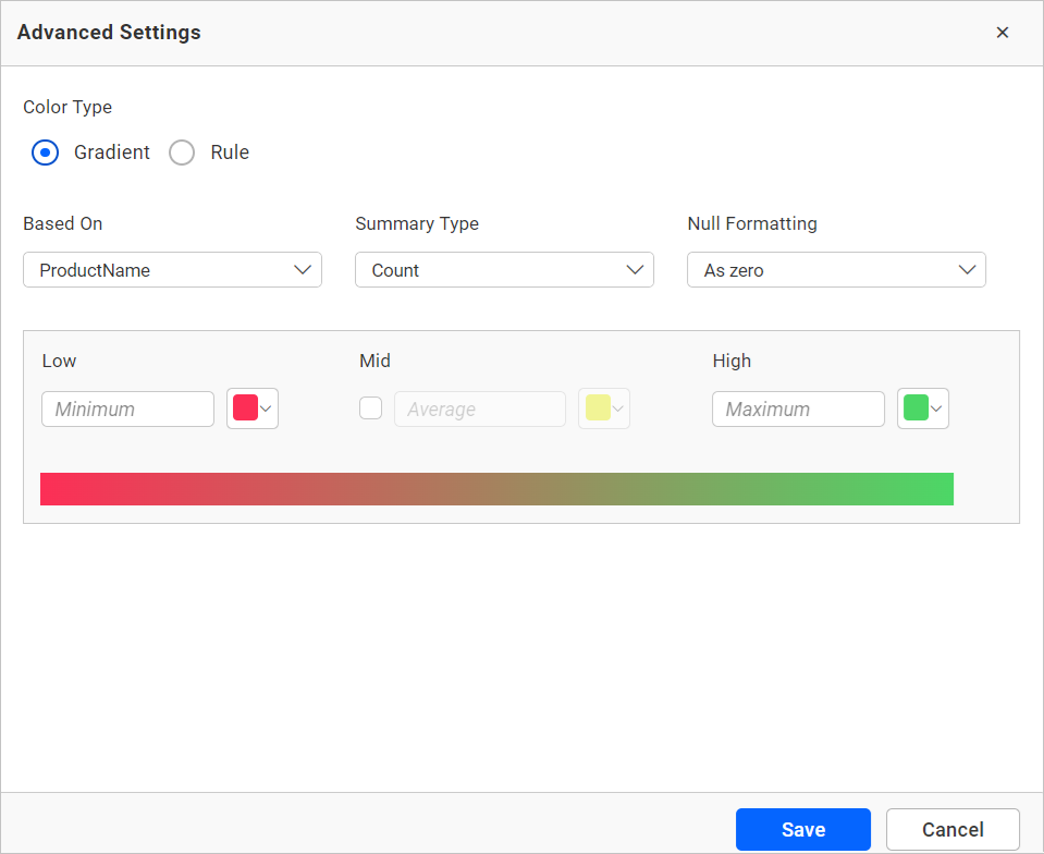
In the properties pane, under the Formatting section, click the Advanced Settings radio button.
This will open the Advanced Settings dialog.
Color types
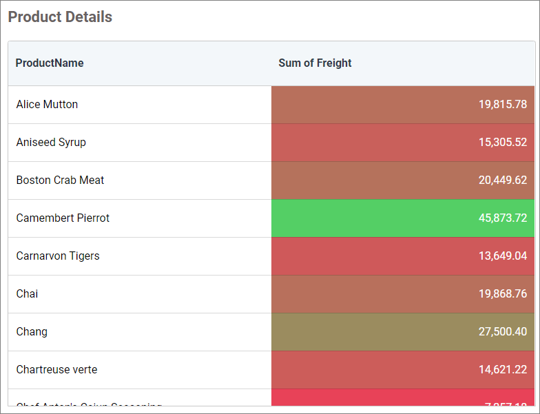
Gradient: You can customize the cell background color of the grid columns using gradient-based advanced settings. This is the default mode.
Rule based: This allows you to customize the cell color and the text style of the grid columns.
Gradient mode
Based on field
You can choose the field from the Based-On section to apply the conditions from the highlighted drop-down.
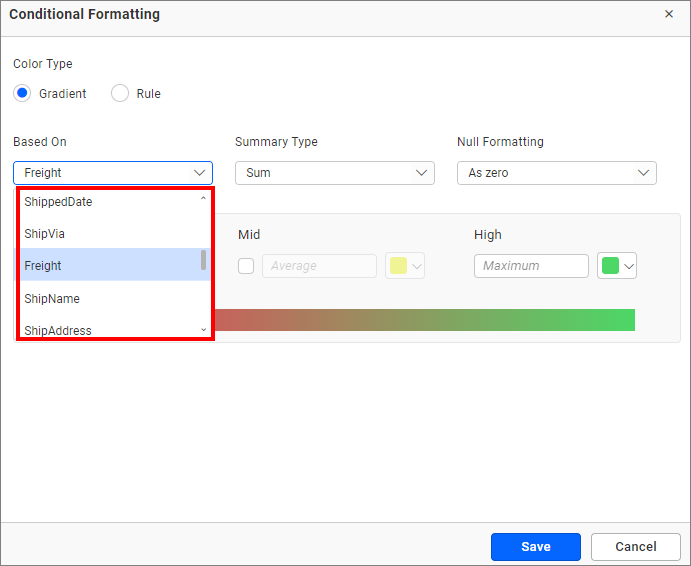
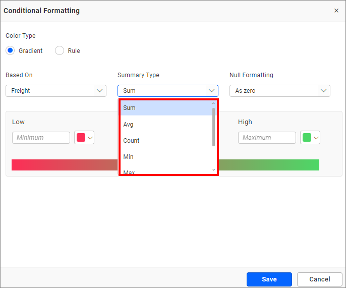
Summary type
You can select the summary type for the selected measure field.
Low, mid, and high values
You can define your range by entering the low, mid, and high values.
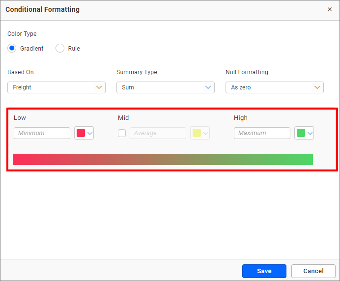
NOTE: It is optional. If no value is entered, then the ranges will be auto-calculated based on the minimum and maximum values from the data source.
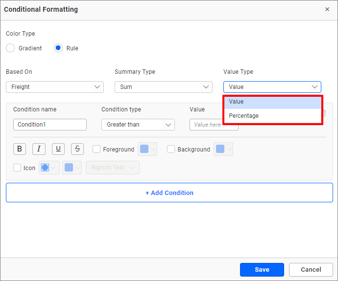
Rule bases mode
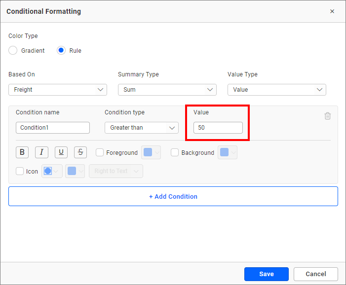
Value type
The value type drop-down allows you to choose whether to apply the direct value (specific number like three goals, order ID 10248) or percentage (values above 30% or 50%).
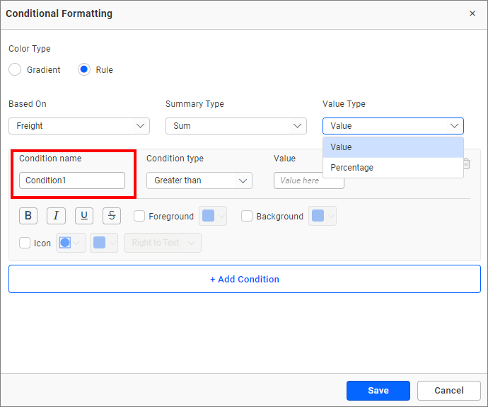
Condition name
You can give a meaningful name to the applied conditions using the highlighted text box.
Condition type
Choose the condition for the measure field from the highlighted conditions.
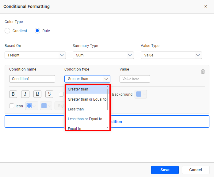
If you have selected the dimension as a based on field and want to use text condition, the following text-based conditions are available.
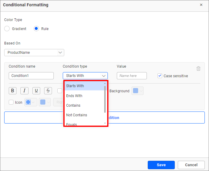
NOTE: The text based condition type will be enabled only when the selected dimension is used as the based on field.
Value
Enter the condition value.
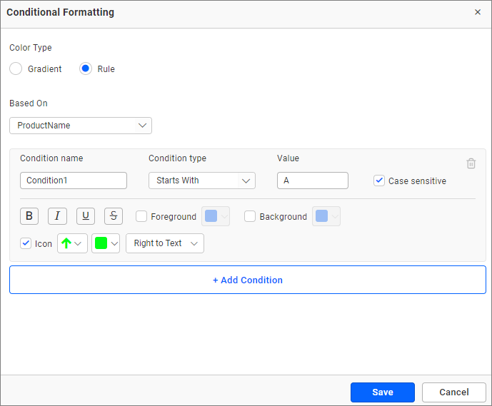
Font style
Allows you to choose the title font style. (Bold, Italic, Underline, and Superscript).
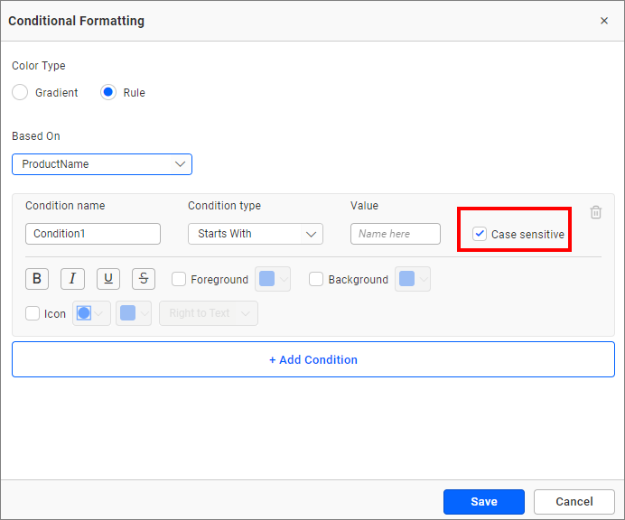
Case sensitivity
For the dimensions, the option to choose whether the entered value is case sensitive or not is provided.
Colors and icons
Select the checkbox provided next to the options to customize the properties. Similarly, click on the font style icons to apply them, as shown in the following screenshot.
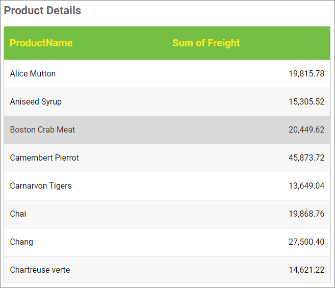
Figure: Grid widget the applied customization
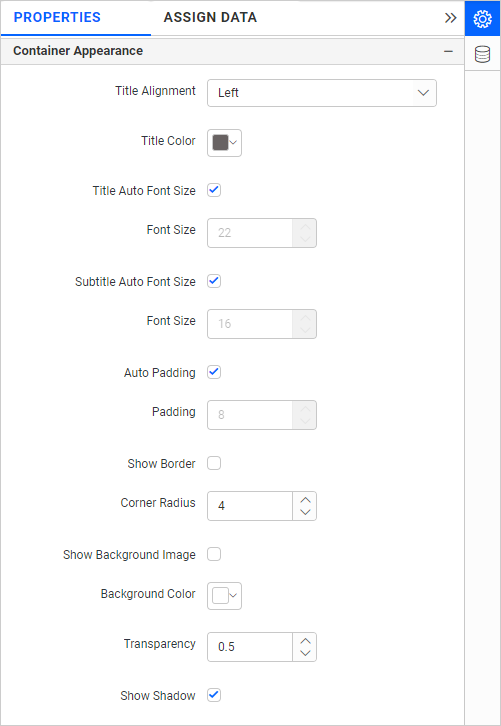
Container appearance
Title alignment
This allows you to align the widget title to the left, center, or right.
Title color
This allows you to apply a specific color to the widget title.
Title Auto Font Size
When enabled, the font size of the title will be adjusted automatically if the screen resolution varies.
Font Size
This allows you to apply a specified font size to the widget title if the Title Auto Font Size is disabled. The value can range between 10 and 44.
Subtitle Auto Font Size
When enabled, the font size of the subtitle will be adjusted automatically if the screen resolution varies.
Font Size
This allows you to apply a specified font size to the widget subtitle if the Subtitle Auto Font Size is disabled. The value can range between 10 and 32.
Auto Padding
When enabled, the padding of the widget container will be adjusted automatically if the size of the widget varies.
Padding
This allows you to customize the padding of the widget container if the Auto Padding is disabled. The value can range between 0 and 25.
Show Border
This allows you to toggle the visibility of the border surrounding the widget.
Corner Radius
This allows you to apply a specified radius to the widget corners if the Show Border is enabled. The value can range between 0 and 100.
Transparency
You can adjust the transparency from 0 to 1.
Show Shadow
This allows you to toggle the visibility of the shadow surrounding the widget.
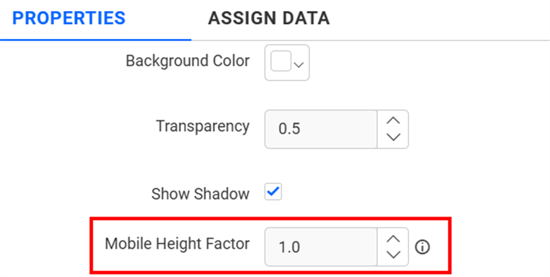
Mobile Height Factor
This option allows you to resize widgets specifically for mobile view.
Container actions
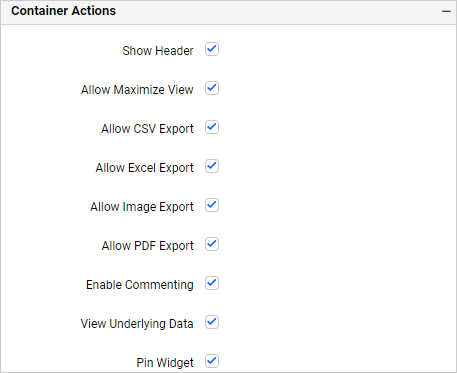
Show header
This allows you to enable or disable the widget title of the Grid.
Allow maximize view
This allows you to enable or disable the maximized mode of the Grid. The visibility of the maximize icon in the widget header will be defined based on the setting in the viewer.
Allow CSV export
This allows you to enable or disable the CSV export option for the Grid. Enabling this allows you to export the summarized data of the widget view to CSV format in the viewer.
Allow Excel export
This allows you to enable or disable the Excel export option for the Grid. Enabling this allows you to export the summarized data of the widget view to (.xlsx or .xls) format in the viewer.
Allow image export
This allows you to enable or disable the image export option for the Grid. Enabling this allows you to export the view of the widget to image format (.jpg), (.png), or (.bmp) in the viewer.
Allow PDF export
This allows you to enable or disable the PDF export option for the Grid. Enabling this allows you to export the view of the widget to pdf format in the viewer.
Enable comments
This allows you to enable or disable comment for the dashboard widget. For more details, refer to the Commenting Widget.
Allow Viewing of underlying data
This allows you to visualize the raw data associated with a widget at runtime.
Pin widget
This allows you to pin the widget.