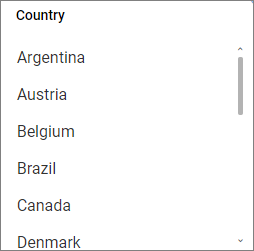
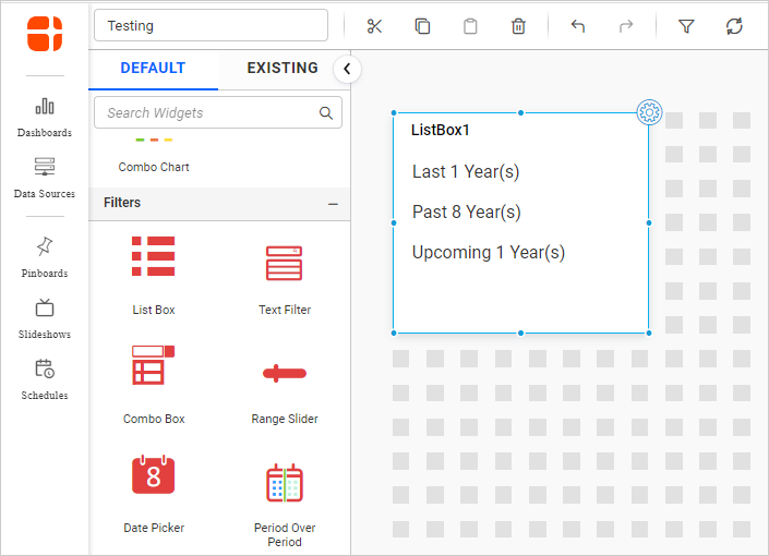
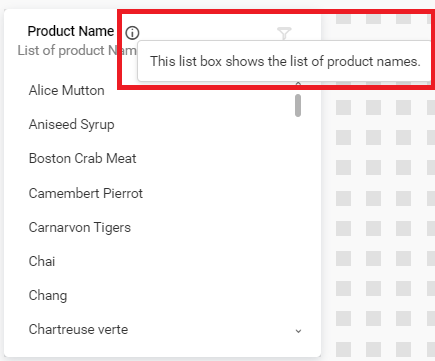
List Box
List Box enables you to filter based on single or multiple item selection in a list. To configure a list box, a minimum requirement of 1 column is needed.
How to configure the table data to list box?
The following procedure illustrates the data configuration of a List Box:
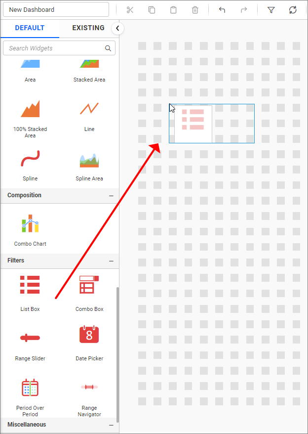
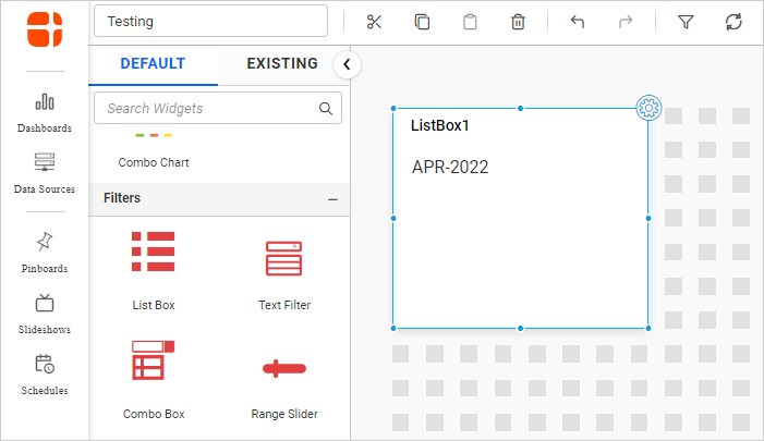
- Drag and drop the
List Boxcontrol icon from the toolbox into the design panel. You can find the control in the toolbox by searching.
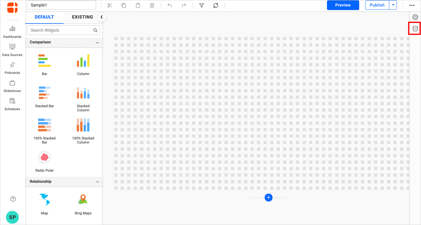
- Click the
Data Sourcebutton in the configuration panel.
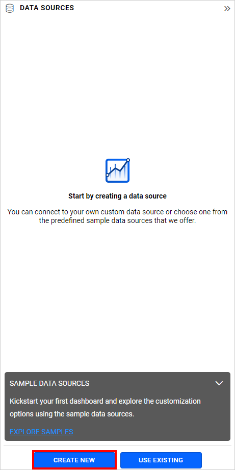
- Click the
CREATE NEWbutton to launch a New Connection from the connection type panel.
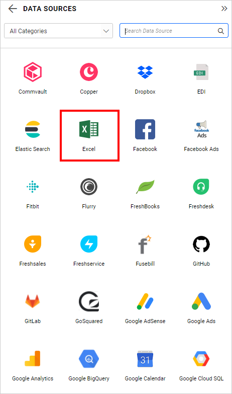
- In the connection type panel, click on any one of the listed connection type buttons (Here
Microsoft ExcelConnection type is selected for demonstration).
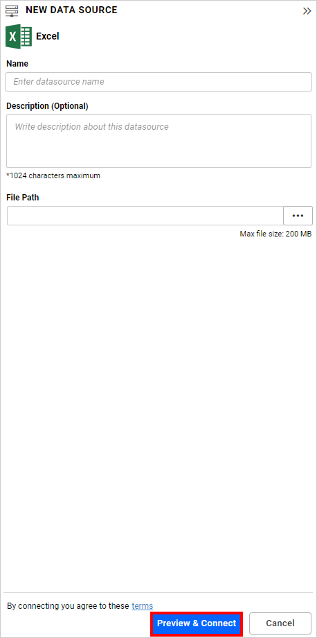
- In the
NEW DATA SOURCEconfiguration panel, fill in the connection type and related details. Click theConnectbutton.
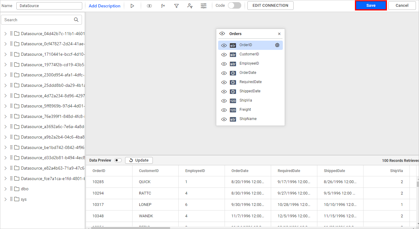
- Drag your preferred table or view from the left pane in the data design view, then click the
Savebutton.
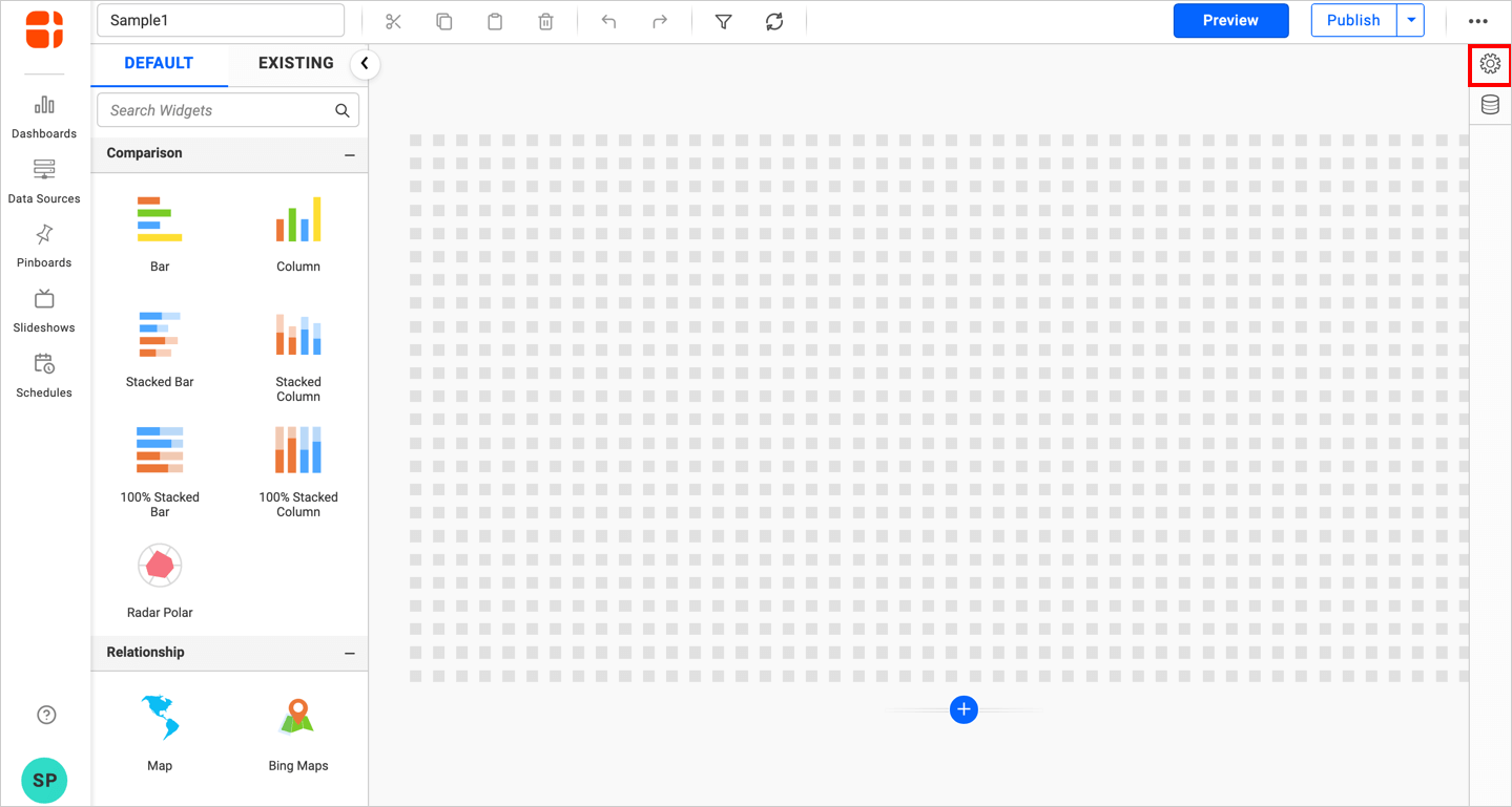
- Click the
Propertiesbutton in the Configuration panel, the property pane opens. Now, switch to theASSIGN DATAtab.
- The data tab will open with available measures and dimensions from the connected data source.
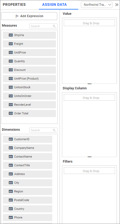
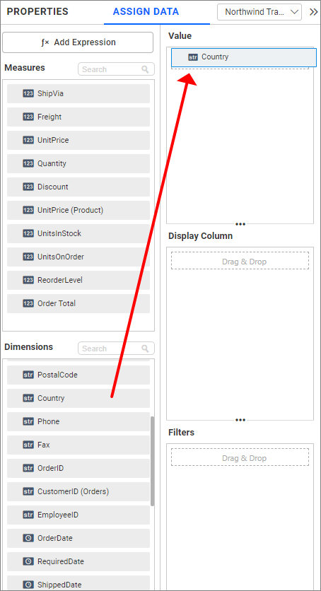
- Drag and drop a column from
MeasuresorDimensionsto theColumnssection.
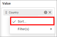
Define the sort of the dropped column through the Sort option in the Settings dropdown menu. For more details, refer to Sort
You can use the filters by selecting the Filter(s) option. For more details, refer to the filter.
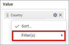
You can clear the filters by selecting the Show All Records option.
How to configure relative dates to list box?
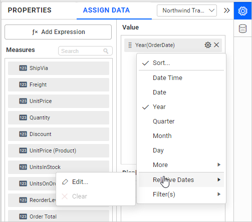
Click the Settings icon in the dropped date value and select Relative Dates from the dropdown menu.
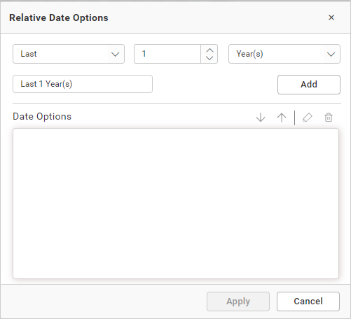
In the launched Relative Date Options window, configure the relative date and click Add. Repeat this process until the required set of relative dates is added.
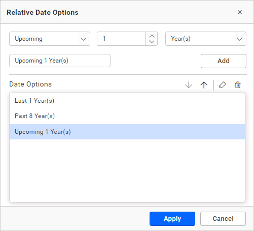
You can see the added relative dates in the list box as follows:
Note: If Multi-selection is enabled, then the applied relative dates will be removed.
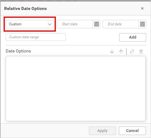
How to configure custom relative dates to the list box?
Click the Settings icon in the dropped date value and select Relative Dates in the drop-down menu.
In the launched Relative Date Options window, select the Custom option from the drop-down list.
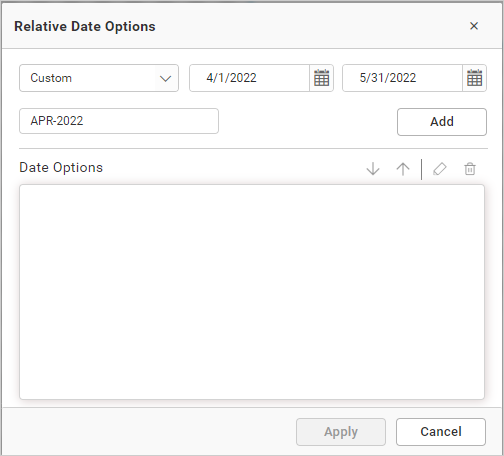
Choose the start and end dates you would like to set as a custom range, set a name for the custom range, and then click Add. Repeat this process until the required set of custom relative dates is added.
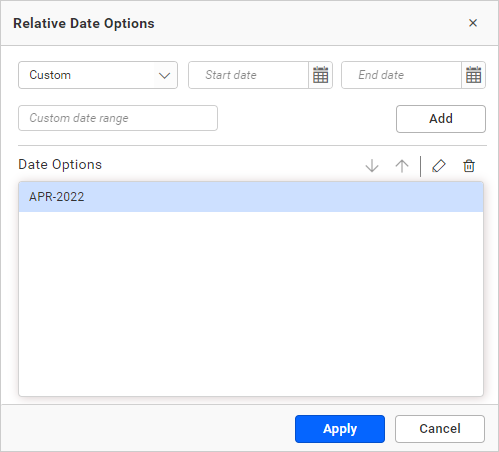
You can see the added custom relative dates in the list box as follows:
Note: If Multi-selection is enabled, then the applied relative dates will be removed.
How to format list box?
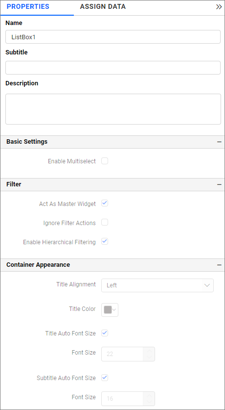
You can format the List box for a better illustration of the view that you require, through the settings available in the Properties tab. This pane can be opened from the design view by clicking the Settings icon at the top right corner of the widget.
General Settings
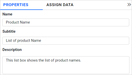
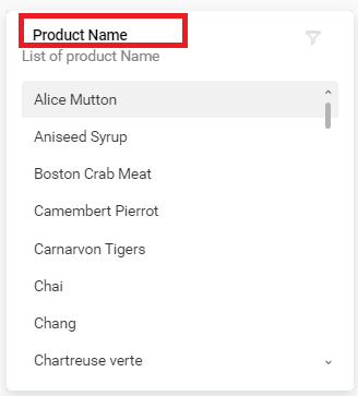
Name
This allows you to set the title for the list box widget.
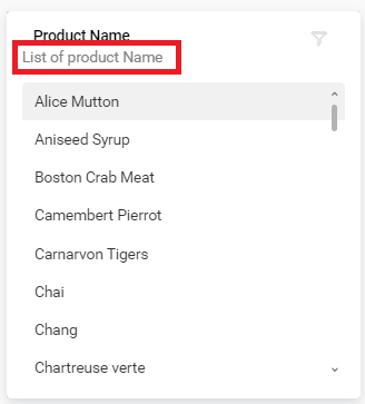
Subtitle
This allows you to set the subtitle for the list box widget.
Description
This allows you to set a brief explanation about the list box widget.
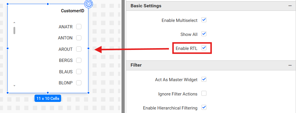
Basic Settings
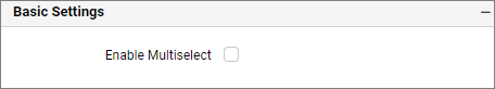
Enable Multi-select
Enable Multi-Select allows you to select one or more items in the dropdown list.
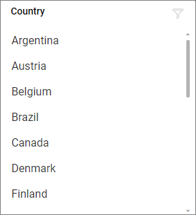
Single Selection
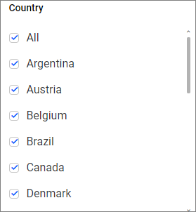
Multiple Selection
You can select multiple items in the list box.
Enable RTL
This option allows data to be displayed from right to left.
Filter
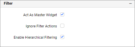
Act as Master Widget
This allows you to define this list box widget as a master widget so that its filter action can be made to listen by other widgets in the dashboard.
Ignore Filter Actions
This allows you to define this list box widget to ignore responding to the filter actions applied on other widgets in the dashboard.
Enable hierarchical filtering
Using this option, you can enable or disable the hierarchical Top N filtering. When the hierarchical filter option is enabled, the Top N will be applied for each individual column separately based on the number set for each column.
When the hierarchical filter option is enabled, the Top N will be applied for each individual column separately based on the number set for each column.
Show Filter
This feature allows you to toggle the visibility of the Filter icon for the Listbox widget when the Act as Master Widget option is enabled.
Container Appearance
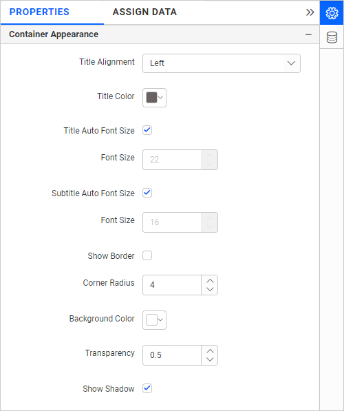
Title Alignment
This allows you to handle the alignment of the widget title to either left, center, or right.
Title Color
This allows you to apply the text color to the widget title.
Title Auto Font Size
On enabling Auto Font Size, the font size of the title will be adjusted automatically if the resolution of the screen varies.
Font Size
This allows you to apply the specified size of the font to the widget title if the Title Auto Font Size is disabled. The value can be between 10 and 44.
Subtitle Auto Font Size
When Auto Font Size is enabled, the font size of the subtitle will adjust automatically if the screen resolution varies.
Font Size
This feature allows you to set the font size for the widget title if the Subtitle Auto Font Size is disabled. The value can range from 10 to 32.
Show Border
This feature allows you to show or hide the border around the widget.
Corner Radius
This feature allows you to set the radius for the corners of the widget if the Show Border is enabled. The value can range from 0 to 100.
Background Color
This feature allows you to choose the background color for the list box widget.
Transparency
This property allows you to adjust the transparency of the background color.
Show Shadow
This feature allows you to show or hide the shadow around the widget.
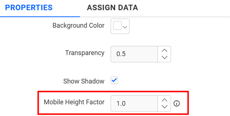
Mobile Height Factor
This option allows you to resize widgets specifically for mobile view.
Container actions
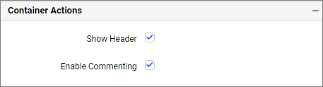
Show Header
This feature allows you to enable or disable the widget title for the list box widget.
Enable Comments
This feature allows you to enable or disable comments for the dashboard widget. For more details, please refer to the Commenting Widget.