Bold BI – A Basic Walkthrough
This is a simple walkthrough that will help you get started with Bold BI. Throughout this walkthrough, we will be using the Northwind database to demonstrate each feature of Bold BI.
You may watch this video first. This video describes how to create a marketing performance dashboard with key metrics.
Opening dashboard designer
To create a new dashboard in Bold BI, click on the option below.
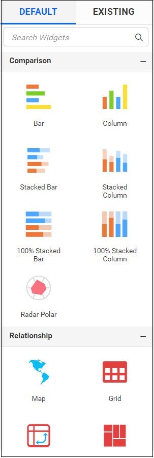
You can either start creating the dashboard from scratch or use templates, as shown below.

To open the Dashboard Designer, click on the Start from Scratch option highlighted below.

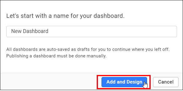
Please enter the dashboard name and click Add and Design to open the Dashboard Designer.
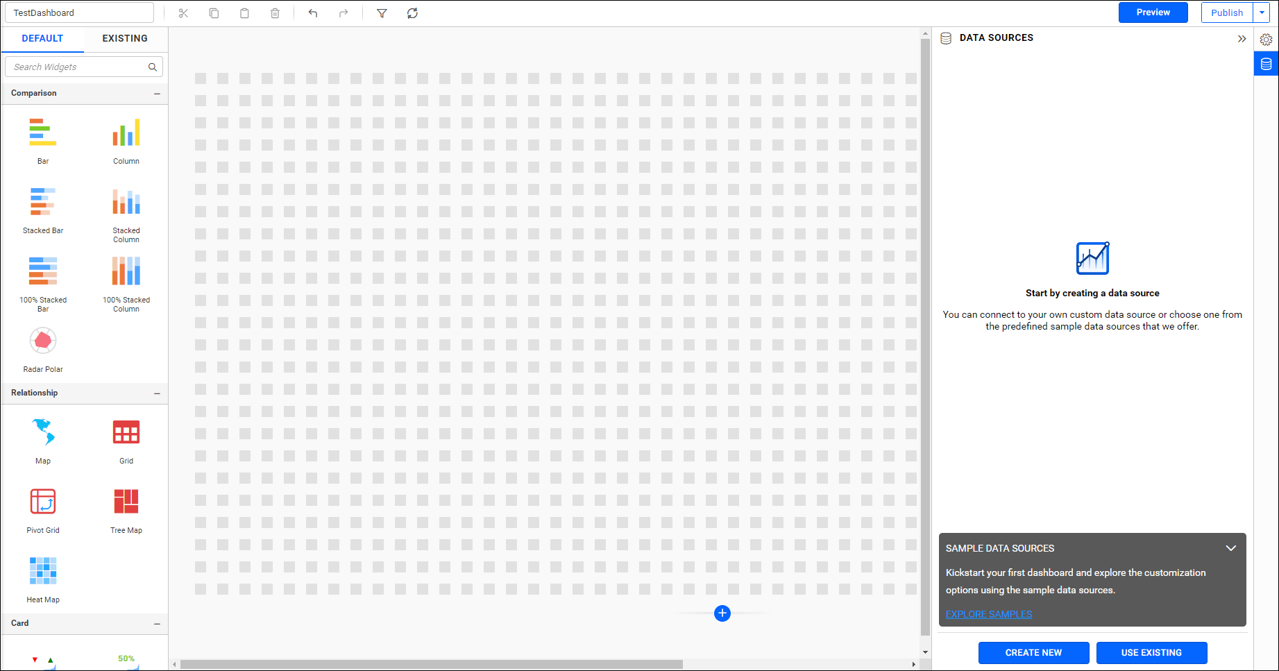
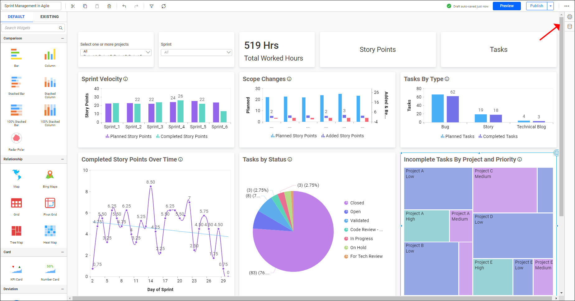
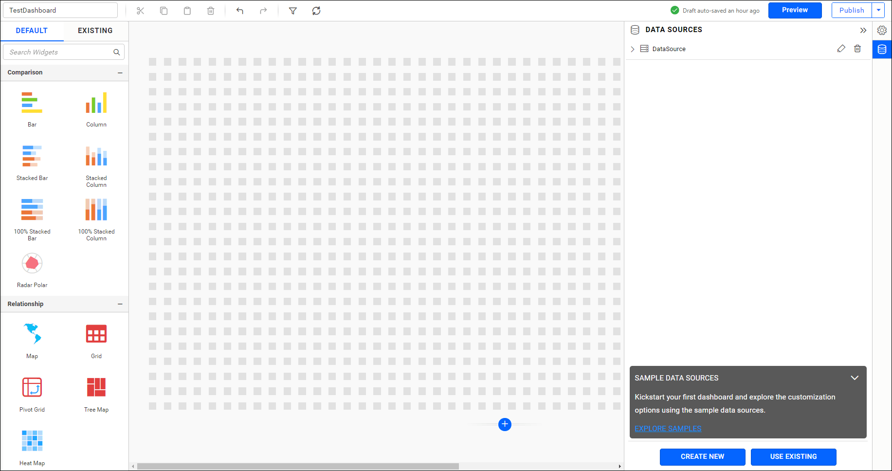
Now, the dashboard designer page will open, as shown in the image below.
Scrollable Dashboard
The default canvas size for a Bold BI dashboard is 48 columns x 24 rows. You can add additional rows using the Scrollable Dashboard feature. Moreover, you can remove added rows that exceed the default row size.
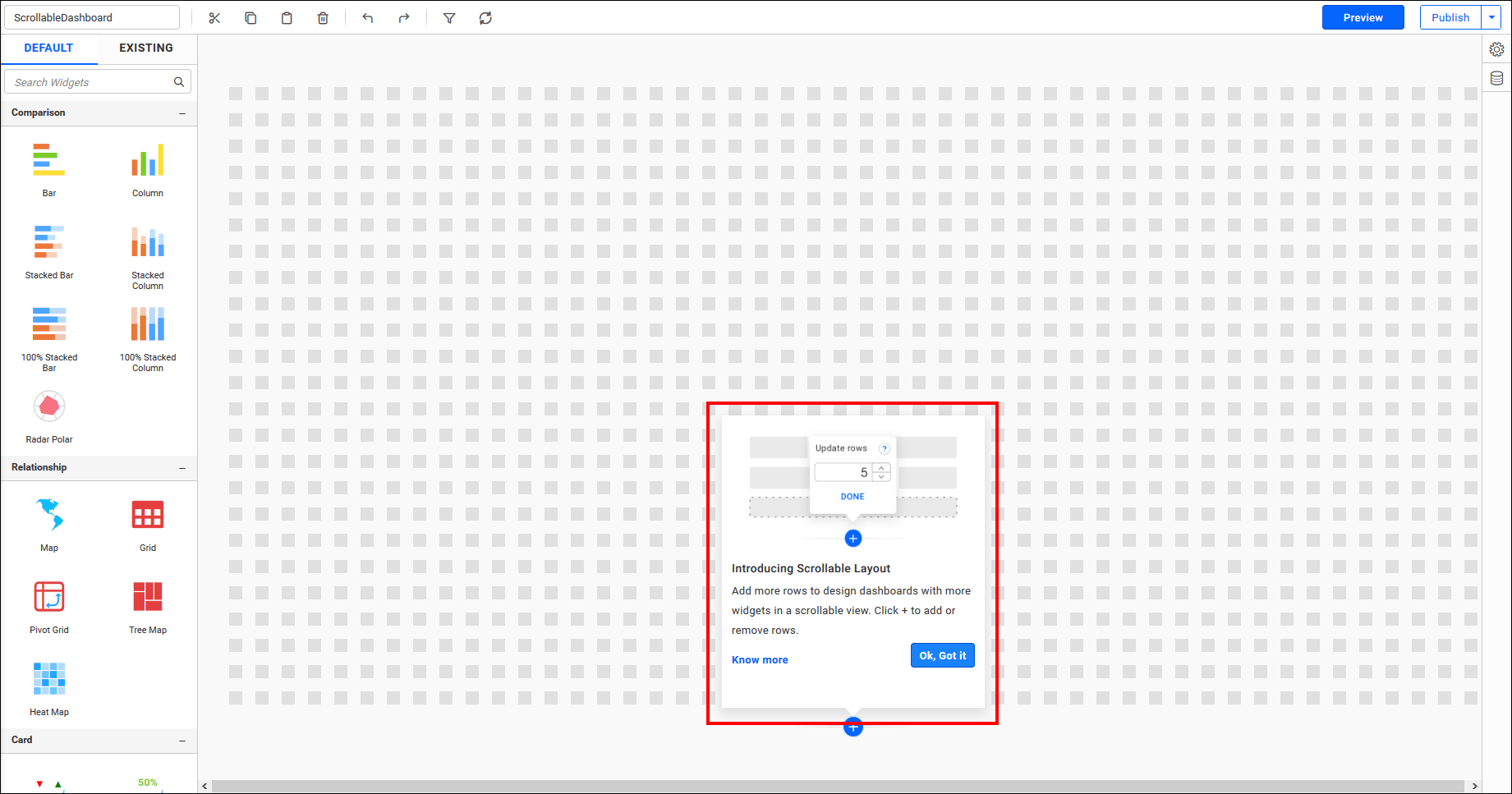
To add new rows, increase the row count and then click Done. If you attempt to add 40 or more rows, it may potentially impact the performance of the dashboard. In such cases, an alert message will be displayed, as shown in the image below.
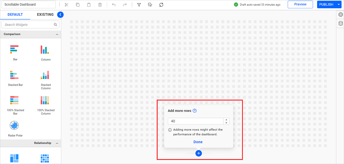
When new rows are added, the dashboard will become scrollable, allowing for the addition of extra widgets, as shown in the following image.
Connecting to data
To establish a data connection, you need to add a new data source using one of the supported data connection types, as described below.
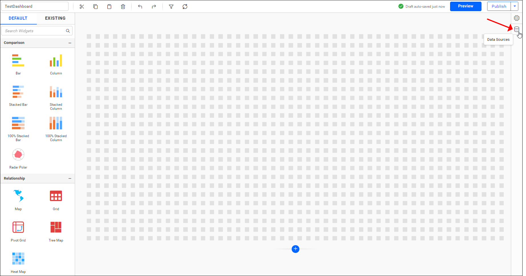
Setting up connection
Click the Data Source button in the configuration panel.
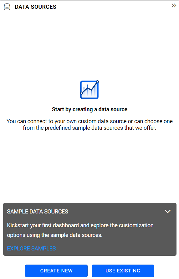
Click CREATE NEW to create a new connection or use an existing data source by clicking USE EXISTING in the data source window.
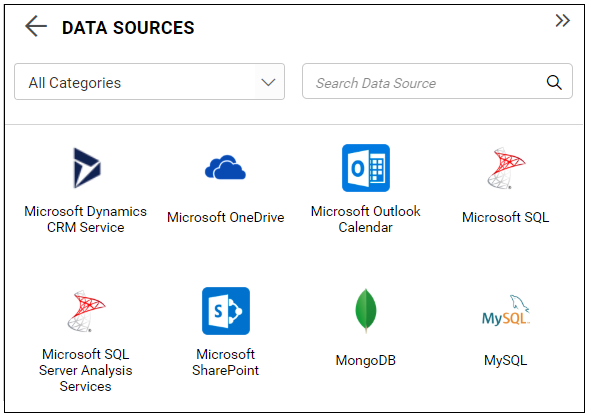
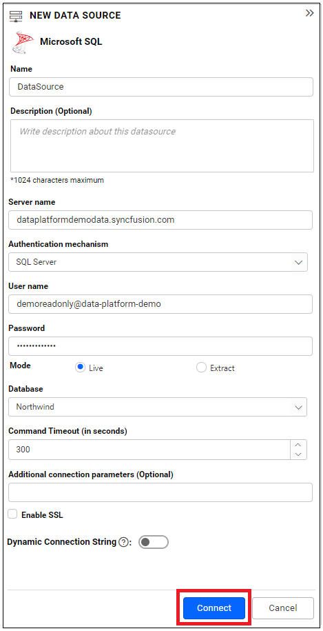
In the list of data sources, click on one of the listed data sources. For demonstration purposes, we have selected the Microsoft SQL connection type.
Configuring tables and views
In the NEW DATA SOURCE configuration panel, please provide the connection type and its related details.

Click on the Connect button in the NEW DATA SOURCE configuration panel.
Now, the following view will be displayed.
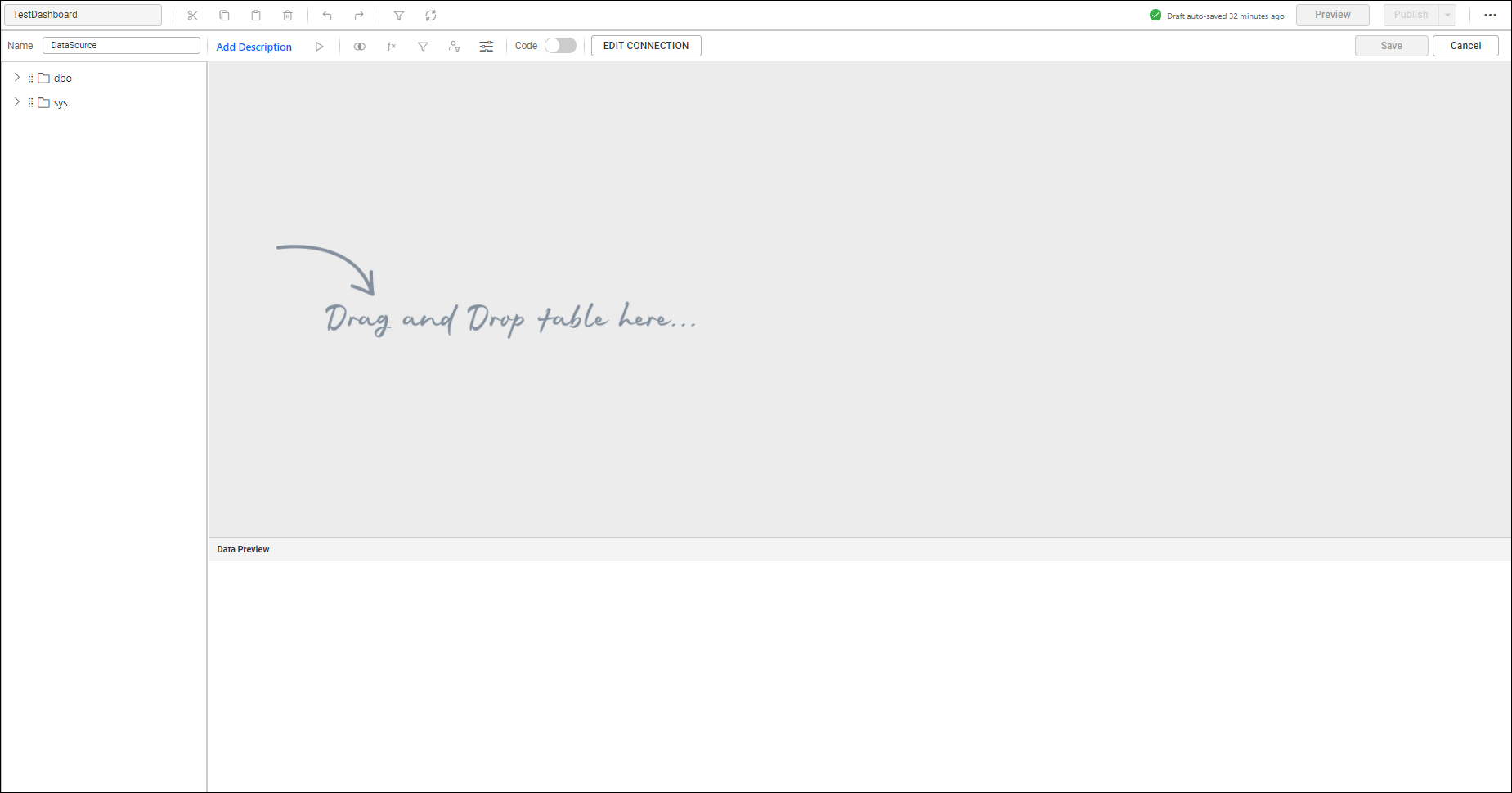
The left pane displays the tables and views associated with the connected database. Drag the preferred table or view from the left pane and drop it into the center pane labeled Drag and Drop table here.... Then, click Update in the bottom pane to view the data in the data preview grid, as shown below.
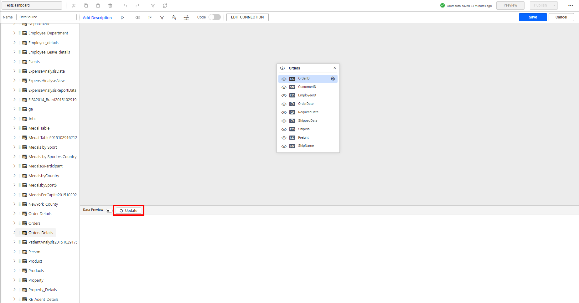
To automatically update the data in the data preview grid, enable the Toggle Option.

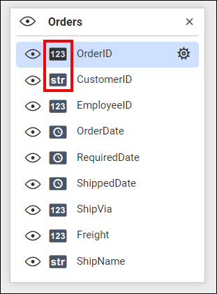
The data type of each column will be represented nearby, as shown below.
Add more than one table, if you prefer, by following the same drag and drop operation. This is subjected to joining of tables.
Transforming data
You can Rename a column as required by selecting the options in the Settings drop-down menu or by double-clicking the column to enable edit mode.
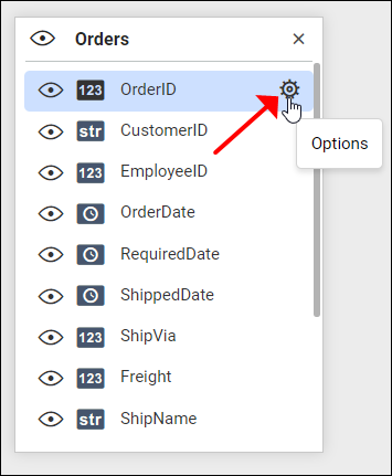
To remove an unwanted column, click the icon located on the left side of the respective column.
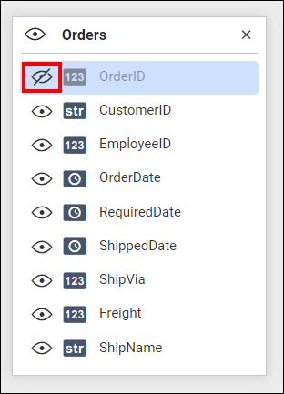
The column that has been removed will be represented as shown above. Clicking on it again will re-include that column for consideration.
To change the column type, click on the Settings icon of the corresponding column, navigate to Change Column Type, and select the preferred type for conversion.
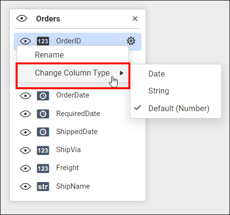
For supported column types and their equivalent convertible types, refer to the formatting columns section.
You can add required expression columns by creating them using built-in functions and existing columns. Click the option in the tools pane in data design view to open the expression dialog.

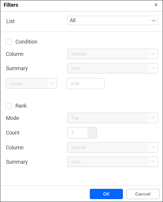
To filter the data that is not required in the dashboard, use the data filters option in the tools pane in data design view. Click the option to open the filter dialog.

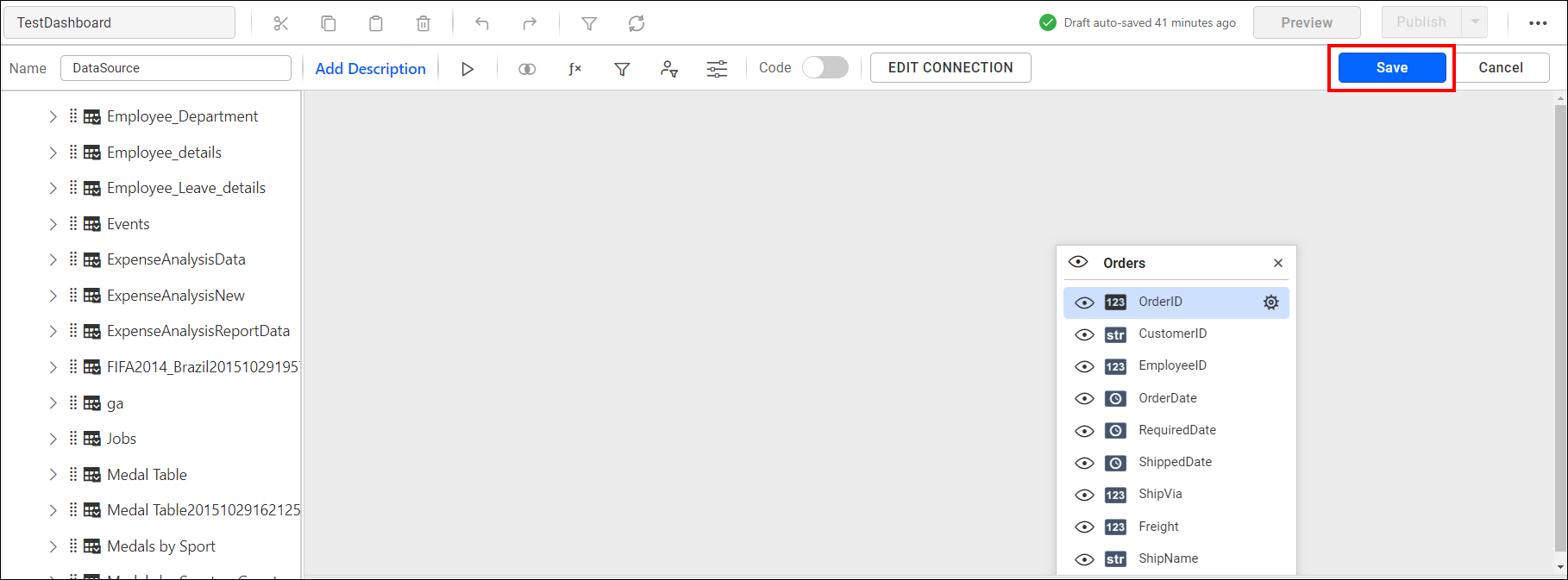
Click Save in the tools pane in the data design view to save the changes and navigate to the dashboard design view.
Creating dashboard
Now, the dashboard design view will open after the table has been successfully configured.
Adding a widget to design view
The left toolbox pane consists of data visualization, filtering, and miscellaneous widgets to design an interactive dashboard.
Please click and drag the preferred widget from the toolbox, then drop it into the available space of the design area.
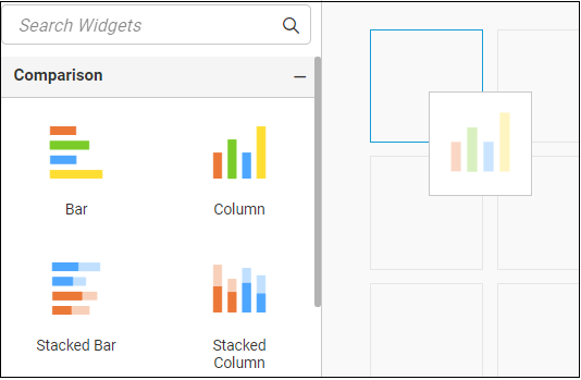
The widget will only drop if you place it in the appropriate region. A blue border around the cell indicates that the targeted region is valid for dropping.
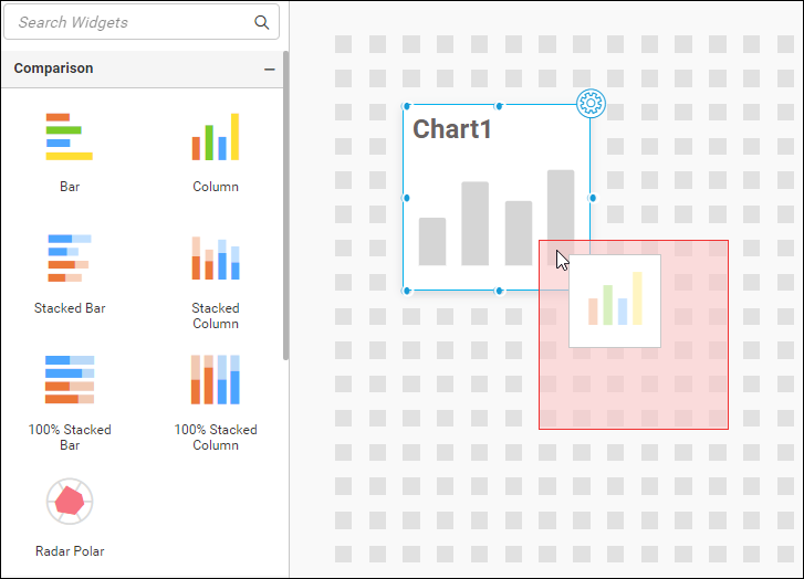
If you drop the widget in an invalid region where a widget or part of it already exists, a red border will be displayed to indicate the error.
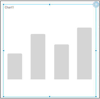
If needed, you can resize the dropped widget by placing the focus over it and dragging the widget corner.
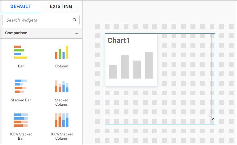
This will adjust the size of the widget. The blue border indicates the occupied cell range of the widget after resizing.
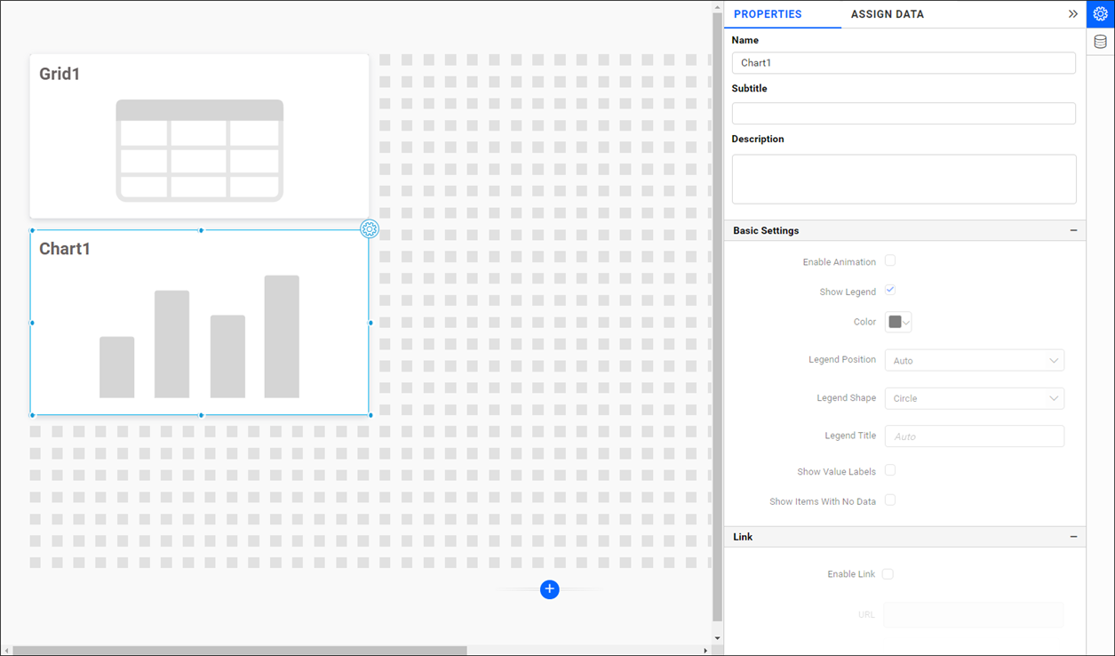
Assigning data to widget
NOTE: This step is only applicable to widgets that do not belong to the miscellaneous category, except for the
Imagewidget.
To bind data to a widget placed in the design area, focus on that widget.
Click the Properties button in the configuration panel to open the property pane. Switch to the ASSIGN DATA tab.
Here, you can configure the data for the widget in the designer canvas.
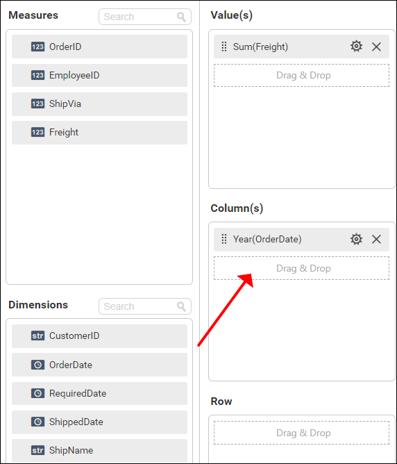
The ASSIGN DATA tab displays the data configuration view. The numeric columns and numeric expressions are listed under the Measures section, while other column types and dimension expressions are listed under the Dimensions section.
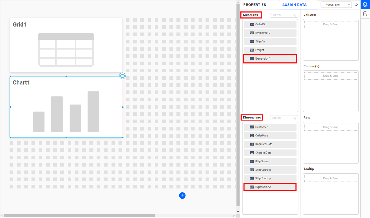
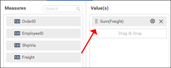
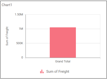
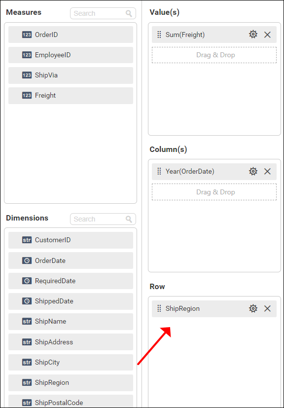
To assign data, select and drag a numeric column (measure element) or a numeric expression column from the Measure section and drop it in the Y Values section.
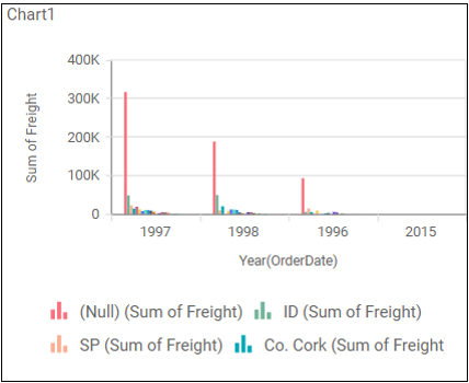
The widget will then render the chart for the assigned values.
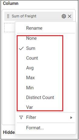
Click the Settings icon (highlighted) to open the aggregation type drop-down list.
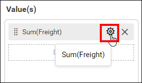
Set the preferred aggregation type to compute the dropped measure column.
Select and drag a non-numeric column (dimension element) from the Dimensions section and drop it into the Columns section. This column will be used to measure the numeric columns that were dropped.
The widget will update accordingly.

To group the added column element by a column, add the respective non-numeric column (dimension element) into the Rows section.
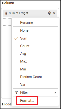
If needed, you can format the measure column values by clicking the Settings icon and selecting the Format option to open the Measure Measure Formatting dialog.
The Measure Formatting dialog will open as follows.
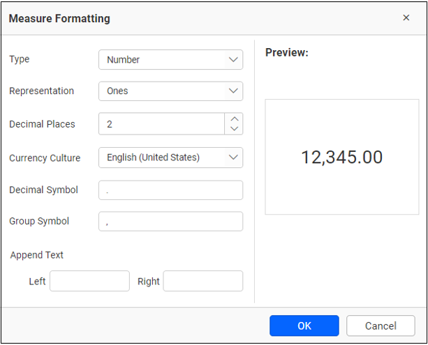
In the Measure Formatting dialog, make the necessary changes and click OK to save the changes or Cancel to discard them.
You can also filter the data for a particular widget using the Measure Filter or Dimension Filteroption in the Settings drop down menu.
Measure Filter
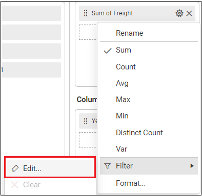
The Measure Filter dialog will open as follows:
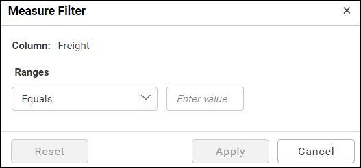
Refer to the filter to make required changes and click Apply to save the changes.
Dimension Filter
The Dimension Filter dialog will open as follows:
Refer to filter to make required changes and click OK to save the changes.
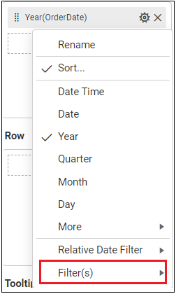
You can customize the sorting behavior of dimension and measure fields in each widget using the Sort option shown in the Settings drop down menu.
Dimension Sorting
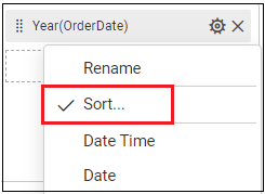
The Dimension Sorting dialog will open as follows:
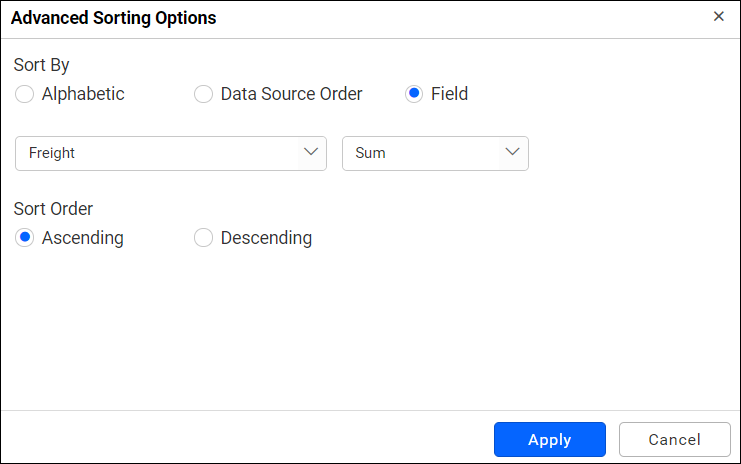
Refer to the sort to make required changes and click Apply to save the changes.
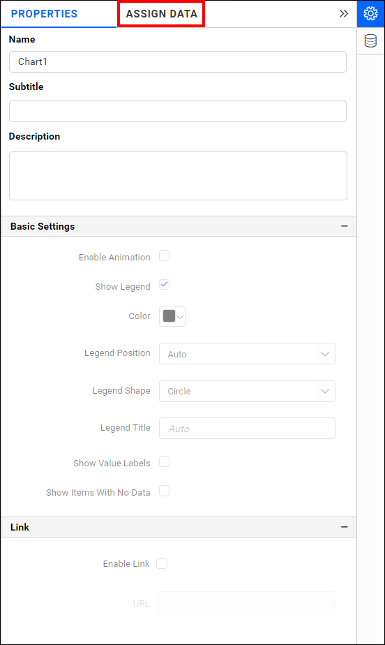
Configuring properties to widget
Navigate to the PROPERTIES pane in the properties tab.
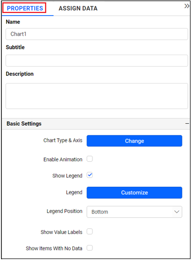
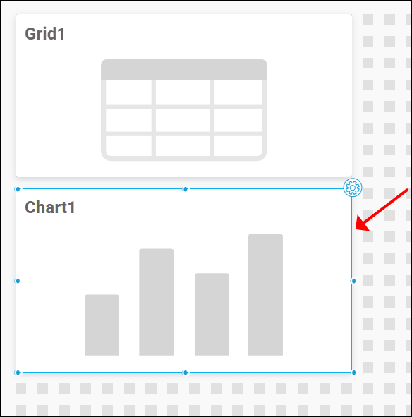
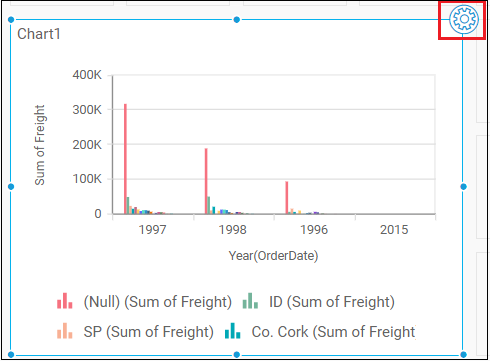
From the dashboard design tab, you can navigate to the properties pane by placing the focus on the widget as shown below.
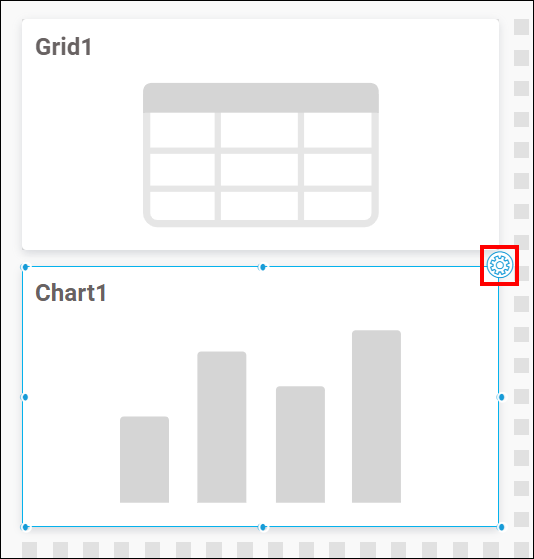
Click the Settings in the top right corner of the widget. The focus moves to the data design view tab and opens the PROPERTIES pane.
This pane holds some general settings and some specific to the widget. Configure the desired settings and refer to the Properties Configuration widget-wise for more details.
You can add more widgets by following the same procedure to create a dashboard as shown below.
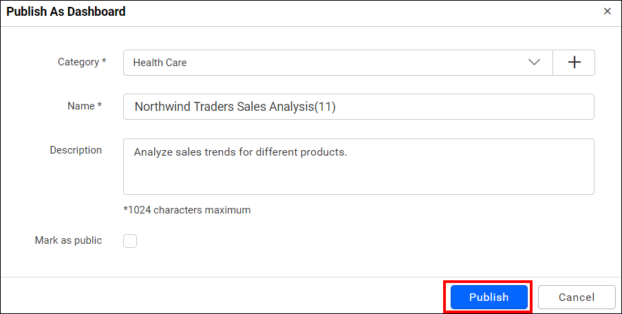
Once you are done with the dashboard, Publish it by clicking the Publish As button in the tools pane.
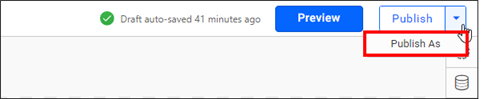
Click Publish in the dialog below.
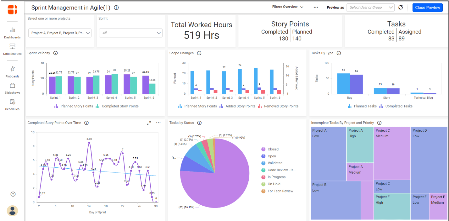
Click preview at the top right of the tools pane to see the dashboard preview launched in the web browser page.

Now, the dashboard preview can be visualized like below.
You can design any number of dashboards by following the steps given above.
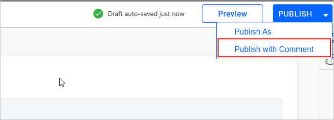
Publishing Dashboards with Comments
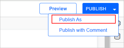
Once the datasource and widget are configured in the dashboard, there are two primary methods to publish the dashboard with comments.
Publish and Publish AS
When adding the dashboard using the Publish or Publish As option, you can provide comments in the designated comments text area. This allows you to include relevant notes or updates regarding the dashboard at the time of its initial publication.
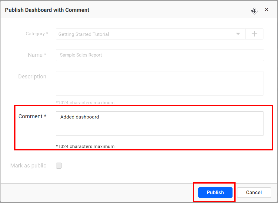
Publish With Comment
If you need to update an existing dashboard and wish to modify the comments, you can use the Publish With Comment option. This allows you to add new comments or update existing ones associated with the dashboard.
NOTE: If you choose to publish while updating the dashboard without using the
Publish With Commentoption, the previous version’s comments will automatically be included in the version history comments.