Theme
You can switch the application’s theme from light to dark mode and vice versa using this option. Additionally, you can customize the text color, active state, and hover state background color. You can also customize components such as switches, radio buttons, check boxes, and numeric text boxes by using branding colors. The dashboard theme can also be customized in this option.
Switch Application Theme Mode
The application theme mode can be switched to either light or dark mode. By default, the light mode is applied.
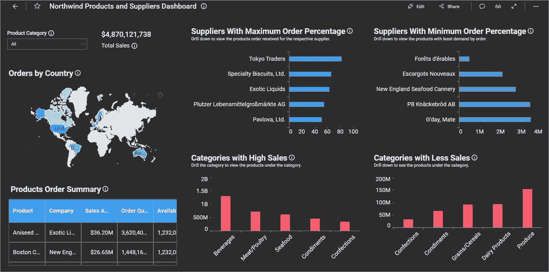
In the default light mode, the application will have a light appearance with the blue variant as the branding color, as shown in the image below.
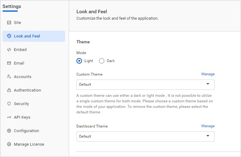
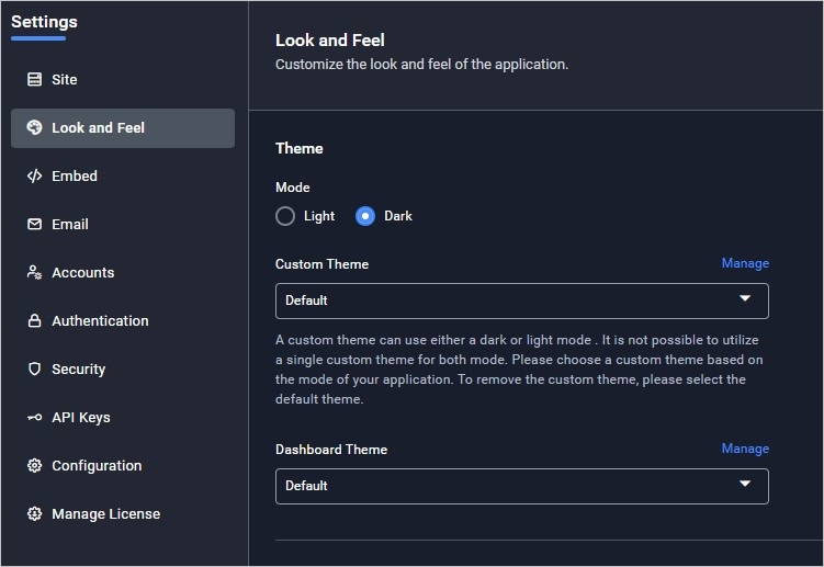
In dark default mode, the application will have a dark appearance with a blue variant as the branding color, as shown in the image below.
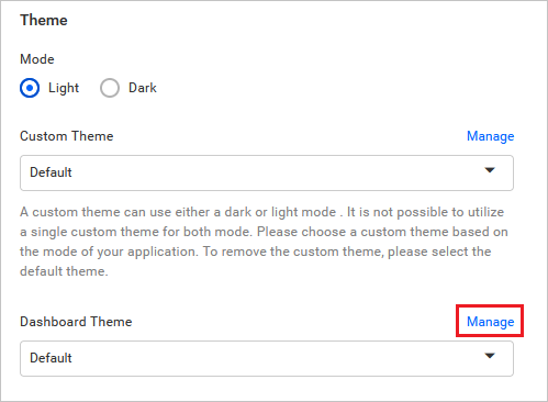
Custom Theme
You can upload a customized theme file using the Manage option in the theme section. With this feature, you can change the branding color, text color, active state, and hover state background colors, in addition to choosing between light or dark mode. The background and surface areas cannot be customized and will always follow the selected mode.
Please follow the steps below to create and apply a custom theme for the application:
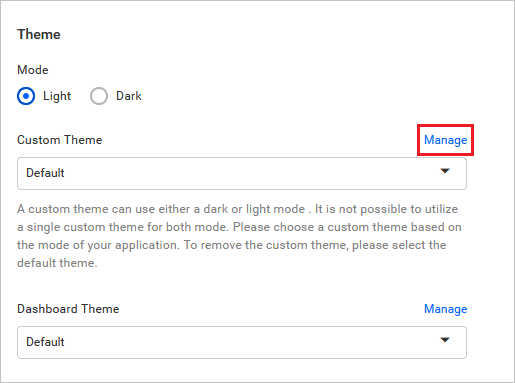
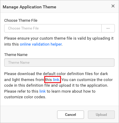
- Click on the
Manageoption to open a dialog for uploading your custom theme.
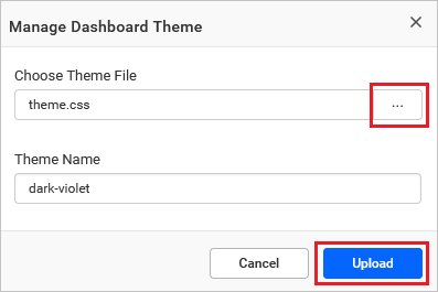
- Download the theme template files from the link highlighted in the image below.
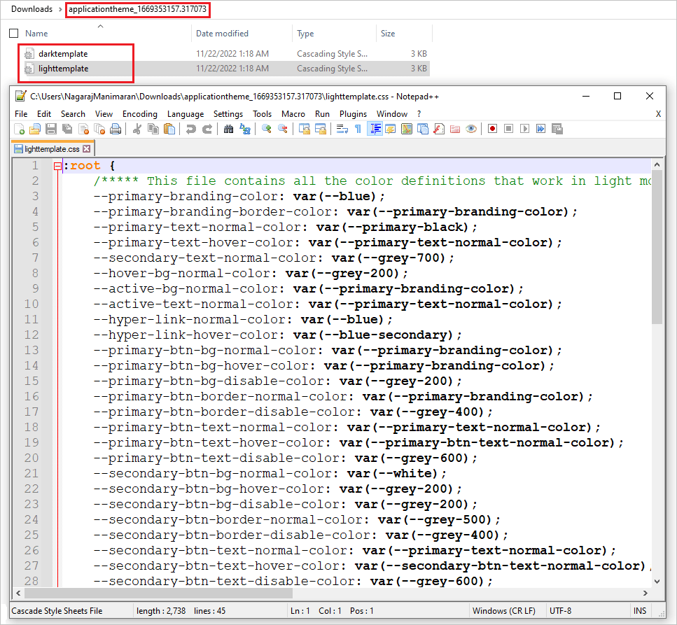
- Extract the downloaded zip folder. The extracted folder contains CSS3 variables with color code values for each component, as shown in the image.
- Update the color code values according to your preference and upload the updated custom theme file into the application. Refer to the Create application custom theme section to learn more about customizing color codes to create your preferred theme.
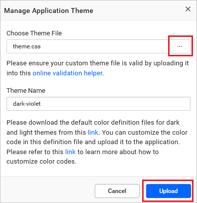
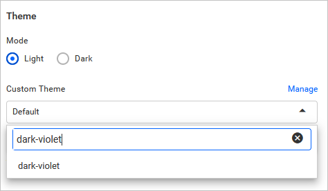
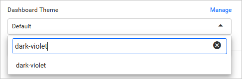
- The uploaded theme will be listed in the
Custom Themedrop-down. Select the uploaded theme in the custom theme drop-down and save the settings.
Here is a sample image after applying the custom theme.
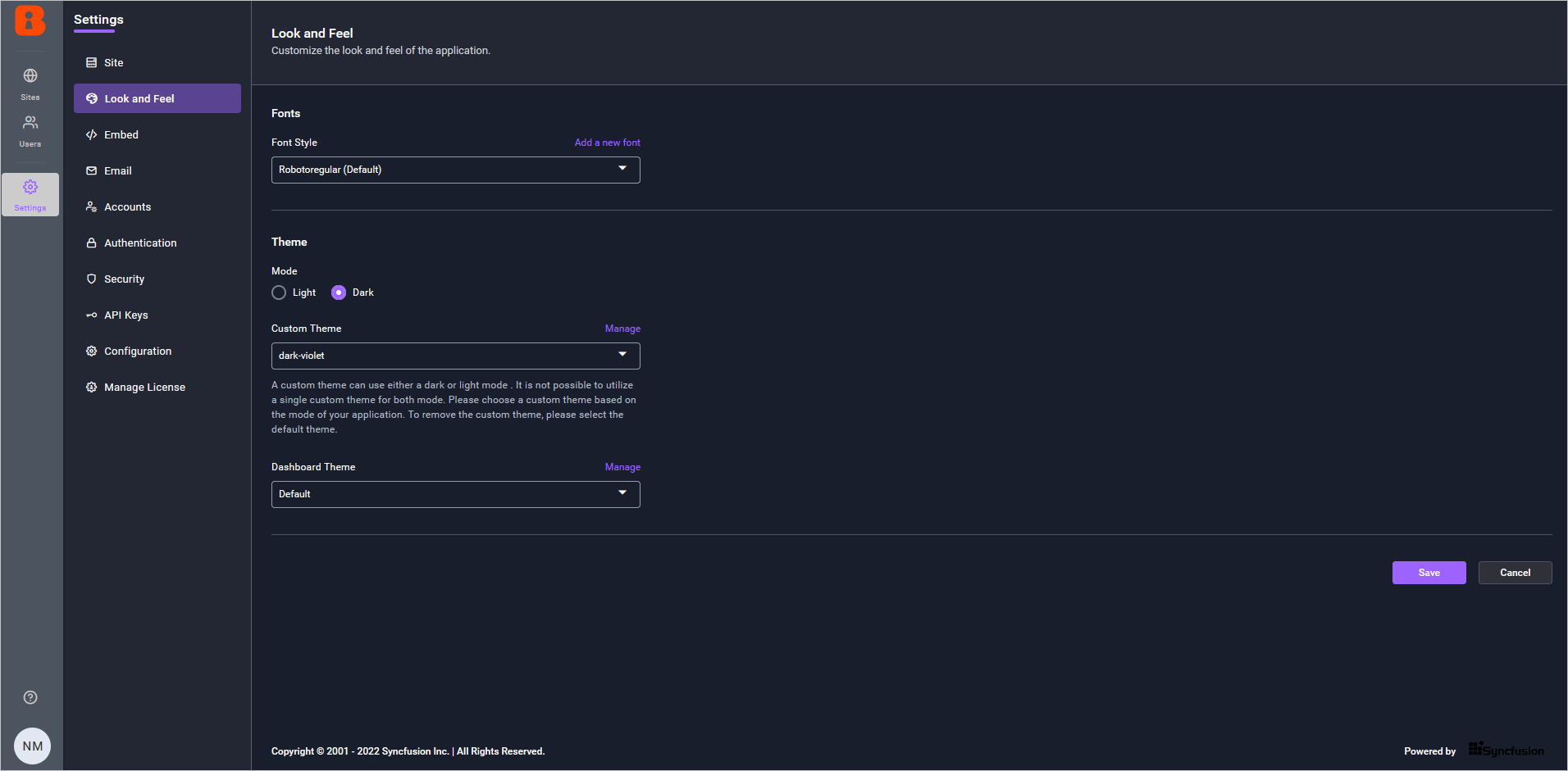
Dashboard Theme
You can customize the dashboard theme that will be applied to dashboards in dashboard view mode. By default, the Default option will be selected.
Follow these steps to upload the generated custom theme file:
- Click the
Manageoption next toDashboard Themeunder theThemesection.
- A dialog will appear below. Choose the created custom theme file by clicking three dots and then click
Upload. Please refer to the Create dashboard custom theme section to learn how to create your preferred custom theme file for dashboards.
- The uploaded custom theme file will appear in the
Dashboard Themedrop-down, as listed below. In theDashboard Themedrop-down menu, choose the uploaded theme, then save the settings.
- The dashboard will be rendered according to your customized theme file. For example, the
darkviolettheme is rendered as shown below.