
Bar Chart
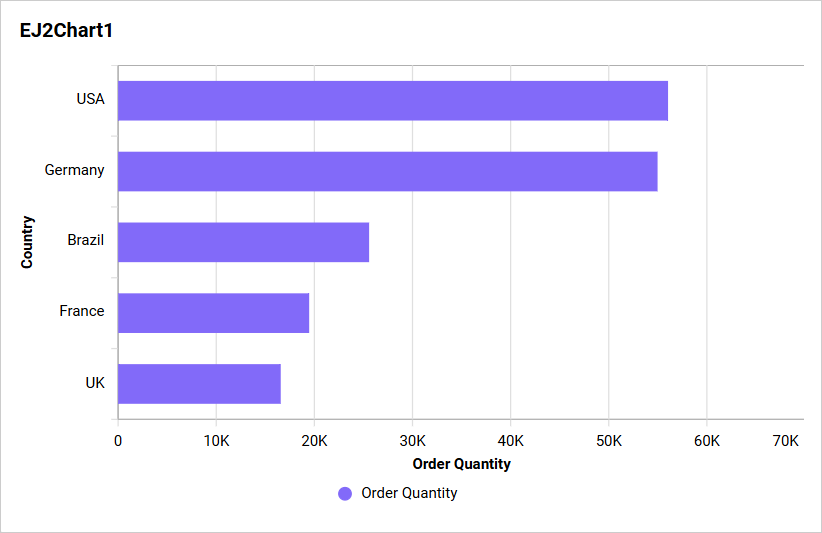
A Bar Chart compares values across categories using horizontal bars. It is useful when category labels are long or when differences between many categories need to be compared clearly.
Configuring Data
Configure the Bar Chart in the ASSIGN DATA tab. At least one field is required in Values.
| Data section | Requirement | Description |
|---|---|---|
| Values | Required | Accepts one or more measures or numeric expressions. Each field is aggregated and plotted as a series. |
| Columns | Optional | Accepts one or more dimensions for the category axis. Multiple fields create a drill-down hierarchy. |
| Row | Optional | Accepts one dimension and splits each value into series based on its distinct values. |
| Hidden Column | Optional | Accepts measures or dimensions used for filtering, linking, or underlying data without plotting them. |
| Filters | Optional | Accepts measures or dimensions and applies additional filtering conditions. |
| Tooltip | Optional | Accepts one or more measures shown as supplementary tooltip values. |
Assigning Data
- Drag the Bar Chart from the toolbox onto the design canvas.
- Select the chart, click the Settings icon, and open the
ASSIGN DATAtab. - Add one or more measures or numeric expressions to
Values. - Optionally, add dimensions to
Columnsto group the bars and create drill-down levels. - Optionally, add one dimension to
Rowto split the values into additional series. - Add fields to
Hidden Column,Filters, orTooltipas needed.
Multiple Values fields create multiple bar series. A Row field creates a series for each distinct row value.
Settings menu
Click the More options icon for an assigned field to access Rename, Aggregation type, Sort, Filter(s), and Format, when supported. See Aggregating Value Columns, Advanced Sorting, Configuring Widget Filters, and Formatting Measure Type Column.
When Row is configured, Exclude Rows is available for eligible Sum and Count value fields. Use it to keep selected series from being split by the row dimension.
Drill Down
Widgets that support hierarchies enable drill-down when multiple dimension fields are assigned to the hierarchy data section. Select a data point to move to the next level, and use the widget breadcrumb to return to a previous level.
Formatting the Bar Chart
You can format the Bar Chart using the property categories listed below.
General Settings
Refer to General Settings for information about configuring the widget type, unique name, title, subtitle, and description shown for the widget.
Basic Settings
Configure chart type and axis assignment, value labels, hover scaling, missing values, scrolling, bar size, border, and corner radius.
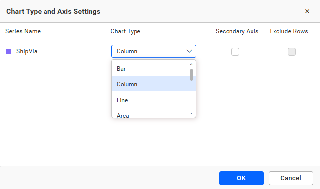
Refer to Basic Settings for more information.
Tooltip Settings
Configure tooltip visibility, content, color, direction, and shared display. Refer to Tooltip Settings for more information.
Legend Settings
Configure legend visibility, interaction, position, shape, title, and text behavior. Refer to Legend Settings for more information.
Series Palette
Configure series colors when Row is assigned. Refer to Series Palette for more information.
Link
Refer to Linking for information about configuring navigation from a data point.
Axis
Configure category and value axes, secondary-axis behavior, formats, and axis ranges.
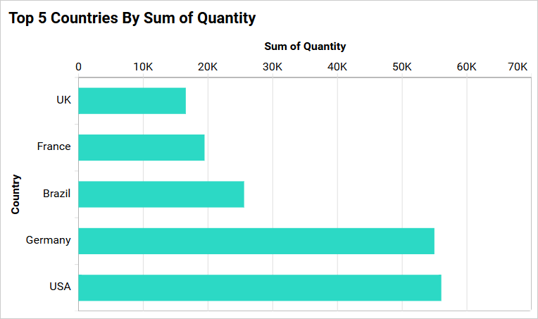
Refer to Axis for more information.
Grid Lines
Configure primary, secondary, and category-axis grid lines. Refer to Grid Lines for more information.
Trendline
Add a trendline when the Bar Chart has an eligible non-stacked data configuration. Refer to Trendline for more information.
Formatting
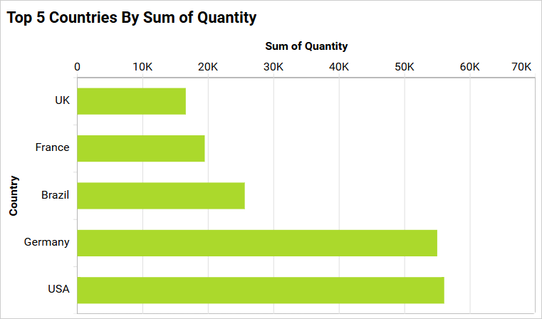
This allows you to change the color for the bar chart series.
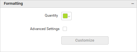
Changes are reflected in the chart immediately.
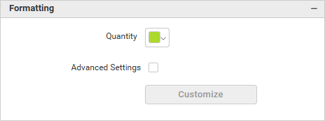
Advanced Settings
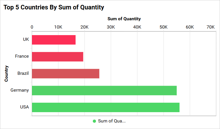
Enable Advanced Setting to open the conditional formatting dialog, where you can apply gradient or rule-based colors.
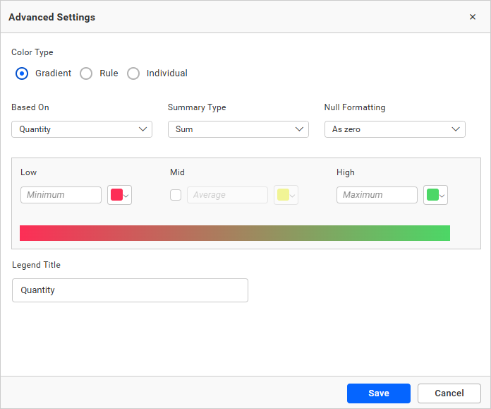
Select the mode, enter the required conditions, and click Save to apply.
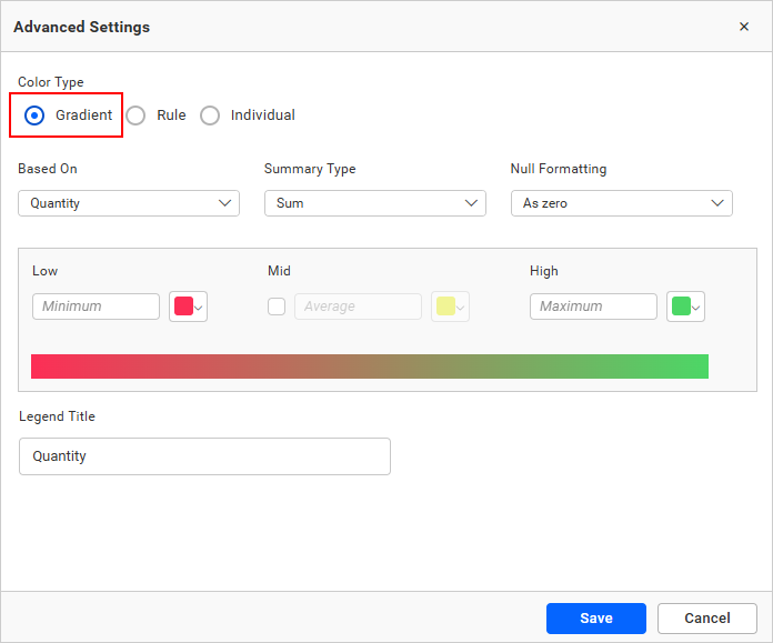
The widget visualization updates based on the applied conditions.
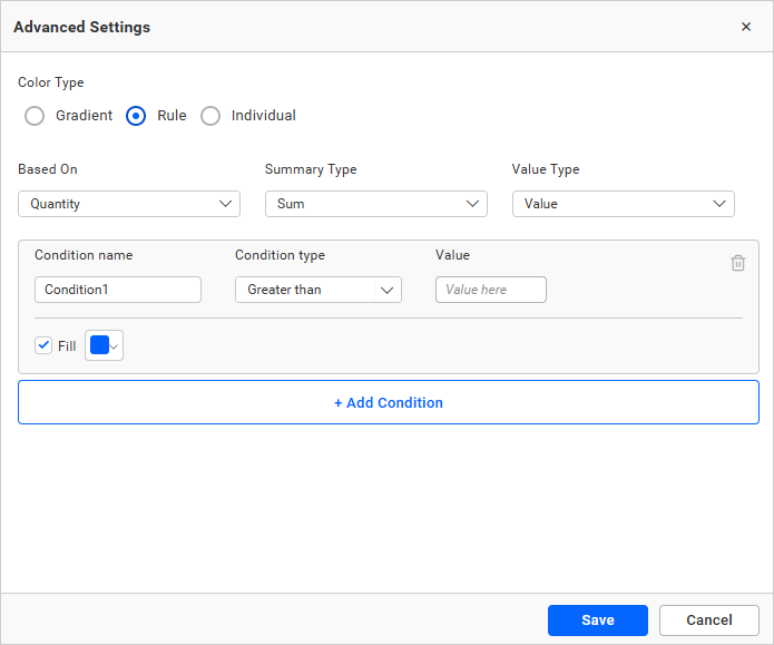
Rule-Based Condition Mode
Apply formatting rules using numeric or text conditions.
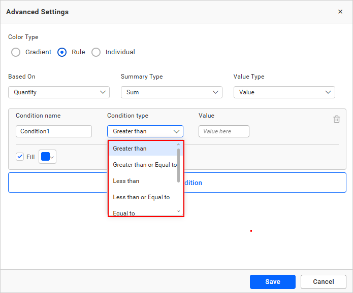
For numeric columns, the following condition types are available.
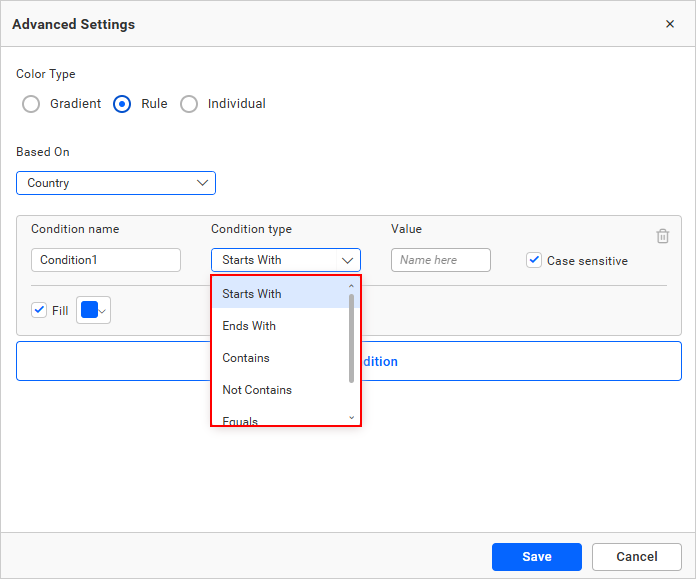
For dimension-based text conditions, the following types are available.
Individual Mode
In individual mode, you can specify a color for each data record.
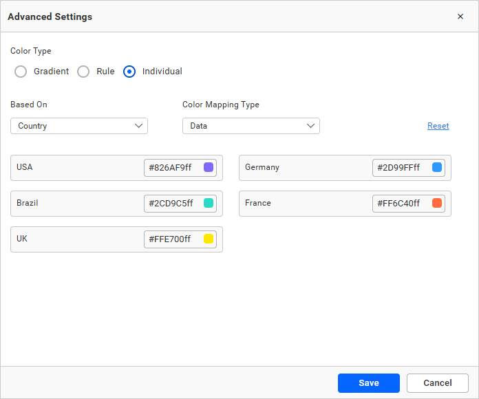
Color Mapping Type
Apply colors based on data or index.
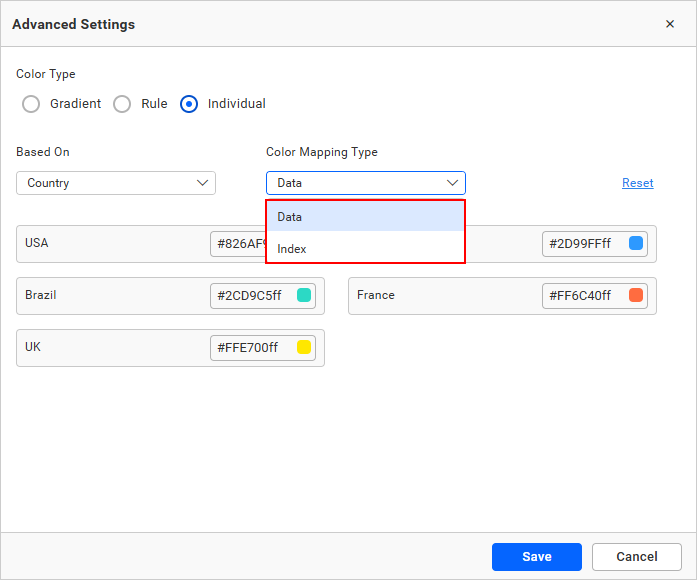
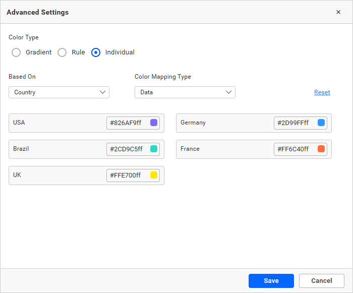
Data — applies color based on the data value.
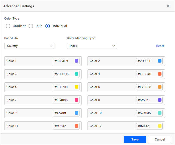
Index — applies color based on position, maintaining colors even when data changes.
Configure series colors and eligible advanced color rules. Refer to Formatting for more information.
Font Settings
Refer to Font Settings for information about configuring chart fonts.
Filter
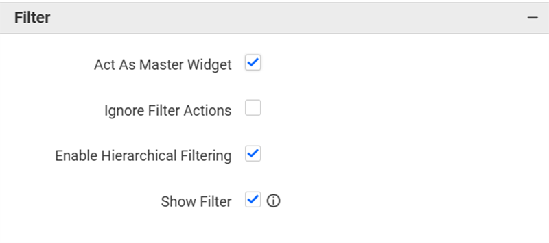
Refer to Filter Settings for information about configuring filter-related properties.
Container Appearance
Refer to Container Appearance for information about configuring the widget container.
Container Actions
Refer to Container Actions for information about configuring viewer actions.
No Data Appearance
Refer to No Data Appearance for information about configuring the chart when no data is available.
Export Settings
Refer to Export Options for information about configuring available export formats.
View Underlying Data
Refer to View Underlying Data for information about allowing viewers to inspect the chart’s underlying records.