
Radar/Polar Chart
A Radar or Polar Chart compares multiple measures across categories on axes that extend from a common center. Use it to identify relative strengths, weaknesses, and patterns across a common scale.
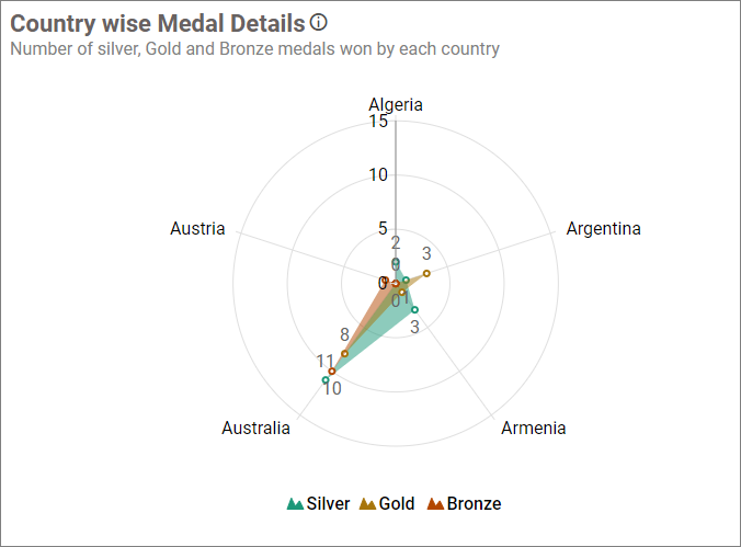
Configuring Data
| Data section | Requirement | Description |
|---|---|---|
| Value | Required | Measures plotted around the radial axes. |
| Column | Required | Dimension that defines the categories. |
| Hidden Column | Optional | Field used without displaying it in the chart. |
| Filters | Optional | Fields used to restrict the chart data. |
| Tooltip | Optional | Additional fields displayed in the tooltip. |
Assigning Data
- Drag the Radar Chart or Polar Chart from the toolbox onto the design canvas.
- Open the ASSIGN DATA tab.
- Add one or more measures to Value and a dimension to Column.
- Optionally add fields to Hidden Column, Filters, and Tooltip.
Field Settings
Use a field’s settings menu to configure the supported rename, aggregation, sorting, filtering, relative-date, and formatting options. See Configuring Data.
Formatting the Radar/Polar Chart
General Settings
Refer to General Settings for information about configuring the widget type, unique name, title, subtitle, and description shown for the widget.
Basic Settings
Enable Animation
Displays the series with animation when the chart loads or refreshes.
Show Marker
Shows or hides the marker at each data point. Marker availability depends on the selected series type.
Show Value Label
Displays the measure value at each data point.
Value Label Color
Sets the value-label text color and is available when Show Value Label is enabled.
Draw Type
Switches the visualization between Radar and Polar.
Chart Type
Draws the series as Line, Area, Spline, or Scatter.
Tooltip Settings
Show Tooltip
Shows or hides tooltips for data points.
Customize Tooltip
Opens the tooltip designer for choosing the displayed fields.
Enable RTL
Displays tooltip content from right to left.
Legend Settings
Show Legend
Shows or hides the series legend.
Interactivity
Lets viewers show or hide a series by selecting its legend item.
Legend Label Color
Sets the legend text color.
Position
Places the legend at the Bottom, Left, Right, or Top.
Legend Shape
Displays legend markers as a Circle or by Series Type.
Customize
Opens the legend editor and is available after data is assigned and the legend is shown.
Axis
Label Color
Sets the axis-label color.
Show Axis Border
Shows or hides the axis border.
Show X-Axis
Shows or hides the category axis.
Show Y-Axis
Shows or hides the value axis.
Axis Range
Opens the primary value-axis range settings for configuring minimum, maximum, and interval values.
Grid Lines
Category Axis
Shows or hides the X-axis grid lines.
Primary Value Axis
Shows or hides the Y-axis grid lines.
Series Palette
Color Settings
Opens the palette editor for configuring series colors. It is available after Value and Column fields are assigned.
Font Settings
Refer to Font Settings for chart font properties.
Filter
Refer to Filter Settings for filter behavior.
Link
Refer to Linking for data-point navigation.
Container Appearance
Refer to Container Appearance for widget-container styling.
Container Actions
Refer to Container Actions for viewer actions.
No Data Appearance
Refer to No Data Appearance for empty-state settings.
Export Settings
Refer to Export Options for export settings.
View Underlying Data
Refer to View Underlying Data for access to chart records.