
Stacked Column Chart
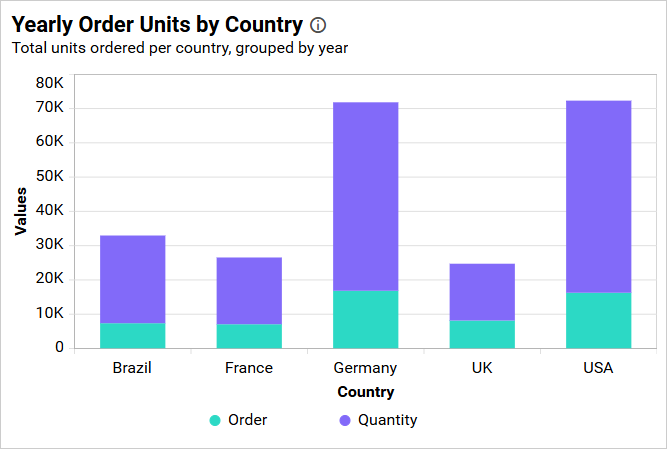
A Stacked Column Chart uses vertical columns divided into series segments. It compares category totals and the contribution of each series to those totals.
Configuring Data
Configure the Stacked Column Chart in the ASSIGN DATA tab. At least one field is required in Values.
| Data section | Requirement | Description |
|---|---|---|
| Values | Required | Accepts one or more aggregated measures or numeric expressions. Each field forms a stacked series. |
| Columns | Optional | Accepts one or more category dimensions. Multiple fields create a drill-down hierarchy. |
| Row | Optional | Accepts one dimension and creates additional stacked series from its distinct values. |
| Hidden Column | Optional | Accepts measures or dimensions used without plotting them. |
| Filters | Optional | Accepts measures or dimensions for additional filtering. |
| Tooltip | Optional | Accepts measures shown as supplementary tooltip values. |
Assigning Data
- Add the Stacked Column Chart to the design canvas and open its
ASSIGN DATAtab. - Add one or more measures or numeric expressions to
Values. - Optionally, add dimensions to
Columnsfor categories and drill down. - Optionally, add one dimension to
Rowto create additional series. - Add fields to
Hidden Column,Filters, orTooltipas needed.
Each category is represented by one column, and the configured value and row series are stacked within it.
Settings menu
Use the More options icon to configure Rename, Aggregation type, Sort, Filter(s), and Format, when supported. With Row configured, Exclude Rows is available for eligible Sum and Count value fields. See Data Configuration.
Drill Down
Widgets that support hierarchies enable drill-down when multiple dimension fields are assigned to the hierarchy data section. Select a data point to move to the next level, and use the widget breadcrumb to return to a previous level.
Formatting the Stacked Column Chart
You can format the Stacked Column Chart using the property categories listed below.
General Settings
Refer to General Settings for information about configuring the widget type, unique name, title, subtitle, and description shown for the widget.
Basic Settings
Configure chart type and axis assignment, labels, hover scaling, missing values, scrolling, column size, border, and corner radius. Refer to Basic Settings for more information.
Tooltip Settings
Configure tooltip visibility, content, color, direction, and shared display. Refer to Tooltip Settings for more information.
Legend Settings
Configure legend visibility, interaction, position, shape, title, and text behavior. Refer to Legend Settings for more information.
Series Palette
Configure series colors when Row is assigned. Refer to Series Palette for more information.
Link
Refer to Linking for information about configuring navigation from a data point.
Axis
Configure category and value axes, secondary-axis behavior, formats, and axis ranges. Refer to Axis for more information.
Grid Lines
Configure primary, secondary, and category-axis grid lines. Refer to Grid Lines for more information.
Formatting
Configure the colors used by stacked series. Refer to Formatting for more information.
Font Settings
Refer to Font Settings for information about configuring chart fonts.
Filter
Refer to Filter Settings for information about configuring filter-related properties.
Container Appearance
Refer to Container Appearance for information about configuring the widget container.
Container Actions
Refer to Container Actions for information about configuring viewer actions.
No Data Appearance
Refer to No Data Appearance for information about configuring the chart when no data is available.
Export Settings
Refer to Export Options for information about configuring available export formats.
View Underlying Data
Refer to View Underlying Data for information about allowing viewers to inspect the chart’s underlying records.