
Radial Gauge
A Radial Gauge displays an actual value on a circular scale and can compare it with a target or performance range.
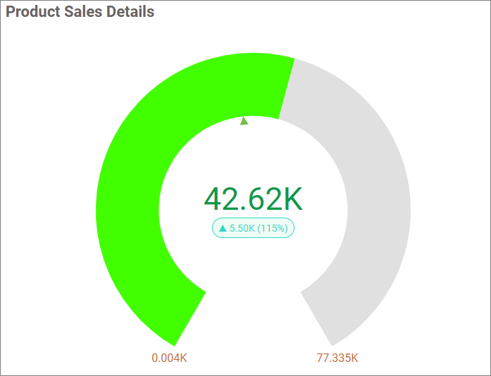
Configuring Data
| Data section | Requirement | Description |
|---|---|---|
| Actual Value | Required | Measure represented by the gauge pointer. |
| Target Value | Optional | Measure represented by the target marker. |
| Start Value | Optional | Measure that supplies the beginning of the scale. |
| End Value | Optional | Measure that supplies the end of the scale. |
| Series | Optional | Dimension that creates one gauge for each member. |
| Hidden Column | Optional | Field used without displaying it. |
| Filters | Optional | Fields used to restrict gauge data. |
Assigning Data
- Add the Radial Gauge to the canvas and open ASSIGN DATA.
- Add a measure to Actual Value.
- Optionally configure Target Value, Start Value, End Value, and Series.
- Add hidden columns and filters when required.
Field Settings
Use a field’s settings menu to configure supported rename, aggregation, sorting, filtering, relative-date, and formatting options. See Configuring Data.
Formatting the Radial Gauge
General Settings
Refer to General Settings for information about configuring the widget type, unique name, title, subtitle, and description shown for the widget.
Basic Settings
Gauge Type
Selects Half Circle, Horse Shoe, or Full Circle.
Minimum
Sets the beginning of the scale. It is disabled when a field is assigned to Start Value.
Maximum
Sets the end of the scale. It is disabled when a field is assigned to End Value.
Enable Animation
Animates the gauge when it loads or refreshes.
Show Actual Value
Displays the actual measure value. Value Color sets its text color when an actual value is configured.
Show Difference Value
Displays the difference between actual and target values when both fields are assigned.
Percent Color
Sets the difference-value color for a Full Circle gauge.
Percent Size
Sets the Full Circle difference-value size from 12 through 55 pixels.
Tooltip Settings
Show Tooltip
Displays gauge values when a viewer points to the visual.
Customize Tooltip
Opens the tooltip editor for arranging and formatting the supported gauge values.
Enable RTL
Displays tooltip content from right to left.
Color Settings
Direction
Selects High is Good or Low is Good to determine how actual performance is evaluated.
High Color
Defines the color used when the gauge indicates a high or positive performance state.
Medium Color
Defines the color used when the gauge indicates a neutral or warning performance state.
Low Color
Defines the color used when the gauge indicates a low or negative performance state.
Formatting
Color Settings
Opens the formatting editor for configuring value-based gauge colors.
Pointer Settings
Value Pointer
Selects Range Pointer, Needle Pointer, or Range with Needle for supported non-Full-Circle gauges.
Range Bar Color
Sets the range-pointer color.
Needle Pointer Color
Sets the needle color.
Needle Value Pointer Height
Sets needle length from 20 through 100 percent of the gauge radius.
Target Pointer
Selects Line, Triangle, or Inverted Triangle for the target marker.
Target Pointer Color
Sets the target-marker color.
Scale Settings
Scale Color
Sets the scale-line color.
Show Ticks
Displays scale ticks. Ticks Position places them Inside or Outside the gauge.
Ticks Height
Sets tick length from 1 through 10, and Ticks Width sets thickness from 1 through 5 pixels.
Show Scale Label
Displays scale values. Scale Label Position places them Inside or Outside the gauge.
Range Width
Sets the scale range thickness from 1 through 60 pixels.
Range Settings
Show Range
Displays configurable performance bands on the scale.
Ranges
Selects Range1, Range2, or Range3 for editing.
Start
And End define the selected range boundaries.
Range Color
Sets the range-band color.
Value Color
Selects Default Color or Range Color for the actual value.
Label Color
Selects Default Color or Range Color for scale labels.
Link
Refer to Linking for gauge navigation.
Font Settings
Refer to Font Settings for gauge fonts.
Filter
Refer to Filter Settings for filter behavior.
Inter-Widget Linking
Refer to Inter-Widget Linking for information about linking the Radial Gauge to a Tab widget.
Container Appearance
Refer to Container Appearance for widget-container styling.
Container Actions
Refer to Container Actions for viewer actions.
No Data Appearance
Refer to No Data Appearance for empty-state settings.
Export Settings
Refer to Export Options for export settings.
View Underlying Data
Refer to View Underlying Data for access to gauge records.