
Scatter Chart
A Scatter Chart plots data points using X- and Y-axis values, helping viewers identify relationships, clusters, and outliers. Assigning a measure to Size displays the points as bubbles and represents an additional value through bubble size.
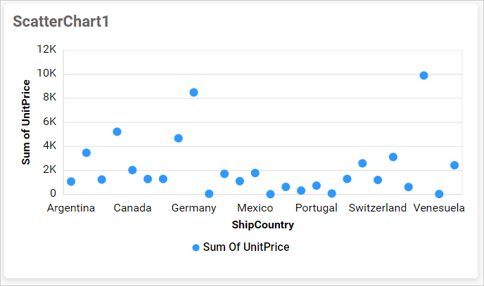
Configuring Data
Configure the Scatter Chart in the ASSIGN DATA tab. One field is required in both Y-Axis and X-Axis.
| Data section | Requirement | Description |
|---|---|---|
| Y-Axis | Required | Accepts one measure and controls the vertical position of each point. |
| X-Axis | Required | Accepts one measure or dimension and controls the horizontal position of each point. A numeric field produces a value axis; other supported fields produce a category axis. |
| Label | Optional | Accepts one dimension and identifies the individual points. It cannot be used when X-Axis contains a dimension or when either axis uses the None summary type. |
| Row | Optional | Accepts one field and splits the plotted points into separate color-coded series based on its distinct values. |
| Size | Optional | Accepts one measure and controls point size. Adding this field changes the visualization from scatter points to bubbles. |
| Hidden Column | Optional | Accepts measures or dimensions used for linking, filtering, or underlying data without plotting them. |
| Filters | Optional | Accepts measures or dimensions and applies additional filtering conditions. |
| Tooltip | Optional | Accepts one or more fields displayed as supplementary tooltip information without changing the visualization. |
Assigning Data
- Drag the Scatter Chart from the toolbox onto the design canvas.
- Select the chart, click the Settings icon, and open the
ASSIGN DATAtab. - Add a measure to
Y-Axis. - Add a measure or dimension to
X-Axis. - Optionally, add a dimension to
Labelto identify individual points. - Optionally, add a field to
Rowto create multiple series. - Optionally, add a measure to
Sizeto display a Bubble Chart. - Add fields to
Hidden Column,Filters, orTooltipas needed.
Settings menu
Click the More options icon for an assigned field to access Rename, Aggregation type, Sort, Filter(s), and Format, when supported. See Aggregating Value Columns, Advanced Sorting, Configuring Widget Filters, and Formatting Measure Type Column.
The None summary type is available for fields assigned to X-Axis and Y-Axis. Remove the Label field before using None on either axis. Settings that change sorting, filtering, relative dates, or measure formatting are unavailable for fields in Hidden Column.
Formatting the Scatter Chart
You can format the Scatter Chart using the property categories listed below.
General Settings
Refer to General Settings for information about configuring the widget type, unique name, title, subtitle, and description shown for the widget.
Basic Settings
Show Value Labels
Displays a label beside each scatter point or bubble.
Series Shape
Opens the shape selector for customizing scatter-point markers. It is available only when Size is not configured; bubbles use their own circular representation.
Show Axis Border
Shows or hides the border lines for the chart axes.
Tooltip Settings
Show Tooltip
Displays the X-axis, Y-axis, and other configured information when a viewer points to a scatter point or bubble. Disabling it disables the remaining tooltip controls.
Customize Tooltip
Opens the tooltip designer for choosing and arranging the fields displayed in the tooltip.
Enable RTL
Displays tooltip content from right to left.
Legend Settings
The Scatter Chart displays a legend when Row is configured and creates multiple series.
Show Legend
Shows or hides the series legend. Enabling it makes the position setting available.
Interactivity
Lets viewers show or hide a series by selecting its legend item. It is unavailable when advanced color settings prevent series-level interaction.
Position
Places the legend automatically or at the Top, Bottom, Left, or Right of the chart.
X-Axis Settings
Show X Axis
Shows or hides the horizontal axis. Disabling it hides the remaining X-axis controls.
Show Axis Title
Shows or hides the X-axis title.
Axis Title
Specifies a custom X-axis title. When left empty, the assigned field name is used.
Label Rotation
Rotates X-axis labels using the selected automatic or fixed angle.
Axis Format
Opens formatting options for the X-axis values.
Axis Range
Opens the range dialog for setting the X-axis Minimum, Maximum, and Interval. It is available when the X-axis is visible and uses a numeric field. Leave a value empty to calculate it automatically; supported number-type dashboard parameters can also supply the values.
Y-Axis Settings
Show Y Axis
Shows or hides the vertical axis. Disabling it hides the remaining Y-axis controls.
Show Axis Title
Shows or hides the Y-axis title.
Axis Title
Specifies a custom Y-axis title. When left empty, the assigned measure name is used.
Axis Format
Opens formatting options for the Y-axis values.
Axis Range
Opens the range dialog for setting the Y-axis Minimum, Maximum, and Interval. Leave a value empty to calculate it automatically; supported number-type dashboard parameters can also supply the values.
Opposed Axis
Moves the Y-axis from its default side of the chart to the opposite side.
Grid Lines
Category Axis
Shows or hides grid lines aligned with the X-axis values.
Primary Value Axis
Shows or hides grid lines aligned with the Y-axis values.
Formatting
This group is available when Row is not configured.
Color Settings
Sets the color used for scatter points or bubbles. Use its advanced settings to apply supported gradient, rule-based, or individual colors based on data values.
Refer to Conditional Formatting for the available formatting modes.
Series Palette
This group is available when Row is configured.
Use Default Palette
Uses the default colors for the scatter series. Disable it to display the custom palette editor.
Color Palette
Opens the palette editor for assigning a color to each series created by the Row field.
Font Settings
Refer to Font Settings for information about configuring chart fonts.
Link
Refer to Linking for information about configuring navigation from a data point.
Filter
Refer to Filter Settings for information about configuring filter-related properties.
Container Appearance
Refer to Container Appearance for information about configuring the widget container.
Container Actions
Refer to Container Actions for information about configuring viewer actions.
No Data Appearance
Refer to No Data Appearance for information about configuring the chart when no data is available.
Export Settings
Refer to Export Options for information about configuring available export formats.
View Underlying Data
Refer to View Underlying Data for information about allowing viewers to inspect the chart’s underlying records.