
Range Slider
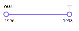
A Range Slider lets dashboard viewers filter data by dragging handles to define a numeric or date range. It provides an intuitive visual interface for selecting lower and upper bounds from a continuous scale.
Use a range slider when:
- Viewers need to interactively narrow a numeric or date range to filter other widgets.
- A visual handle metaphor is more intuitive than typing exact filter values.
- Both a lower and upper bound need to be set simultaneously.
Configuring Data
The Range Slider requires at least one Columns field.
| Data section | Required | Description |
|---|---|---|
| Columns | Yes | Numeric or date dimension column that determines the slider scale. |
Steps
- Drag and drop the Range Slider control from the toolbox onto the design canvas.
- Resize the widget as required.
- Click the Properties icon in the configuration panel, then switch to the ASSIGN DATA tab.
- Drag a numeric or date dimension field into Columns.
Settings menu
Click the settings icon on the configured field to access:
- Rename — Overrides the display name for that field.
- Sort — Applies sort order. See Advanced Sorting.
- Filter — Adds a field-level filter. See Configuring Widget Filters.
Formatting the Range Slider
Basic Settings
Range Selection
Enables selection of a range with two handles. Disable it to select a single value.
Orientation
Sets the slider direction to horizontal or vertical.
Slider Interval
Sets the interval between values on the slider scale.
Label Color
Sets the color of the slider labels.
Slider Color
Sets the color of the slider track and selection.
For slider text styling, see Font Settings. The Range Slider also provides a tooltip section for values displayed during interaction.
Shared Properties
| Property | Purpose |
|---|---|
| Font Settings | Configure the slider font family and style. |
| Tooltip Settings | Configure the value tooltip displayed during slider interaction. |
| Container Appearance | Set title, subtitle, background, border, padding, shadow, and export actions. |