
Doughnut Chart
A Doughnut Chart represents values as proportional segments of a ring. The hollow center distinguishes it from a Pie Chart while retaining the same part-to-whole comparison.
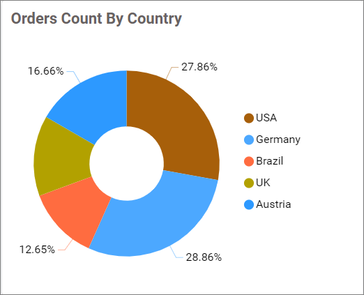
Configuring Data
Configure the Doughnut Chart in the ASSIGN DATA tab. At least one field is required in Values.
| Data section | Requirement | Description |
|---|---|---|
| Values | Required | Accepts one or more measures or numeric expressions. Each value is aggregated and determines the size of a segment. |
| Columns | Optional | Accepts one or more dimensions that divide the values into categorized segments. Multiple fields create a drill-down hierarchy. |
| Row | Optional | Accepts one dimension and creates a separate Doughnut Chart for each distinct value. |
| Hidden Column | Optional | Accepts measures or dimensions used for filtering, linking, or underlying data without displaying them. |
| Filters | Optional | Accepts measures or dimensions and applies additional filtering conditions. |
| Tooltip | Optional | Accepts one or more measures shown as supplementary tooltip values. |
Assigning Data
- Drag the Doughnut Chart from the toolbox onto the design canvas.
- Select the chart, click the Settings icon, and open the
ASSIGN DATAtab. - Add a measure or numeric expression to
Values. - Optionally, add dimensions to
Columnsfor categorized segments and drill down. - Optionally, add a dimension to
Rowto create multiple charts. - Add fields to
Hidden Column,Filters, orTooltipas needed.
Without a Columns field, the configured Values fields form the segments. With a Columns field, the chart groups each measure by the distinct dimension values.
Settings menu
Click the More options icon for an assigned field to access Rename, Aggregation type, Sort, Filter(s), and Format, when supported. See Aggregating Value Columns, Advanced Sorting, Configuring Widget Filters, and Formatting Measure Type Column.
Drill Down
Widgets that support hierarchies enable drill-down when multiple dimension fields are assigned to the hierarchy data section. Select a data point to move to the next level, and use the widget breadcrumb to return to a previous level.
Formatting the Doughnut Chart
You can format the Doughnut Chart using the property categories listed below.
General Settings
Refer to General Settings for information about configuring the widget type, unique name, title, subtitle, and description shown for the widget.
Basic Settings
Doughnut Radius
Controls the size of the opening at the center of the chart. The supported range is 0.1 through 0.9.
For the remaining shared Basic Settings, refer to Basic Settings.
Tooltip Settings
Configure tooltip visibility, content, and right-to-left display. Refer to Tooltip Settings for more information.
Series Settings
Configure the grid arrangement used when the widget displays multiple Doughnut Charts. Refer to Series Settings for more information.
Legend Settings
Configure legend visibility, interaction, position, shape, title, and text behavior. Refer to Legend Settings for more information.
Series Palette
Configure the colors used by the chart segments. Refer to Series Palette for more information.
Link
Refer to Linking for information about configuring navigation to another dashboard or URL.
Font Settings
Refer to Font Settings for information about configuring font-related properties.
Filter
Refer to Filter Settings for information about configuring filter-related properties.
Container Appearance
Refer to Container Appearance for information about configuring the widget container.
Container Actions
Refer to Container Actions for information about configuring viewer actions.
No Data Appearance
Refer to No Data Appearance for information about configuring the widget when no data is available.
Export Settings
Refer to Export Options for information about configuring available export formats.
View Underlying Data
Refer to View Underlying Data for information about allowing viewers to inspect the chart’s underlying records.