
Grid
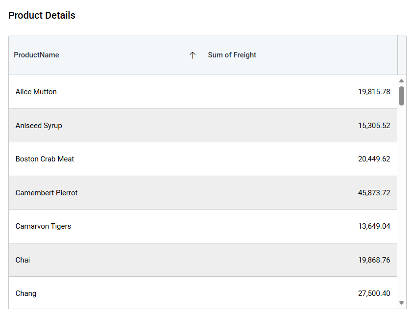
The Grid presents data in rows and columns. Use it when viewers need detailed values, sorting, paging, summaries, or conditional formatting.
Configuring Data
| Data section | Requirement | Description |
|---|---|---|
| Column | Required | Measures and dimensions displayed as grid columns. |
| Hidden Column | Optional | Fields used for sorting, filtering, linking, or formatting without displaying them. |
| Filters | Optional | Fields used to restrict grid records. |
Assigning Data
-
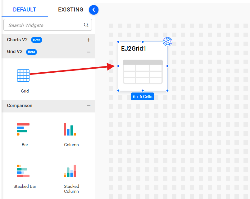
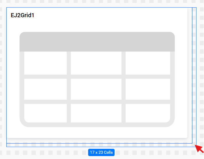
Add the Grid to the design canvas and open ASSIGN DATA.
-
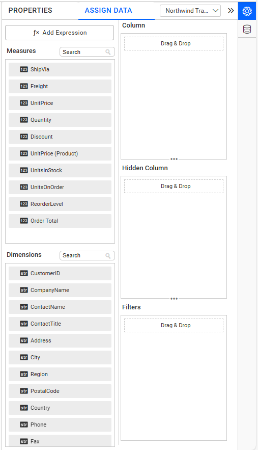
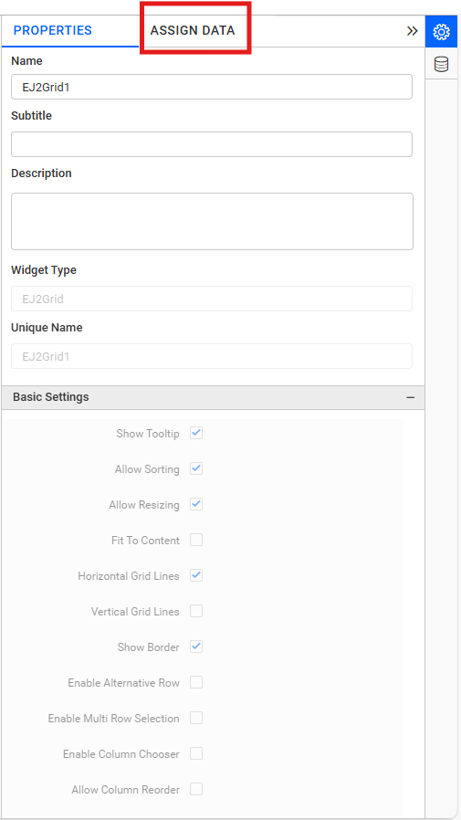
Click Assign Data to open the data pane.
-
Click the + icon or drag fields into the Column section.
-
Add the required measures or dimensions to Column.
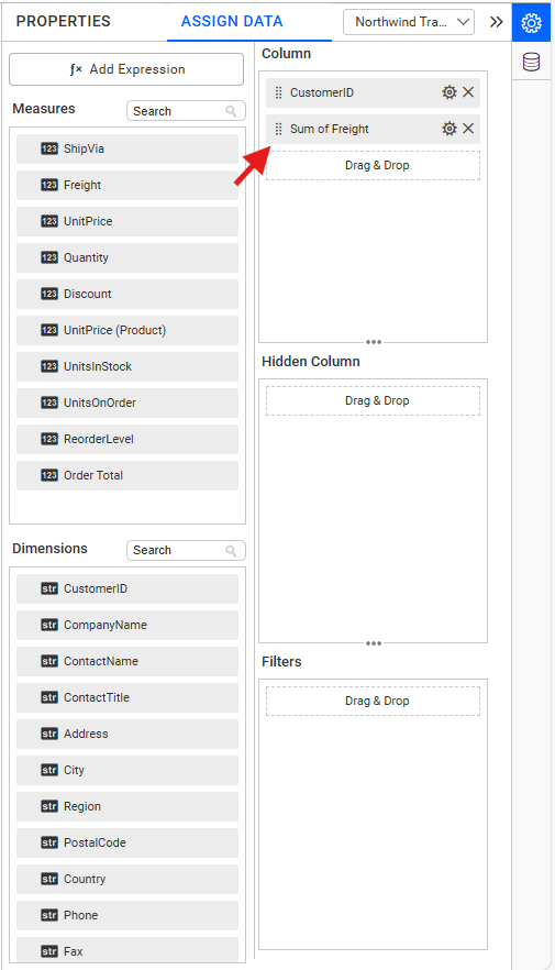
-
Optionally add fields to Hidden Column to use them for sorting, filtering, or formatting without displaying them.
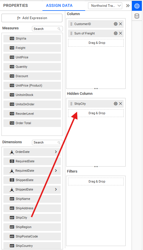
-
The configured widget is ready for formatting.
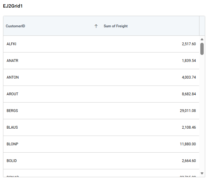
Field Settings
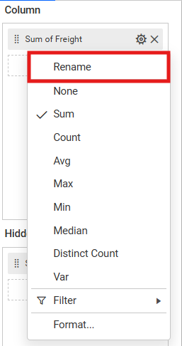
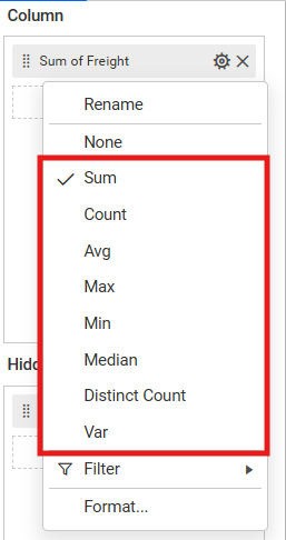
Open a column’s settings menu to rename it or configure supported aggregation, sorting, filtering, relative dates, and value formatting.
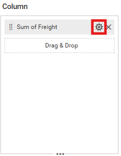
Use the Rename option to give the column a custom display name.
Select the Aggregation type to change how the column values are summarized.
See Configuring Data.
Formatting the Grid
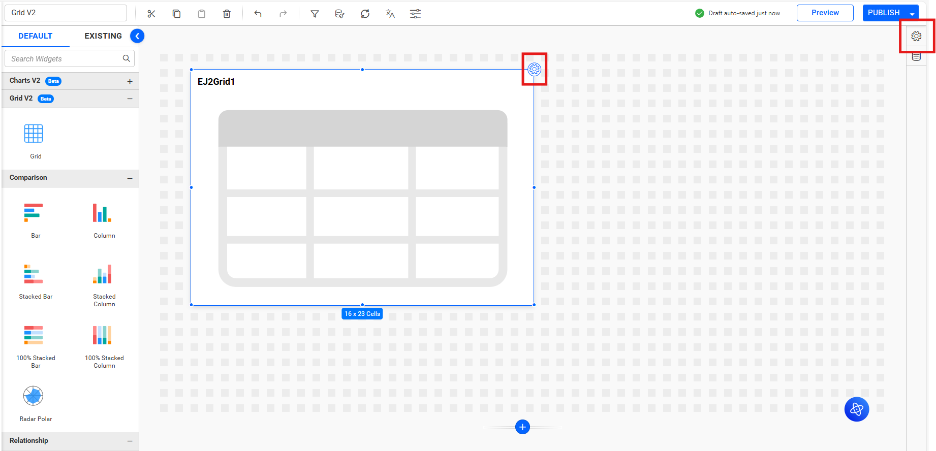
Open the properties panel by clicking the Settings icon on the widget.
General Settings
Refer to General Settings for information about configuring the widget type, unique name, title, subtitle, and description shown for the widget.
Basic Settings
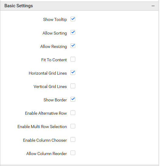
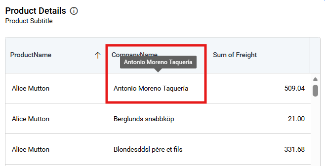
Show Tooltip
Displays the full cell value when a viewer points to it.
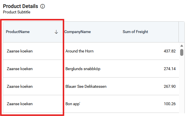
Allow Sorting
Lets viewers sort columns.
Allow Resizing
Lets viewers resize columns.
Allow Resize To Fit
Automatically sizes columns according to their content.
Horizontal Grid Lines
Shows or hides the horizontal separator lines between rows.
Vertical Grid Lines
Shows or hides the vertical separator lines between columns.
Show Border
Shows or hides the outer border around the grid.
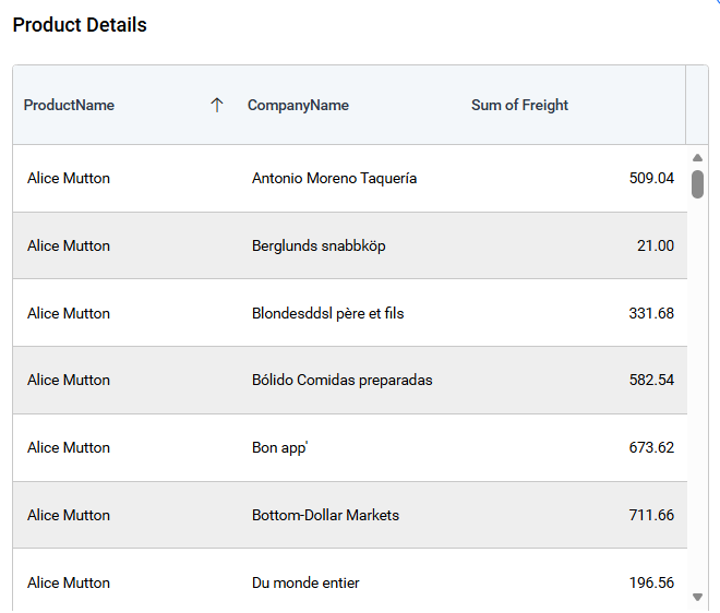
Enable Alternative Row
Applies alternating row colors.
Enable Multi Row Select
Allows viewers to select more than one row.
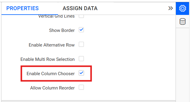
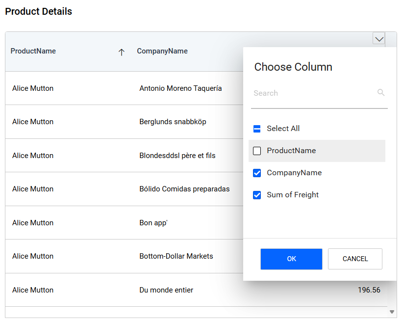
Enable Column Chooser
Lets viewers show or hide columns at runtime.
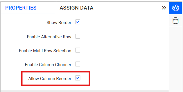
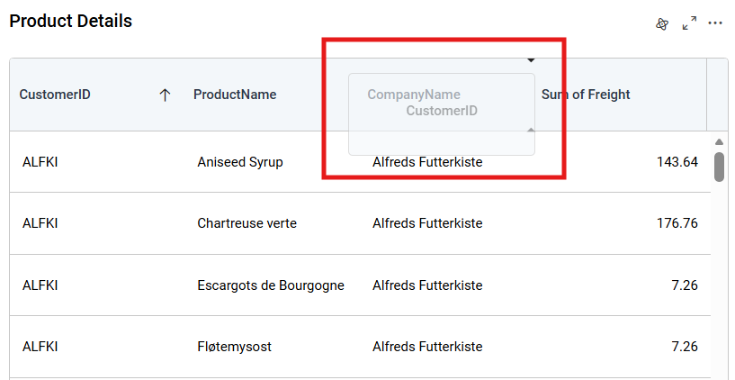
Allow Column Reorder lets viewers drag columns into a different order.
Frozen Settings
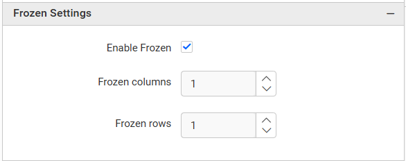
Enable Frozen
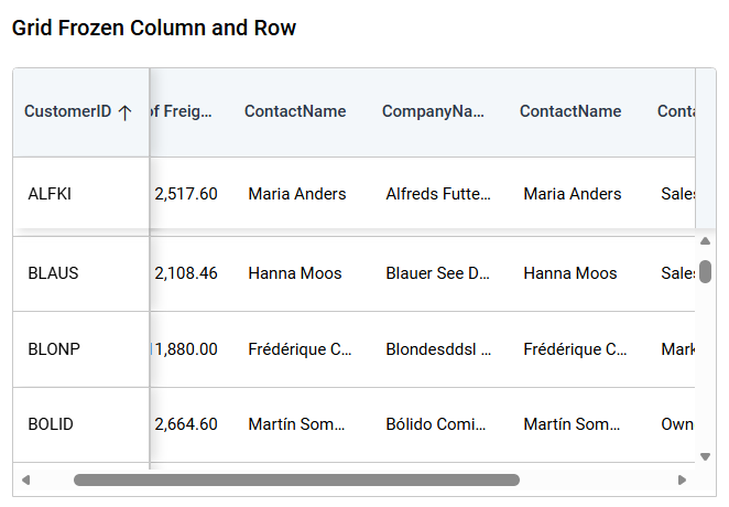
Keeps configured rows and columns visible while viewers scroll.
Frozen Columns
Sets the number of fixed columns from 0 through 5.
Frozen Rows
Sets the number of fixed rows from 0 through 5.
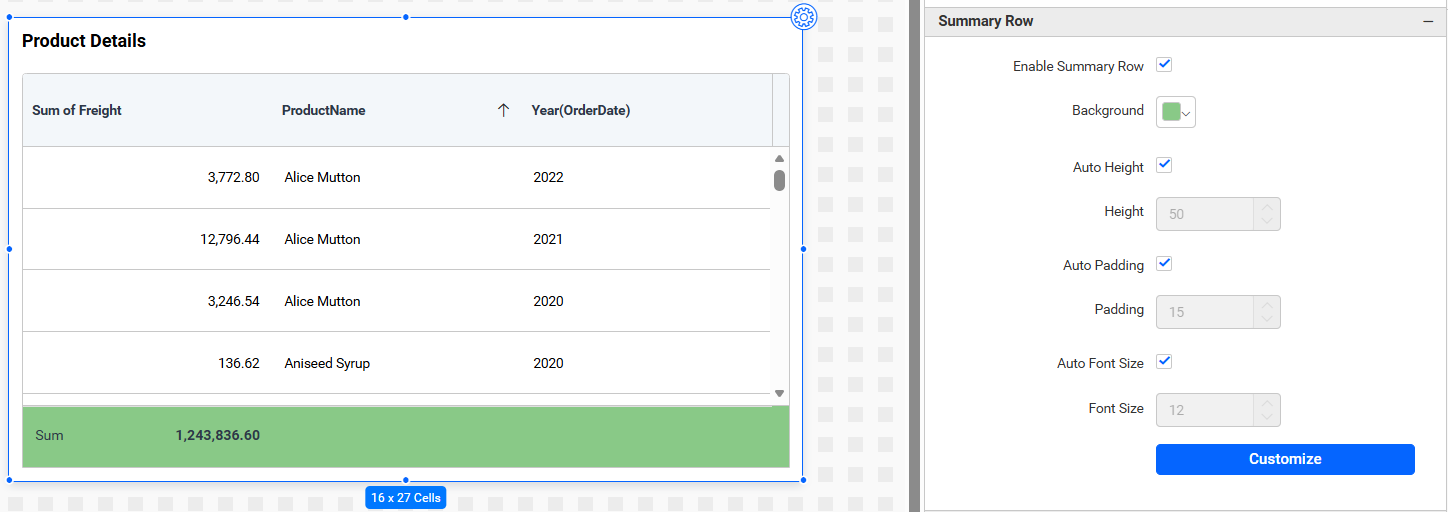
Summary Row
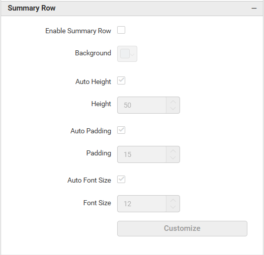
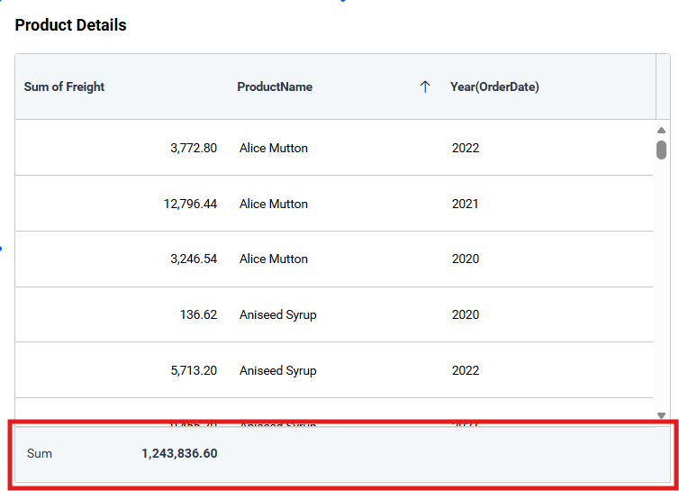
Enable Summary Row
Displays aggregate information below the grid.
Background
Sets the summary-row background color.
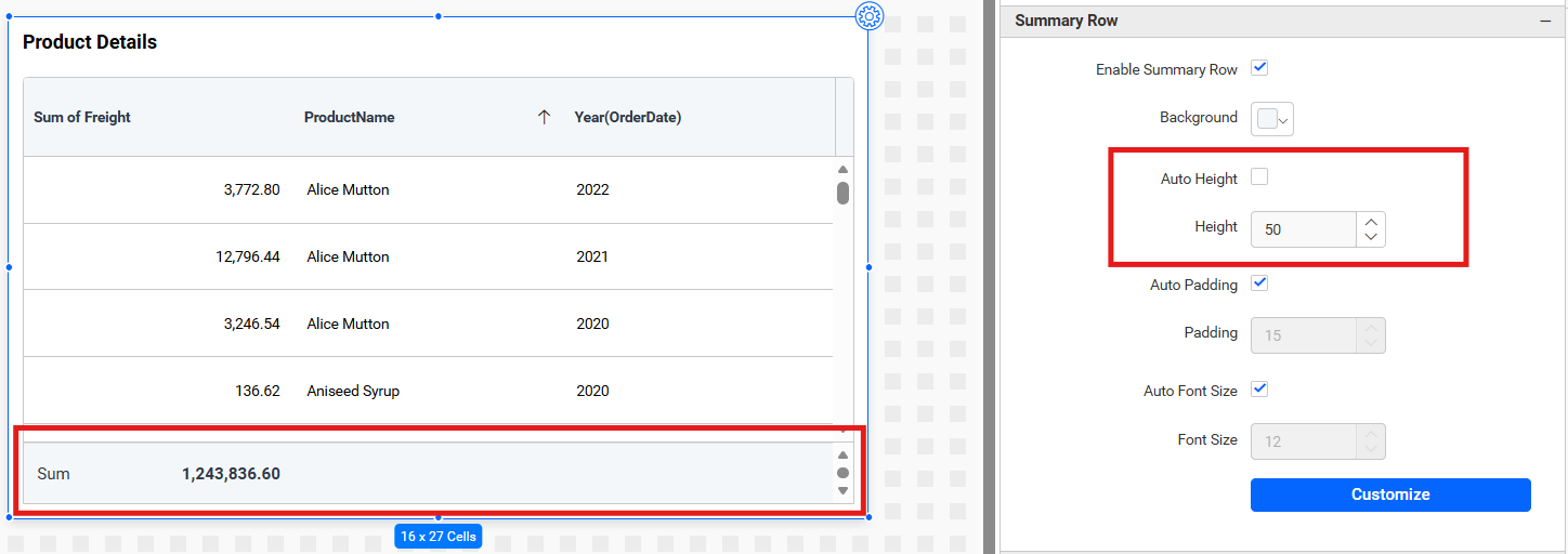
Auto Height
Automatically sizes the summary row. Disable it to set Height, whose minimum is 10 pixels.
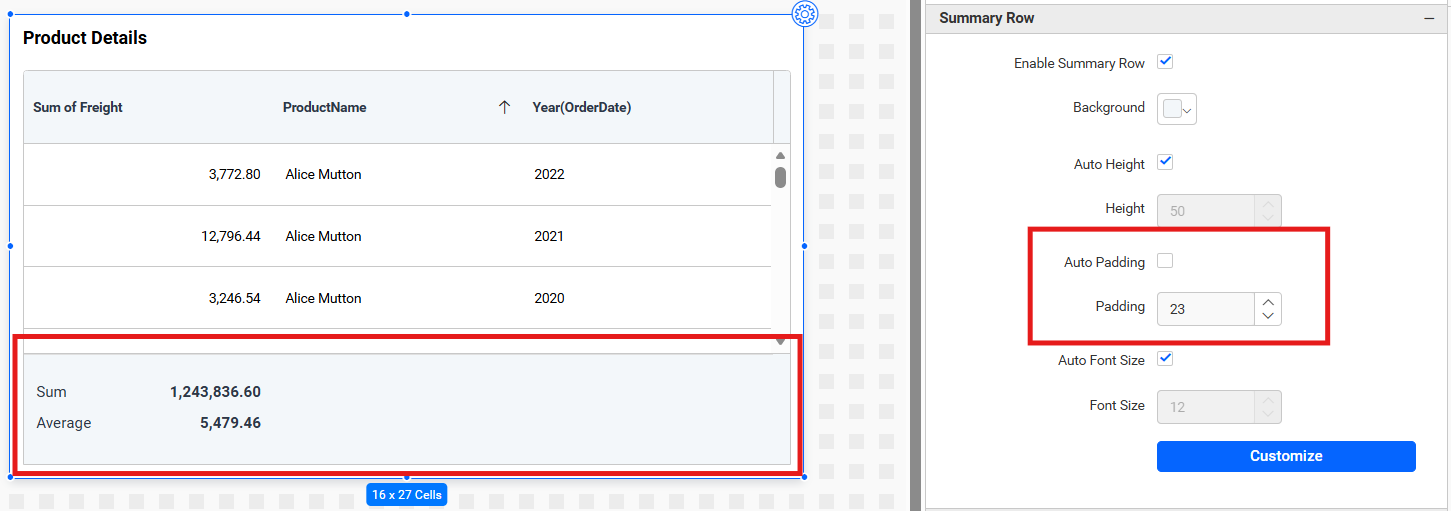
Auto Padding
Automatically determines spacing. Disable it to set Padding, whose minimum is 0.
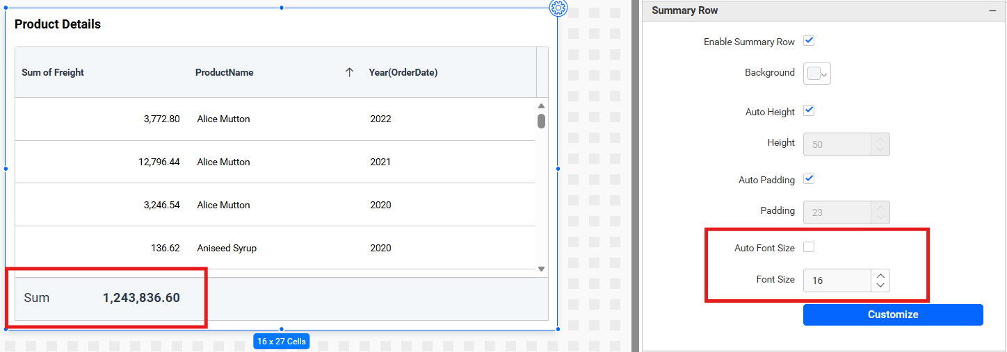
Auto Font Size
Automatically calculates and adjusts the summary-row font size based on the available space.
Font Size
Lets you manually set the summary-row font size from 1 through 60 pixels when Auto Font Size is disabled.
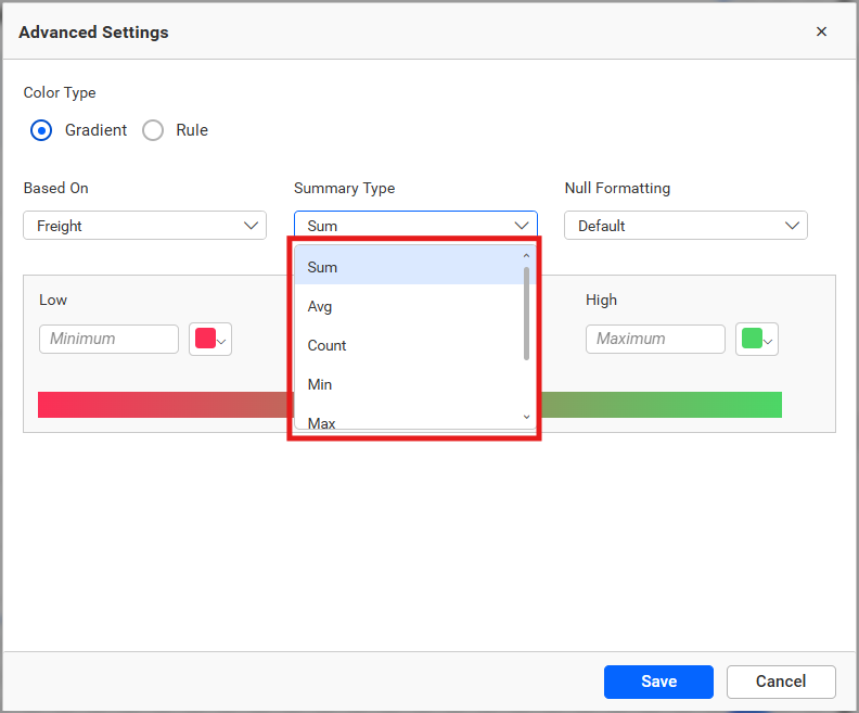
Summary Type
Select the aggregation type to display in each summary cell.
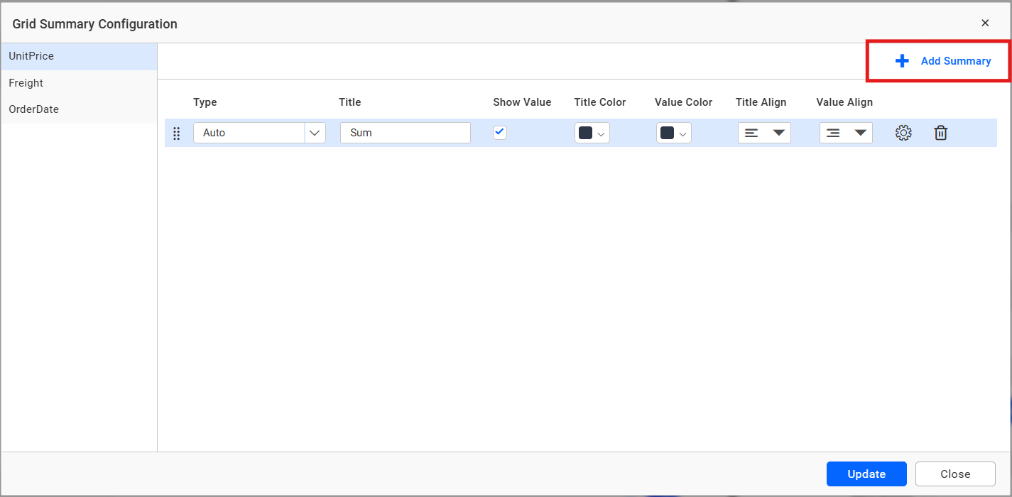
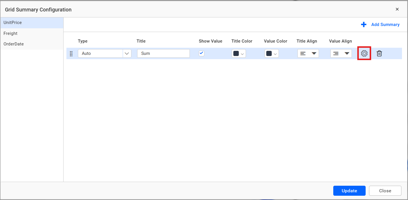
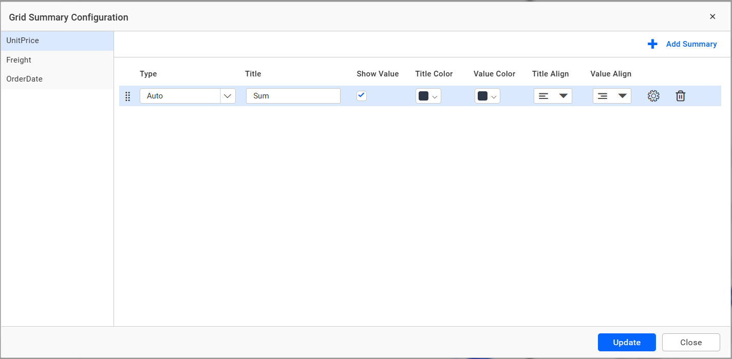
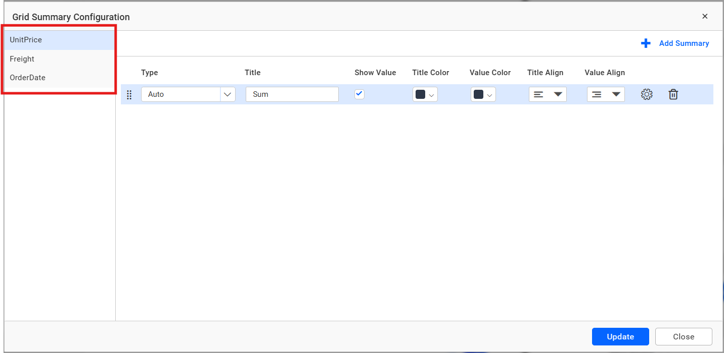
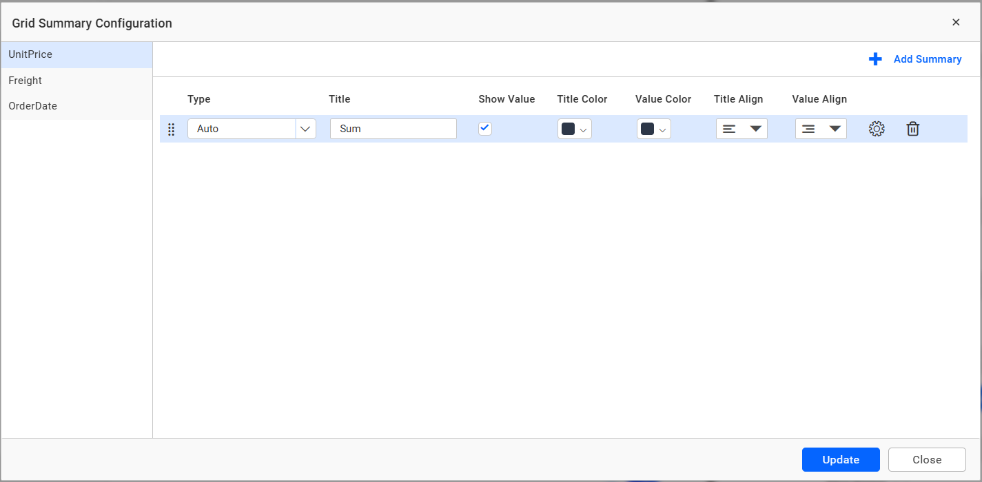
Customize
Opens the summary editor for selecting columns, aggregate types, labels, and formats.
Column Settings
Column Customize
Opens the editor for configuring the display, width, alignment, and data-type-specific behavior of individual columns.
KPI Columns
Configures KPI presentation for eligible grid columns.
Page Settings
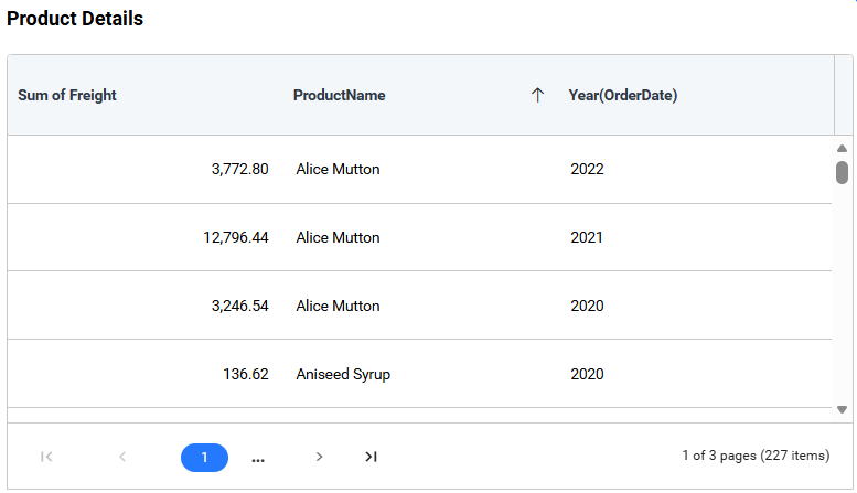
Allow Paging
Enables page navigation.
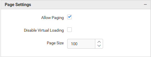
Disable Virtualization
Loads a conventional page of records instead of using virtual scrolling. It is available when paging is enabled.
Page Size
Sets the number of rows displayed on each page and accepts values of 1 or greater.
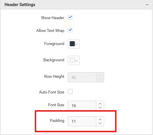
Header Settings
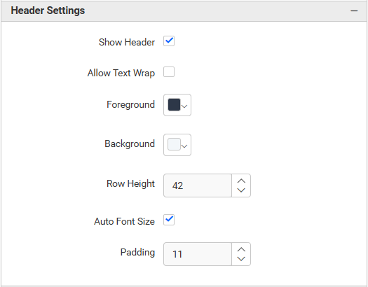
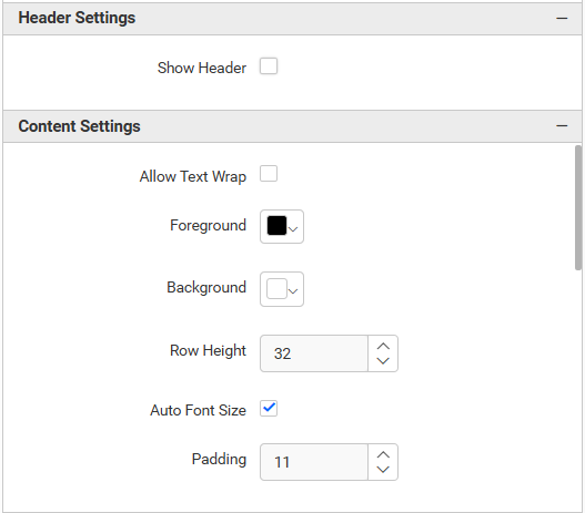
Show Header
Controls header visibility.
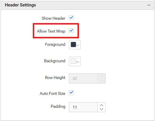
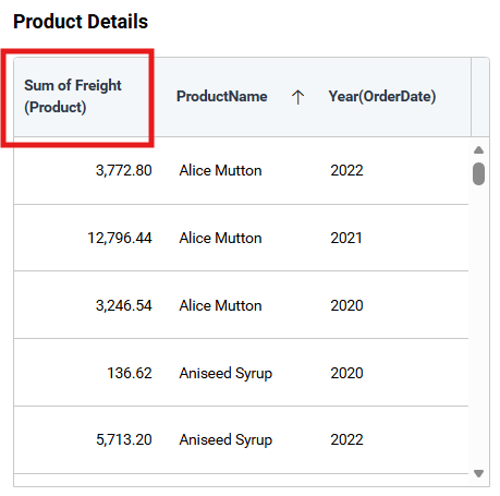
Allow Text Wrap
Wraps long column names.
Header Foreground
And Header Background set the header text and fill colors.
Row Height
Sets header height from 15 through 120 pixels and is disabled when text wrapping controls the height.
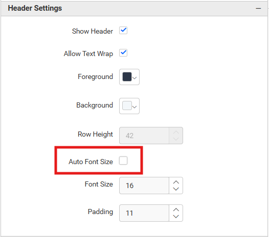
Auto Font Size
Automatically calculates and adjusts the header font size based on the available space.
Font Size
Lets you manually set the header font size from 1 through 60 pixels when Auto Font Size is disabled.
Padding
Sets the spacing inside header cells from 1 through 20 pixels.
Content Settings
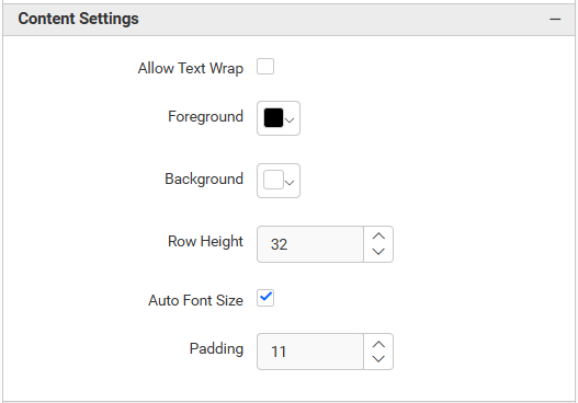
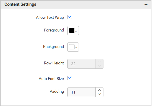
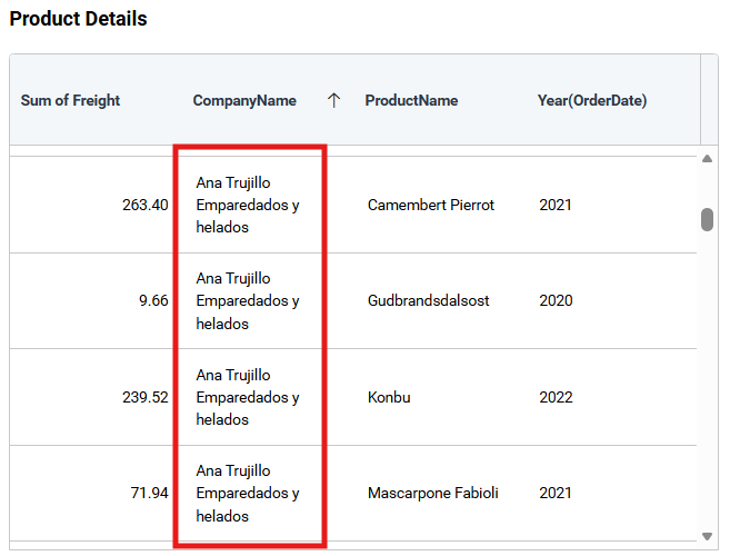
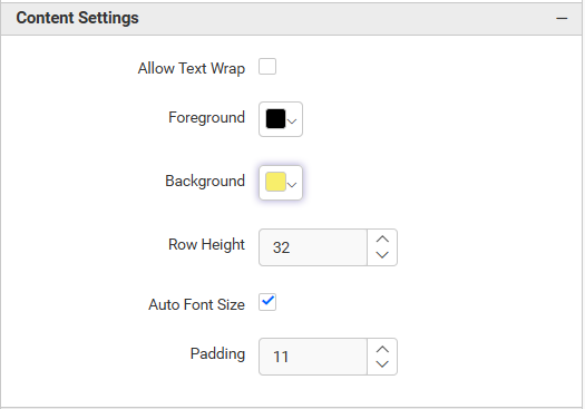
Allow Text Wrap
Wraps long cell values.
Value Foreground
And Value Background set the standard cell text and fill colors.
Alternative Row Foreground
And Alternative Row Background set the colors used for alternating rows.
Row Height
Sets content-row height from 15 through 120 pixels and is disabled when text wrapping controls the height.
Auto Font Size
Automatically calculates and adjusts the cell font size based on the available space.
Font Size
Lets you manually set the cell font size from 1 through 60 pixels when Auto Font Size is disabled.
Padding
Sets the spacing inside data cells from 1 through 20 pixels.
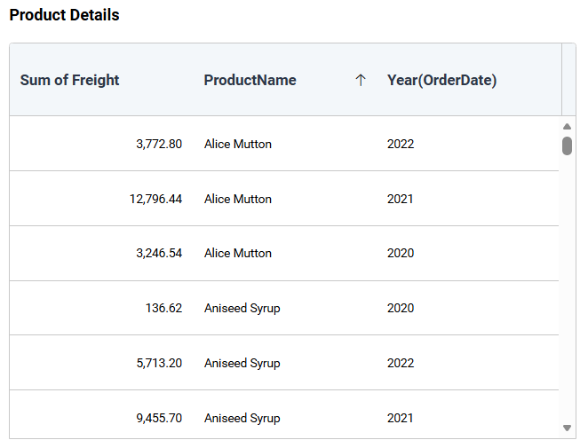
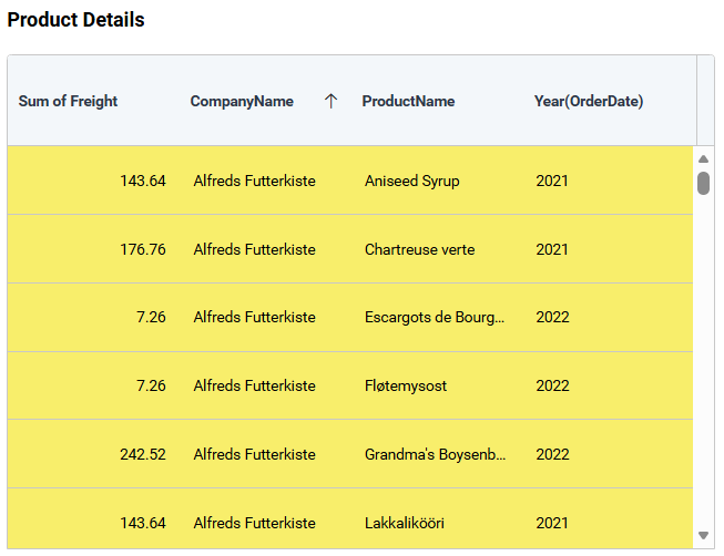
After applying content customization, the grid reflects your changes.
Font Settings
Refer to Font Settings for grid font properties.
Formatting
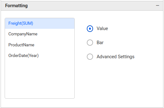
Select a column under Value, then choose a representation type.
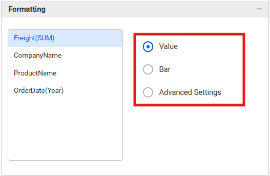
The available display representations are:
-
Value — displays the raw numeric or text value
-
Data List — shows values in a list format
-
Data Bar — renders a proportional bar inside the cell
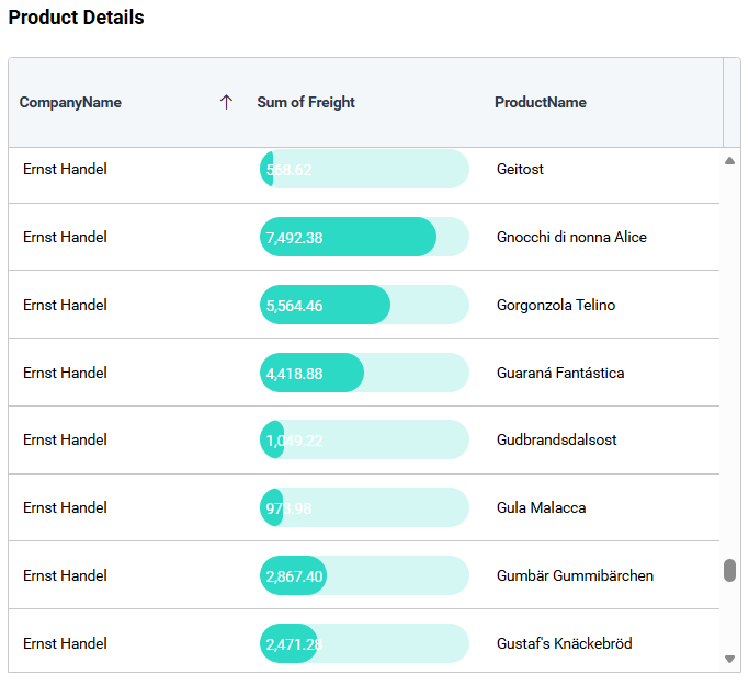
-
Bar — configures data bar fill color
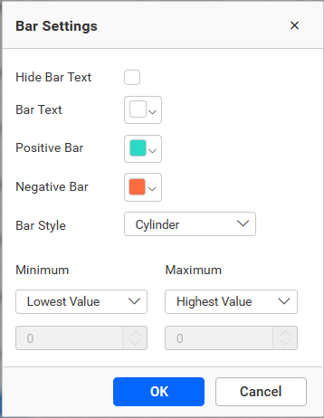
-
Bar Shape — selects the bar style (rectangular, rounded, etc.)
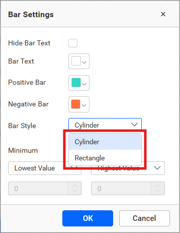
-
-
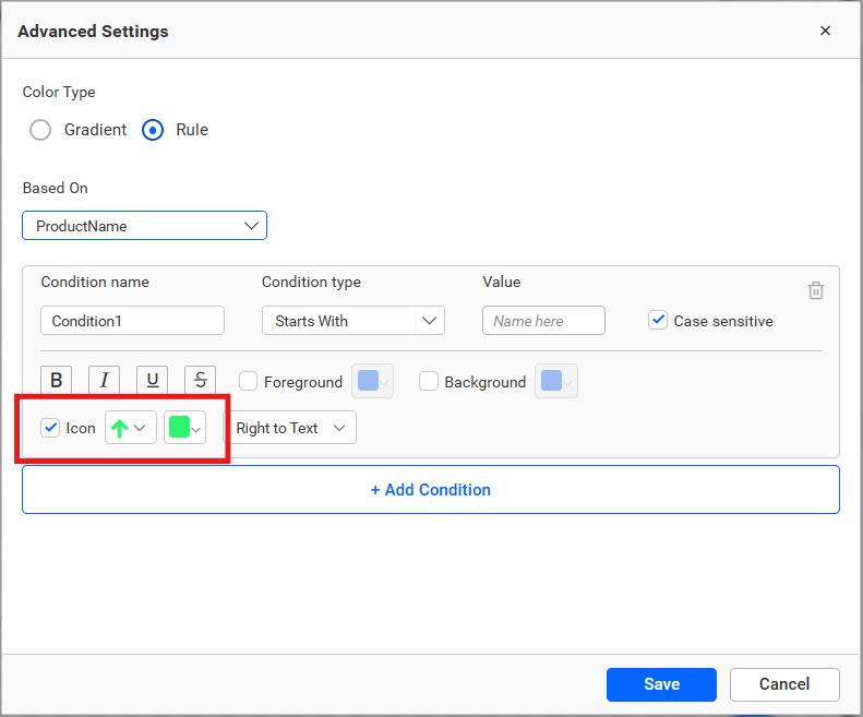
Icons — displays a configurable icon for each value
-
Background — applies a fill color to the cell based on the value
Value Representation
Configure how the value is presented alongside the chosen representation.
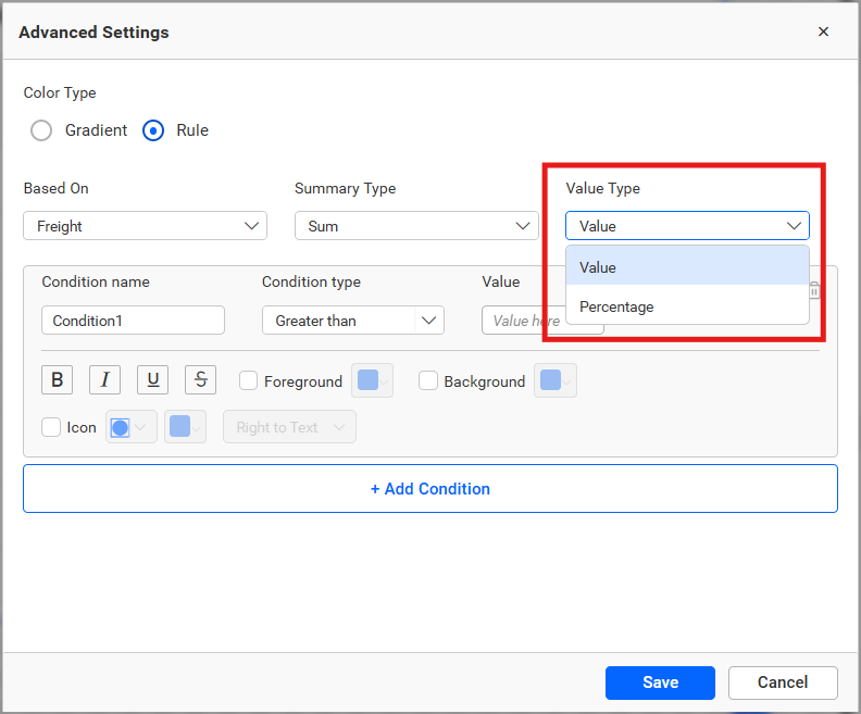
Value Type
Determines whether the condition applies to the actual value or a percentage.
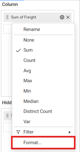
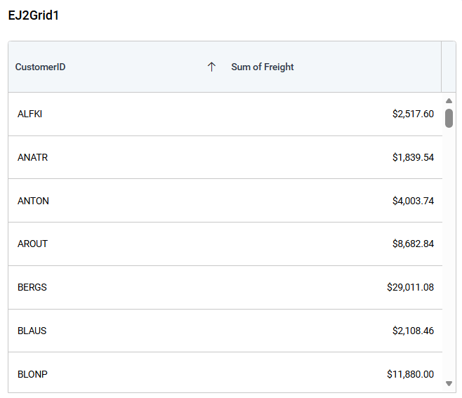
Measure Format
Applies a number format to the column values.
Advanced Settings
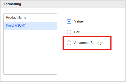
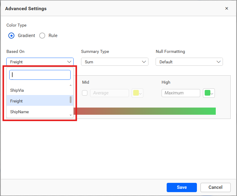
Use Advanced Settings for gradient or rule-based colors.
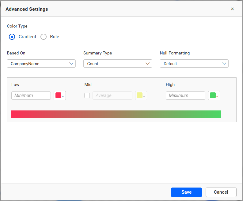
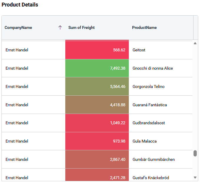
Configure rule-based conditions to apply different formatting to ranges of values.
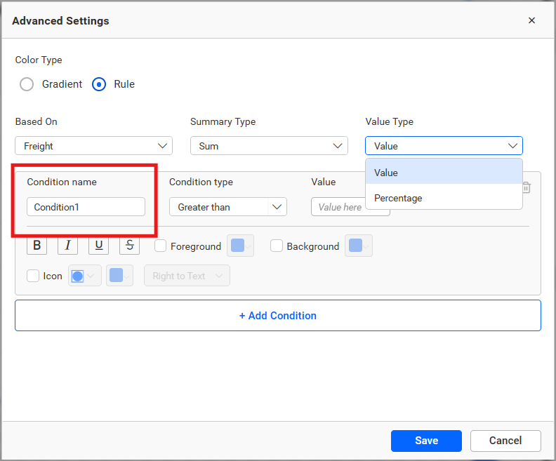
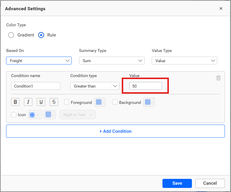
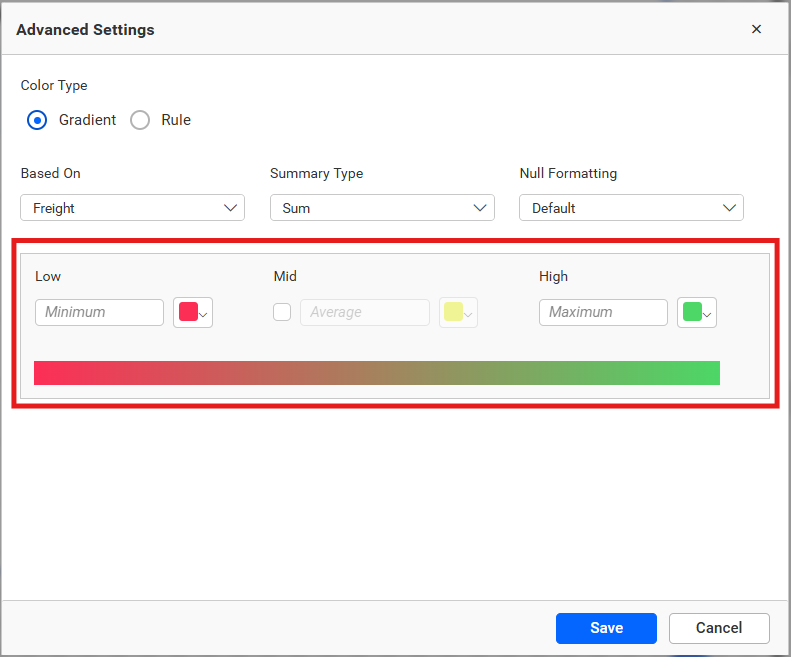
Select the field to base conditions on and set case sensitivity for text comparisons.
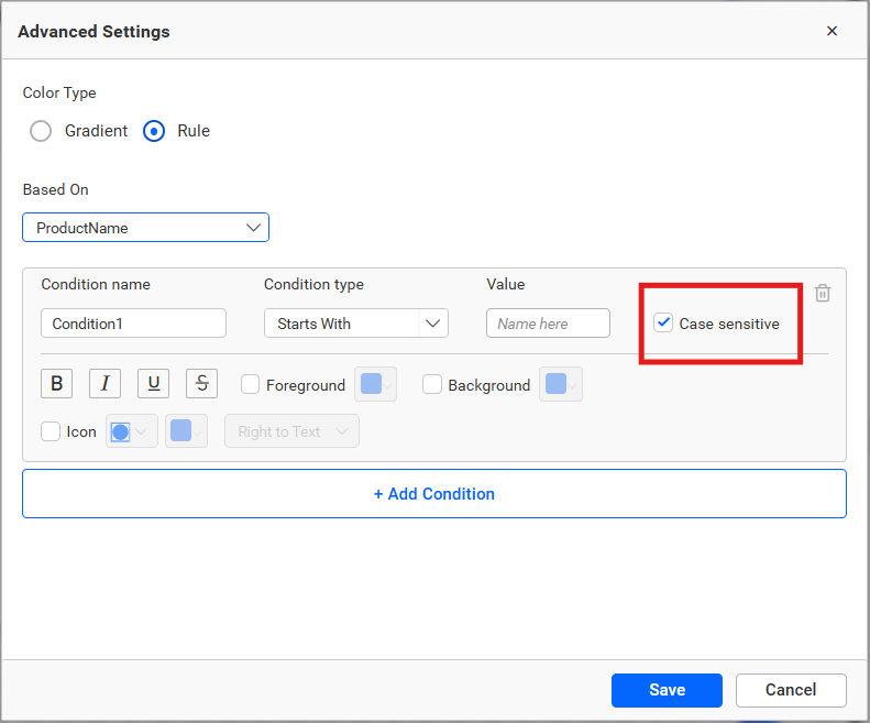
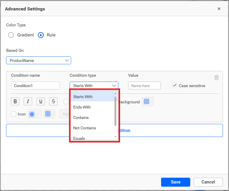
For text columns, use text-based conditions.
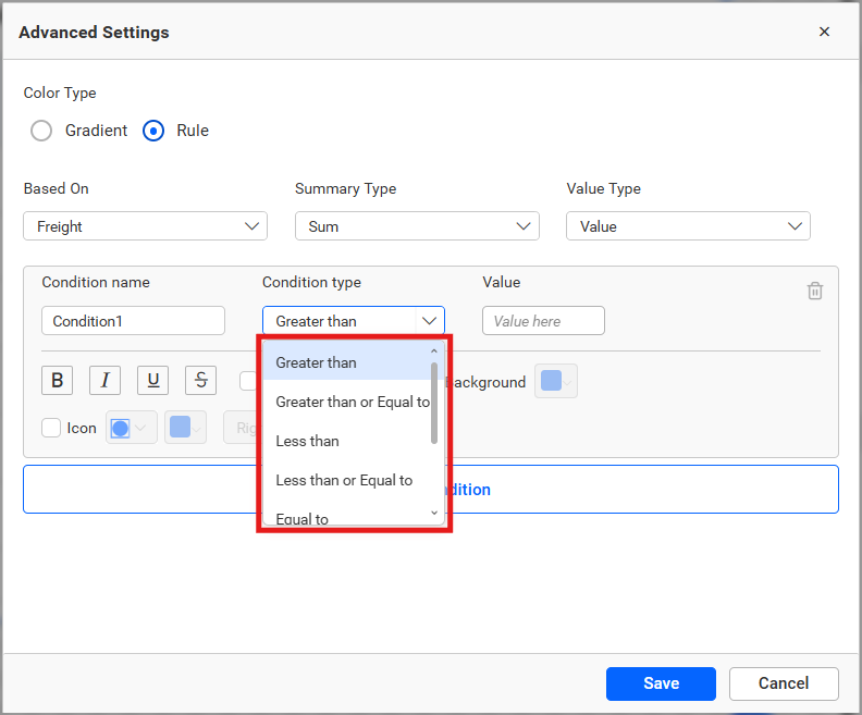
For numeric columns, use numeric conditions.
After applying formatting, the grid reflects the result.
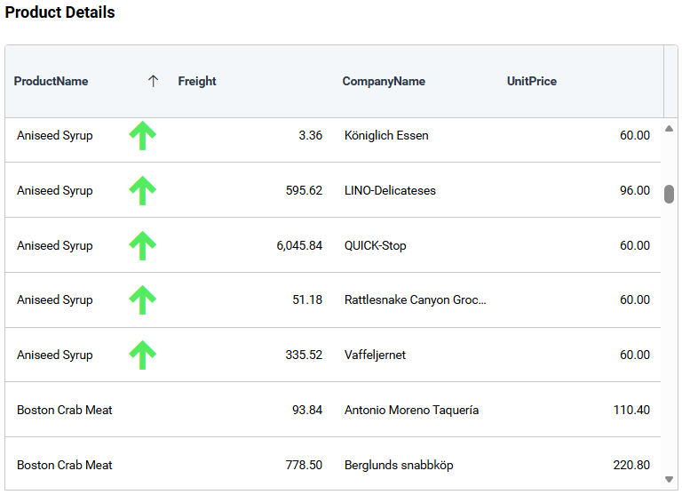
Refer to Conditional Formatting for details about the supported formatting modes.
Filter
Configure filter behavior for the Grid.
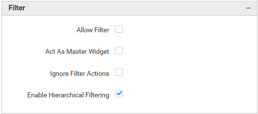
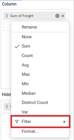
Allow Filtering
Enables column-level filtering in the Grid.
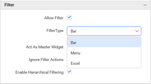
Filter Type
Determines how filter controls are shown in the Grid. The available filter types are Bar, Menu, and Excel.
Bar
Displays a filter input below each column header so viewers can type a filter value directly.
Menu
Displays a filter icon in the column header and lets viewers choose filter conditions from a menu.
Excel
Displays a filter icon in the column header and lets viewers filter using a list of available values.
Refer to Filter Settings for master-widget behavior, ignore-filter behavior, and hierarchical filtering.
Link
Configure row or cell navigation.
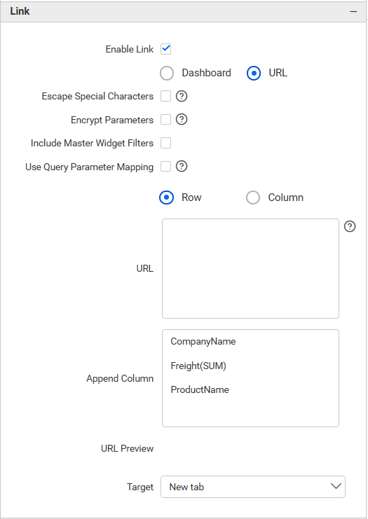
Refer to Linking for row or cell navigation.
Container Appearance
Configure widget-container styling, including background color and padding.
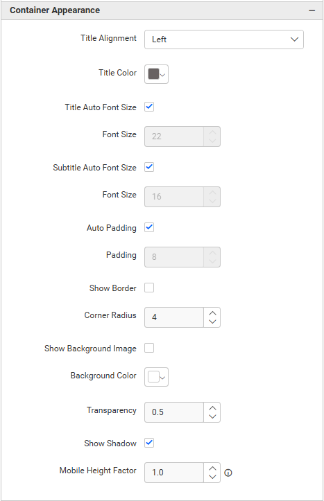
Refer to Container Appearance for widget-container styling.
Container Actions
Configure viewer actions such as maximizing, exporting, and interacting with the widget.
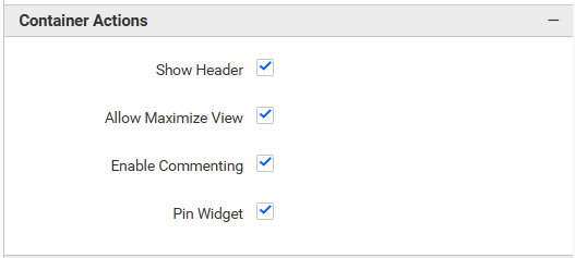
Refer to Container Actions for viewer actions.
No Data Appearance
Refer to No Data Appearance for empty-state settings.
Export Settings
Refer to Export Options for export settings.
View Underlying Data
Refer to View Underlying Data for access to grid records.