
Map
The Map visual displays geographic data as colored regions or location markers, helping viewers compare values by place.
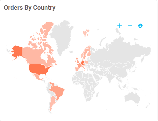
Configuring Data
| Data section | Requirement | Description |
|---|---|---|
| Location Value | Required for a value-based shape layer | Measure used to color map regions. |
| Location Name | Required for a shape layer | Geographic dimension matched to map regions. Multiple fields enable drill down. |
| Location Tooltip | Optional | Additional shape information shown in the tooltip. |
| Marker Latitude | Required with Marker Longitude for coordinates | Latitude used to position markers. |
| Marker Longitude | Required with Marker Latitude for coordinates | Longitude used to position markers. |
| Marker Size | Optional | Measure used to size markers. |
| Marker Tooltip | Optional | Additional marker information shown in the tooltip. |
| Marker Image | Optional | Image field used for marker symbols. |
| Hidden Column | Optional | Field used without displaying it. |
| Filters | Optional | Fields used to restrict map data. |
Assigning Data
- Add the Map to the design canvas and open ASSIGN DATA.
- For a shape layer, add fields to Location Value and Location Name.
- For coordinate markers, add fields to Marker Latitude and Marker Longitude.
- Optionally configure tooltip, marker, hidden-column, and filter fields.
Field Settings
Use a field’s settings menu to configure its supported rename, aggregation, filtering, relative-date, and formatting options. See Configuring Data.
Drill Down
Widgets that support hierarchies enable drill-down when multiple dimension fields are assigned to the hierarchy data section. Select a data point to move to the next level, and use the widget breadcrumb to return to a previous level.
Formatting the Map
General Settings
Refer to General Settings for information about configuring the widget type, unique name, title, subtitle, and description shown for the widget.
Basic Settings
Map Type
Selects how the assigned geographic data is displayed. Choose Choropleth to color regions or Bubble to place value-sized bubbles.
Enable Zooming
Allows viewers to zoom and pan the map.
Show Label
Displays labels on the map. This property is available for supported Choropleth configurations.
Map Value Type
Determines what the label shows when Show Label is enabled. Depending on the data configuration, the label can display the location value, the location name, or both.
Color
Sets the label color when Show Label is enabled.
Enable Multi Selection
Allows viewers to select multiple map regions during filter interaction. This property is available only when the Map acts as a master widget and the current configuration supports shape-based selection.
Shape Kind
Selects the geographic level used to match the Location Name field. The available levels are Continent And Region, Country, and State.
Shape Data
Selects the boundary data used for the selected Shape Kind. The available options change according to the selected geographic level.
Formatting
Formatting
Selects Monochromatic or Advanced color formatting. Monochromatic formatting uses shades of one color; Advanced formatting applies value-based colors and rules through Customize. Refer to Conditional Formatting for the available advanced formatting modes.
Color
Sets the base color used by the map when Monochromatic formatting is selected.
Legend Settings
Show Legend
Displays the map legend.
This property is available for supported Choropleth configurations.
Show Legend Title
Displays a heading above the legend.
Legend Type
Selects whether the legend describes Layers or Markers. The available option depends on the configured map data.
Legend Title
Specifies the legend heading and is available when Show Legend Title is enabled.
Legend Position
Places the legend at the Top, Bottom, Left, or Right of the map.
Font Settings
Refer to Font Settings for map font properties. In the current Modern Map, the available element-level font groups are Legend, Legend Title, and Value Label, depending on whether those elements are enabled.
Tooltip Settings
Show Tooltip
Displays information when a viewer points to a region, marker, or route.
Customize Tooltip
Opens the tooltip editor, where you can arrange the assigned tooltip fields and customize their display.
Enable RTL
Displays tooltip content from right to left.
Filter
Refer to Filter Settings for filter behavior.
Link
Refer to Linking for location navigation.
Container Appearance
Refer to Container Appearance for widget-container styling.
Container Actions
Refer to Container Actions for viewer actions.
No Data Appearance
Refer to No Data Appearance for empty-state settings.
Export Settings
Refer to Export Options for export settings.
View Underlying Data
Refer to View Underlying Data for access to map records.