
Pivot Grid
The Pivot Grid summarizes measures across row and column dimensions, allowing viewers to inspect grouped values and totals from different perspectives.
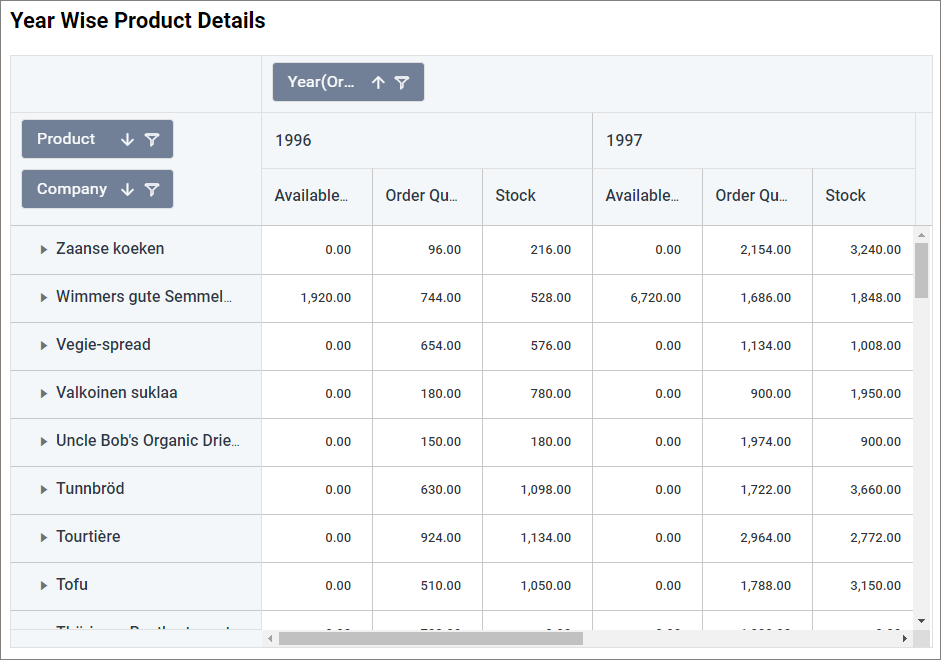
Configuring Data
| Data section | Requirement | Description |
|---|---|---|
| Value | Required | Measures summarized in pivot cells. |
| Row | Required with Column | Dimensions displayed as row groups. |
| Column | Required with Row | Dimensions displayed as column groups. |
| Hidden Column | Optional | Field used without displaying it. |
| Filters | Optional | Fields used to restrict pivot data. |
| Tooltip | Optional | Additional fields displayed in tooltips. |
Assigning Data
- Add the Pivot Grid to the canvas and open ASSIGN DATA.
- Add measures to Value and dimensions to Row and Column.
- Optionally add fields to Hidden Column, Filters, and Tooltip.
Field Settings
Use a field’s settings menu to configure supported rename, aggregation, sorting, filtering, relative-date, and value-format options. See Configuring Data.
Formatting the Pivot Grid
General Settings
Refer to General Settings for information about configuring the widget type, unique name, title, subtitle, and description shown for the widget.
Basic Settings
Enable Classic Pivot
Switches to the earlier Pivot Grid presentation when compatibility is required.
Enable Value Sorting
Allows pivot values to determine the sort order.
Expand All Nodes
Opens every hierarchy when the widget loads.
Enable Persistence
Retains the viewer’s expanded and collapsed state. It is hidden when Expand All Nodes is enabled.
Allow Text Wrap
Wraps long cell content. It is not available in the classic Pivot Grid or Pivot Chart view.
Allow Column Resize
Lets viewers resize pivot columns.
Allow Content To Fit
Automatically sizes columns to their content.
Value Fields in Row
Places multiple measure fields on rows instead of columns.
Hide Empty Headers
Removes row or column headers that contain no data.
Empty Cells Content
Specifies the text displayed for cells without a value.
Horizontal Grid Lines
And Vertical Grid Lines control the separators between cells.
Tooltip Settings
Show Tooltip
Displays field and value details when a viewer points to a pivot cell.
Customize Tooltip
Opens the tooltip editor for arranging and formatting tooltip content.
Enable RTL
Displays tooltip content from right to left. Tooltip settings are hidden in Pivot Chart view.
Pivot Chart Settings
Enable Pivot Chart
Displays the pivot result as a chart. It is unavailable in the classic Pivot Grid.
Chart Type
Selects the chart used to visualize the pivot result.
Show Stripe Line
Displays a reference band on the Pivot Chart.
Start Value
And End Value define the reference band’s value range.
Stripe Line Color
Sets the band color, and Stripe Line Text specifies its label. These properties are available when Show Stripe Line is enabled.
Content Settings
Row Height
Sets pivot-row height from 25 through 120 pixels. It is disabled when text wrapping controls row height.
Column Width
Sets data-column width from 10 through 500 pixels. It is disabled when Allow Content To Fit is enabled.
Header Column Width
Sets row-header width from 100 through 1000 pixels and is disabled when content-to-fit sizing is enabled.
Group Bar Settings
Show Group Bar
Displays the panel used to review and rearrange row, column, value, and filter fields.
Show Sort Icon
Displays sorting controls on group-bar fields.
Show Filter Icon
Displays filtering controls on group-bar fields.
Grand Totals Settings
Show Row Grand Totals
Displays a grand-total row, and Row Grand Total Text specifies its label.
Show Column Grand Totals
Displays a grand-total column, and Column Grand Total Text specifies its label.
Show Row Subtotals
Displays subtotals for row groups. Row Subtotal Fields selects which row fields receive subtotals.
Show Column Subtotals
Displays subtotals for column groups. Column Subtotal Fields selects which column fields receive subtotals.
Edit Field Settings
Column Options
Opens the field editor for configuring supported aggregation, sorting, filtering, and display options for assigned fields.
Alignment Settings
Row Header
Sets row-header alignment to Left, Right, or Center.
Column Header
Sets column-header alignment to Left, Right, or Center.
Value
Sets pivot-value alignment to Left, Right, or Center.
Link
Refer to Linking for cell navigation.
Formatting
Group Panel Background
Sets the group-bar background color.
Header Background
And Header Foreground set pivot-header fill and text colors.
Include Subtotal Cells
Applies configured formatting rules to subtotal cells.
Color Settings
Opens the value and conditional-formatting editor for pivot cells.
Font Settings
Refer to Font Settings for pivot fonts.
Filter
Refer to Filter Settings for filter behavior.
Container Appearance
Refer to Container Appearance for widget-container styling.
Container Actions
Refer to Container Actions for viewer actions.
No Data Appearance
Refer to No Data Appearance for empty-state settings.
Export Settings
Refer to Export Options for export settings.
View Underlying Data
Refer to View Underlying Data for access to pivot records.