
Number Card
A Number Card displays a measure as a prominent value in a compact dashboard tile. It can also display a separate card for each series value, along with supporting tooltips, images, and a sparkline trend.
Use a Number Card when:
- You need to highlight an important value, such as total revenue, order count, or current inventory.
- You want to display the same measure for multiple categories, such as products or regions.
- A sparkline can provide useful historical context for the displayed value.
Single Number Card:

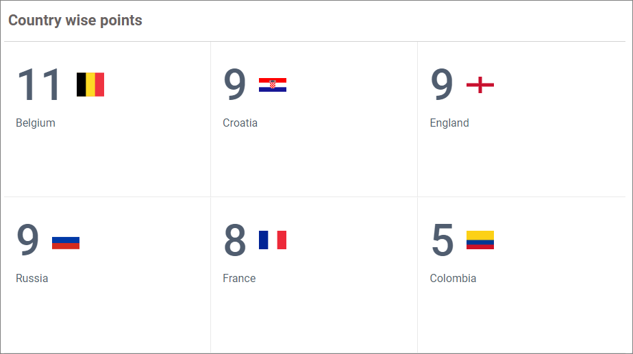
Series of Number Cards:
Configuring Data
Configure the data for the Number Card in the ASSIGN DATA tab. At least one Measure field is required to render the card.
| Data section | Requirement | Description |
|---|---|---|
| Measure | Required | Specifies the measure or numeric expression displayed as the primary value. |
| Series | Optional | Specifies the dimension used to render a separate Number Card for each distinct value. |
| Tooltip | Optional | Adds one or more measure values to the tooltip shown when a viewer points to the card. |
| Sparkline | Optional | Specifies the date, date-time, or numeric dimension used to plot the measure trend. |
| Image | Optional | Specifies one or more dimension fields used to construct an image URL for each card. |
| Background Image | Optional | Specifies one or more dimension fields used to construct a background-image URL for each card. |
| Filters | Optional | Applies additional filtering conditions to the Number Card data. |
Assigning Data
- Drag and drop the Number Card widget from the toolbox onto the design canvas.
- Resize the widget as required.
- Select the Number Card and click the Settings icon to open the configuration panel.
- Switch to the
ASSIGN DATAtab. - Drag and drop a measure or numeric expression into the
Measuresection. - Optionally, drag and drop a dimension into the
Seriessection to create a separate card for each distinct value. - Optionally, assign fields to
Tooltip,Sparkline,Image, andBackground Imagebased on the information you want to display. - Optionally, add fields to the
Filterssection to apply additional filtering conditions.
Assigning only a Measure renders a single Number Card. Assigning Series renders multiple cards, with the configured measure summarized independently for each series value. Assigning Sparkline displays how the measure changes across the assigned field.
Settings menu
Click the More options icon for an assigned field to configure the available options. The options vary based on the field type and data section.
- Rename — Overrides the display name of the assigned field.
- Aggregation type — Changes how a measure is summarized. See Aggregating Value Columns.
- Sort — Configures the order of values in a dimension field. See Advanced Sorting.
- Filter(s) — Applies field-level conditions to include or exclude values. See Configuring Widget Filters.
- Format — Changes the display format of the assigned measure. See Formatting Measure Type Column.
Formatting the Number Card
You can format the Number Card using the property categories listed below. The categories are presented in the same order as the PROPERTIES panel.
General Settings
Refer to General Settings for information about configuring the widget type, unique name, title, subtitle, and description shown for the widget.
Basic Settings
Fit to Content
Automatically adjusts the font sizes of the card elements to fit the available space. Individual font-size properties are disabled while this option is enabled.
Text Overflow Mode
Controls content that does not fit within the card. Select Trim to shorten overflowing text or Hide to hide it.
Tooltip Settings
Configure whether the tooltip is displayed, customize its content, and enable right-to-left tooltip rendering. Refer to Tooltip Settings for more information.
Formatting
Advanced Settings
Enables rule-based color customization after a measure is configured. Click Customize to define conditions based on the measure and apply colors to supported elements such as the title, background, sparkline, measure, image, and background image.
Refer to Conditional Formatting for the supported formatting modes.
Appearance
Horizontal Alignment
Aligns the card content to the Left, Center, or Right.
Vertical Alignment
Aligns the card content to the Top, Center, or Bottom.
Font Settings
Configure the widget font family and style, or use the dashboard font settings. Element-level font controls are available for the measure and title. Refer to Font Settings for more information.
Measure
Show Measure
Shows or hides the primary measure value.
Measure Color
Sets the color of the measure value.
Auto Font Size
Automatically calculates and adjusts the measure font size to fit the available card space.
Measure Font Size
Lets you set a fixed measure font size after Auto Font Size is disabled.
Title
Show Title
Shows or hides the card title.
Title Text
Specifies the title displayed on a single Number Card. When Series is configured, the corresponding series value is used as the card title.
Enable Wrap
Wraps the title onto multiple lines when sufficient space is available. This option is disabled while Fit to Content is enabled.
Title Color
Sets the title color.
Auto Font Size
Automatically calculates and adjusts the title font size to fit the available card space.
Title Font Size
Lets you set a fixed title font size after Auto Font Size is disabled.
Title Position
Displays the title at the Top or Bottom of the card.
Animation Settings
Enable Animation
Animates the measure value when the widget loads or refreshes.
Animation Duration
Specifies how long the animation runs. The supported duration is from 1,000 through 5,000 milliseconds.
Image
Show Image
Shows or hides the image displayed in the card.
Image Mode
Controls how the image fits within its available area. The available modes are Default, Fill, Uniform, and Uniform To Fill.
Image Position
Places the image on the left or right side of the card.
Image Source
Selects Local, URL, or Parameterized URL as the image source. The related browse, URL, or pattern property is displayed based on the selected source.
When using a parameterized URL, add placeholders such as {0} and {1} to insert the values of fields assigned to the Image data section.
Background
Show Image
Shows or hides the background image.
Image Mode
Controls how the background image fits within the card. The available modes are Default, Fill, Uniform, and Uniform To Fill.
Image Source
Selects Local, URL, or Parameterized URL as the background-image source. The related browse, URL, or pattern property is displayed based on the selected source.
Background Color
Sets the card background color.
Transparency
Controls the transparency of the background color and image from 0 through 1.
Sparkline
These properties are applicable when a field is assigned to the Sparkline data section.
Show Sparkline
Shows or hides the trend sparkline.
Show Sparkline Background
Displays the sparkline as a background layer behind the card content.
Color
Sets the sparkline color.
Opacity
Controls the sparkline opacity from 0 through 1.
Link
Enables navigation to another dashboard or a URL when a viewer selects a Number Card. Refer to Linking for configuration details.
Inter-Widget Linking
Refer to Inter-Widget Linking for information about linking the Number Card to a Tab widget.
Filter
Configures the Number Card as a master widget, controls whether it responds to other master widgets, and enables hierarchical filtering. The master-widget option is available when Series is configured. Refer to Filter Settings for more information.
Container Appearance
Configures the title, subtitle, padding, border, corner radius, shadow, and mobile height of the widget container. Refer to Container Appearance for more information.
Container Actions
Controls viewer actions such as maximize, commenting, and pinning the widget. Refer to Container Actions for more information.
No Data Appearance
Configures the message, font size, text color, image, and header displayed when the Number Card has no data. Refer to No Data Appearance for more information.
Export Settings
Controls the export formats available to viewers, including CSV, Excel, PowerPoint, image, and PDF. PDF page size and orientation can also be configured. Refer to Export Options for more information.
View Underlying Data
Controls whether viewers can inspect the records behind the Number Card. You can allow exporting, allow column selection, choose whether the action is available from the widget header, card selection, or both, and configure the columns displayed in the underlying-data view. Refer to View Underlying Data for more information.