
Combo Chart
A Combo Chart displays two or more series with compatible chart types on a shared category axis. It is useful for comparing measures with different scales, such as revenue and quantity, in one visual.
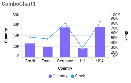
Configuring Data
| Data section | Requirement | Description |
|---|---|---|
| Primary Y Values | Required if Secondary Y Values is empty | Measures plotted on the primary value axis. |
| Secondary Y Values | Required if Primary Y Values is empty | Measures plotted on the secondary value axis. |
| Columns | Required | Dimension used for the shared category axis. Multiple fields create a drill-down hierarchy. |
| Hidden Column | Optional | Field used for sorting, filtering, linking, or formatting without displaying it. |
| Filters | Optional | Fields used to restrict the data shown in the chart. |
| Tooltip | Optional | Additional fields displayed in the tooltip. |
Assigning Data
- Drag the Combo Chart from the toolbox onto the design canvas.
- Select the widget and open the ASSIGN DATA tab.
- Add measures to Primary Y Values, Secondary Y Values, or both.
- Add a dimension to Columns.
- Optionally add fields to Hidden Column, Filters, and Tooltip.
Field Settings
Open a field’s settings menu to rename it or configure the supported aggregation, sorting, filtering, relative-date, and value-format options. See Configuring Data.
Drill Down
Widgets that support hierarchies enable drill-down when multiple dimension fields are assigned to the hierarchy data section. Select a data point to move to the next level, and use the widget breadcrumb to return to a previous level.
Formatting the Combo Chart
General Settings
Refer to General Settings for information about configuring the widget type, unique name, title, subtitle, and description shown for the widget.
Basic Settings
Chart Type and Axis
Opens the series configuration and lets you select a compatible chart type and value axis for each measure.
Enable Animation
Animates the series when the chart loads or refreshes.
Enable Multi Selection
Lets viewers select more than one data point when the chart acts as a master widget.
Show Value Labels
Displays values on the data points. Enabling it displays the related label properties.
Value Label Color
Sets the value-label text color.
Value Label Position
Selects the supported position for value labels. The available positions depend on the configured series types.
Value Label Rotation
Rotates labels by -90°, -45°, 0°, +45°, or +90°.
Show Value Label Suffix
Appends custom text to each value label.
Suffix Value
Specifies the appended text and is available when Show Value Label Suffix is enabled.
Show Marker
Displays markers for eligible Line and Spline series.
Show Items With No Data
Retains categories that do not contain a measure value.
Column Width
Sets the relative thickness of eligible Bar or Column series from 0.1 through 1.0.
Column Spacing
Sets the space between eligible Bar or Column series from 0.1 through 1.0.
Enable Smooth Scroll
Uses proportional scrolling for larger result sets.
Line Style
Customizes the appearance of eligible Line and Spline series.
Tooltip Settings
Show Tooltip
Shows or hides tooltips for data points.
Customize Tooltip
Opens the tooltip designer for choosing and arranging the displayed fields.
Enable RTL
Displays tooltip content from right to left.
Enable Legend Color
Displays the corresponding series color in the tooltip.
Shared Tooltip
Displays all series values for the selected category in one tooltip.
Legend Settings
Show Legend
Shows or hides the legend.
Interactivity
Allows viewers to show or hide a series by selecting its legend item. It is unavailable when advanced color settings prevent series-level interaction.
Legend Label Color
Sets the legend text color.
Customize
Opens the legend editor for changing individual legend text.
Legend Position
Places the legend at a supported side of the chart.
Legend Alignment
Aligns the legend using None, Near, Center, or Far.
Legend Shape
Displays legend markers as a Circle or by Series Type.
Legend Title
Specifies the text displayed above the legend items.
Forecast Settings
This category is available for an eligible single Line or Spline series. Refer to Forecast Settings for more information.
Enable
Enables forecast calculation for the supported series.
Forecast Point Length
Sets the number of future data points included in the forecast.
Confidence Interval
Sets the forecast confidence level to 75%, 80%, 85%, 90%, 95%, or 99%.
Seasonality
Sets the repeating seasonal interval used by the forecast calculation.
Show Forecast
Shows or hides the forecast series.
Show Confidence
Shows or hides the confidence band.
Confidence Band Style
Displays the confidence band using Fill, Line, or Dot and is available when Show Confidence is enabled.
Axis
Title Color
Sets the axis-title color.
Label Color
Sets the axis-label color.
Show Axis Border
Shows or hides the chart-axis border.
Show Category Axis
Shows or hides the category axis.
Show Axis Title
Shows or hides the category-axis title.
Axis Title
Specifies the category-axis title text.
Label Overflow Mode
Handles category labels using Auto, Trim, or Hide.
Enable Trim
Shortens labels that exceed the available width.
Label Maximum Width
Sets the trim width from 10 through 500 and is enabled when Enable Trim is selected.
Label Rotation
Rotates category labels using the selected angle.
Auto Interval
Automatically calculates the interval between category labels.
Interval
Sets the label interval from 1 through 10 and is available when Auto Interval is disabled.
Show Primary Value Axis
Shows or hides the primary value axis.
Show Primary Axis Title
Shows or hides the primary-axis title.
Primary Axis Title
Specifies the primary-axis title text.
Primary Axis Type
Selects a Linear or Logarithmic scale when supported.
Primary Axis Format
Opens the number-format settings for primary-axis values.
Equivalent secondary-axis properties appear when at least one series uses the secondary axis.
Open the primary or secondary axis range to configure Minimum, Maximum, and Interval values. Leave a value empty to calculate it automatically.
Grid Lines
Primary Value Axis
Shows or hides grid lines aligned with the primary value axis.
Secondary Value Axis
Shows or hides secondary-axis grid lines and is enabled when a secondary series is configured.
Category Axis
Shows or hides grid lines aligned with the category axis.
Trendline
Trendline
Opens the trendline editor for adding, changing, or removing a trendline. Select the source series, calculation type, and appearance. This category is available only for supported non-stacked configurations.
Formatting
Color Settings
Opens the series-color editor. Configure individual colors or apply supported gradient and rule-based conditional formatting.
Font Settings
Refer to Font Settings for chart font properties.
Filter
Refer to Filter Settings for widget-filter behavior.
Link
Refer to Linking for data-point navigation.
Container Appearance
Refer to Container Appearance for title, background, border, padding, and shadow settings.
Container Actions
Refer to Container Actions for maximize, commenting, and pinning options.
No Data Appearance
Refer to No Data Appearance for the empty-state message and image.
Export Settings
Refer to Export Options for supported export formats.
View Underlying Data
Refer to View Underlying Data for viewer access to chart records.