Configuring and Formatting Heatmap
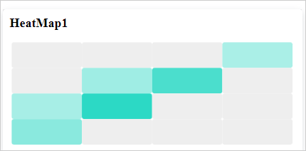
The Heatmap allows you to visualize large amounts of data as clustered rectangles with a color scale.
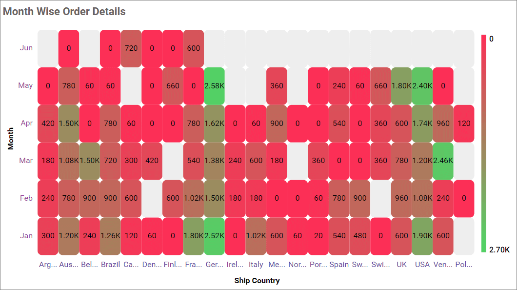
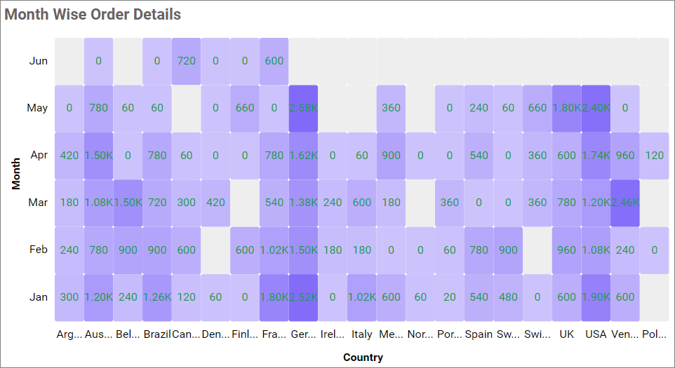
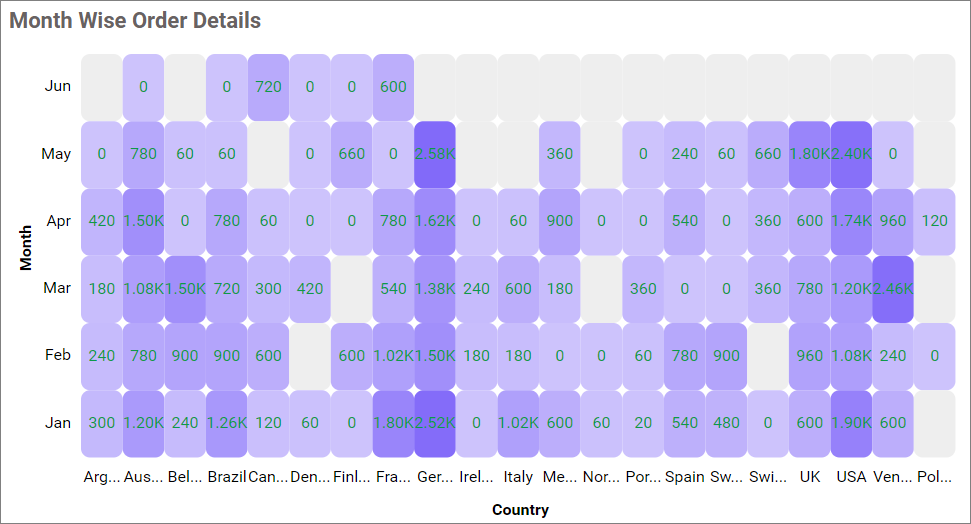
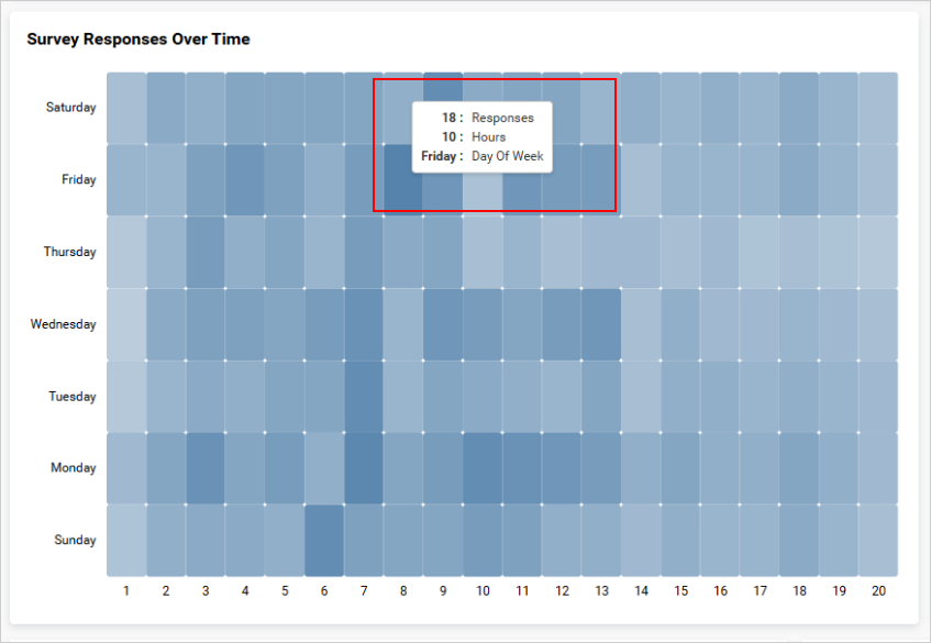
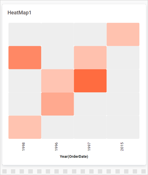
Figure: Heatmap visualization after various customizations
How to configure the data table to Heatmap widget
NOTE: Before adding the Heatmap widget to the design layout, make sure to create the data source. You can refer to this section to learn how to create a new data source.
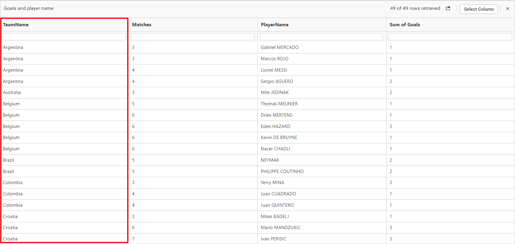
IMPORTANT: To showcase a Heatmap, a minimum requirement of
one valueandtwo groupsby the field is needed.
The following steps explain the data configuration of the Heatmap:
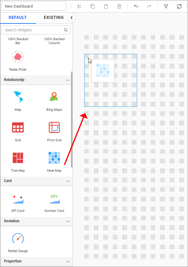
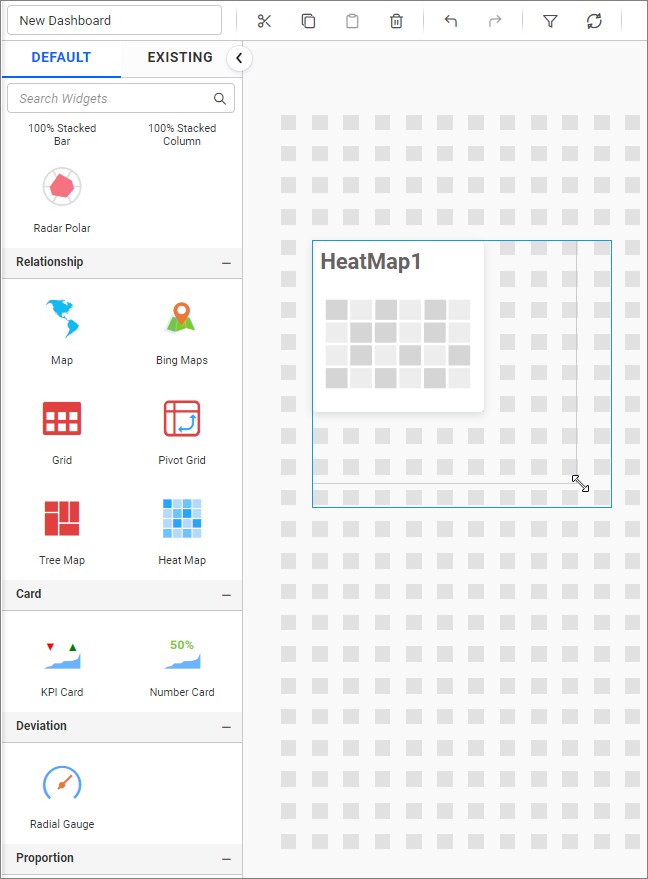
Step 1: Add a heatmap widget to the design canvas
- Drag and drop the
Heatmapcontrol icon from the toolbox into the design panel. You can find the control in the toolbox by searching.
- Resize the widget as required.
- Click the
Propertiesicon in the configuration panel.
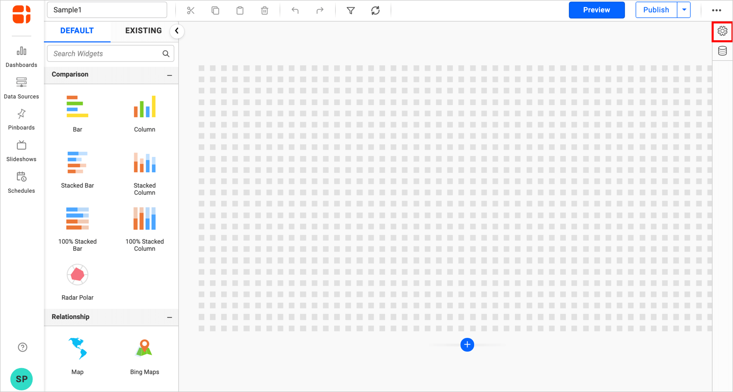
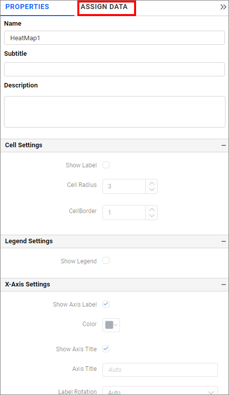
- The properties panel of the widget will be displayed as shown in the following screenshot. Now, switch to the
ASSIGN DATAtab.
- The data tab will be opened with available columns from the connected data source.
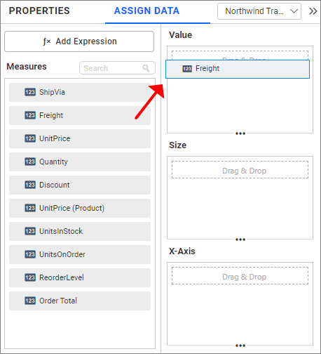
Step 2: Add a measures and dimensions in assign data.
Value section
Bind columns by dragging and dropping the elements from sections to values.
NOTE:
- The field added in this section will act as a measure value.
- It is a mandatory section for widget visualization and only one value can be configured.
Hidden Column
Hidden columns are useful in cases where we don’t want the fields to take part in the visualization, but only to be used for linking, filtering and view data.

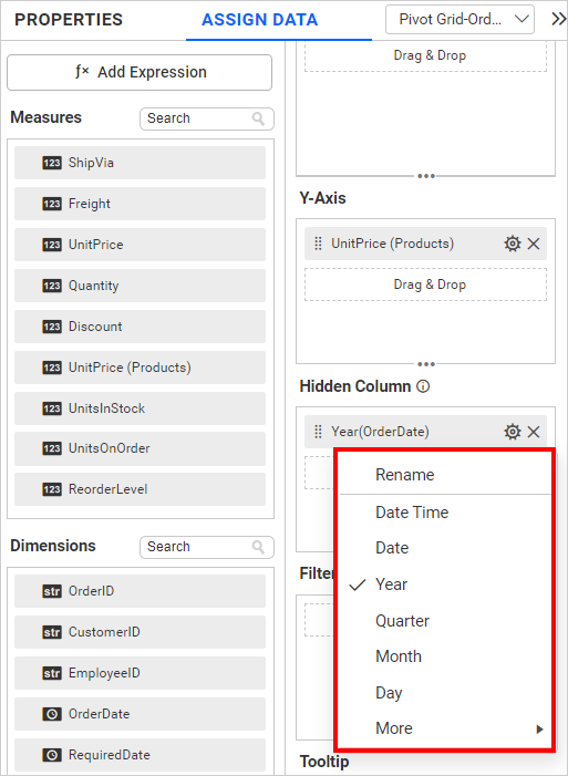
We can configure both measure and dimension fields into the hidden column. For measures, we will have all the settings we have for the measure fields, except formatting and filtering.
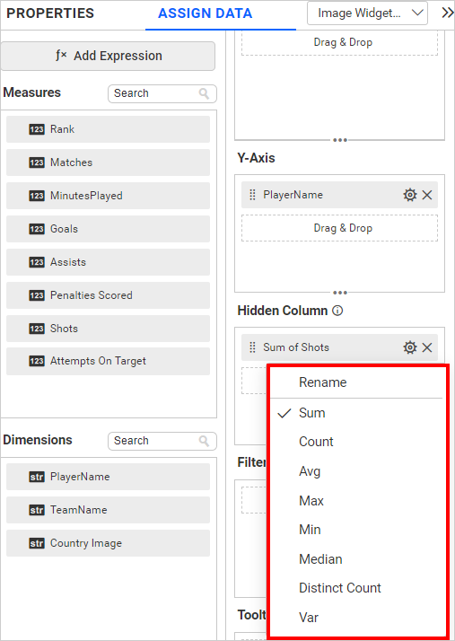
In the case of dimension fields, we will have the following options only. In Date fields, we will have all available types except sorting, relative date filter, settings, and filters.
Linking
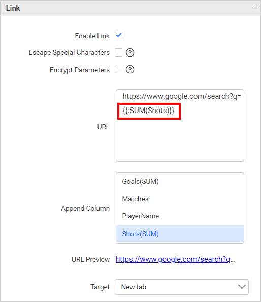
The primary use case for hidden columns is linking. On configuring hidden columns, we can see below that the fields configured in hidden columns are listed in the linking section. On configuring the column in linking, we can pass the corresponding column value in the linking parameter.
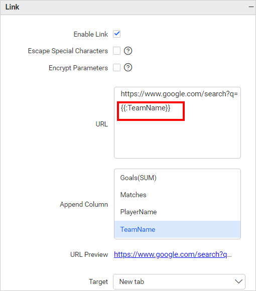
Measure Based Example: If we wish to pass the number of Shots as a URL parameter but do not want it to influence the visualization, we can configure the Shots in the hidden columns and incorporate them into the link.
Dimension Based Example: If we wish to pass the number of Team Name played as a URL parameter but do not want it to influence the visualization, we can configure the Team Name in the hidden columns and incorporate them into the link.
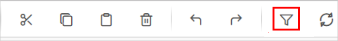
Filtering
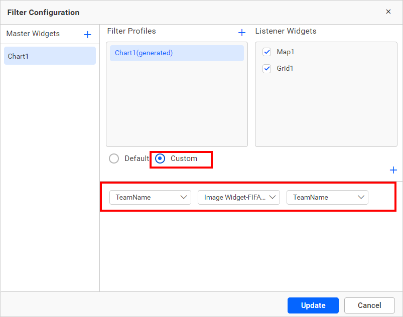
You can use hidden columns to filter data in the visualizations. Configure hidden columns and click the filter icon below.
Click the Custom button highlighted in the filter configuration dialog image below. It will list all the fields configured in the widget. Keep the field configured in the hidden column and remove the other fields, then click the Update button.
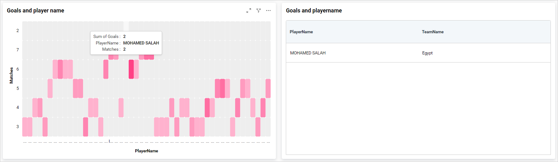
Now, we can see in the image below, the data is filtered based on the hidden column field instead of the actual column that we bound in the widget.
For more details about filtering the widget data, refer to the Cross Filter Configuration documentation
View Data
You can view the data in the hidden columns in the underlying data view. This is useful for checking the data in more detail and can help you identify any issues with the data.
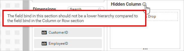
NOTE: We don’t recommend configuring lower hierarchy data in hidden columns, as indicated by the info icon in the
Hidden Columnsection.
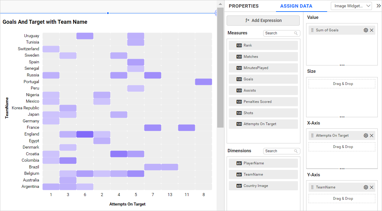
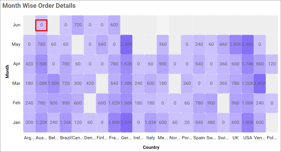
The heat map below displays the goals and Attempts On Target by each team without hidden columns.
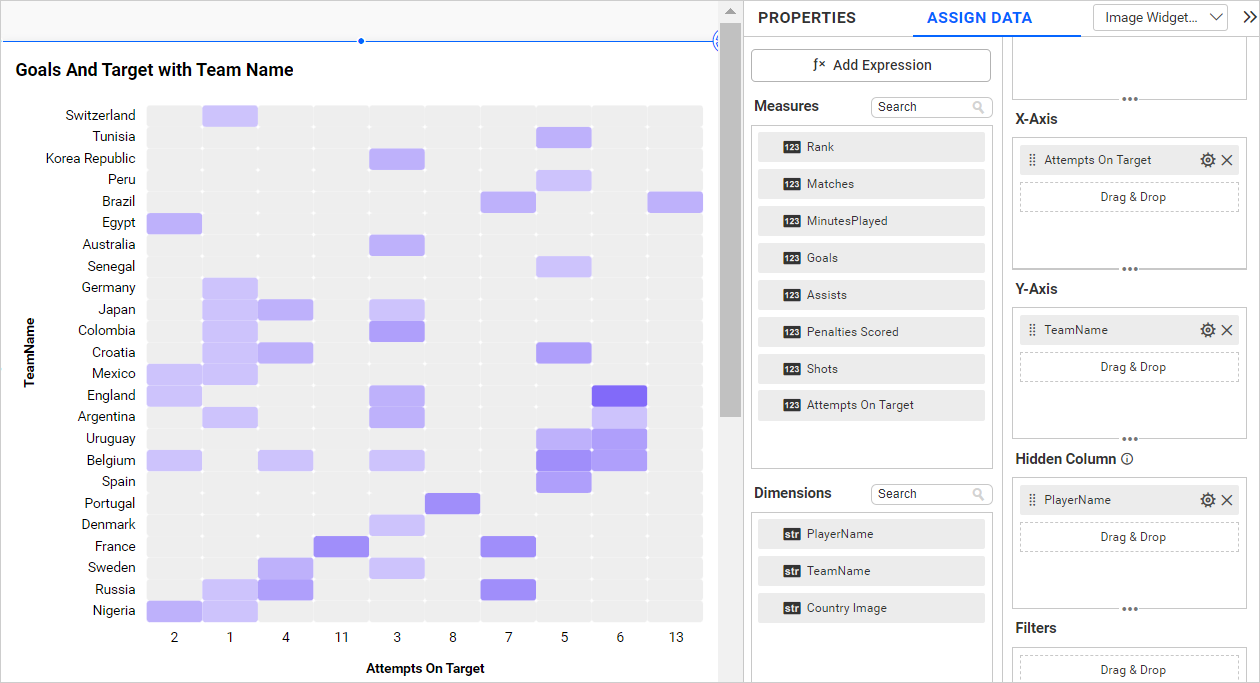
If we configure lower hierarchy data (Player Name) in hidden columns, the data configured in the widgets gets duplicated. The sorting order of the widget will change, which affects the heat map visualization as seen in the image below.
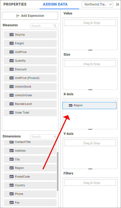
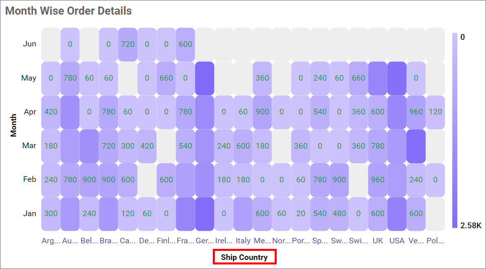
X-Axis section
Drag and drop the elements from sections to the X-Axis section.
NOTE:
- The field added in this section will act as a dimension value.
- It is a mandatory section and only one value can be configured
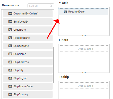
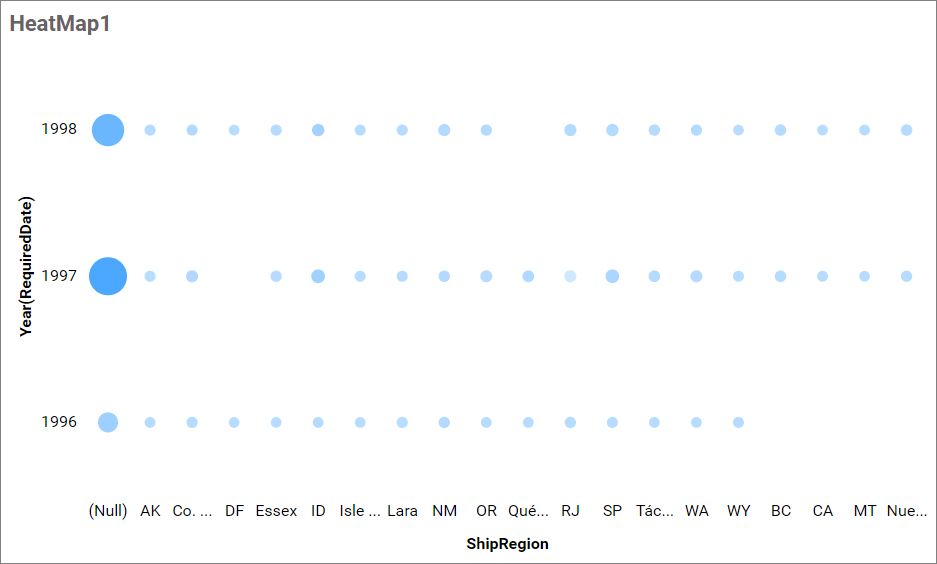
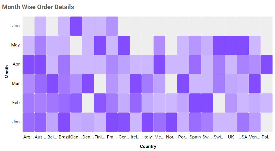
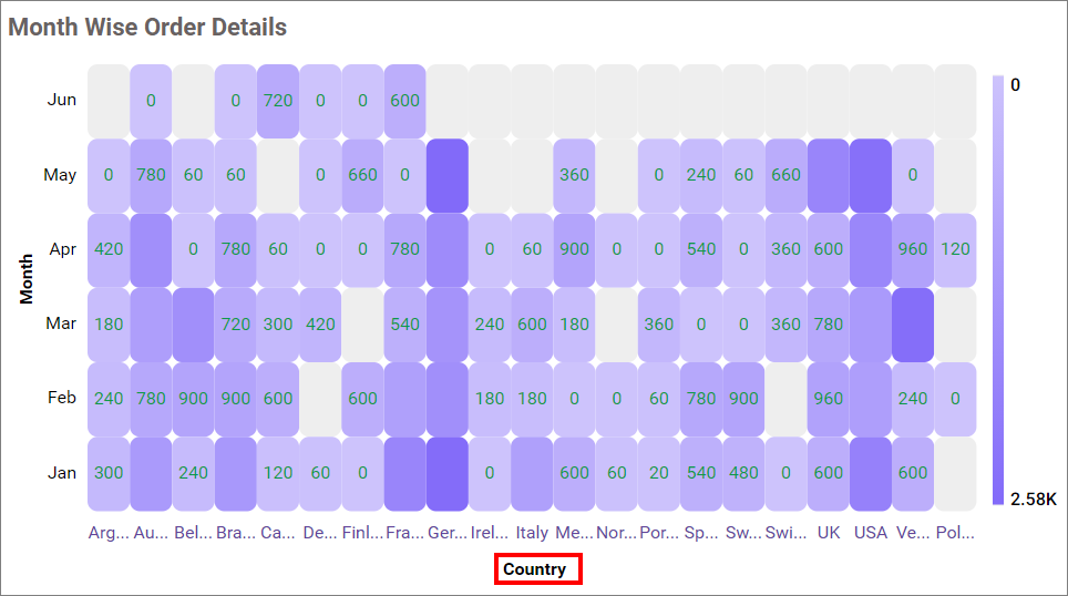
Y-Axis section
Drag and drop the elements from sections to the Y-Axis section.
NOTE:
- The field added in this section will act as a dimension value.
- It is a mandatory section and only one value can be configured.
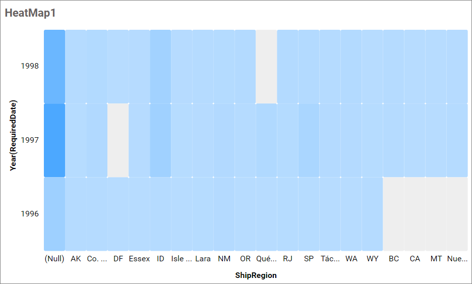
Image: Heatmap widget after configuring the mandatory fields.
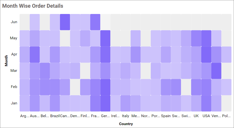
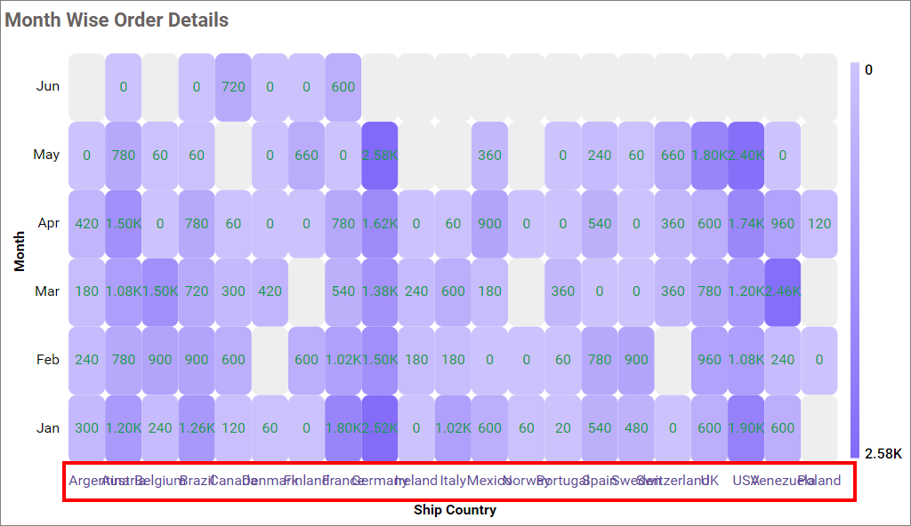
Size section
Drag and drop the elements from sections to the size section. It will define the size of the bubble in the heatmap. Also, it is an optional section.
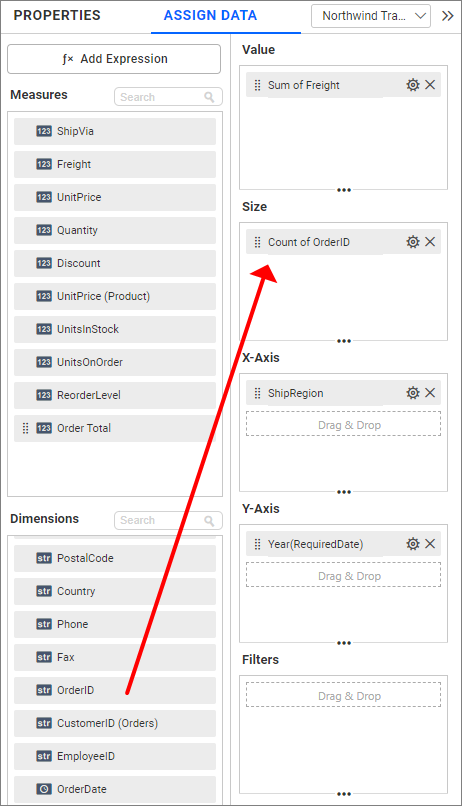
Image: Heatmap widget after configuring the size field
Tooltip section
You can configure the tooltip section to showcase additional information in the widget’s tooltip without affecting the visualization. Refer to this section for more details on configuring the tooltip fields.
Step 3: Settings menu options
You can filter, format, and Rename the data displayed in the widget from the settings menu options. To open the settings menu, click the settings icon.
The following screenshots show the various settings menu options based on the type of field configured in the type of section.
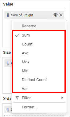
Measure field in values
Dimension field in value
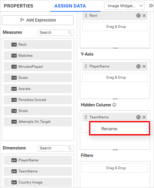
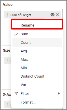
Renaming fields
The configured field names can be edited by using the Rename option provided in the settings menu.
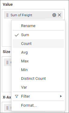
Changing the aggregation type
You can change the aggregation type of the measure section from the settings menu as shown in the following screenshot. Refer to this section for more details.
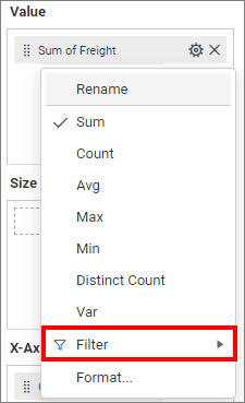
Filtering data
You can use Filters to change the values by selecting the Filter option. For more details, refer to the Measure filter and dimension filter.
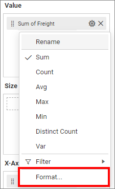
Measure formatting
You can format the elements by selecting the Format option. For more details, refer to the measure format.
Drill Down
When the second value is added to the X-axis or Y-axis section, an alert message will be shown.
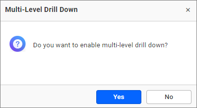
Click Yes to enable the option. If you click No, then a single value will be added to the respective section (X-axis or Y-axis).
Figure: Heat Map with a drilled view of the selected region.
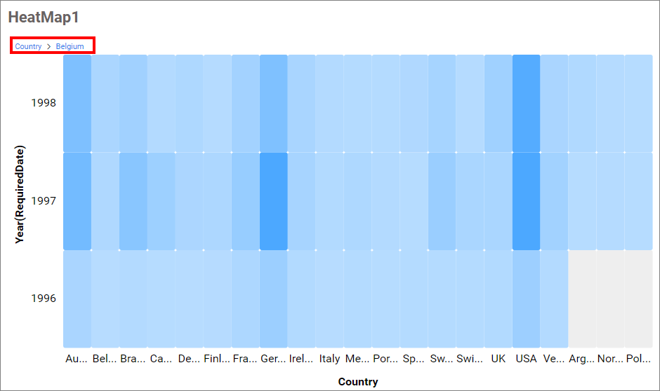
Drill Up
Once you’ve drilled down, you can drill up to the previous view using the breadcrumb navigator located at the top of the widget.
How to format Heatmap widget
You can format the Heatmap for better illustration of the view that you require using the settings available in the Properties tab.
General settings
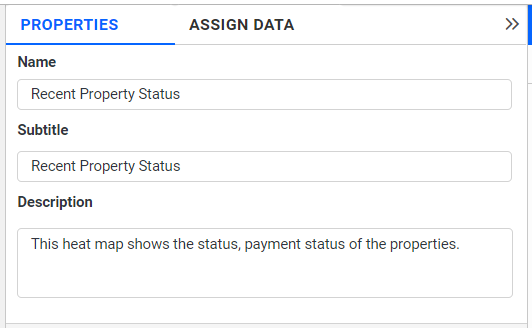
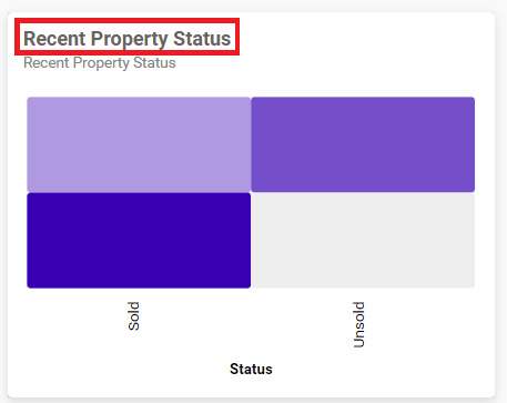
Name
This allows you to set a title for this Heatmap widget.
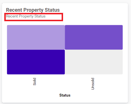
Subtitle
This allows you to set a subtitle for this Heatmap widget.
Description
This allows you to set a brief explanation about this Heatmap widget.
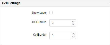
Cell settings
If we uncheck this property, the value label color property will be hidden.
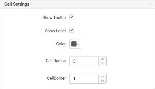
Show label
This allows you to toggle the visibility of value labels.
Label Color
This allows you to change the color of the label.
Cell radius
This allows you to apply the specified radius to cell corners. The value ranges from 0 to 10. The Default value is 3.

Cell border
This allows you to toggle the visibility of the border surrounding the cell. The value ranges from 0 to 10. The default value is 1.
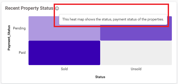
Tooltip Settings
The Tooltip Settings section allows you to customize the appearance and behavior of tooltips in widget visualizations.
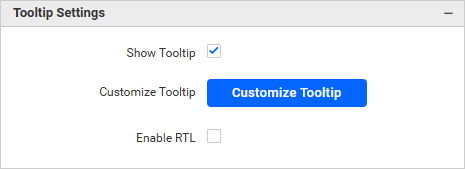
Show Tooltip
This option allows you to toggle the visibility of the tooltip in a heat map.
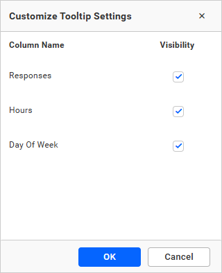
Customize Tooltip
This option allows you to customize which columns are visible in the map’s tooltip.
Enable RTL
This option allows you to display fields and their data from right to left.
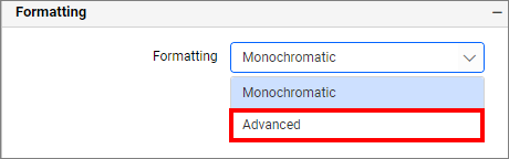
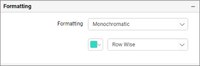
Formatting
You can change the color of the widget.
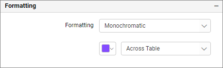
Monochromatic
This allows you to configure a single-color palette whose saturation will be varied based on the value density.
Types
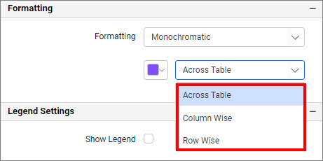
Across Table: Monochromatic color applied based on the whole table minimum and maximum data values.
Column Wise: Monochromatic color applied based on the individual column-wise minimum and maximum data values.
Row Wise: Monochromatic color applied based on the individual row wise minimum and maximum data values.
Advanced setting
Select Advanced setting to configure conditions and apply color to the cells based on that. Click here for more details.
Legend settings
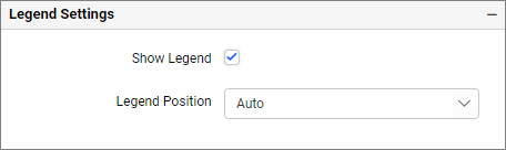
Show legend
This allows you to toggle the visibility of the legend in the heatmap. By default, it will be disabled.
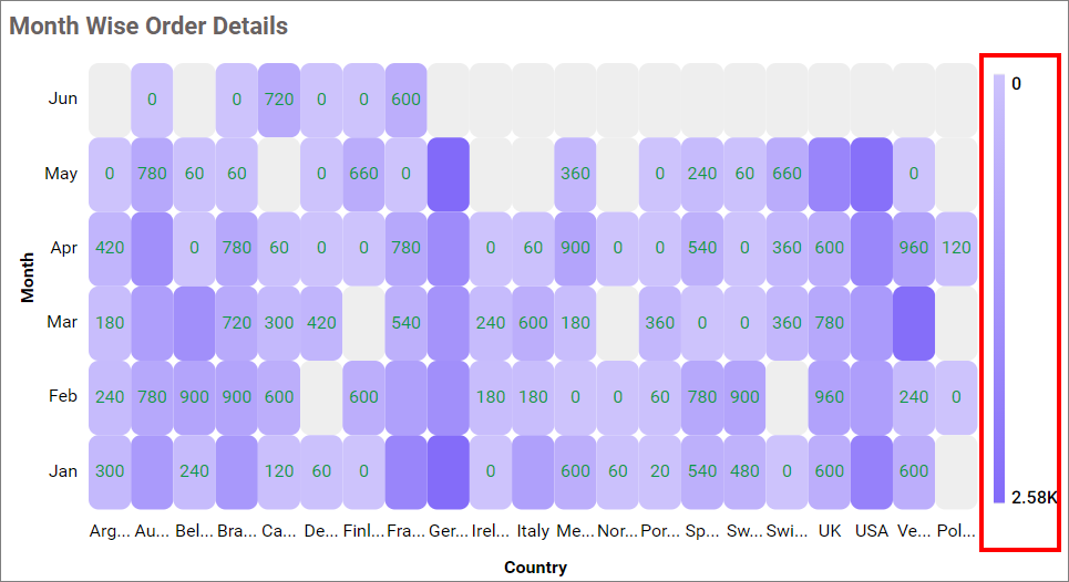
Legend Position
This option allows you to place the legend at the position of Left, Right, Top, and Bottom.
X-axis settings
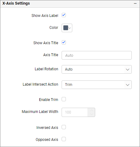
Show axis label
This allows you to enable the visibility of x-axis labels.
Label Color
This allows you to change the x-axis label color.

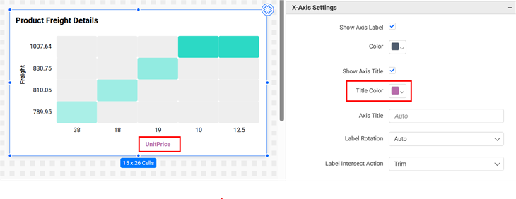
Title Color
This allows you to change the x-axis title color.
Show axis title
This allows you to enable the visibility of x-axis title.
Axis title
This allows you to edit the x-axis title for the heatmap. It will reflect in the x-axis title of the heatmap.
Label rotation
This allows you to define the rotation angle for x-axis labels to display.
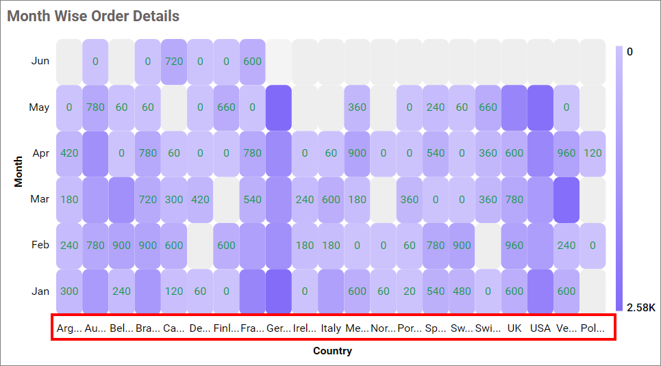
Label intersect action
None
This option did not trim the end of overlapping label in the axis.
Trim
This option trims the end of overlapping labels in the axis.
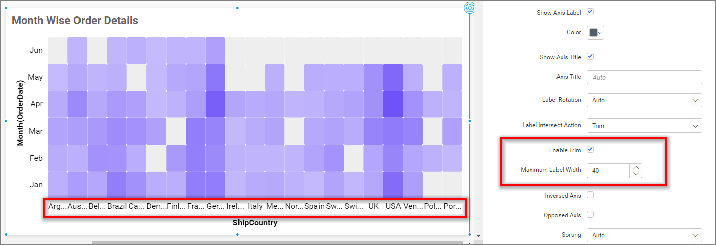
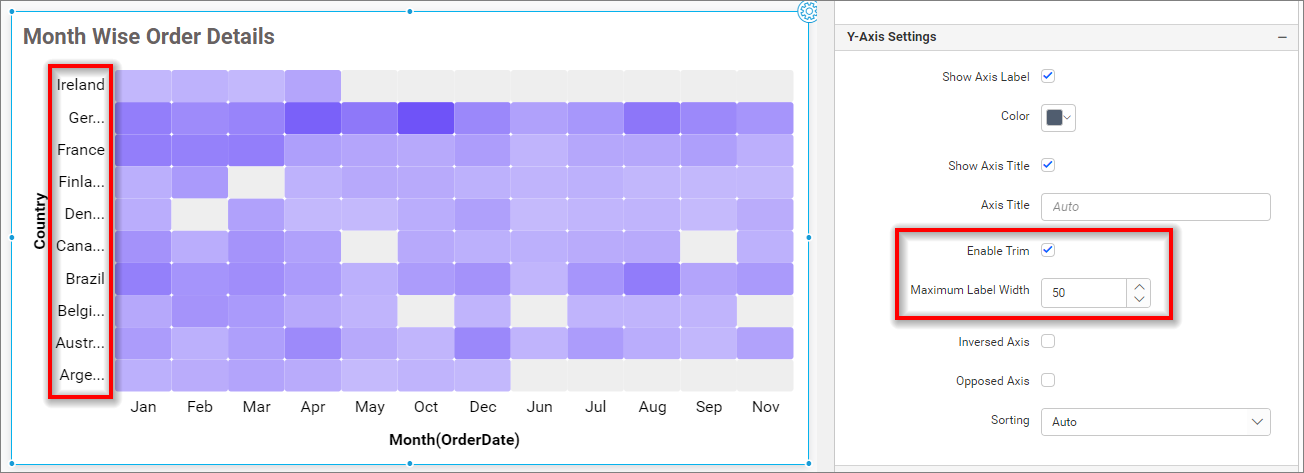
Enable Trim
This option allows you to trim X-axis labels based on the Maximum Label Width property value.
Maximum Label Width
This option allows you to set a maximum width for the X-axis labels, and it can also be made customizable when the trim axis label option is enabled.
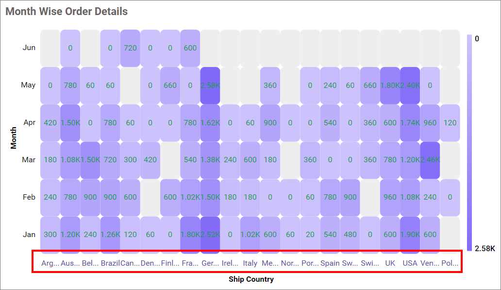
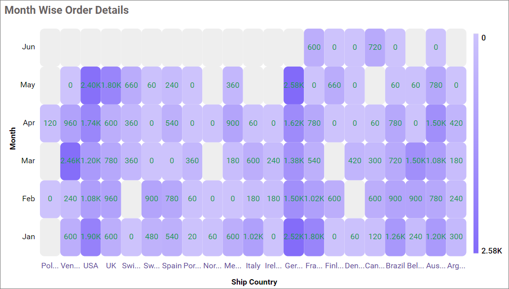
Inversed axis
This allows you to change the axis label’s placement order from left to right in the X-axis.
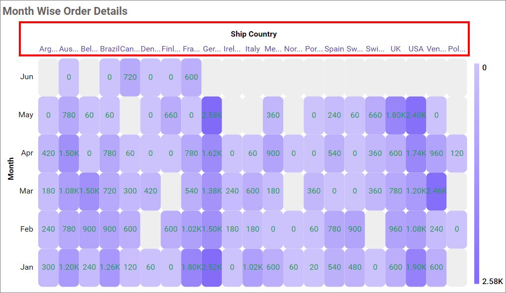
Opposed axis
This allows you to change the axis position from bottom to top in the x-axis.
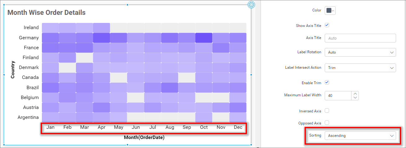
Sorting
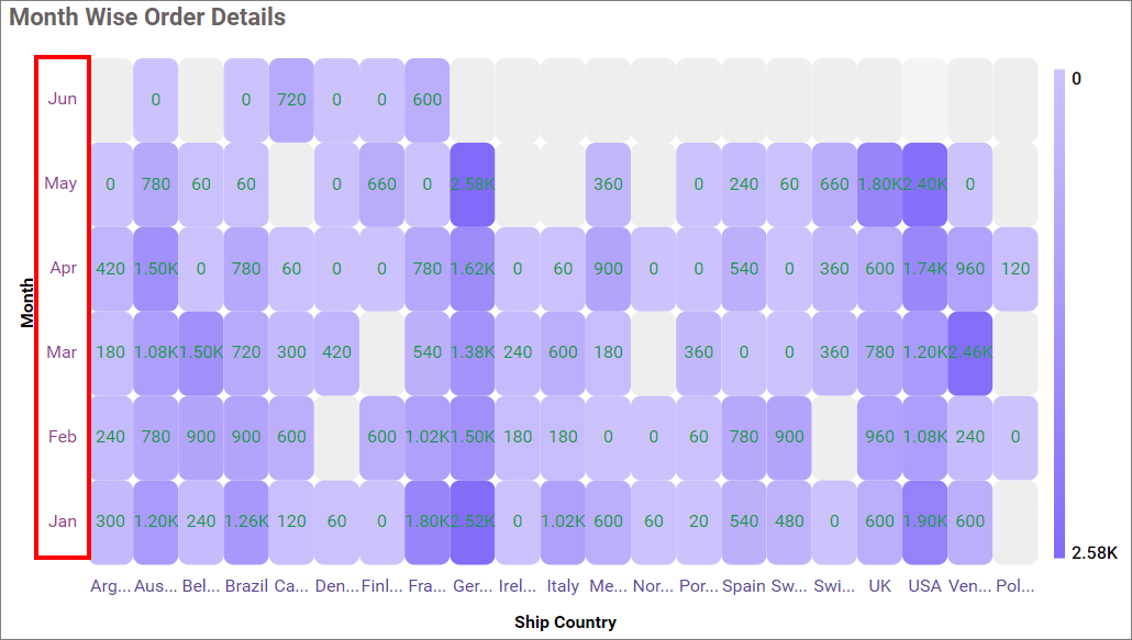
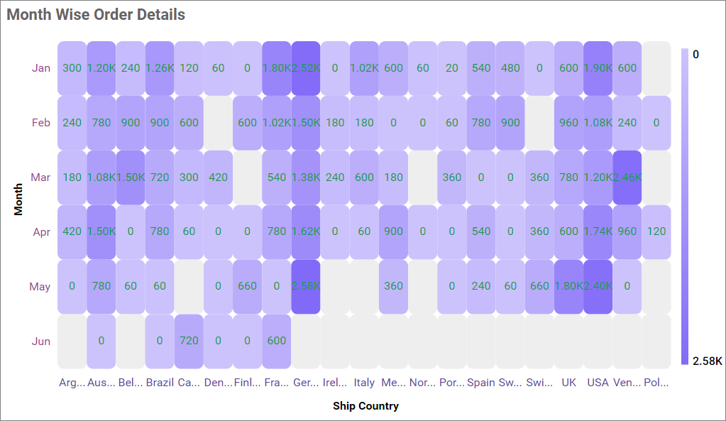
This option allows you to perform sorting on both the X-axis and Y-axis at the same time. As we are currently plotting data as per the 2D resultant table, you are unable to sort both the X and Y axis at the same time. So, we have provided an option in the property panel to customize the sort setting in Heat Map. By default, Auto sorting is selected, and the sort order will be the same as per the 2D resultant table.
X-axis sorting with Ascending value.
Y-axis settings
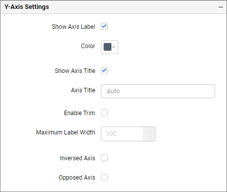
Show axis label
This allows you to enable the visibility of y-axis labels.
Label Color
This allows you to change the y-axis label color.
Show axis title
This allows you to enable the visibility of y-axis title.
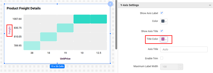
Title Color
This allows you to change the y-axis title color.
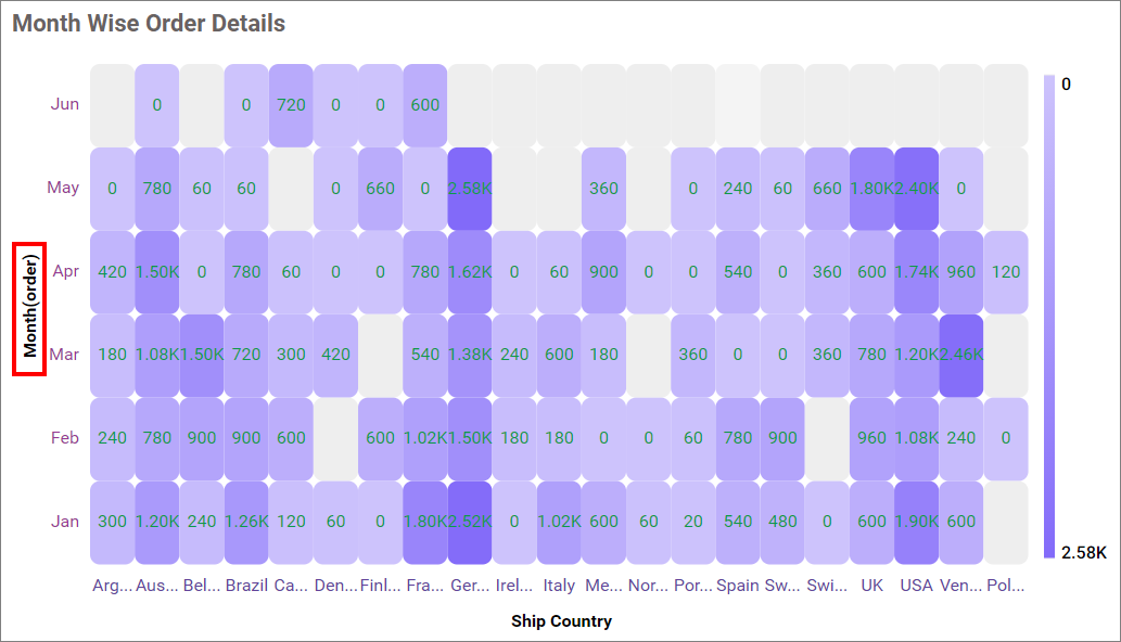
Axis title
This allows you to edit the Y-axis title for the Heatmap. It will reflect in the Y-axis title of the Heatmap.
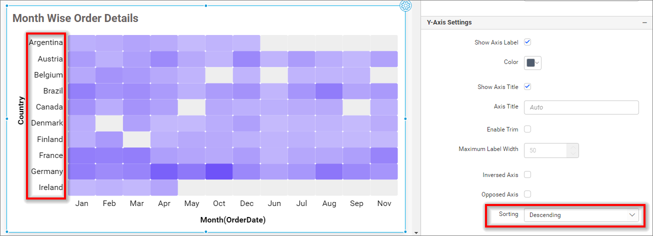
Enable Trim
This option allows you to trim Y-axis labels based on the Maximum Label Width property value.
Maximum Label Width
This option allows you to set the maximum width for the Y-axis labels, and it can also be made customizable when the trim axis label option is enabled.
Inversed axis
This allows you to change the axis label’s placement order from bottom to top in the Y-axis.
Opposed axis
This allows you to change the axis position from left to right in the y-axis.
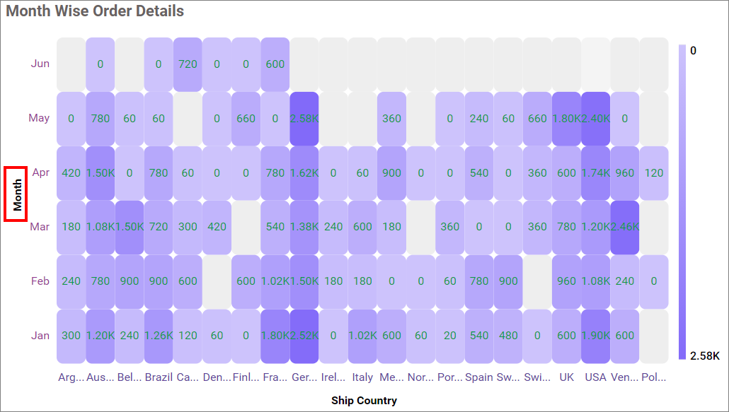
Sorting
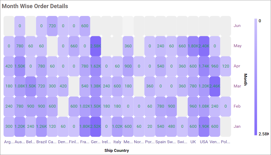
This option allows you to perform sorting on both the X-axis and Y-axis at the same time. As you are currently plotting data as per the 2D resultant table, you are unable to sort both the X and Y axis at the same time. So, we have provided an option in the property panel to customize the sort setting in Heat Map. By default, Auto sorting is selected, and the sort order will be the same as per the 2D resultant table.
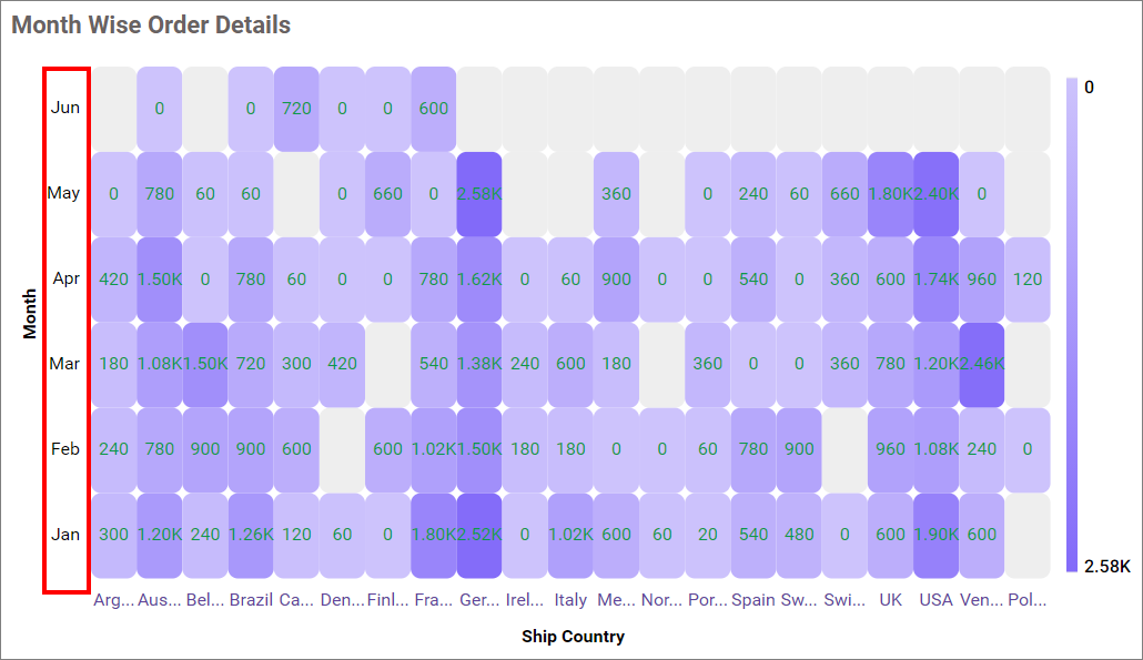
Y-axis sorting with the Descending value.
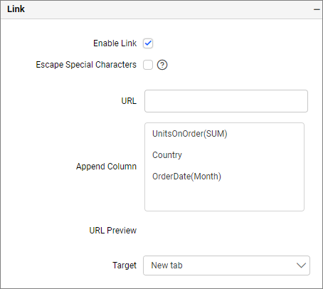
Link
To configure the linking to URL or dashboard with the widget using its settings. For more details, refer to the Linking.
Filter
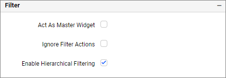
Act as master widget
This allows you to define the Heatmap widget as a master widget such that its filter action can be listened to by other widgets in the Dashboard.
Ignore filter actions
This allows you to define the Heatmap widget to ignore responding to filter actions applied to other widgets in the Dashboard.
Enable hierarchical filtering
Using this option, you can enable or disable the hierarchical Top N filtering. While applying Top N filter with multiple dimension columns, the returned data can be customized based on whether the filtering needs to be done as a flat or hierarchy of added dimension columns.
When the hierarchical filter option is enabled, the Top N will be applied for each individual column separately based on the number set for each column.
Show Filter
This feature allows you to toggle the visibility of the Filter icon for the heatmap widget when the Act as Master Widget option is enabled.
How to apply conditional formatting in Heatmap
In case you have the requirement to highlight any data based on some conditions, you might be required to enable the advanced formatting option.
How to enable advanced formatting
- In the properties pane, click on the
Advanced Settingradio button under theFormattingsection.
- This will open the
Conditional Formattingdialog.
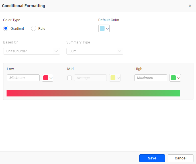
-
Enter the conditions as required, select the
mode, and click theSavebutton to apply. -
The widget visualization will now be updated based on the conditions.
Refer to the following sections for the detailed steps on using the Gradient and Rule modes.
Gradient mode
You can customize the fill color of the heatmap using the gradient-based conditional formatting. This is the default mode.
NOTE: The Gradient mode option will be disabled if the binding size field in the heat map is enabled.
Based on field
This option is based on the configured value fields and cannot be changed in the conditional formatting dialog.
Summary type
This refers to the summary type of the configured value field.
Low, mid, and high values
You can define your range by entering the low, mid, and high values.
NOTE: If no value is entered, the ranges will be auto-calculated based on the minimum and maximum values from the data source.
Default color
If the region of the Heatmap value is out of the specified range, the color specified in the default color will be applied.
Rule based condition mode
This allows you to customize the fill color of the Heatmap based on one or more numerical/text conditions.
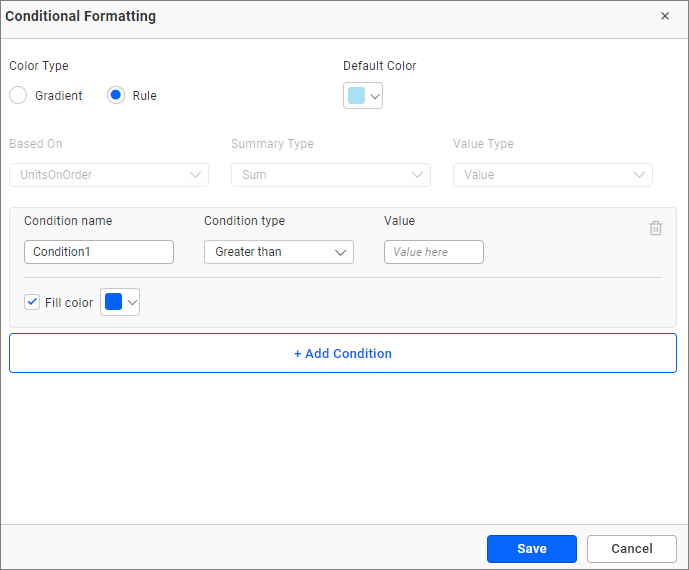
Condition name
You can give a meaningful name to the applied conditions.
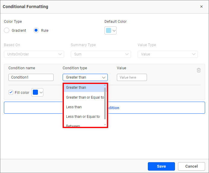
Condition type
Choose the condition for the measure field from the highlighted conditions.
Value
You can specify the condition value.
Fill color
Select the fill color for that condition using the color picker.
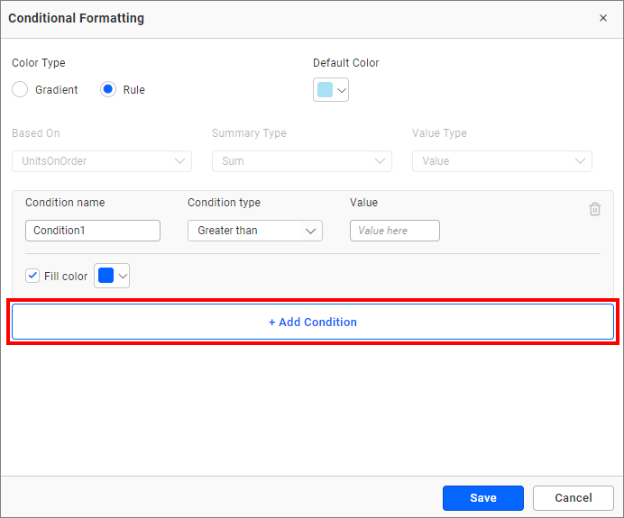
Add condition
Click the add condition button to specify a new condition.
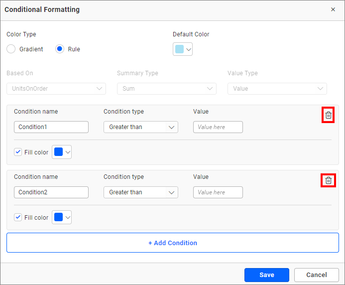
Delete condition
Click the delete button to remove an existing condition.
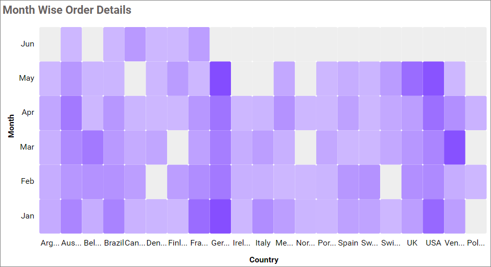
Cohort Visualization
Cohort visualization examines the outcomes of predetermined groups, called cohorts, as they progress through a set of stages. The signature characteristic of a cohort is its comparison of the change in a variable across two different time series. A cohort is a group of people sharing common characteristics over a specified period, and it helps for decision making purposes.
How to do cohort visualization in HeatMap widget
-
Drag and drop the heatmap widget and bind the measure values to it.
-
Go to the
Formatting sectionand change the dropdown value toRow Wise.
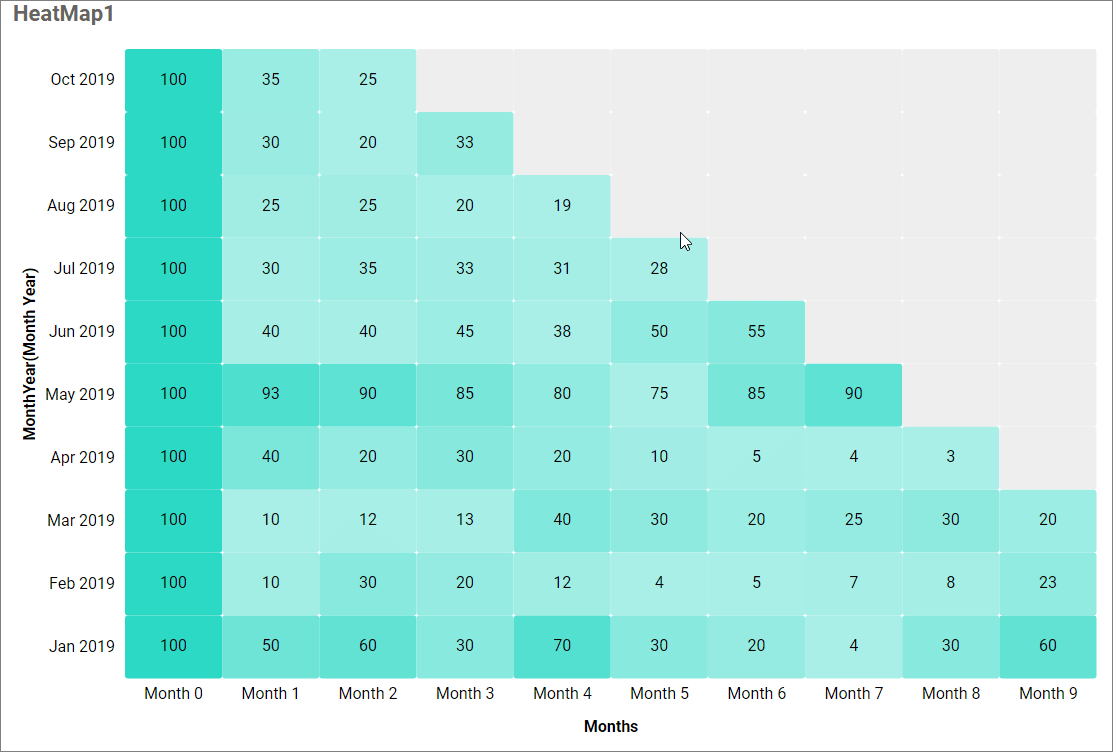
The above screenshot shows cohort visualization in the heatmap widget.
Container Appearance
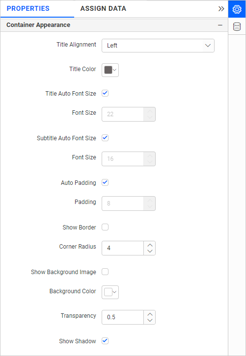
Title Alignment
This allows you to handle the alignment of the widget title to either left, center, or right.
Title Color
This allows you to apply the text color to the widget title.
Title Auto Font Size
When enabled, the font size of the title will be adjusted automatically if the resolution of the screen varies.
Font Size
This allows you to apply the specified size of the font to the widget title if the Title Auto Font Size is disabled. The value can be between 10 and 44.
Subtitle Auto Font Size
When enabled, the font size of the subtitle will be adjusted automatically if the resolution of the screen varies.
Font Size
This allows you to apply the specified size of the font to the widget title if the Subtitle Auto Font Size is disabled. The value can be between 10 and 32.
Auto Padding
When enabled, the padding of the widget container will be adjusted automatically if the size of the widget varies.
Padding
This allows you to customize the padding of the widget container if the Auto Padding is disabled. The value can be between 0 and 25.
Show Border
This allows you to toggle the visibility of the border surrounding the widget.
Corner Radius
This allows you to apply the specified radius to the widget corners if the Show Border is enabled. The value can be between 0 and 100.
Show Background Image
This allows you to set the background image for the heat map widget.
Background Color
This allows you to set the background color for the heat map widget.
Transparency
This property allows you to specify the transparency for the background color.
Show Shadow
This allows you to toggle the visibility of the shadow surrounding the widget.
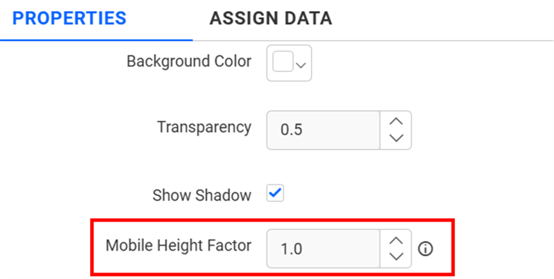
Mobile Height Factor
This option allows you to resize widgets specifically for mobile view.
Container actions
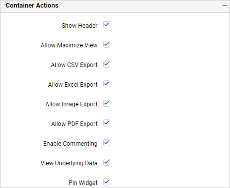
Show Header
This allows you to enable or disable the widget title of the heat map.
Allow Maximize View
This allows you to enable or disable the maximized mode of the heat map widget. The visibility of the maximize icon in the widget header will be defined based on the setting in the viewer.
Allow CSV Export
This allows you to enable or disable the CSV export option for the heat map widget. Enabling this allows you to export the summarized data of the widget view to CSV format in the viewer.
Allow Excel Export
This allows you to enable or disable the Excel export option for the heat map widget. Enabling this allows you to export the summarized data of the widget view to (.xlsx or .xls) format in the viewer.
Allow Image Export
This allows you to enable or disable the Image export option for the heat map widget. Enabling this allows you to export the view of the widget to image format (.jpg), (.png), or (.bmp) in the viewer.
Allow PDF Export
This allows you to enable or disable the PDF export option for the heat map widget. Enabling this allows you to export the view of the widget to pdf format in the viewer.
Enable Comments
This allows you to enable or disable comments for the dashboard widget. For more details, refer to the Commenting Widget.
Allow View Underlying Data
This allows you to visualize the raw data associated with a widget at runtime.
To learn more about viewing the underlying widget data, refer to the view data documentation.
Pin Widget
This allows you to pin the widget.
Responsive Behavior
We hide the widget elements based on the size of the widget for better readability.
When the Heatmap has been placed with less than 20 columns, the chart y-axis title and y-axis label will be hidden.
When the Heatmap is placed with less than 7 rows, the x-axis title and x-axis label, and the legend will be hidden.
When the Heatmap is placed with less than 16 columns and less than 7 rows, the legend will be hidden.