Tab Widget
A Tab widget allows you to add multiple widgets in a single tab and multiple tabs within a single widget. It groups a number of widgets in one place, reducing the large design area of the dashboard.

How to add Tab Widget
You can drag and drop the tab widget into the dashboard from the Miscellaneous group in the left side item panel. Additionally, you can resize the dragged widget to add more widgets in the same tab.

How to configure Tab Widget with multiple widgets
You can add multiple widgets in tabs using three ways:
-
Configure the tab widget by dragging other widgets from the item panel and assigning required data.

-
Drag the configured widgets from design canvas into the tab widget.

-
Drag the existing panel widgets into the tab widget.

Tab Functionalities
Tabs can be added or removed using the following options:
- Add Tab.
- Remove Tab.
1. Add Tab
The tab widget contains a (+) icon at the right of the last tab name. Click the add icon to create a new tab.

2. Remove Tab
Each tab is created with a close icon at the right end of the tab name. A tab can be removed by clicking the close icon.

How to format tab widget
You can format the tab widget for better illustration using the settings available in the Properties tab.
Basic settings

Tab Order
Tab Order helps to rearrange the order of all tabs that have been created. Choose a tab name and then click the corresponding arrow icon to move the tab either upwards or downwards.

After clicking the arrow icon, the selected tab will switch positions as shown in the image.

Tab Rename
To rename a tab, click the edit icon at the top right of the Tab Order section. Follow these steps to edit the tab name:
-
Select the tab name.
-
Click the edit icon on the right side of the
Tab Ordersection. -
A text box will appear for the selected tab name.
-
Rename the tab as shown in the image.

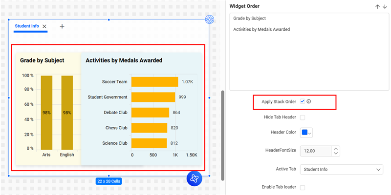
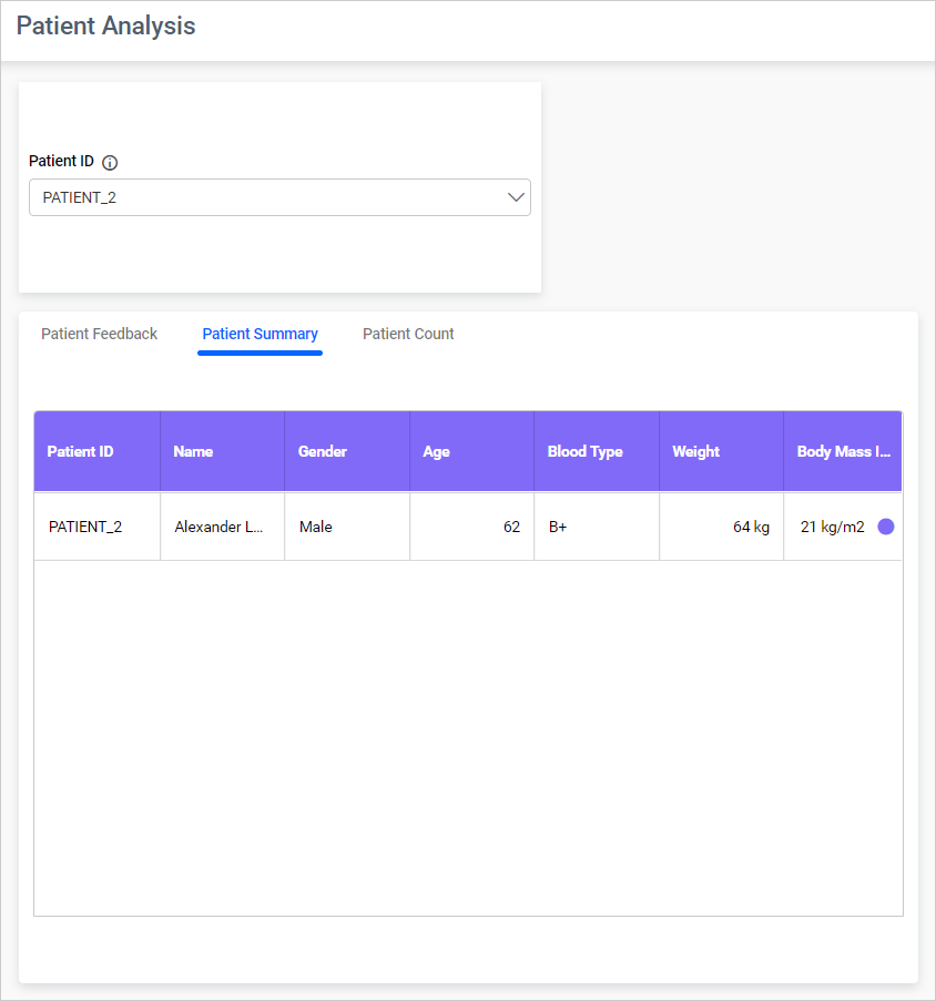
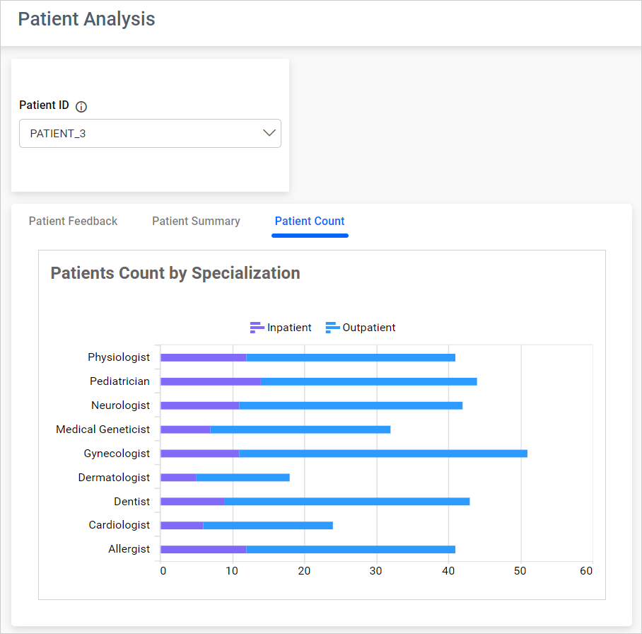
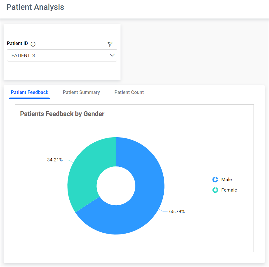
Widget Order
Widget Order allows you to rearrange the widgets within a tab. You can overlap widgets in a tab and change the order using the Widget Order section in the property panel.
The Widget Order section lists the widgets in a tab. Use the arrow icons to rearrange the order.
For example, if you drag the Department widget to the bottom of the list and place it over the Feedback Report widget, select the Feedback Report tab in the Widget Order section and click the downward arrow icon as shown in the image.

After clicking downward arrow icon, Feedback Report tab moves to bottom of the list and it appears over the Department widget within a Patient Feedback tab in tab widget.

Apply Stack Order
This allows you to stack entire widgets on top of each other.
Hide Tab Header
When the Hide Tab Header checkbox is enabled, the tab header will be disabled.

Header color and Font size
The color of the tab header can be changed by choosing a color from Header Color, and the size of the tab font can be changed by selecting the HeaderFontSize option.
Active Tab
Active Tab sets the selected tab as default when the dashboard is rendered.
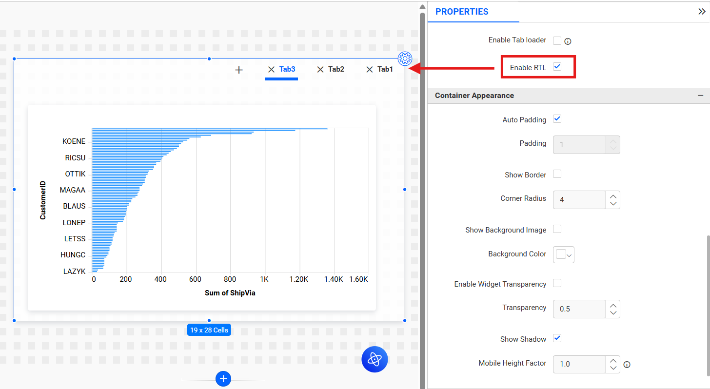
Enable RTL
This option allows tab header to be displayed from right to left.
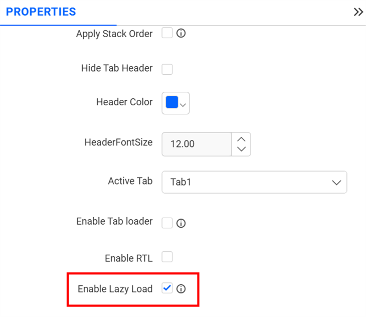
Enable Lazy Load
This option improves dashboard performance by rendering only the widgets in the active tab during initial load. Widgets in other tabs are rendered only when you switch to them (if they have not already been rendered).
Container Appearance

Auto Padding
By enabling Auto Padding, the padding of the widget container will be adjusted automatically if the size of the widget varies. Padding
This allows you to customize the padding of the widget container if Auto Padding is disabled. The value can be between 0 and 25.
Show Border
This allows you to toggle the visibility of the border surrounding the widget.
Corner Radius
This allows you to apply the specified radius to the widget corners if Show Border is enabled. The value can be between 0 and 100.
Show Background Image
This allows you to set the background image for the tab widget.
Show Background Color
This allows you to set the background color for the tab widget.
Transparency
This property allows you to specify the transparency for the background color.
Show Shadow
This allows you to toggle the visibility of the shadow surrounding the widget.
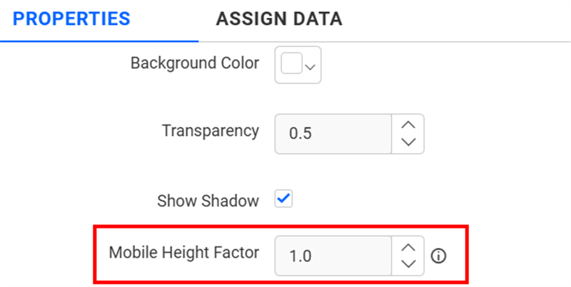
Mobile Height Factor
This option allows you to resize widgets specifically for mobile view.
Export
You can export the tab widget in various formats, including Image, PDF, PowerPoint, Excel and CSV.
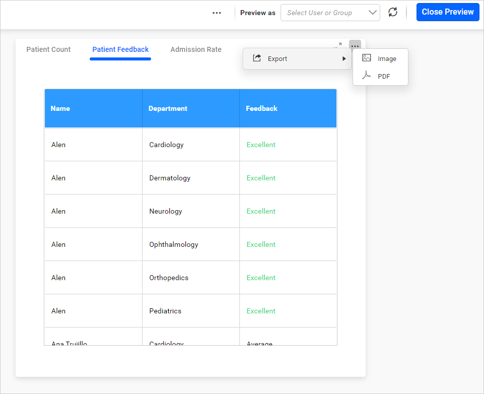
NOTE: For Image, PDF, and PowerPoint exports, only the active tab and its widgets will be exported at this time.
Inter widget linking support for the Tab widget
Inter widget linking support helps to link a few widgets (master widget) with a tab widget and switch the tabs in the tab widget based on the selected index value of the master widget. It also filters the data inside the tab widget while switching the required tab. For example, when selecting the second value from a combo box, the second value is filtered inside the tab widget, and the second tab is also switched.
NOTE: The supported master widgets for linking with a tab widget are Combo Box, List Box, KPI Card, Number Card, and Radial Gauge.
How to configure Inter Widget Linking
The tab widget can be configured with inter-widget linking support by following these steps:
- Drag and drop the master widget(Combo Box,
List Box,
KPI Card,
Number Card,
Radial Gauge) and configure data.
2. Drag and drop the Tab Widget and configure it with widget data.
3. Open the master widget’s property panel and find the Inter Widget Linking section.

Enable Inter widget linking
This allows you to enable the inter-widget linking support for the tab widget. By default, the Enable checkbox is maintained in an unchecked state.
Widgets
The Widgets section displays the list of tab widgets. You can choose the required tab widget for inter-widget linking by enabling the Enable checkbox.
Actions
There are two actions to configure the linking with the tab widget. When hovering over the info icon, it displays a message about the following actions:
The above actions are initially disabled and will be enabled by selecting any of the tab widgets under the Widgets section.
Default
The Default action allows you to switch the tabs based on the selected index from the master widget. For example, when selecting the third value from the master widget, the third tab is switched in the tab widget.

NOTE: If the selected index value is greater than the tab count, the last tab will be switched.
Custom
This allows you to switch the tab based on the specific index which can be entered in the text box under the Custom action. The textbox appears only by choosing the Custom action. This action switches to the configured tab only, even when choosing any value from the master widget. For example, entering a value of 1 in the custom text box will switch to the first tab only, even when selecting any other values in the combo box.

Switching Tabs with URL Parameters
You can now control which tab is displayed in a Tab Widget by passing a URL parameter that specifies the tab name. This is useful for linking from other dashboards or embedding scenarios.
Syntax
&widgetName.Tab=TabNamewidgetName: Name of the Tab Widget in the dashboard (for example,TabWidget1).Tab: Literal keyword that triggers the tab-switch action.TabName: Display name of the tab that should open.
Examples
-
Direct viewer link
http://<servername>/<culturename>/dashboards/<dashboardid>/<category>/<dashboardname>?student details.Tab=Academic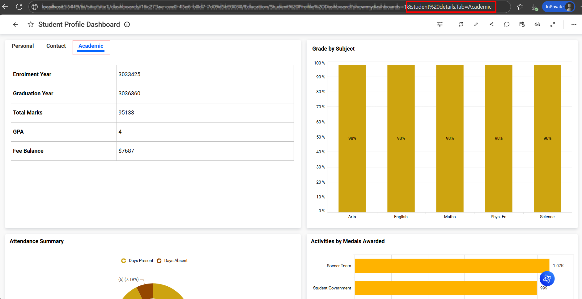
-
Combined with other parameters
http://<servername>/<culturename>/dashboards/<dashboardid>/<category>/<dashboardname>?student details.Tab=Contact&Branch=English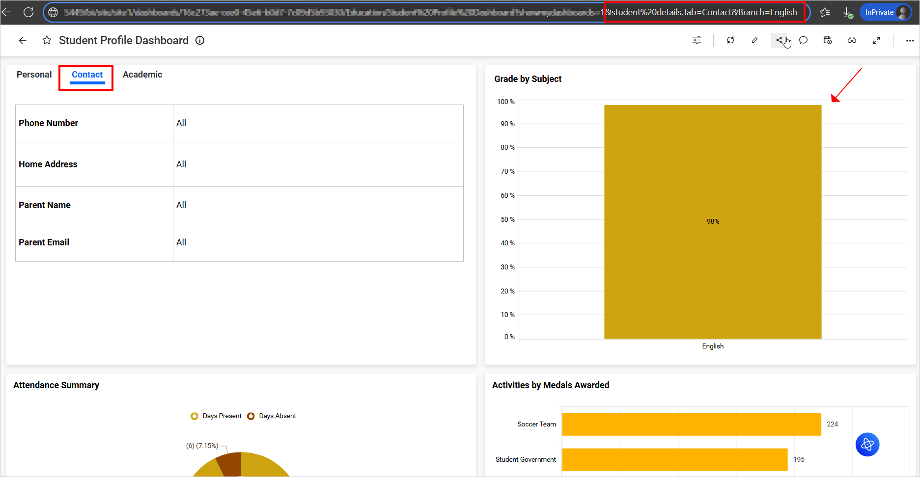
Behavior and tips
- Tab names and widget names are not case-sensitive.
- If the specified tab is not found, the widget loads its default tab.
- You can include multiple widget parameters in the same URL when deep-linking to different widgets on the dashboard.